


Task: Naming, slogan, corporate design that connects emotionally directly with the target group and explains what Julia Milan offers as a service, what her USP is compared to another coach. To visually and conceptually harmonise the levels of mind, body and spirit. In a modern, aesthetic and professional way.
Idea: To develop a fantasy name for the founder‘s personal name that gives a direct idea of what coaching and the service are all about.
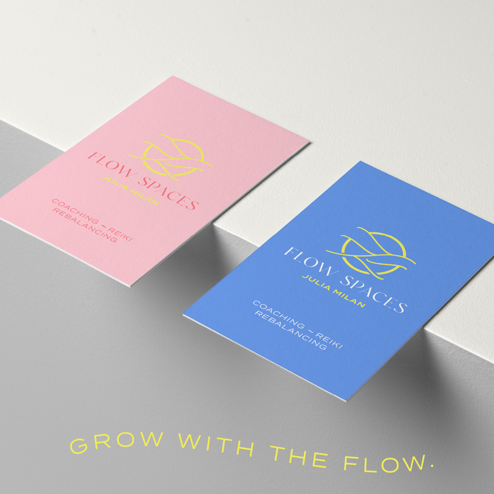
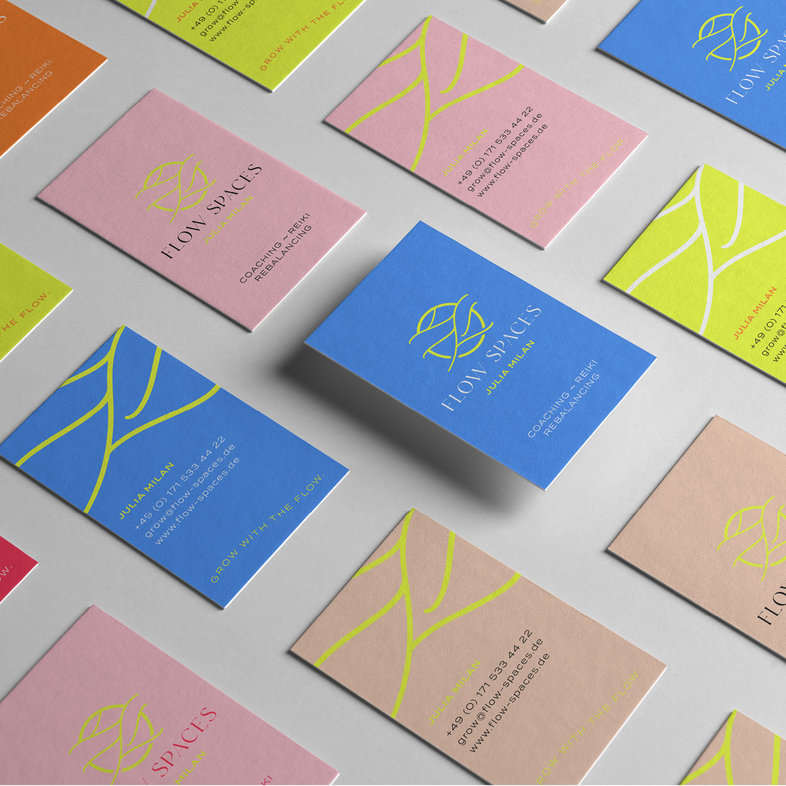
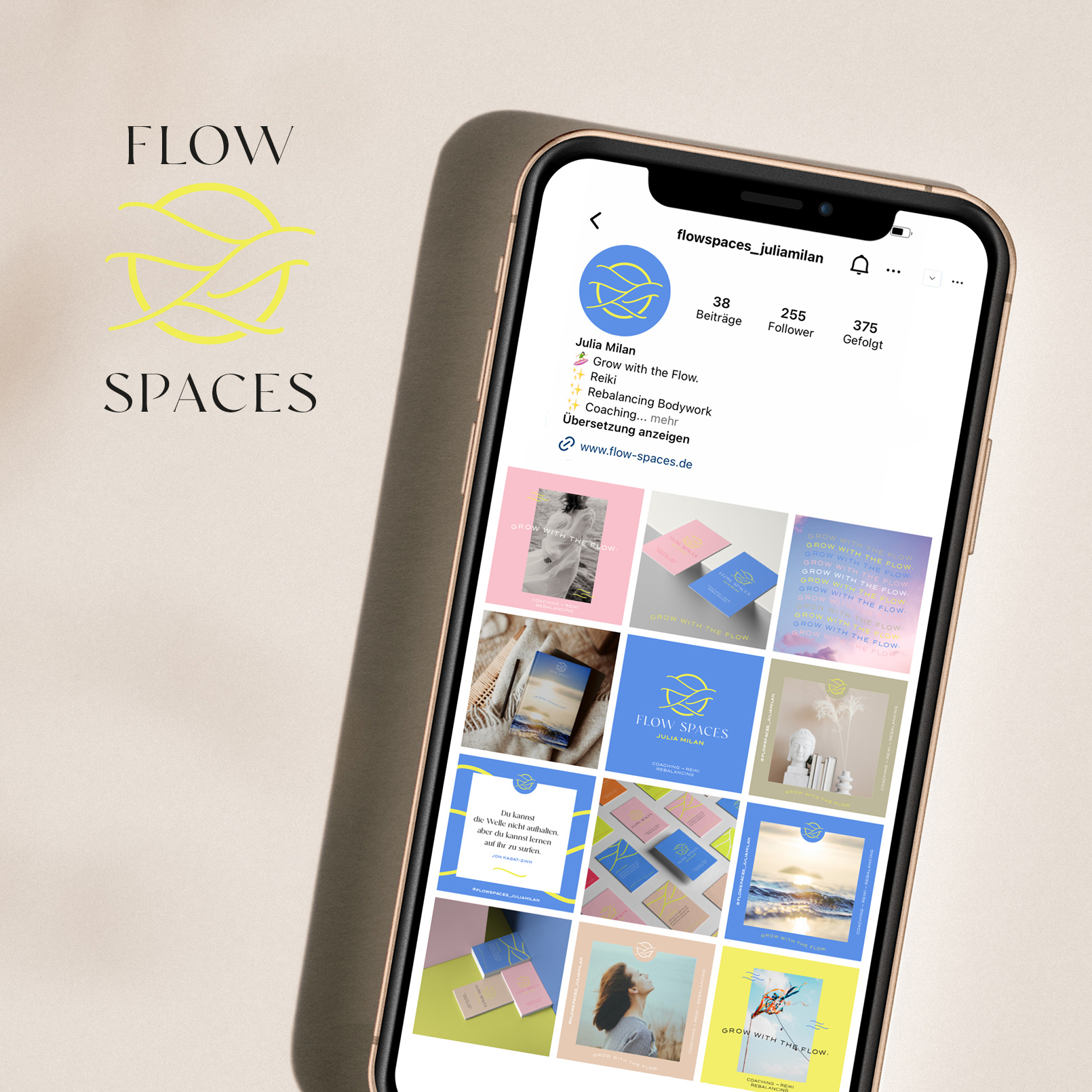
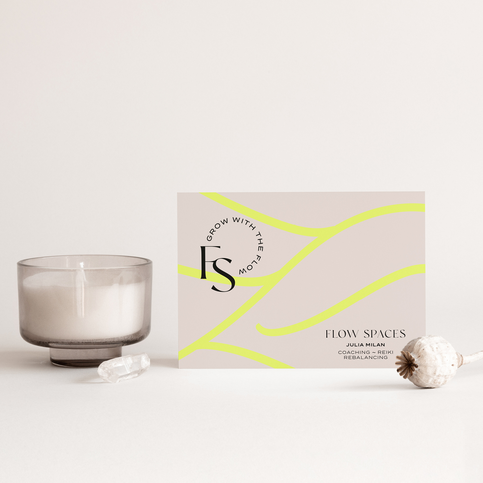
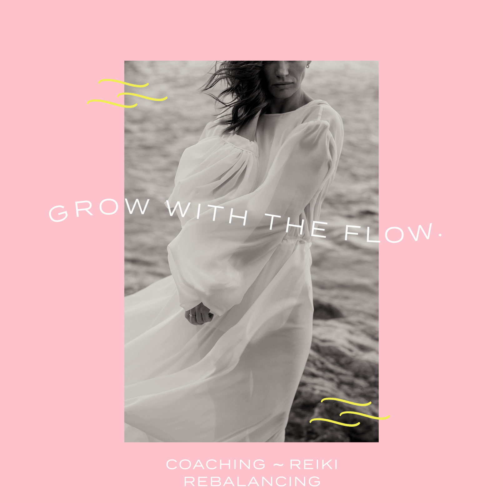
Giving yourself a space for your own thoughts and feelings: hence the name FLOW SPACES. Based on this, the slogan quickly became clear: „Grow with the flow“. Get back into action, into your flow and grow with it.
Solution: In order to give the concept a modern, professional and emotional look, we came up with the idea of a (bright) colour family. Combined with 2 contrasting font families (to emphasise modernity and professionalism/experience) integrated in a word mark to be flexible with its individual elements, just as the concept itself is.
Meanings: Circle = sun, enlightenment, bringing light into the dark, radiance, new energy
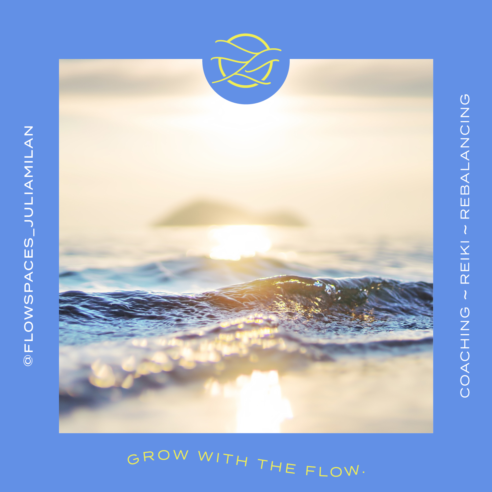
Waves: set everything in motion, be in flow, flowing changes, infinite, constant up + down = development
(Water) waves: Source of life, purification and regeneration
Colours: sun/neon yellow = energy, enlightenment, warming;
blue = waves, wind/flow, calming, trusting
Brand identity: Flow Spaces supports and accompanies people on their very personal path to a freer, more fulfilling life. Holistically seen on different levels of mind, body and spirit. “Out of the hamster wheel, into the flow”. Away from pure functioning, into feeling.
Communication goals: Emotionality, Help for self-help/reflection, Coaching with ease + fun, Differentiation from “eco-spirituality”, Connecting coaching with all levels: Mind & Body, Stand out from the competition through a holistic approach and Willingness to open up to the topic, as approachable
Storytelling: With this very colourful, bold and at the same time very aesthetic design concept, I want to express a lightness and emotional touch for the topic. The name, slogan, colours, typography and imagery all reflect the concept visually and in terms of content.
Attitude: It is an emotional brand design through and through. The naming I developed, the slogan including the word and figurative mark evoke direct visual images in the mind. Paired with bright, cheerful colours, it also makes it easy to open up and embrace the topic.
CREDIT
- Agency/Creative: Daniela Merkel Design
- Article Title: Crafting Brand Harmony: Flow Spaces Design for Julia Milan’s Coaching Brand
- Organisation/Entity: Freelance
- Project Type: Identity
- Project Status: Published
- Agency/Creative Country: Germany
- Agency/Creative City: Düsseldorf
- Market Region: Europe
- Project Deliverables: Brand Design
- Industry: Health Care
- Keywords: Branding, Naming, Corporate Design, Corporate Identity
-
Credits:
Client: Julia Milan


