


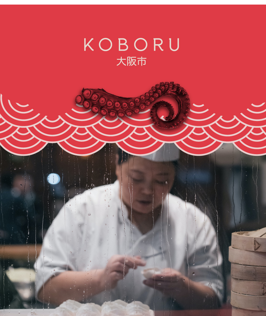
When meticulously crafted, food branding and logo design become powerful tools that do more than just attract—they build trust, create a connection, and set the stage for an authentic culinary experience. Japan, a land celebrated for its ramen, sushi, and a plethora of gastronomic delights, offers a vibrant visual feast as you stroll through the bustling streets of Tokyo. Neon lights and LED-illuminated signs beckon with their creative restaurant branding and visual identity elements, each one a work of art that invites you to step in and indulge.
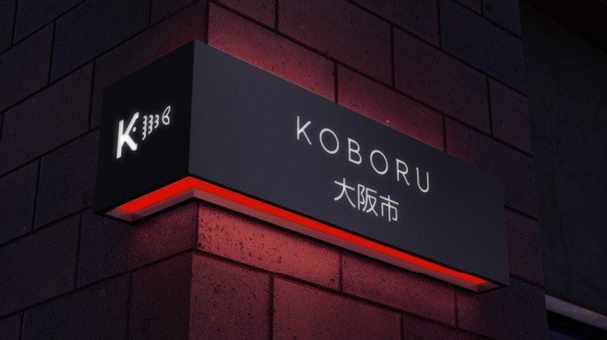
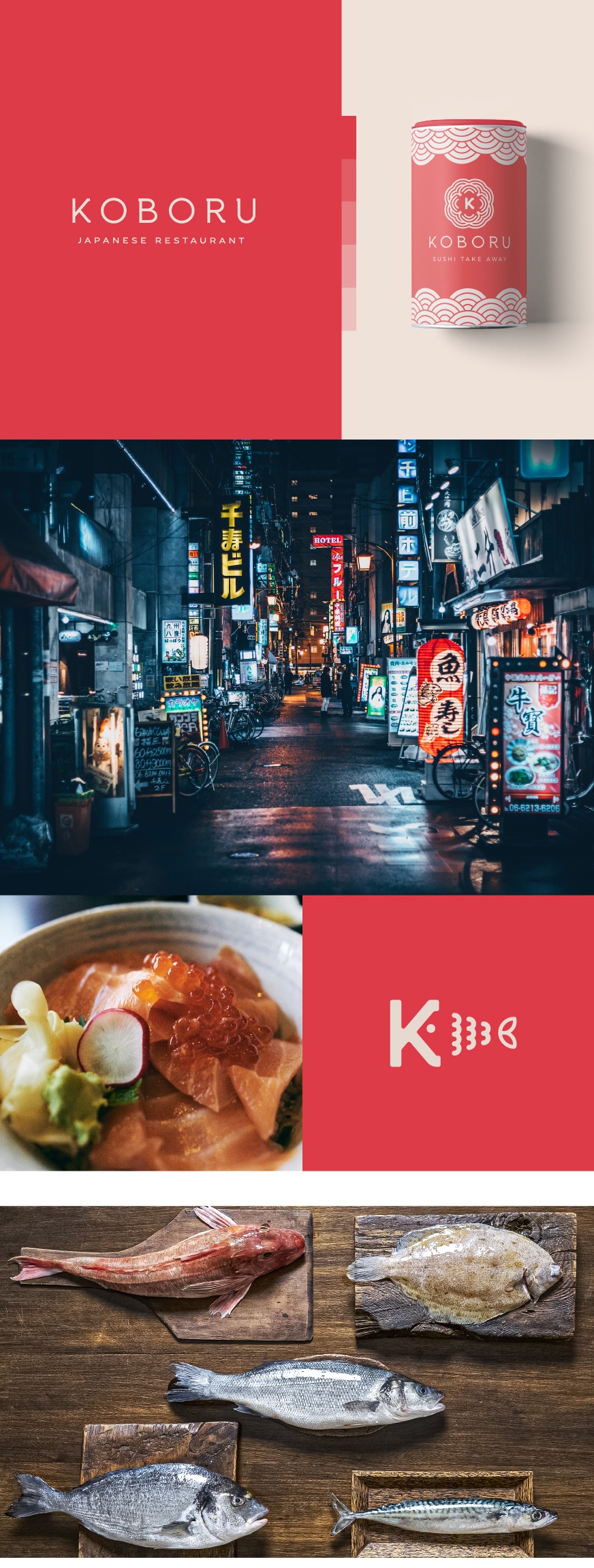
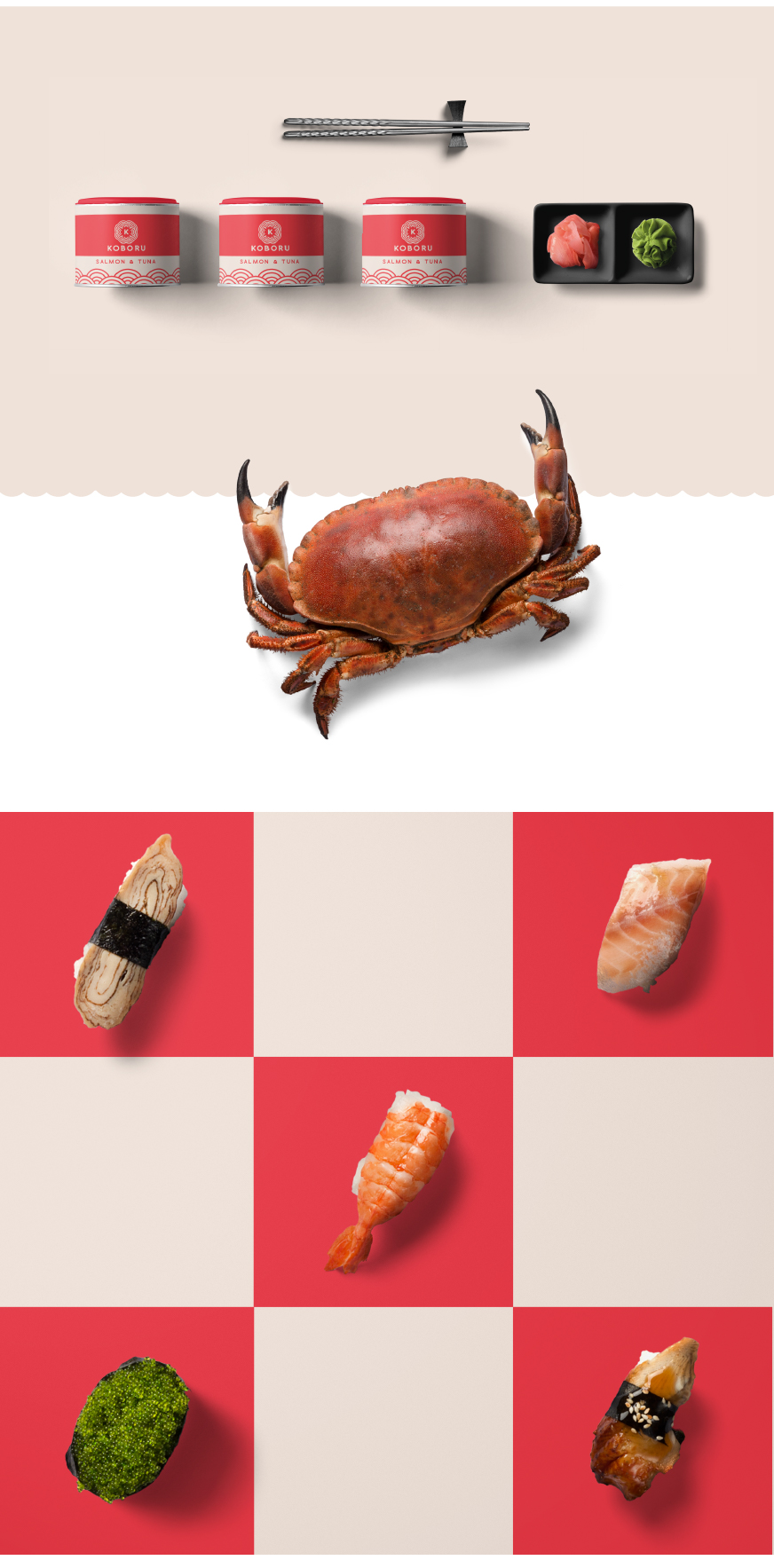
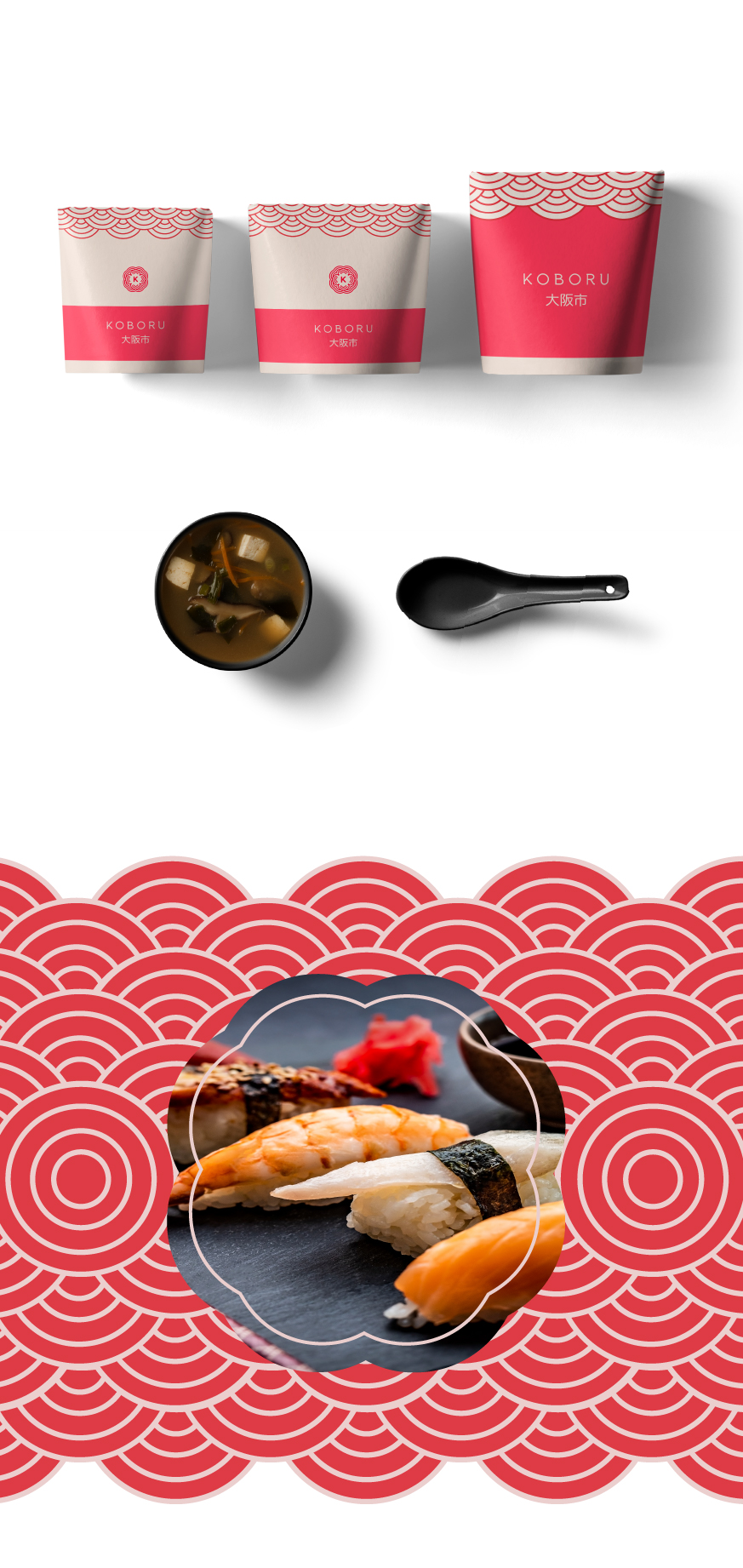
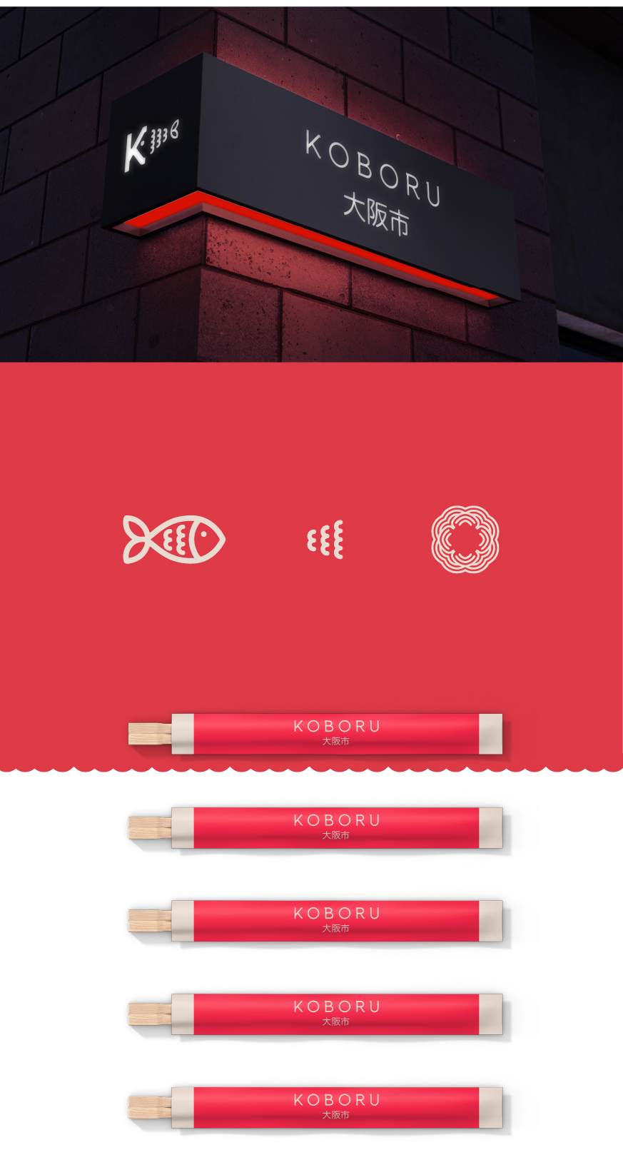
For Koboru Sushi, the goal was clear: to distill this rich, sensory experience into a brand identity that is both modern and rooted in Japanese culture. The result? A clean, minimalist approach that transcends the ordinary, capturing the essence of a sophisticated yet approachable sushi bar.
Drawing inspiration from Japanese-style patterns and delicate typography, the design speaks to the refined minimalism often associated with traditional Zen Buddhist aesthetics. However, this isn’t your typical Asian restaurant brand. By weaving subtle meanings into the logo’s structure, I created a visual narrative that invites deeper exploration. The circle, a central graphic element, is more than just a shape; it’s a powerful symbol in Japanese design, representing balance, harmony, and the cyclical nature of life—ideals that resonate perfectly with the sushi dining experience.
The monochromatic and contrasting color palette was carefully chosen to reflect the brand’s elegance and meticulous attention to quality. It’s a design that is as fresh and modern as the sushi it represents, yet timeless in its simplicity.
When I approach logo design, my aim is always to encapsulate the essence of the brand. It’s about more than just creating a memorable visual—it’s about crafting a symbol that resonates, that speaks to both the brand’s story and its audience. My goal is to balance originality with subtlety, ensuring the design is both recognizable and rich with meaning, without ever being overt or clichéd.
In the end, it’s this blend of thoughtful design, cultural respect, and creative originality that allows Koboru Sushi’s brand identity to stand out, offering a taste of Japan that is as visually satisfying as it is delicious.
CREDIT
- Agency/Creative: Giacomo Urgeghe
- Article Title: Crafting Authentic Brand Identity: The Art of Minimalist Food Branding for Koboru Sushi Restaurants
- Organisation/Entity: Freelance
- Project Type: Identity
- Project Status: Non Published
- Agency/Creative Country: Italy
- Agency/Creative City: olbia
- Market Region: Asia
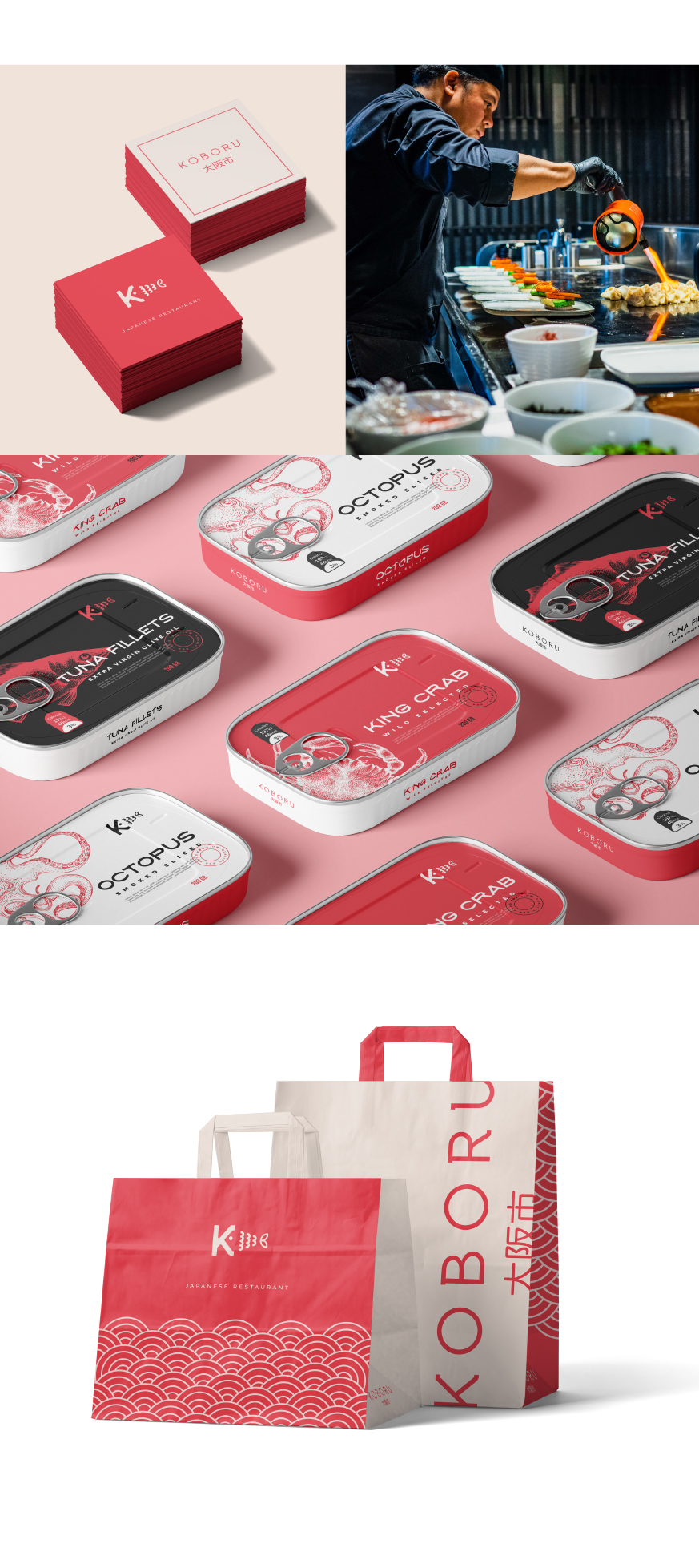
- Project Deliverables: Advertising, Brand Creation, Brand Guidelines, Brand Identity, Branding, Logo Design, Packaging Design, Web Design
- Industry: Food/Beverage
- Keywords: Brand identity, logo symbolism, minimalist branding, visual identity, sushi branding , food packaging, asian restaurant, brand aesthetics, design simplicity, modern logo, sushi bar identity, Japanese restaurant branding, minimalist logo, branding strategy, brand differentiation, logo concept, clean aesthetics, visual storytelling.
-
Credits:
Art director - Brand Designer: Giacomo Urgeghe


