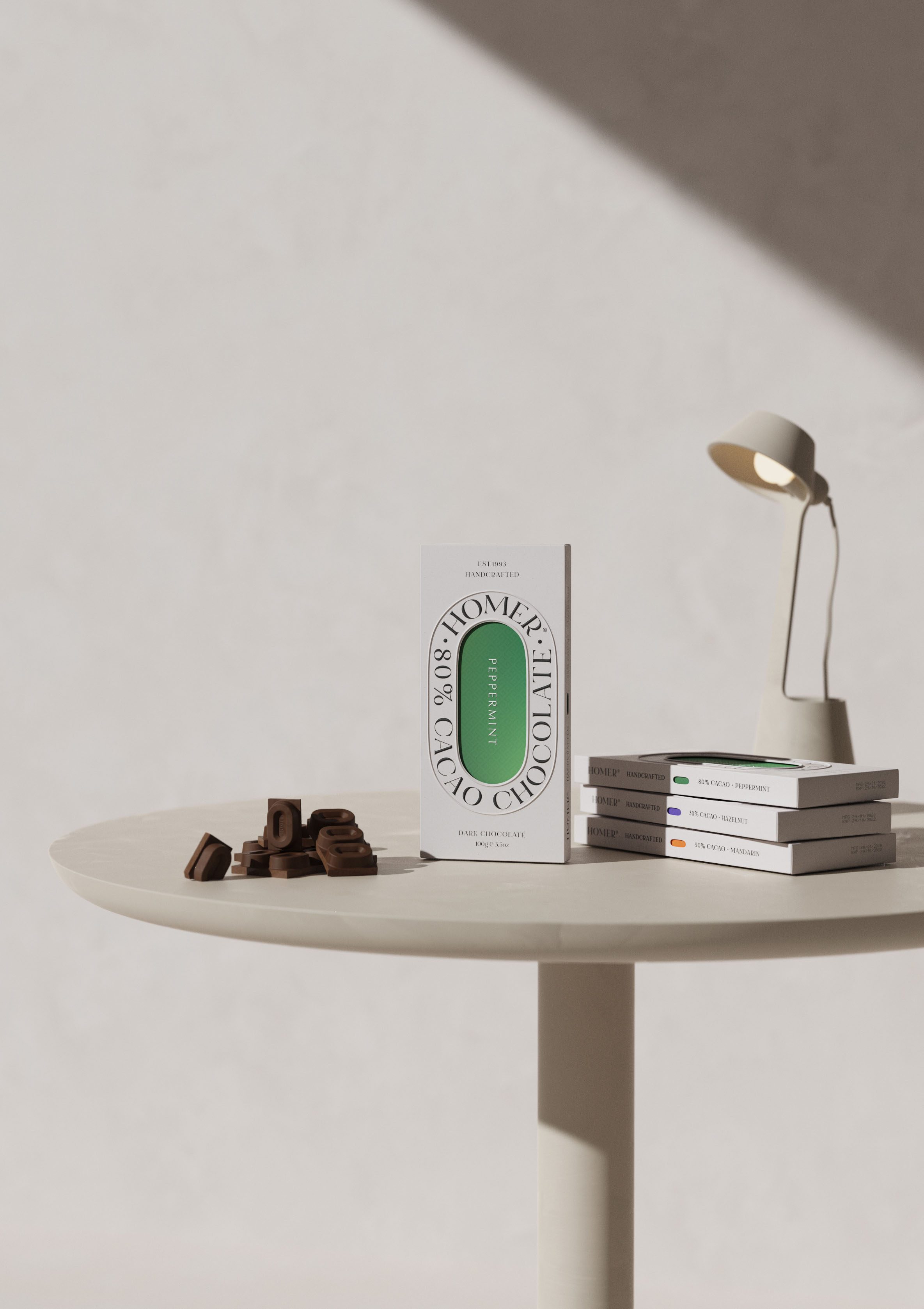
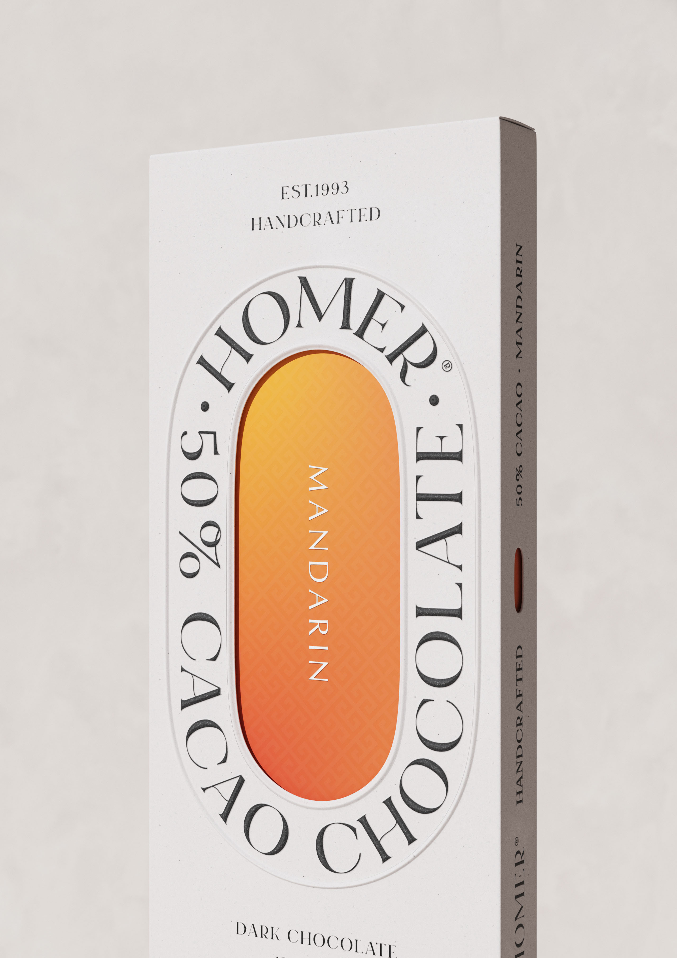
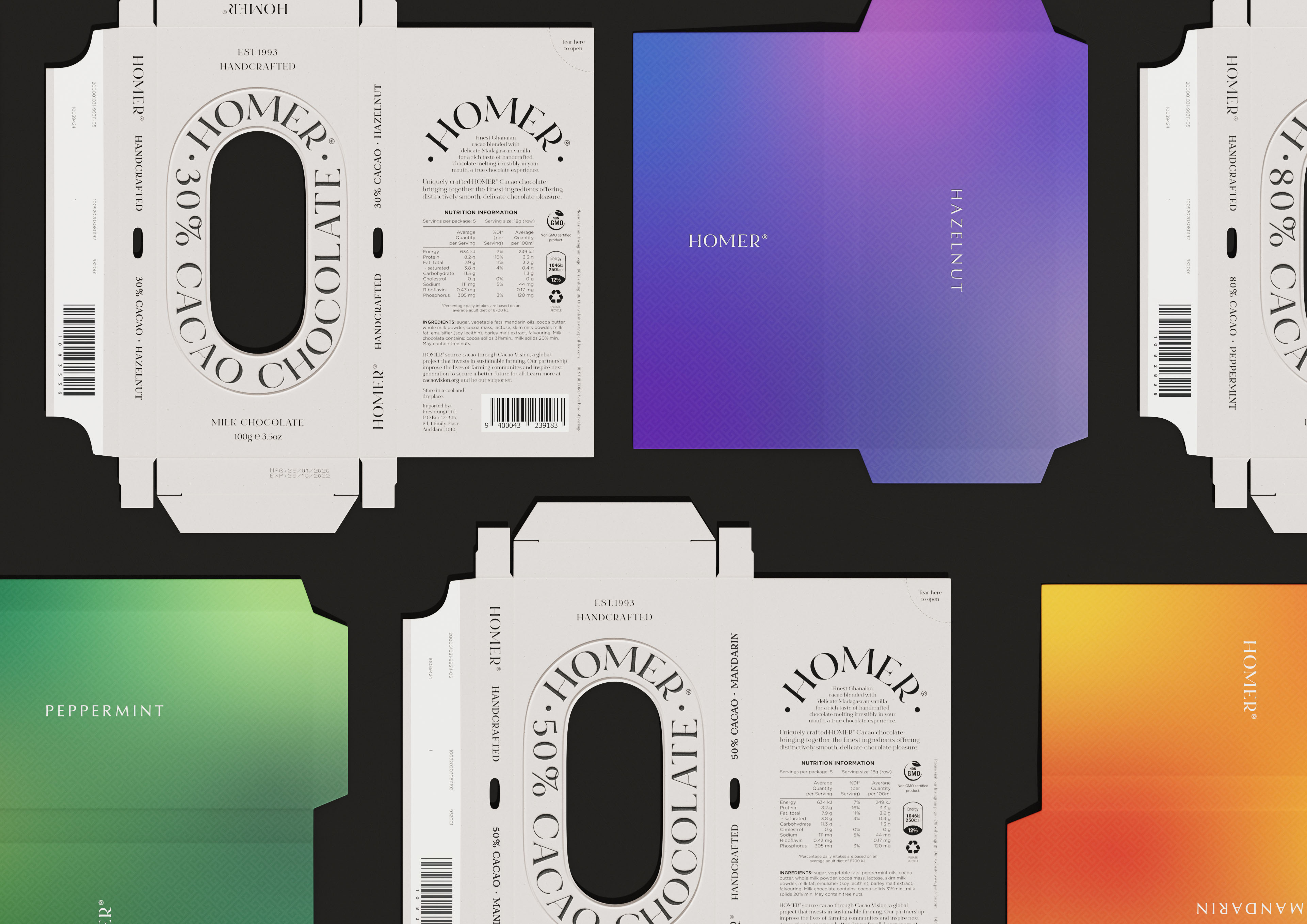
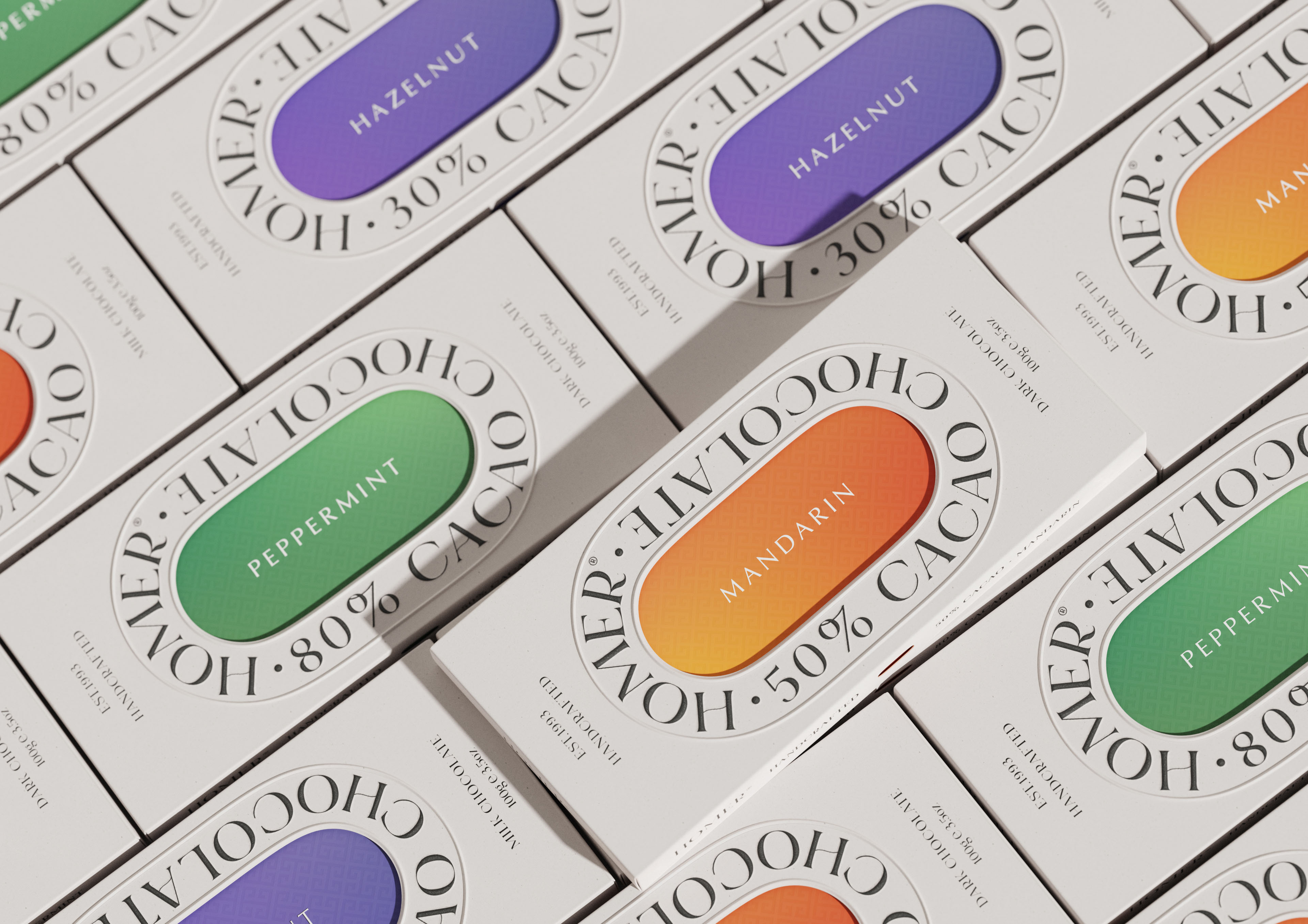
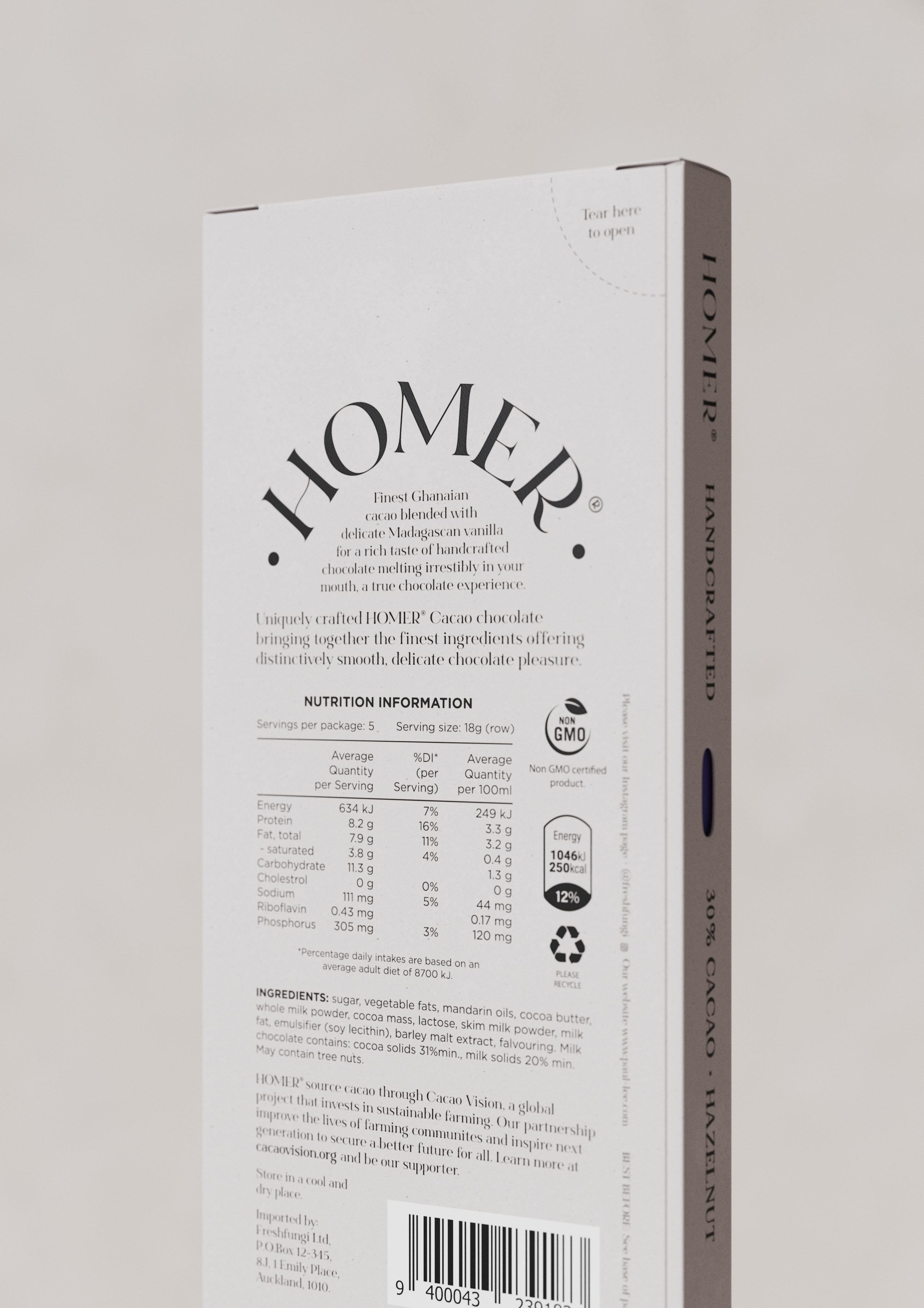
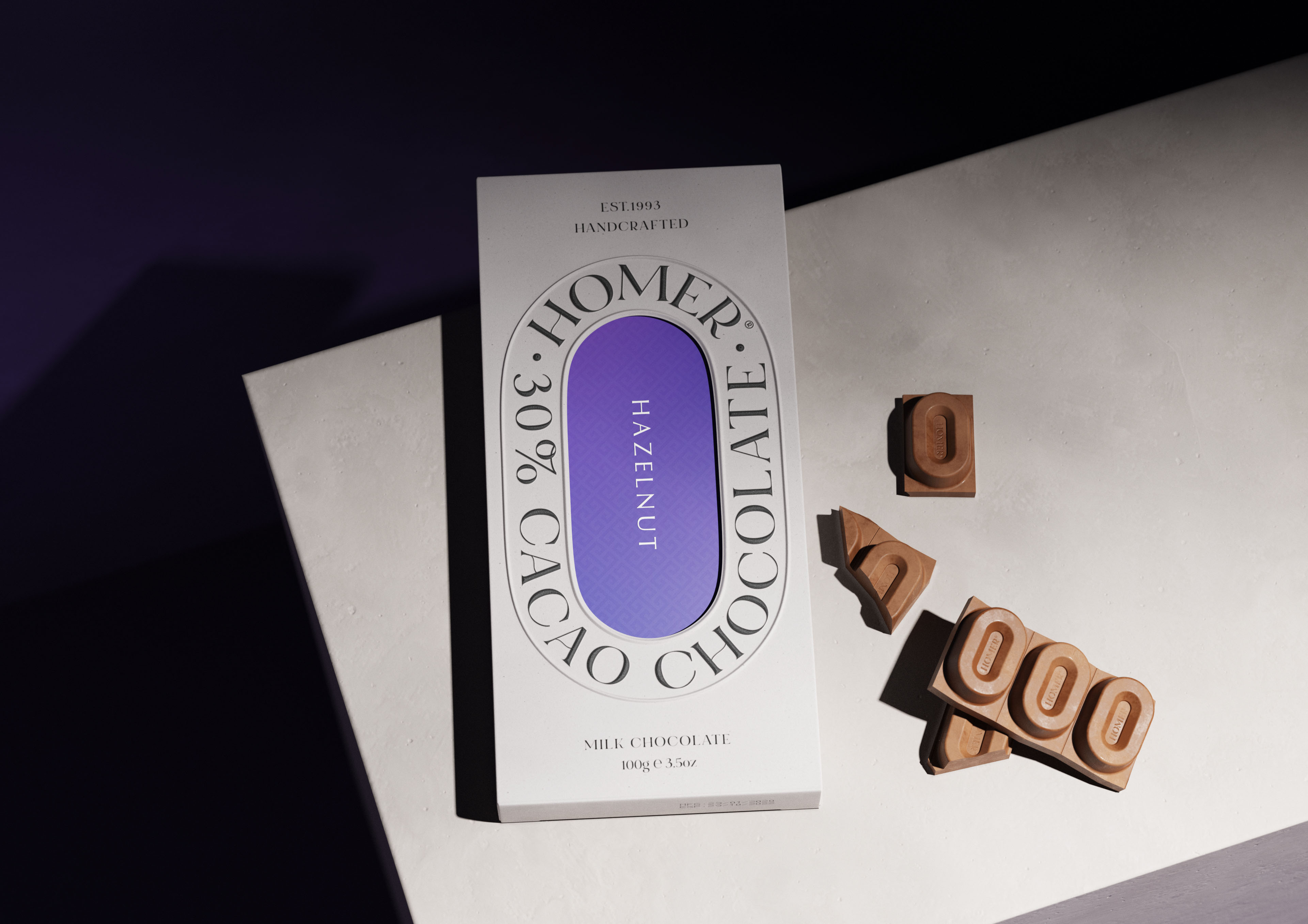
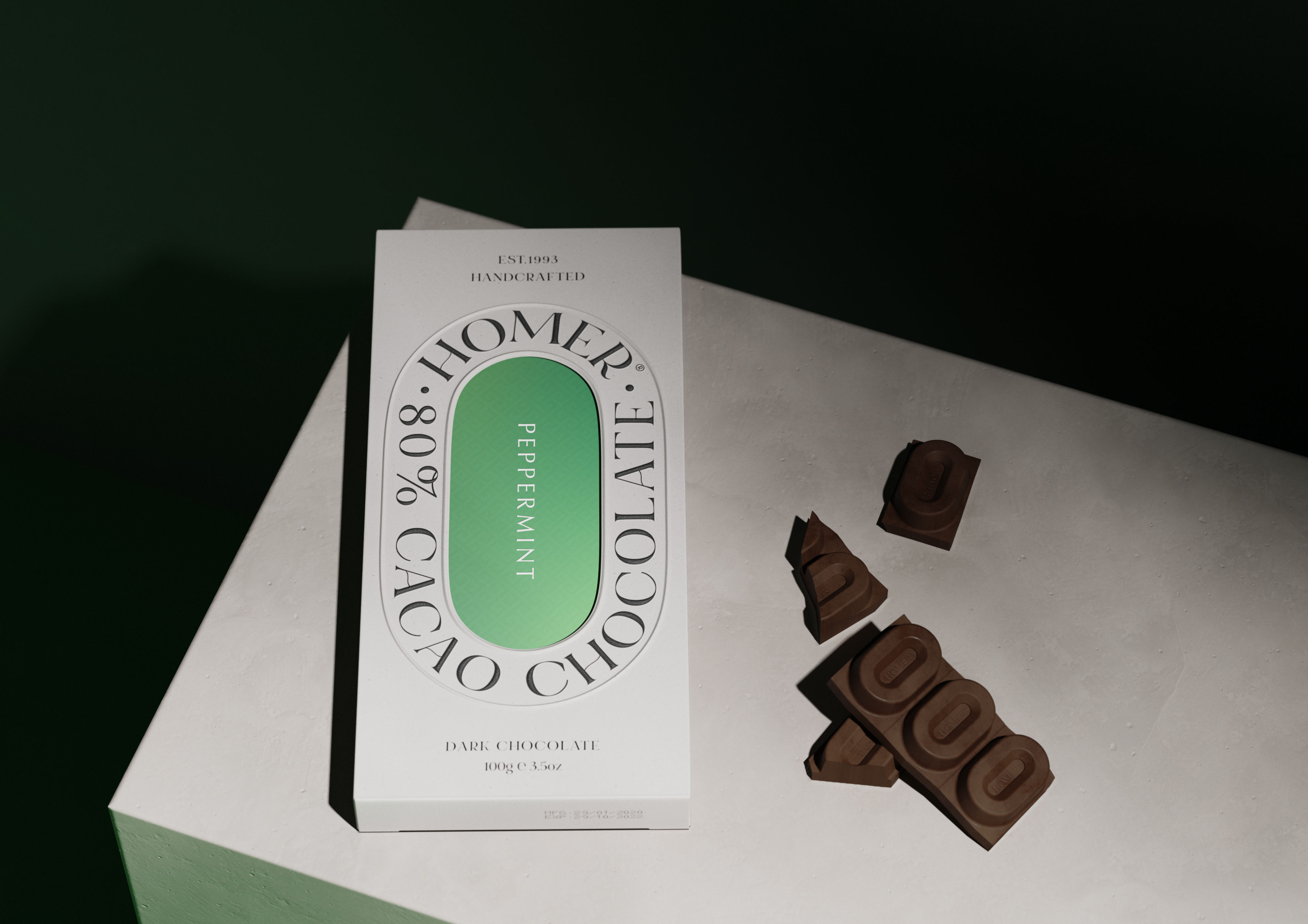
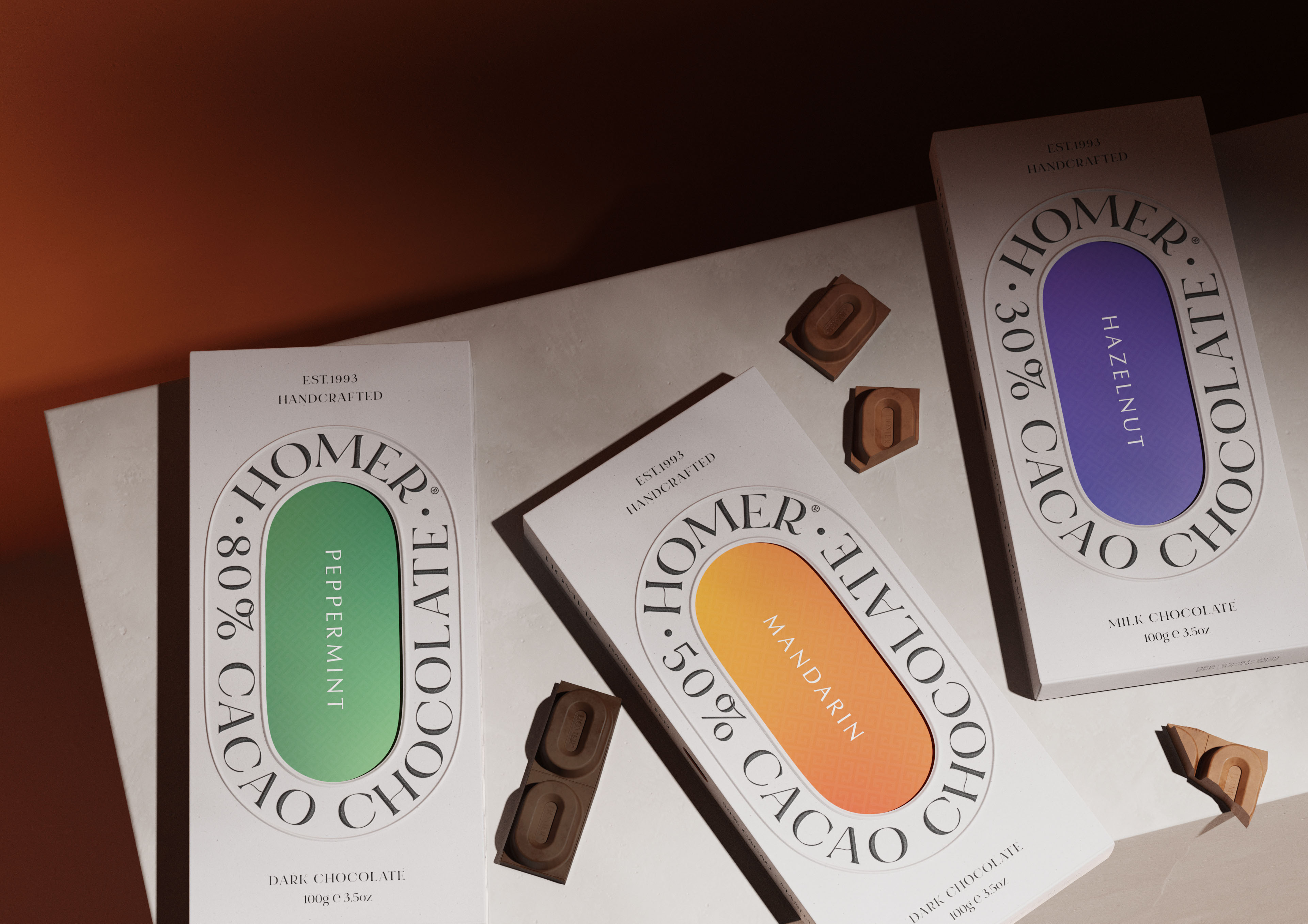
The uniquely crafted Homer cacao chocolate is designed with minimal yet vibrant packaging and comes in three flavours – Peppermint, Mandarin, and Hazelnut. Not only does it thrives best in its appearance, but Homer also delivers a great tasting experience. Hand-picked and handcrafted cacao chocolate delivers an artisanal taste. To minimise the carbon footprint we have removed the foil wraps and used recyclable cardboard.
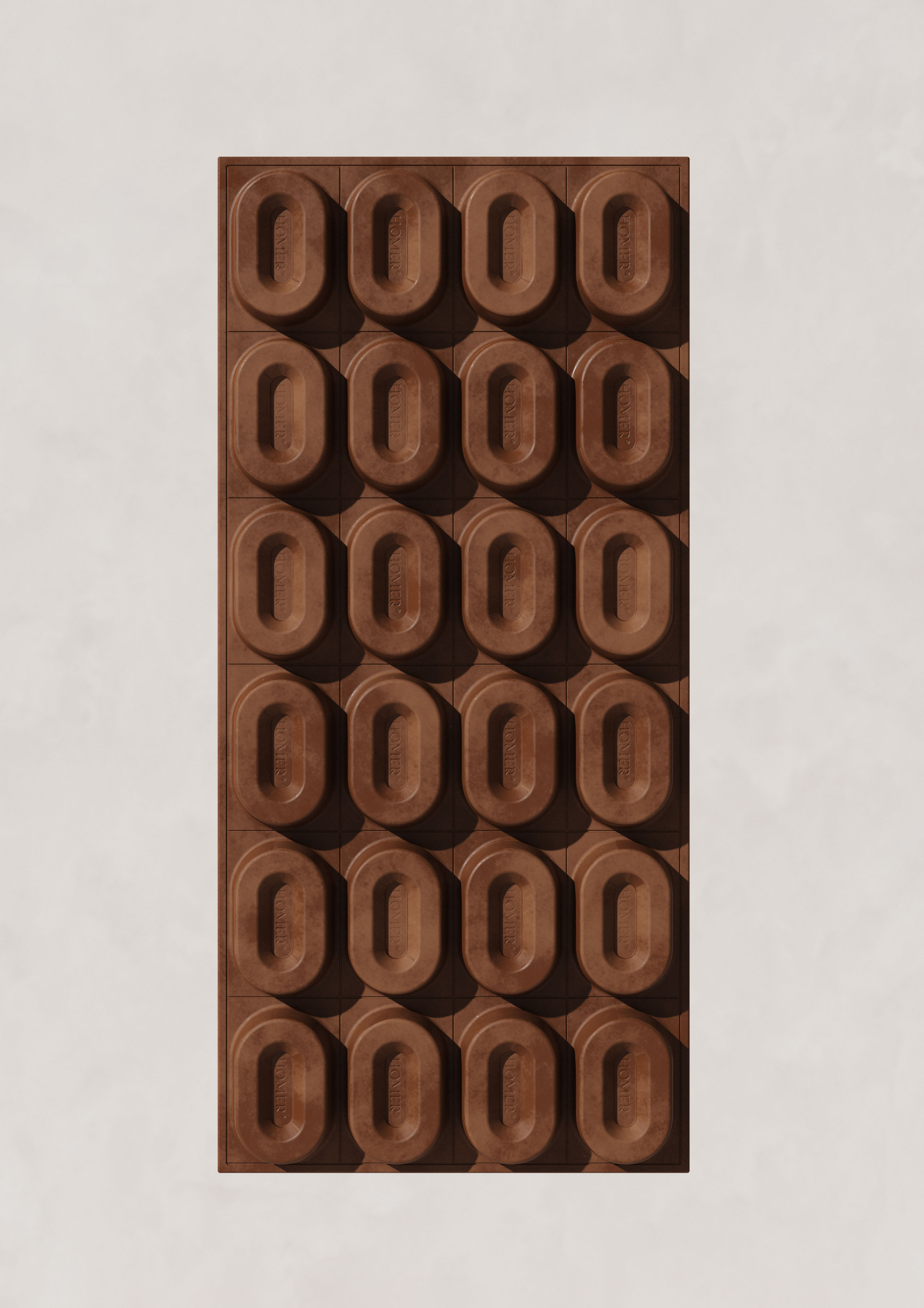
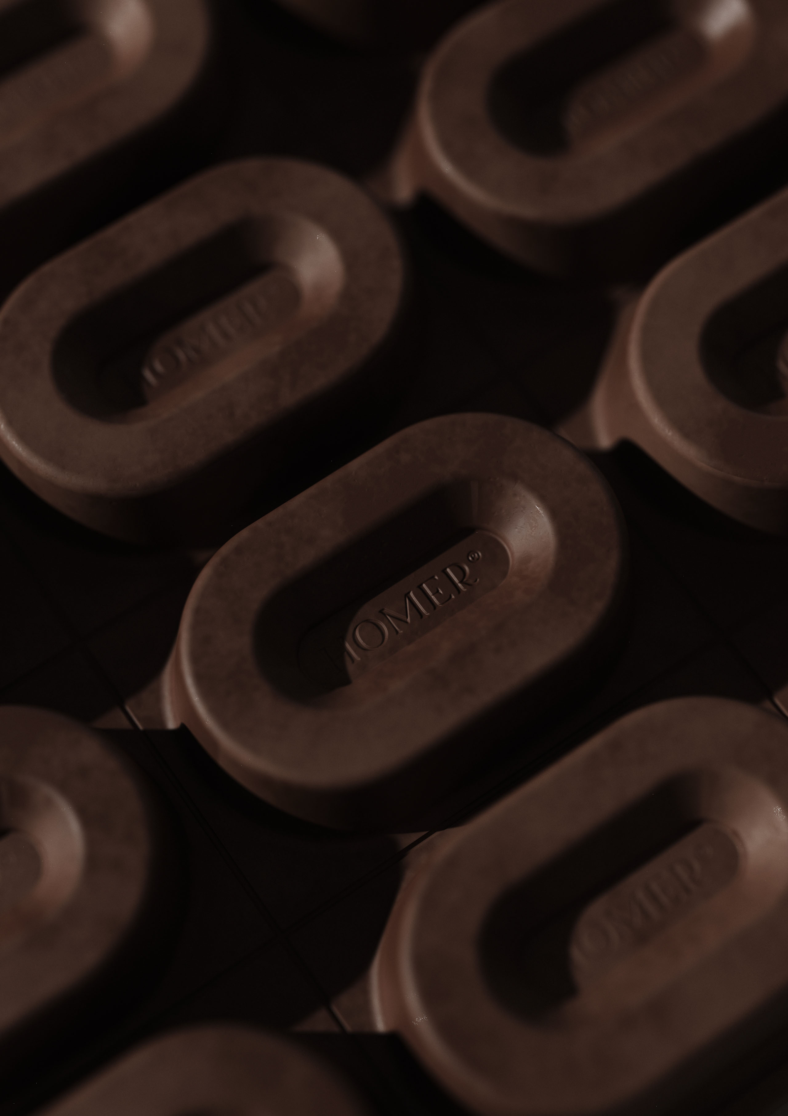
This is my personal project that I have initially designed last year but ended up pausing for a while for various reasons. Now I thought it would be good timing to revise the design and finish it off. I started by researching various food-consuming packaging and wanted my design to target a niche customer but also trend at the same time. I made packaging minimal but wanted some strong accent on it- ended up creating vibrant gradients on the inner surface packaging. I like how it came up as it balances well with a classic simple layout – creating vibrant tension between outer and inner packaging. I also wanted this rounded-tall window hall to easily differentiate the flavours. With this unique shape, I extended them by applying them to the chocolate blocks. Very unique design and yet very acceptable. I modelled them using blender and fusion 360 then applied texture and renders in Keyshot. Took several attempts to get as natural lights that I wanted. Overall I think this project is very differentiate-able compare to the others in the market. Loved working on it and hope you guys like them too. Thanks
This is my personal project that I have initially designed last year but ended up pausing for a while for various reasons. Now I thought it would be good timing to revise the design and finish it off. I started by researching various food-consuming packaging and wanted my design to target a niche customer but also trend at the same time. I made packaging minimal but wanted some strong accent on it- ended up creating vibrant gradients on the inner surface packaging. I like how it came up as it balances well with a classic simple layout – creating vibrant tensions.
CREDIT
- Agency/Creative: Paul Lee
- Article Title: Crafted Homer Cacao Chocolate Packaging and Product Design Concept by Paul Lee
- Organisation/Entity: Freelance
- Project Type: Packaging
- Project Status: Non Published
- Agency/Creative Country: New Zealand
- Agency/Creative City: Auckland
- Market Region: Oceania
- Project Deliverables: CGI, Packaging Design
- Format: Box
- Substrate: Pulp Board
- Industry: Food/Beverage
- Keywords: Chocolate, Food, Packaging
-
Credits:
Art Direct: Paul Lee


