


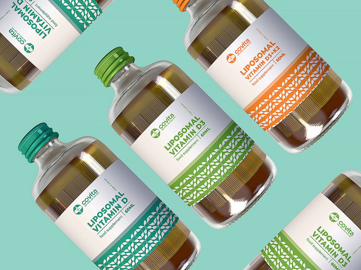
With the desire to bring consumers great experiences with functional food products and health protection foods, Covita is a safe and effective health protection solution!
As a new brand but with the first position, bringing safety, dedication, and efficiency is the guiding principle for brand development. The outstanding value of the brand’s products is the use of natural ingredients combined reasonably with the application of advanced technology in the production and preparation of Covita products to achieve quality standards and production processes.
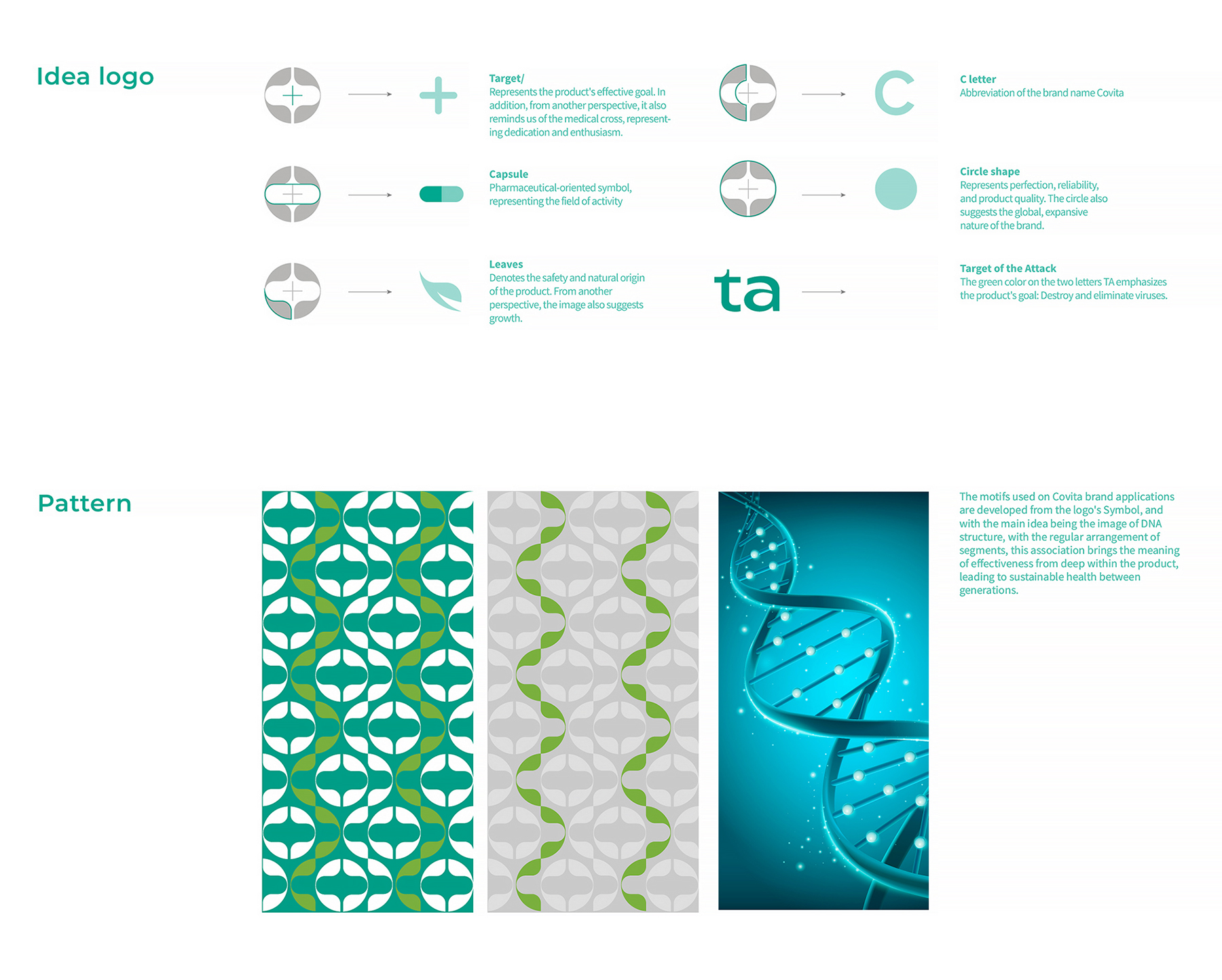
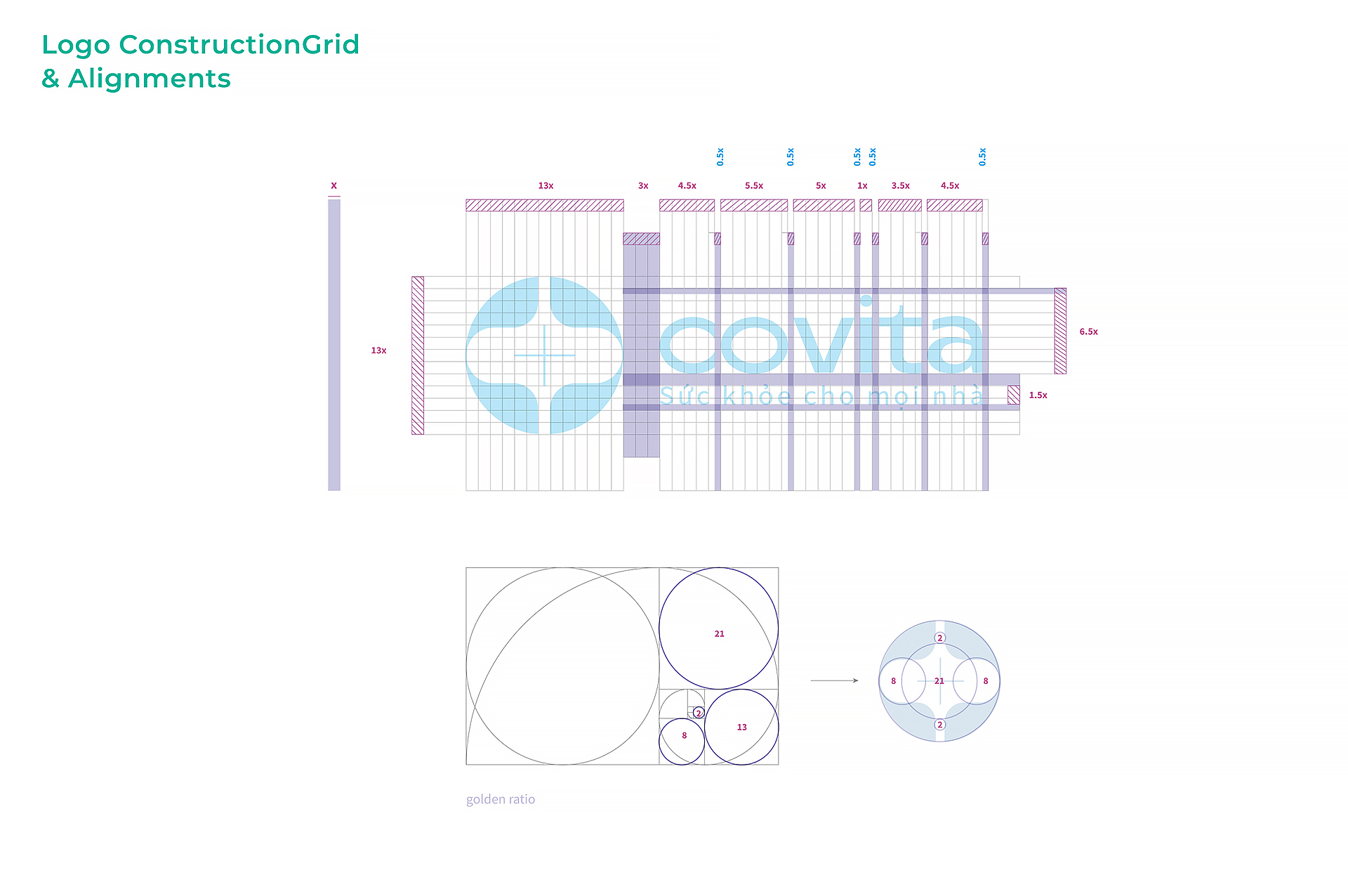
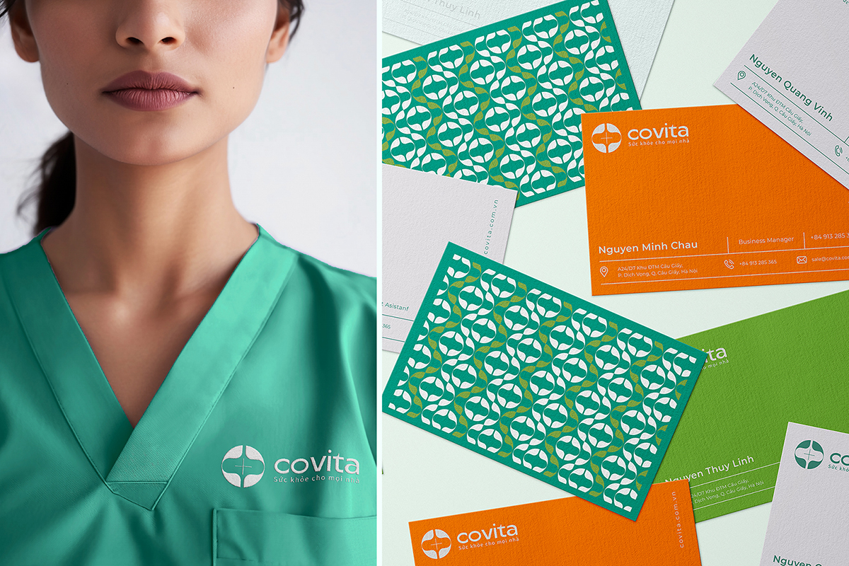
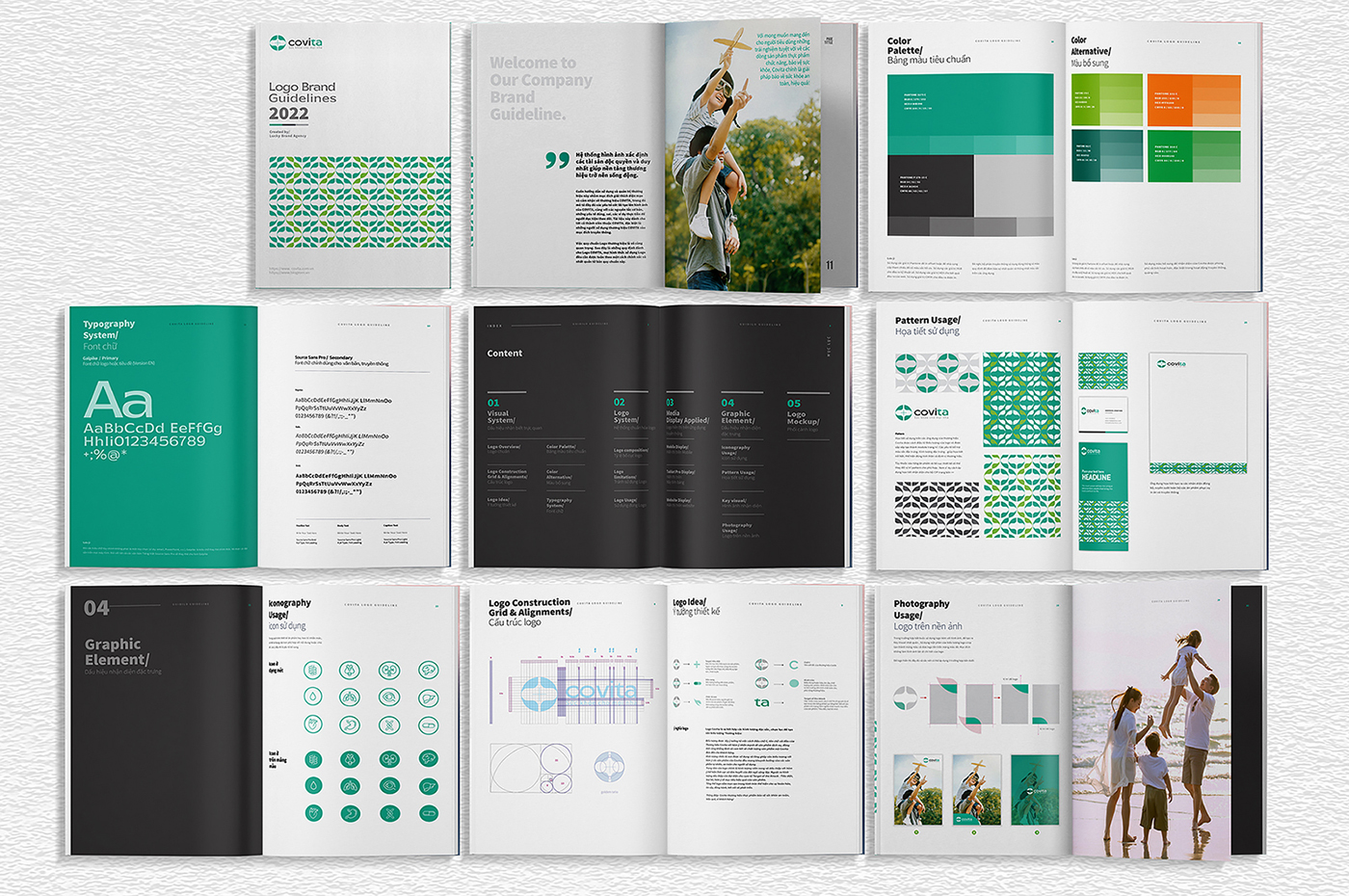
The idea of the Logo design is inspired by the letter C, the first letter of the Covita brand, with the intention of emphasizing the product and service, while also affirming and committing to the quality of the products that Covita brings to customers.
The image of the leaf is not used and integrated into the logo with the function that Covita’s products all follow the trend of natural products, safe for users. The focus of the logo is the capsule and cross symbol with the function of expressing the field and passion of the founding team. In addition, the blue accent on the two letters “TA” is an abbreviation of the phrase Target of the Attack: Destroy, eliminate, implying the effective goal of the product.
The overall logo is in a circle representing perfection, trust, companionship, connection and development.
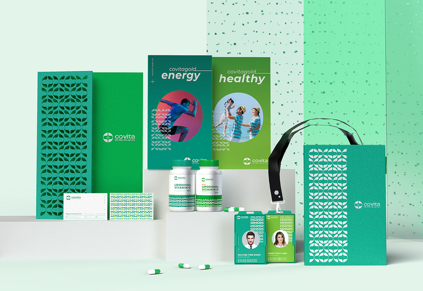
The motifs used on the Covita brand applications are developed from the logo symbol, at the same time with the main idea being the image of the DNA structure, with the regular arrangement of segments, this association brings the meaning of efficiency from deep within the product, leading to sustainable strength between systems.
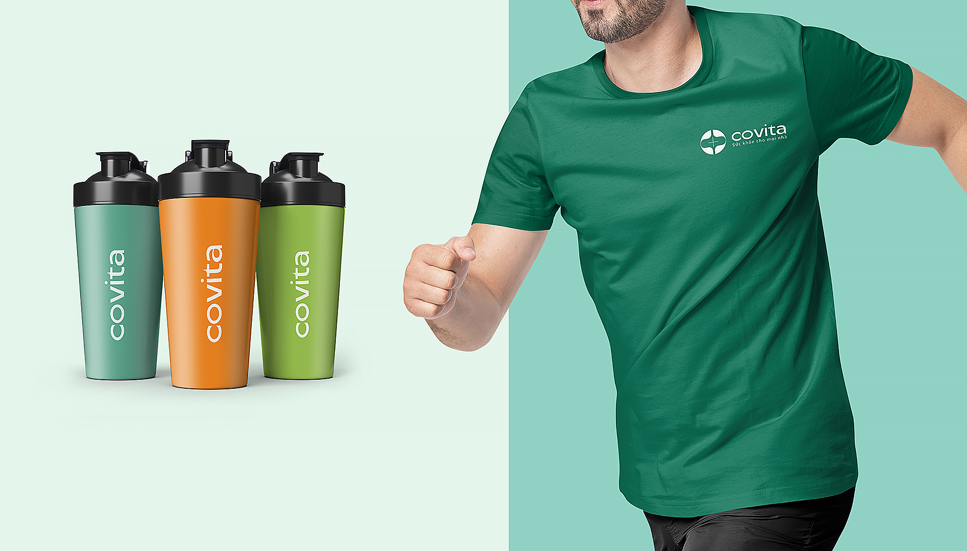
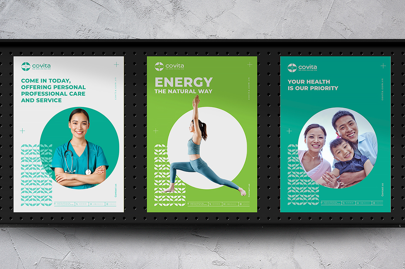
We prioritize using the blue color for the brand here as the color that guides to health, the color of nature, safety, friendliness and efficiency. The addition of white brings cleanliness and intelligence – important factors in the field of Medicine and Pharmacy. Orange brings positive energy, excitement and enjoyment when experiencing the product.
Message: Covita is a safe and effective health food brand for customers.

CREDIT
- Agency/Creative: Lucky Brand Agency
- Article Title: Covita Branding and Packaging Design by Lucky Brand Agency
- Organisation/Entity: Agency
- Project Type: Identity
- Project Status: Published
- Agency/Creative Country: Vietnam
- Agency/Creative City: Hanoi
- Market Region: Asia
- Project Deliverables: Brand Guidelines, Brand Identity, Packaging Design
- Industry: Pharmaceutical
- Keywords: branding, brand identity, packaging design, pharmaceuticals Branding
-
Credits:
Lucky Brand Agency: HungZungManager


