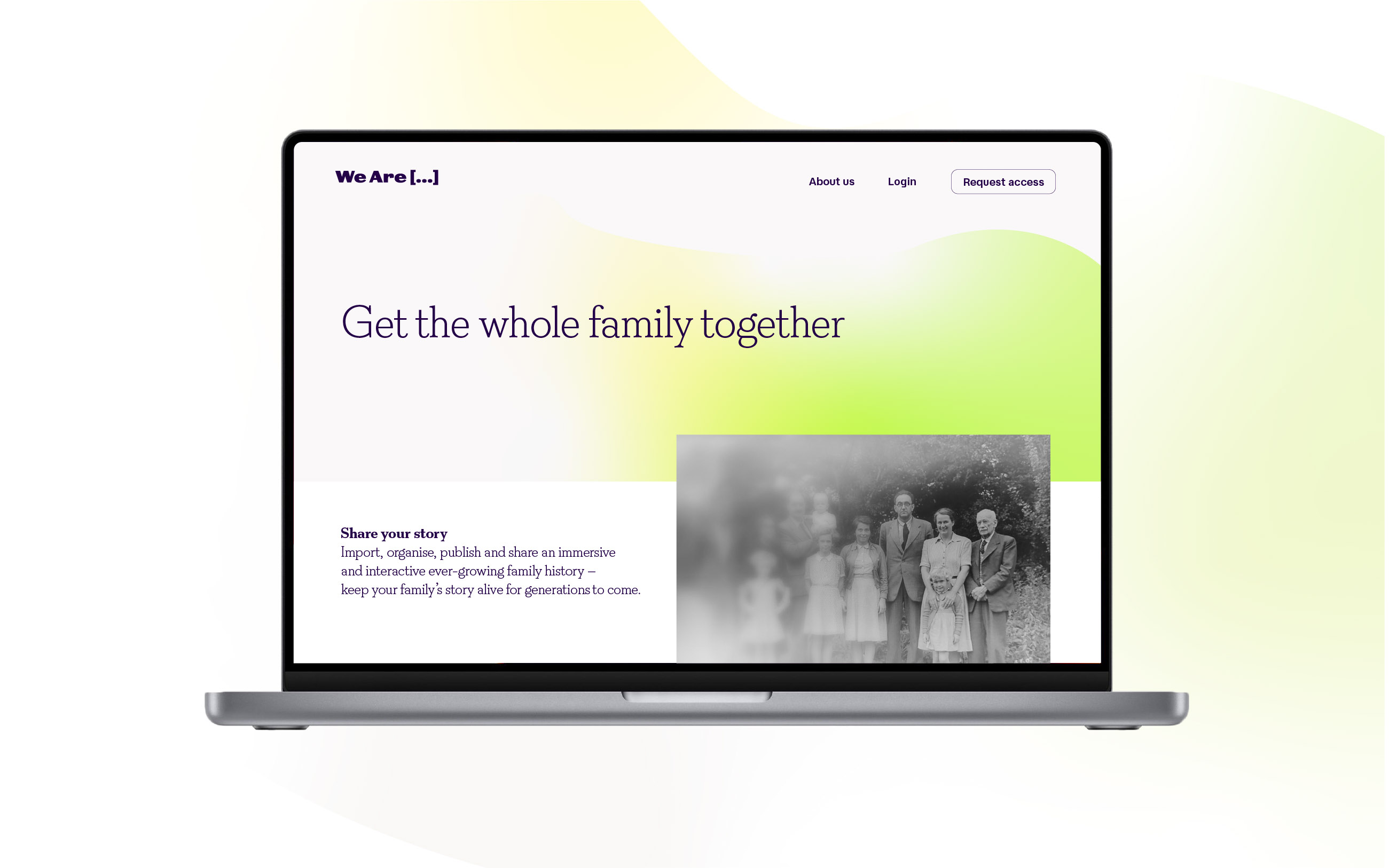
Counter Studio has created the name, strategy and identity for start-up WeAre, the world’s first socially-connected family history platform – giving genealogists, family historians, and their families a dedicated space to archive, curate, publish and share their own immersive, interactive and ever-growing family story.
With some 25 million English speaking family historians alone and the increasing popularity of sites like Ancestry and Find My Past, genealogy is a growing and enduring pastime, but it is also one that has always been a largely solitary pursuit. WeAre aims to change that.
Making family history unforgettable
“The platform is such a great idea” explains Elizabeth Ellis, co-founder of Counter Studio, “being a family is a shared experience, yet the act of discovering and preserving the history of our families generally isn’t. WeAre want to change that by making the process social and collective.”
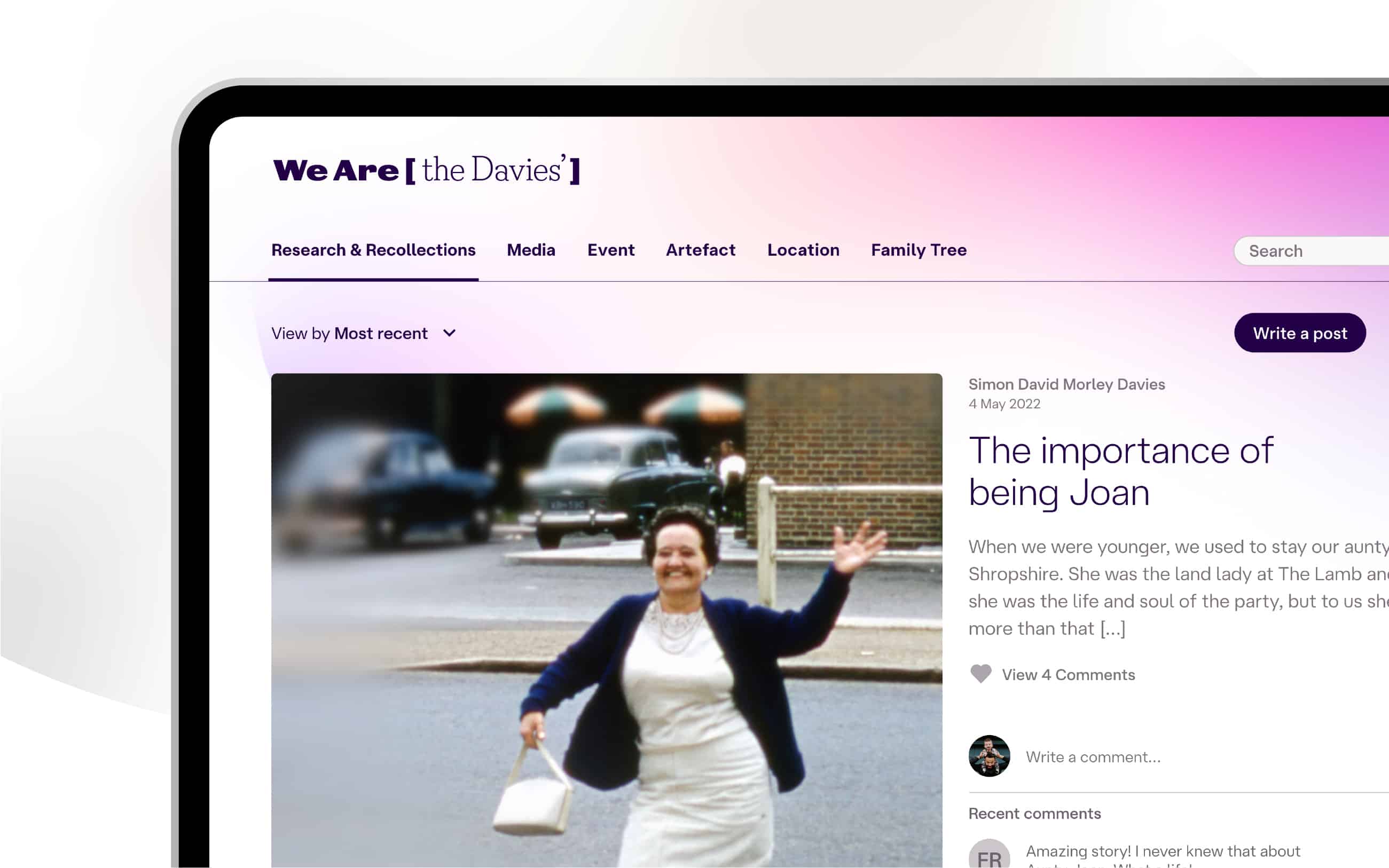
WeAre will enable users to not only upload and import all of their research – both physical and collected from other platforms – to build a rich and interactive website of their family’s history, but also to invite family, friends and other genealogists to share and actively contribute to it.
Social media obviously plays such a significant role in our lives, but this is the first time it’s been applied to history of our families, who we are and where we come from.
“When you consider that if you go back far enough we all start to share ancestors, that’s when it gets really powerful; as users’ relatives begin to overlap so their individual research can become collective, and those family connections and stories start to grow exponentially, something that can’t happen in isolation. It’s a really compelling and exciting prospect, but it needed a clear brand direction to bring all of this to life” says Ellis.
Genealogy in its genes
The studio says the strategy and creative solution were driven by a key user insight into genealogy itself: that the attraction for many genealogists is in the hunt – the quest of tracking down people, places and stories, and of solving mysteries. At its heart is a compelling on-going and unending quest through the often hazy and incomplete mists of time to discover just who we are…
And so, ‘WeAre’ was born.
“The business was originally called “Yo! Family”, which didn’t work for a number of reasons. Once we had a clear idea on the strategic direction, we began a very collaborative naming process with the client, their team, and, unsurprisingly, even their families” says David Marshall, co-founder of Counter Studio.
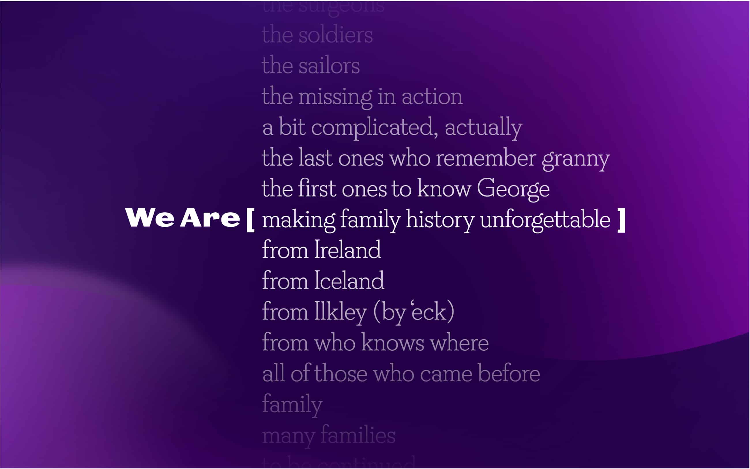
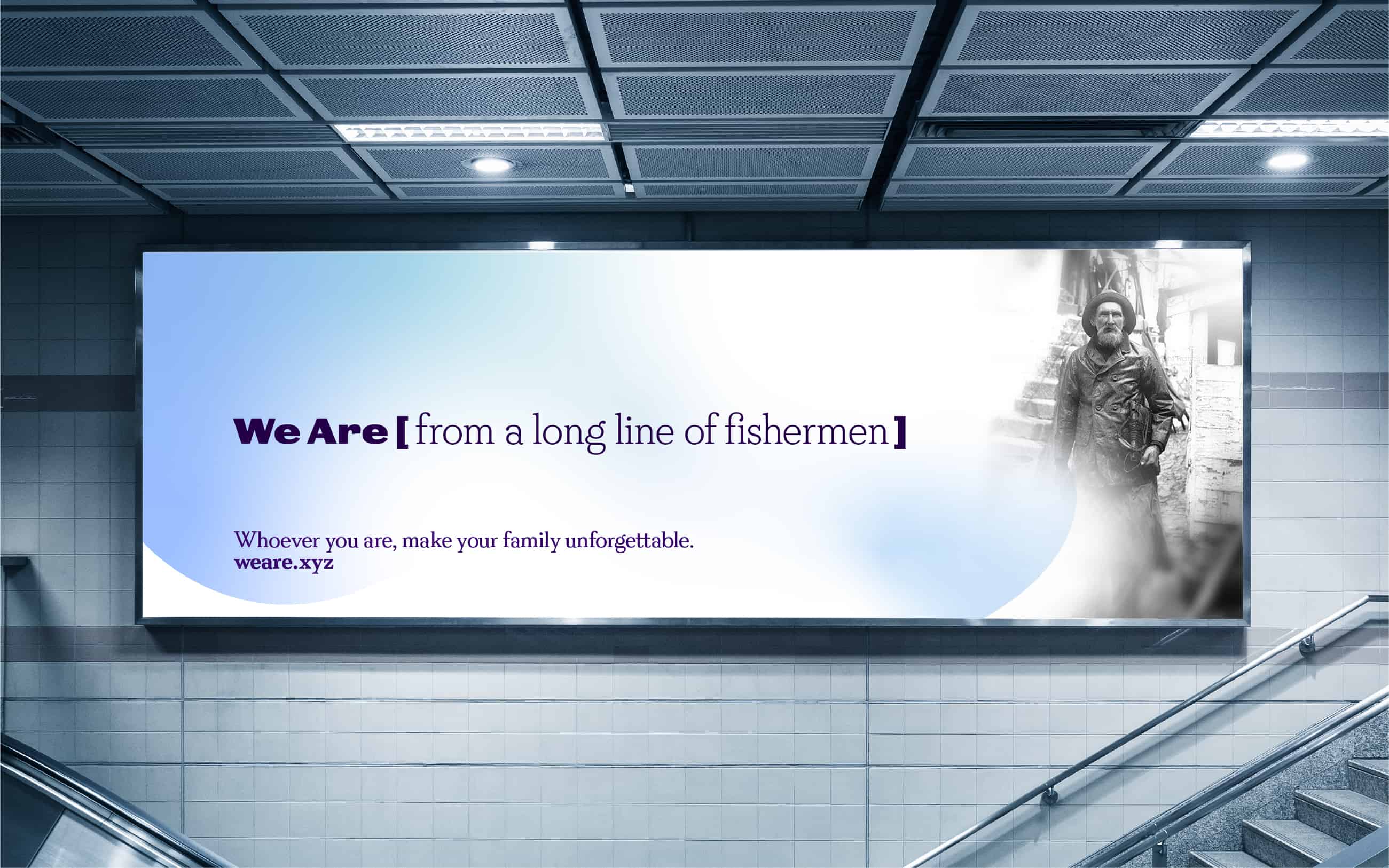
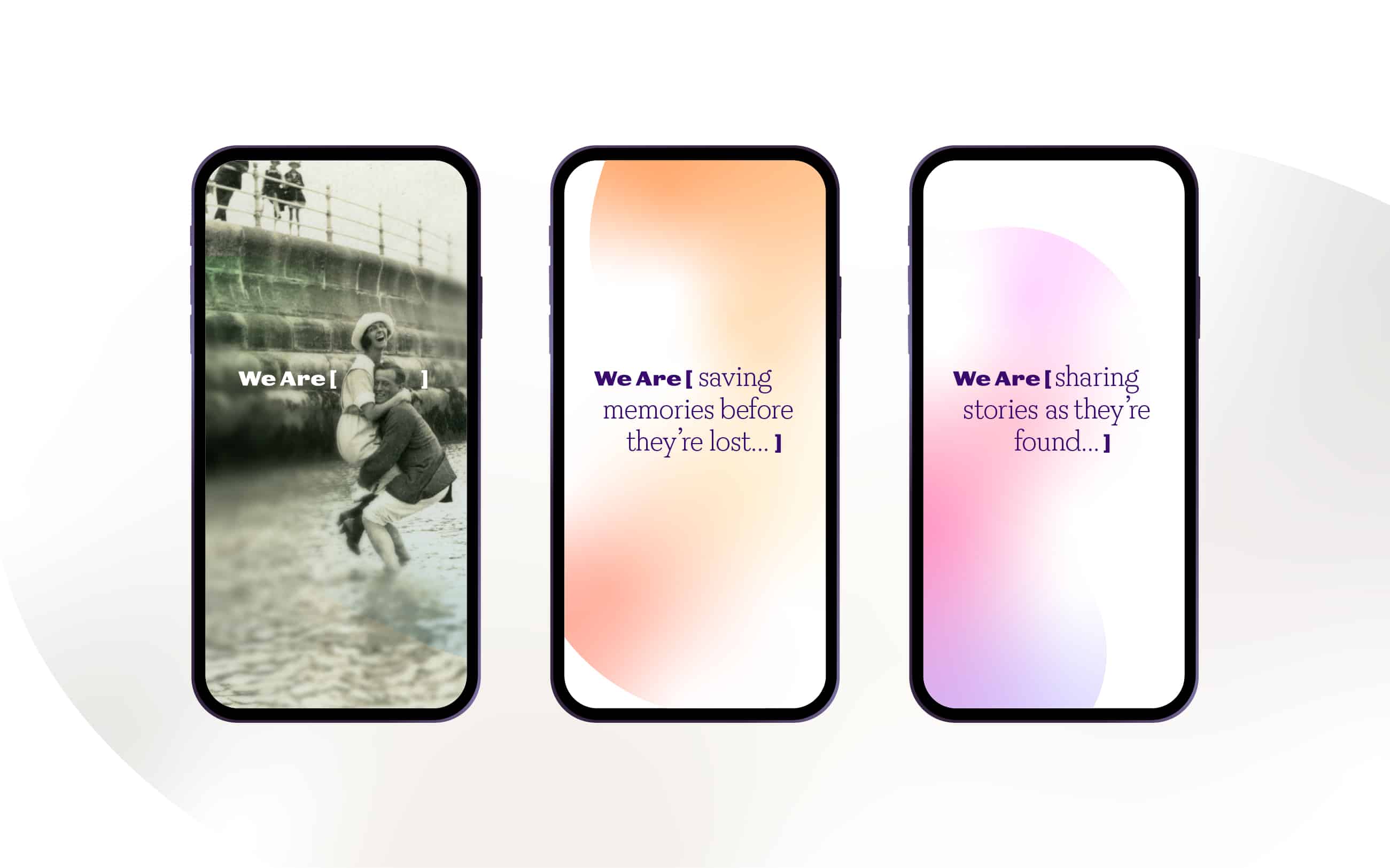
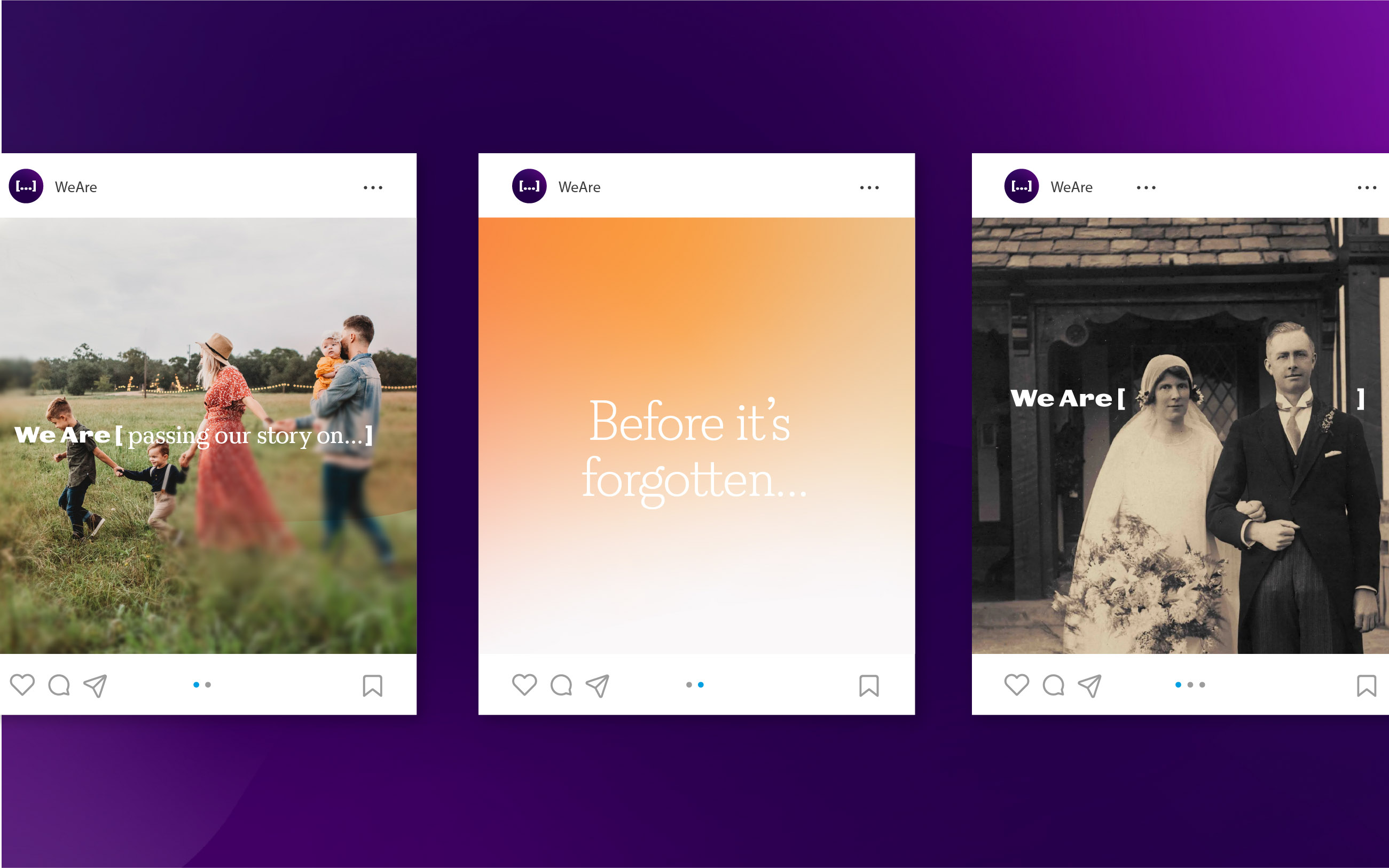
“After a lot of work, the name that emerged was the purest distillation of the core idea: an open ended question designed to inspire an answer, and to be answered time and again. It becomes an integral part of both the visual and verbal identity, infinitely adaptable to each user and each story told, and flexing to brand messaging and targeted communications.”
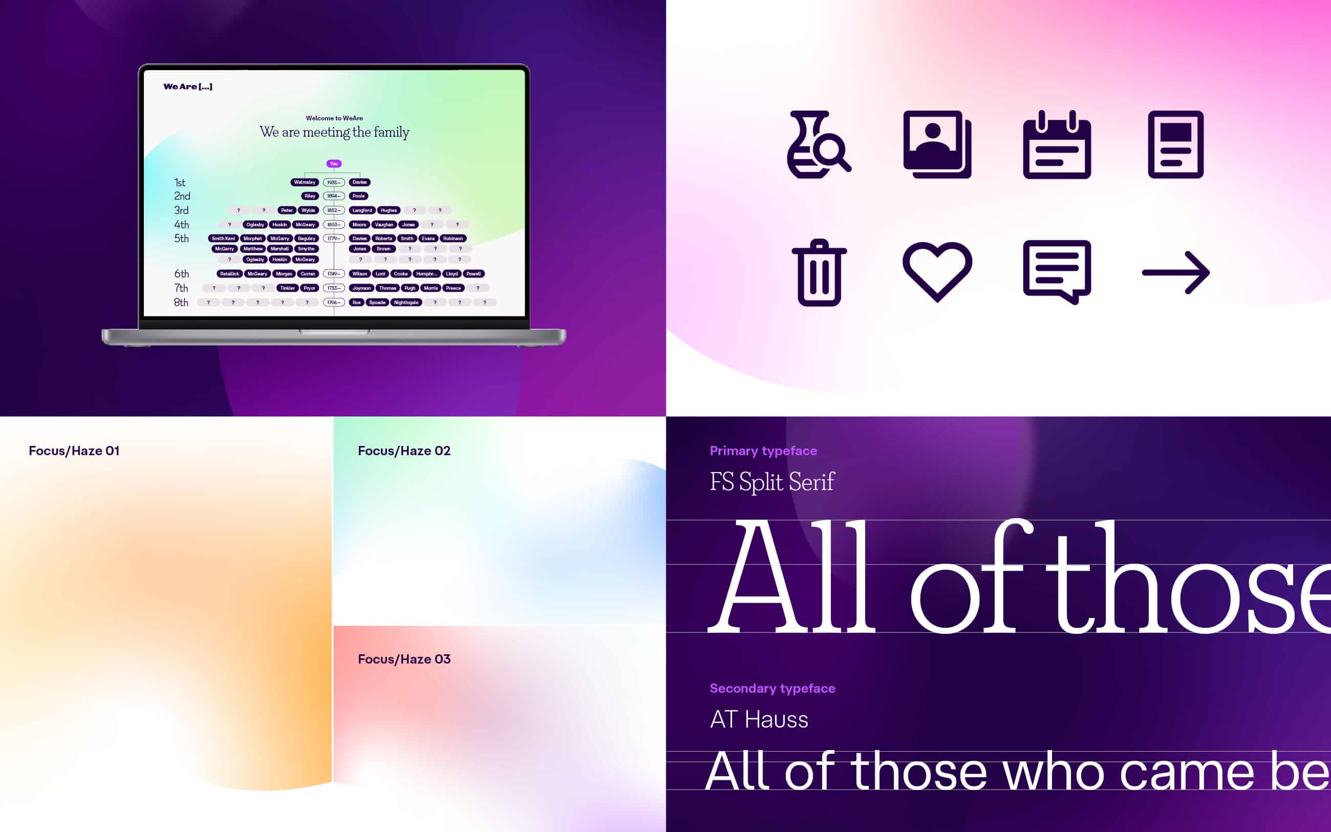
The visual system is also clearly inspired by the core idea; amorphous shapes and colours fade in and out of focus to represent the nebulous, hard to define and ever shifting nature of genealogy: hard to pin down, sometimes difficult to see the edges, while other things come into sharp focus. This is combined with a more precise clarity: sharp typography, a clean design principles, and crisp UI deliver a focussed and clear user experience.
Marshall goes on to say, “The brand needed to quickly carve a space for itself in a well established, successful and busy market – but a market largely dominated by an over use of symbols of trees and leaves (a well-worn play on the ‘family tree’), sepia photos and yellowing old documents. The aim was to disrupt that predictable pattern by bringing some much needed colour, energy and life to people’s personal history.”
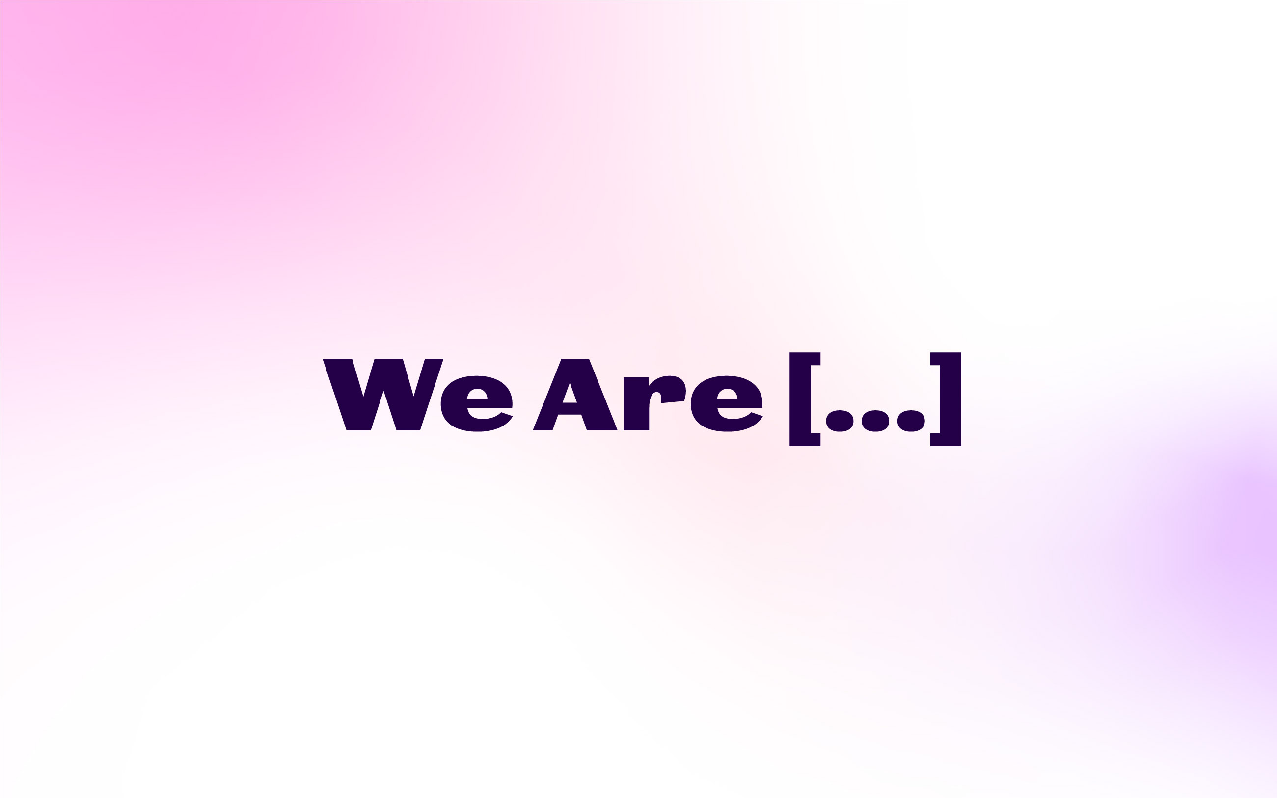
The studio created a bespoke logotype which draws on early grotesque typefaces, a nod to historic references but without looking deliberately old. While the brand symbol – an ellipsis in square brackets – is a recognised shorthand for ‘see more’ or ‘something is missing’, particularly in social media. The name, symbol and brand language have been designed to work together as a flexible system, adapting and changing to different messages.
A large part of the project involved developing the UI for the complex platform. “The platform is an incredibly powerful tool, and like any piece of powerful software there’s a learning curve” says Ellis, “the challenge was how to make it as simple and easy to use as possible”.
The studio developed a custom icon suite, illustrations, as well as the all important family tree. “In most other platforms the family tree is the thing you build, it is the end goal, but in WeAre its just the beginning and is a hugely functional element: to navigate, to illustrate stories, to select certain family members to create sub-trees for events, places or even artefacts.” Ellis continues, “it doesn’t take long for a family tree to become very complex, so it needed a lot of careful thought.”
WeAre…at the start of something new
The platform is in its infancy and launching a new social platform is an extremely ambitious undertaking, especially one as expansive as this, but WeAre brings innovative functionality and powerful tools to the dedicated genealogist, while being simple to use and easy to share for the entire family. It is a showcase for where we’ve come from, what made us and who we are. It is a bright, positive and vivid archive for the future.
Because we’ll all be someone’s ancestors one day, whoever we are.
CREDIT
- Agency/Creative: Counter Studio
- Article Title: Counter Studio Has Developed the Brand for Weare, The World’s First Social Network and Publishing Platform Dedicated to Family History
- Organisation/Entity: Agency
- Project Type: Identity
- Project Status: Published
- Agency/Creative Country: United Kingdom
- Agency/Creative City: Bath
- Market Region: Global
- Project Deliverables: Brand Creation, Brand Identity, Brand Naming, Brand Strategy, Brand Tone of Voice, Graphic Design, Icon Design, Identity System, Infographic, Logo Design, Web Design
- Industry: Entertainment
- Keywords: Genealogy, family history, social network
-
Credits:
Creative Director: David Marshall
Creative Director: Elizabeth Ellis
Consultant: Carl Mesner Lyons
Consultant: Simon Veingard
Motion: Paraform


