


The Green House Group is a company that offers sustainable engineering solutions, focusing on green construction and clean energy. Believing in a more sustainable future, the Green House Group constantly seeks to improve its processes and develop innovative solutions to reduce the environmental impact of its projects.
The Green House Group’s visual identity project was developed with the objective of transmitting the company’s values, its mission and vision, in addition to visually representing the company’s main activity and its concern with sustainability.
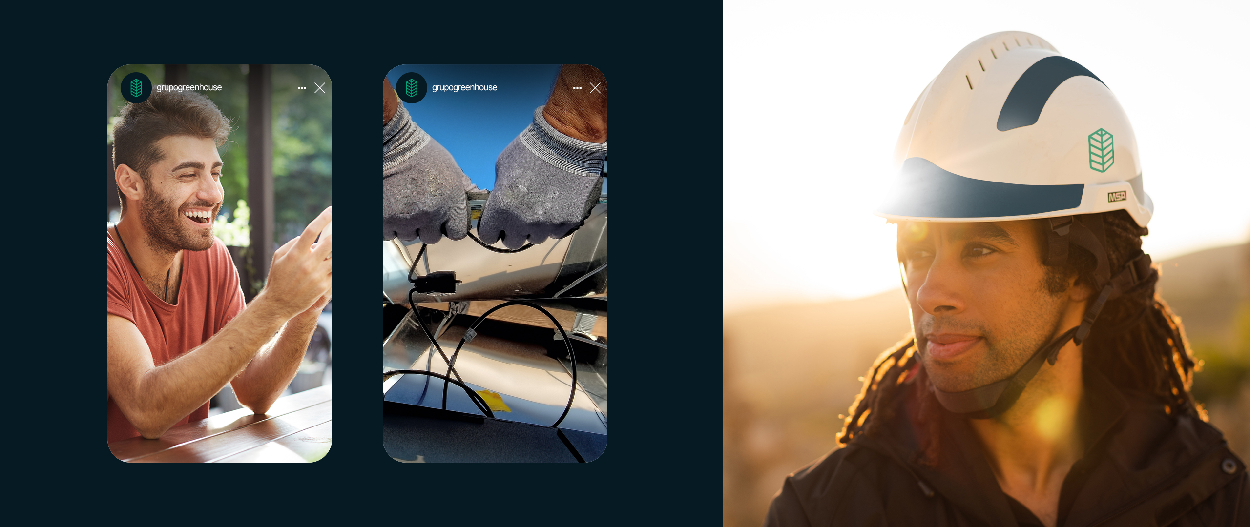
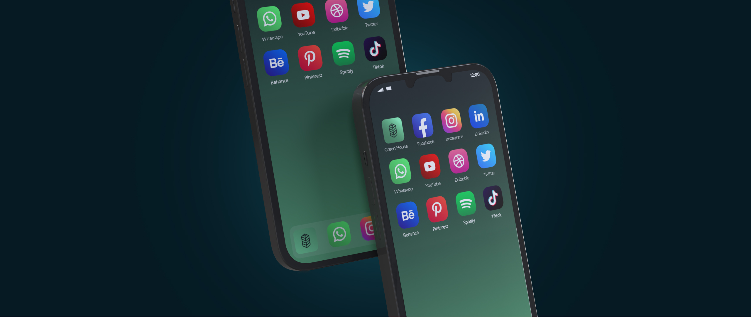
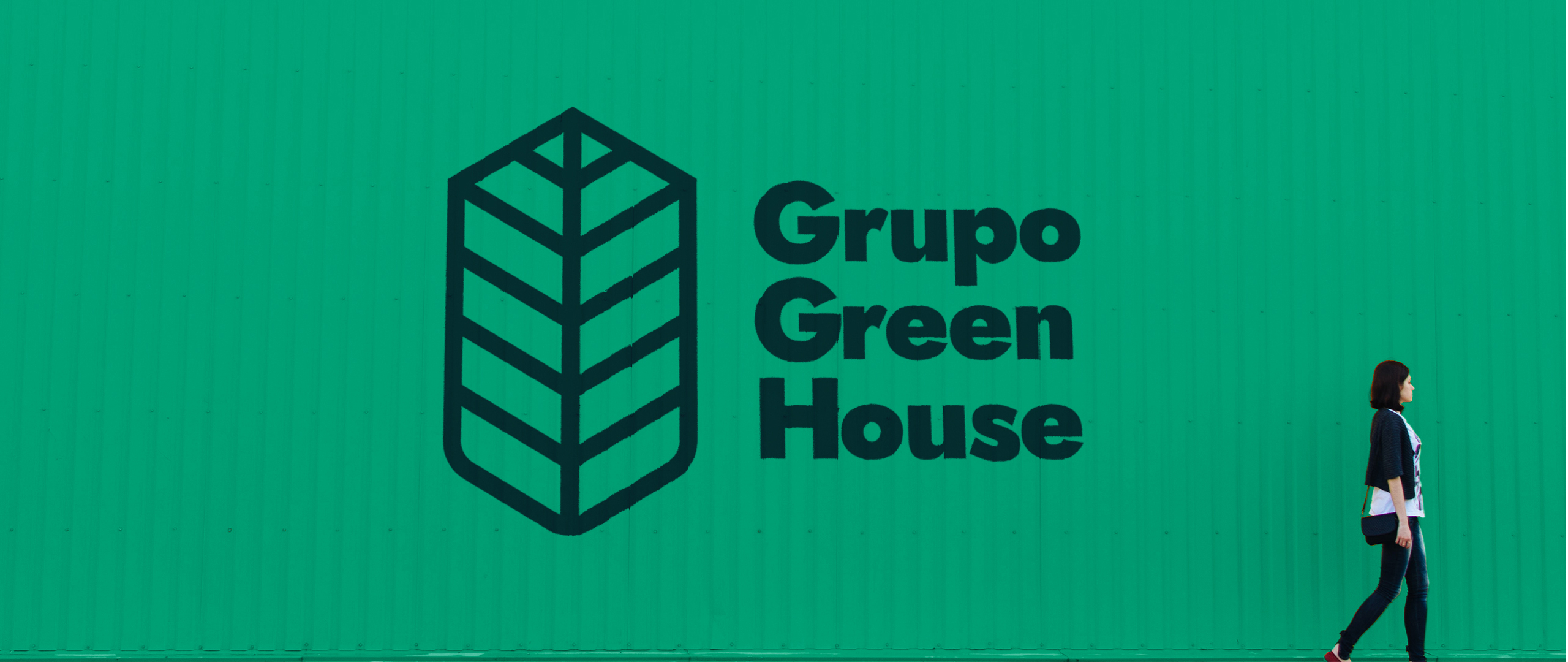
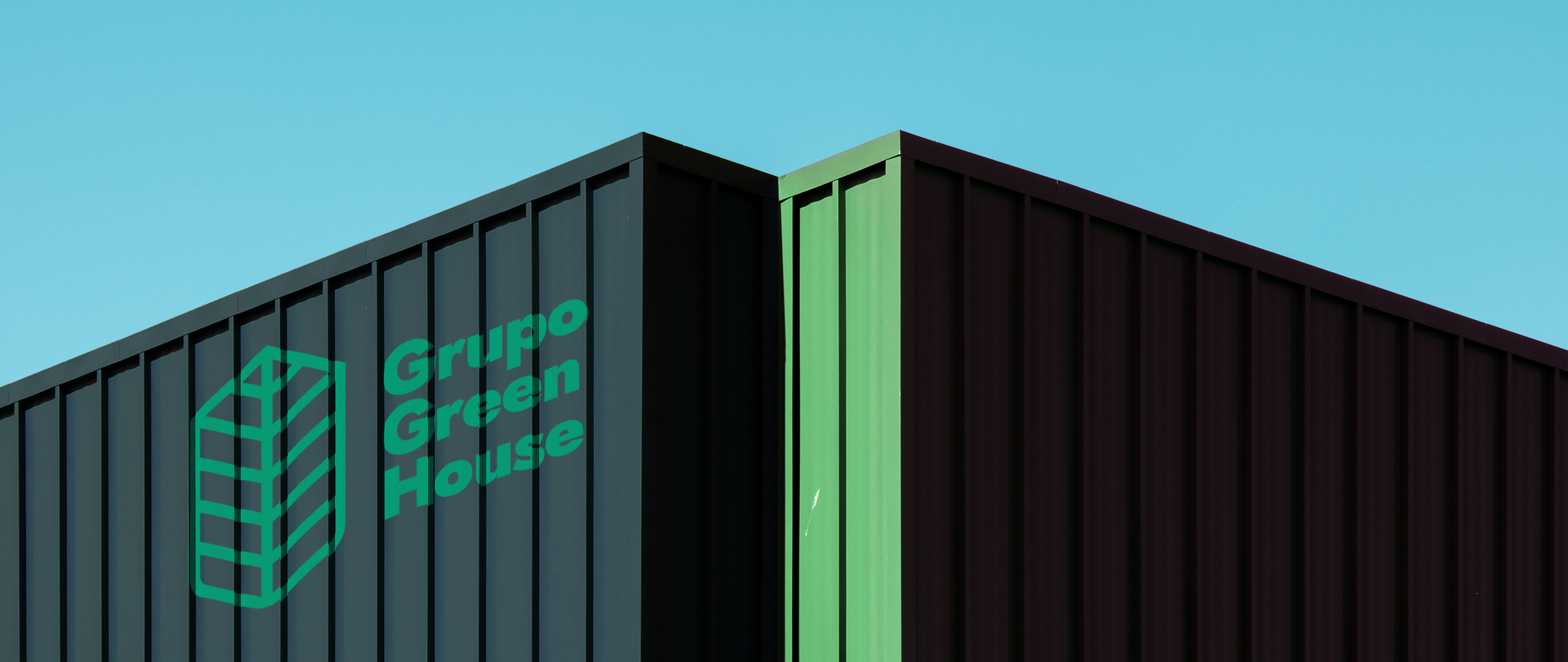
The symbol chosen to represent the Green House Group was based on the combination of the shapes of a shovel, a leaf and a house. The shovel symbolizes planting and construction, the leaf refers to the ecological aspect and the house represents the company’s focus on sustainable construction. Together, these shapes create a strong and memorable symbol that clearly communicates the company’s activity.
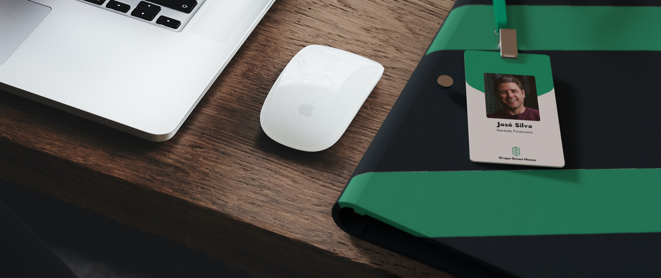
The choice of colors was also carefully thought out. Green, the predominant color in the visual identity, conveys the idea of something clean and represents the company’s concern for the environment. Blue, in turn, represents tranquility and technology, two characteristics that are important to the company.
The typography chosen aims to convey the idea of stability and security. The font chosen is modern and elegant, while conveying an image of confidence and solidity.
With this visual identity, the Green House Group intends to stand out in the market as a company that offers innovative and sustainable solutions, and whose objective is to contribute to a better future for the planet.


CREDIT
- Agency/Creative: Estúdio Felipe Couto
- Article Title: Corporate Identity Project of the Green House Group
- Organisation/Entity: Freelance
- Project Type: Identity
- Project Status: Published
- Agency/Creative Country: Brazil
- Agency/Creative City: Petrolândia
- Market Region: South America
- Project Deliverables: Brand Creation, Brand Design, Brand Mark, Brand World, Logo Design
- Industry: Construction
- Keywords: brand, branding, brand design, brand designer, logotype, corporate identity
-
Credits:
Designer: Felipe Couto


