Perfect Play is a development company that produces browser-based and mobile games. The most famous projects of the studio are Ghost Town Adventures and Mystery Lane arcade games.
The company first entered the market in 2010 under the name of Webgames. In ten years, the indie studio transformed from a gathering of few enthusiasts into a full-fledged brand. The values, the concept, the development plan and the new name appeared. In game theory, the term Perfect Play means a specific strategy that leads a player to the best result, no matter what is going on around them.
The main resource of a game development company is a strong team. Therefore, corporate identity should first and foremost create the right brand image for employees, both existing and potential. And also declare that ‘we are strong, vibrant, disruptive, and being a part of our team is awesome.
The new Perfect Play logo is stylized letters PP. At the heart of each is the so-called Penrose triangle, the classic ‘impossible object’. Impossible objects are flat images of three-dimensional objects that cannot exist in the real world.
We use Penrose’s triangle to denote a brand’s metaphor: the fantasy world created by human mind is able to go beyond the usual, explode boundaries, break rules, become something more.
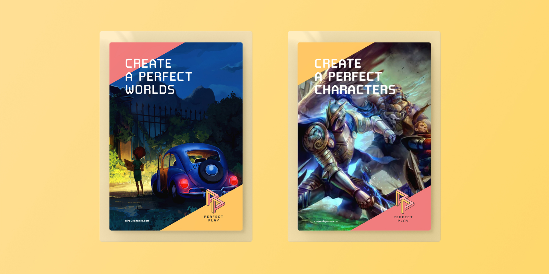
The game brand’s goal is to build a stable and loyal community of players around its products. This requires not only vivid and entertaining gaming worlds, but also the right brand image. A brand that can be trusted: to download and buy the games, invite friends to play them, follow new releases, participate in the creation of guides.
A similar task was set in relation to the employees: to inspire confidence, ignite the thrill of competition, and make up a comfortable creative environment. Now the company employs about 70 people, and the staff will continue to grow. The brand is always interested in new unique specialists, as the key principle of quality content is ‘first who, then what.’ Perfect Play’s new style helps attract new employees and makes the work of the HR department much easier.
The main principle of Perfect Play is always choosing the best possible strategy, under any circumstances not to compromise on quality, and to leave enough space for free creativity. The new brand image is a logical continuation of its philosophy – it’s vibrant and daring, but mathematically accurate at the same time.


CREDIT
- Agency/Creative: lovemedo branding agency
- Article Title: Corporate Identity of the Perfect Play Mobile Game Developer Created by Lovemedo Branding Agency
- Organisation/Entity: Agency, Published Commercial Design
- Project Type: Identity
- Agency/Creative Country: Russia
- Market Region: Europe
- Project Deliverables: Brand Architecture, Brand Identity, Brand Naming, Branding, Graphic Design, Rebranding, Research, Tone of Voice
- Industry: Entertainment
- Keywords: visualstyle / gamedesigner / gamedevelopment / gamestudio / gamedesign / identitydesign / identity / logodesigner / creativelogo / logoconcept


