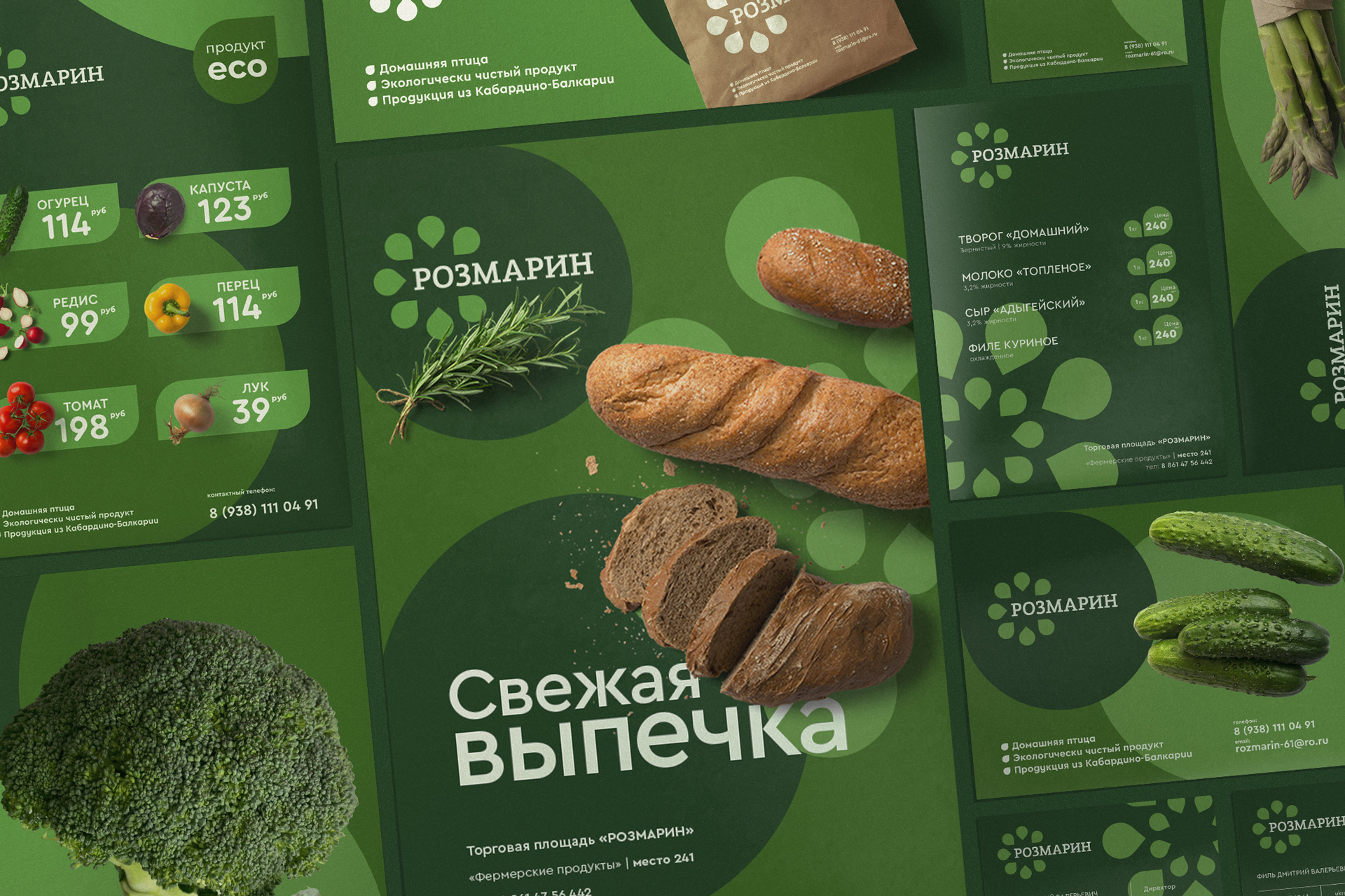
Rosemary is conceived as a retail space in which customers are offered a choice of quality and healthy products. One of the main advantages is a large assortment of farm products and vegetables grown in our own plots, vegetables, herbs, fruits. Rosemary sells its own range, as well as products and brands of other manufacturers who are ready to offer customers fresh and healthy products.
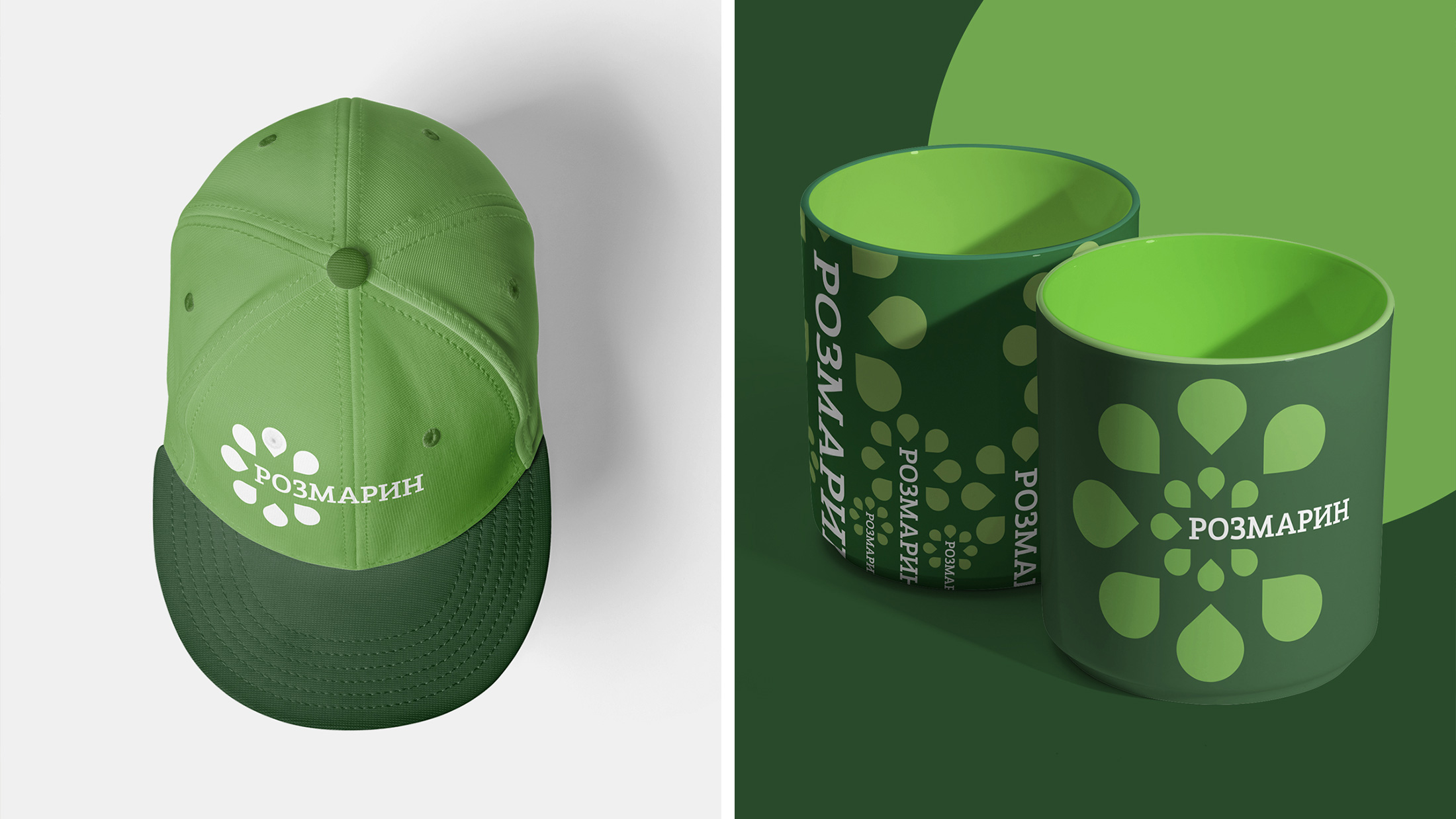
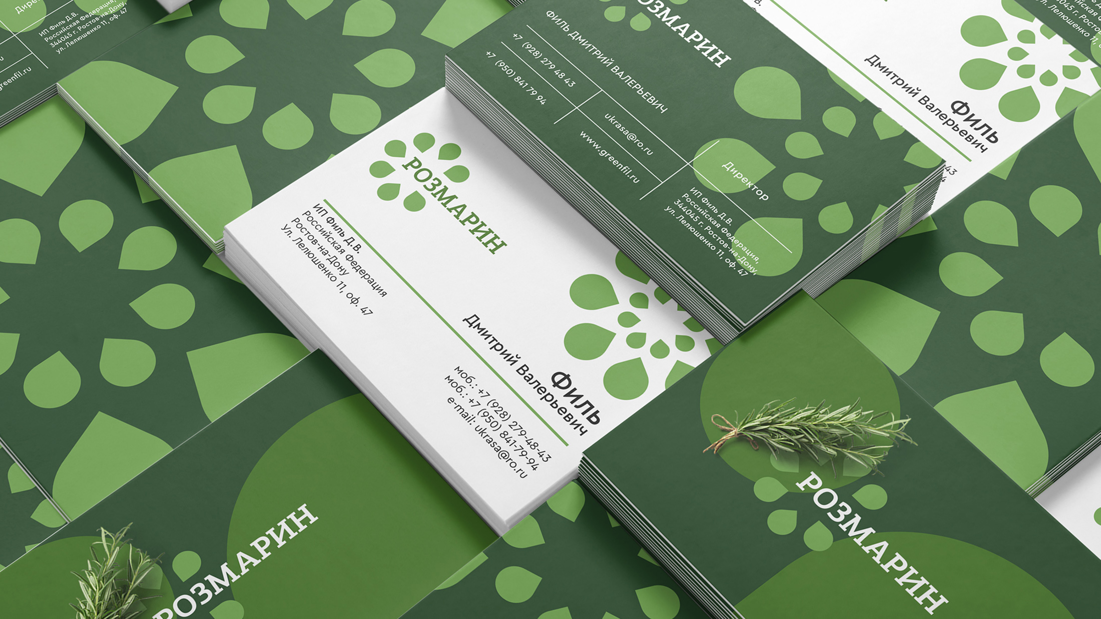
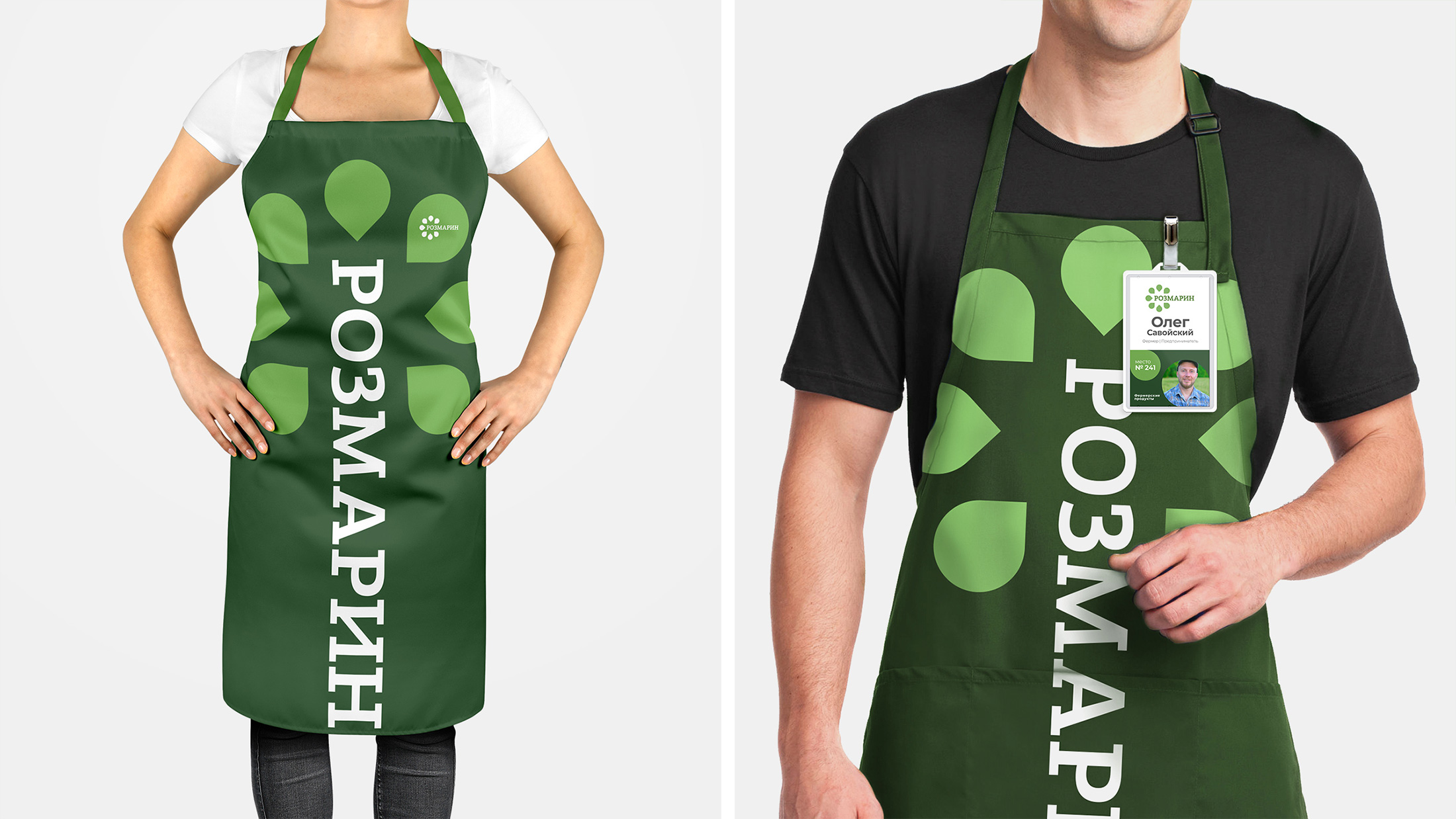
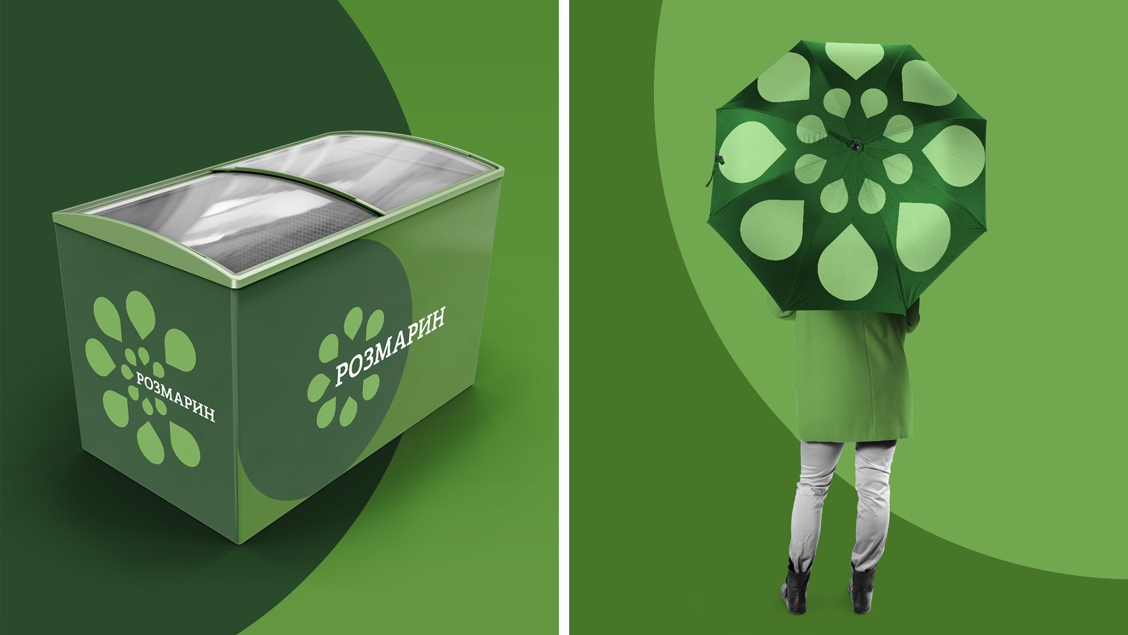
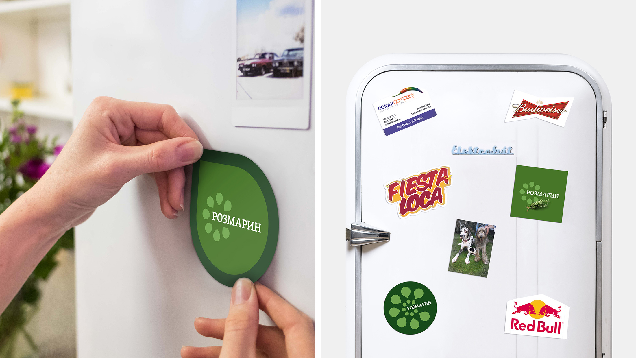
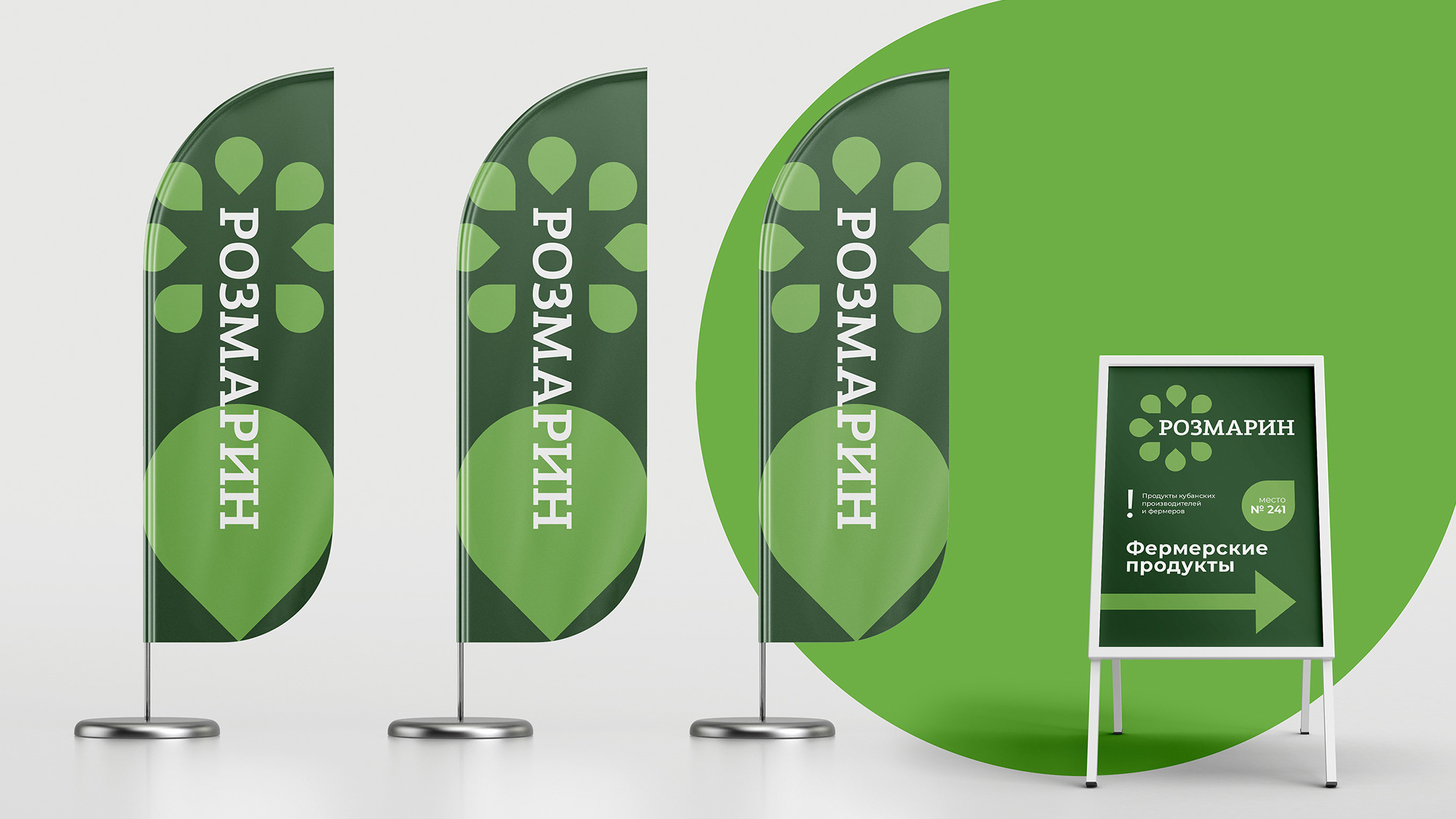
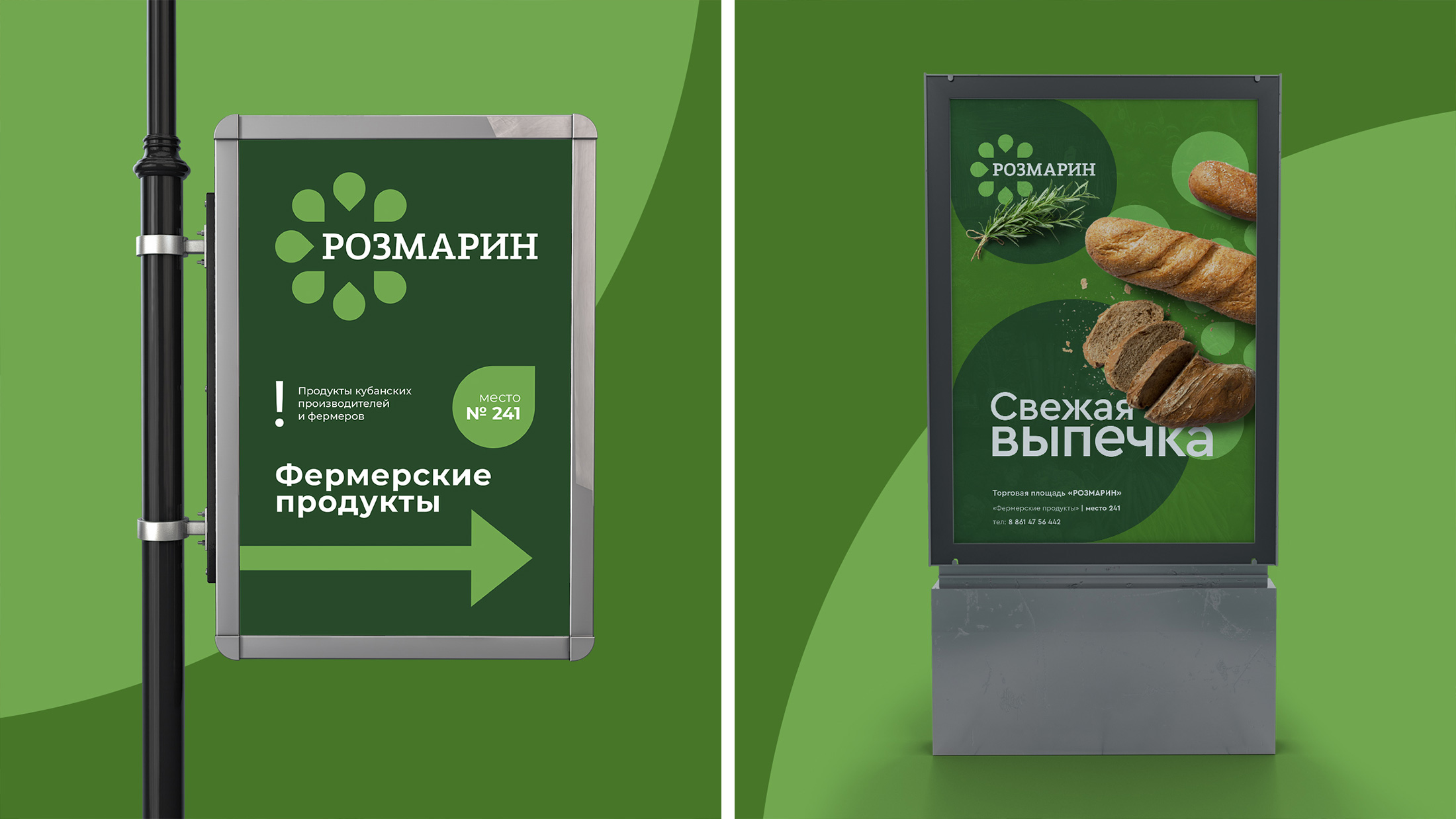
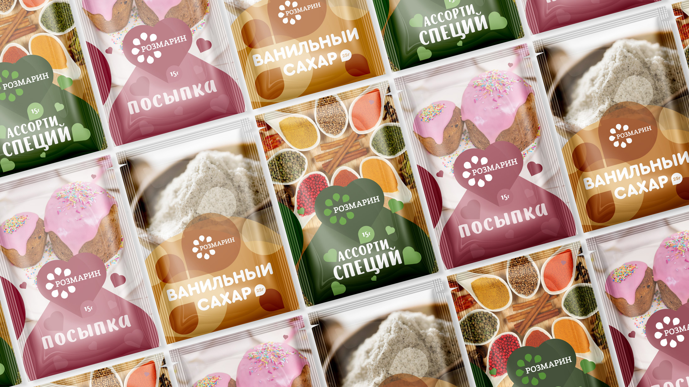
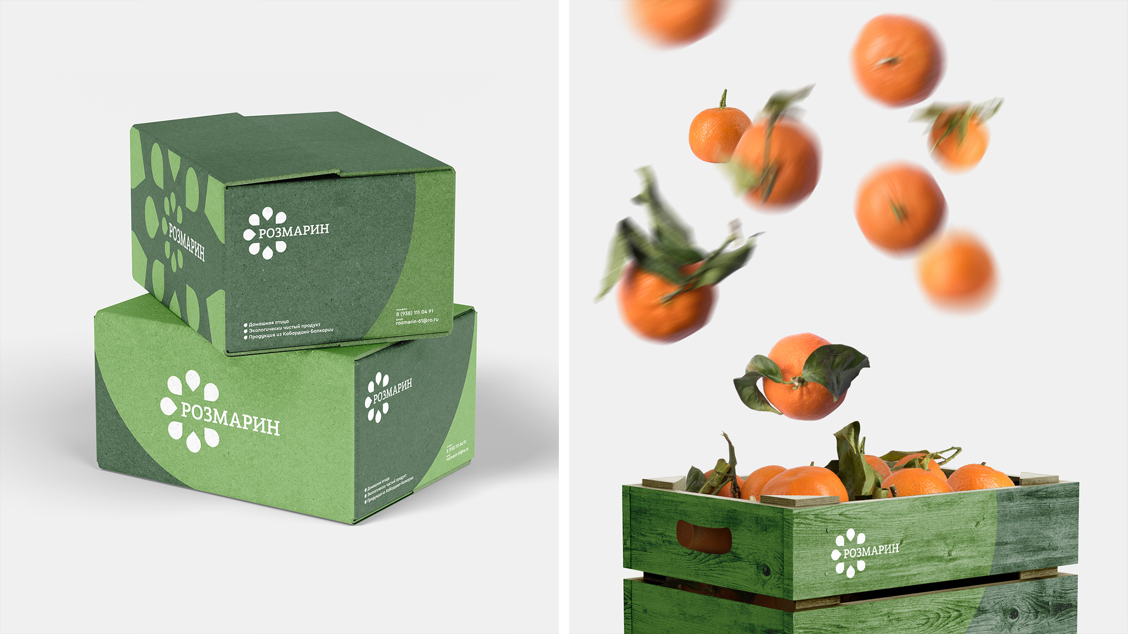
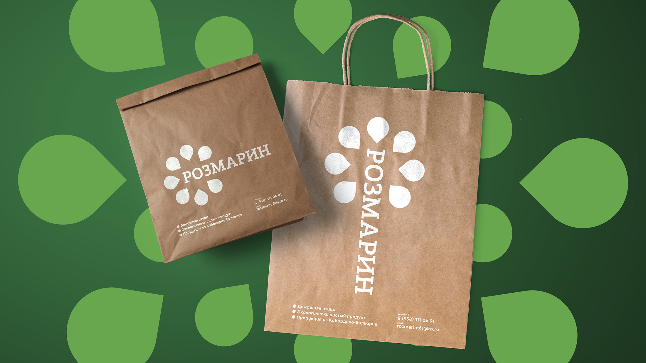
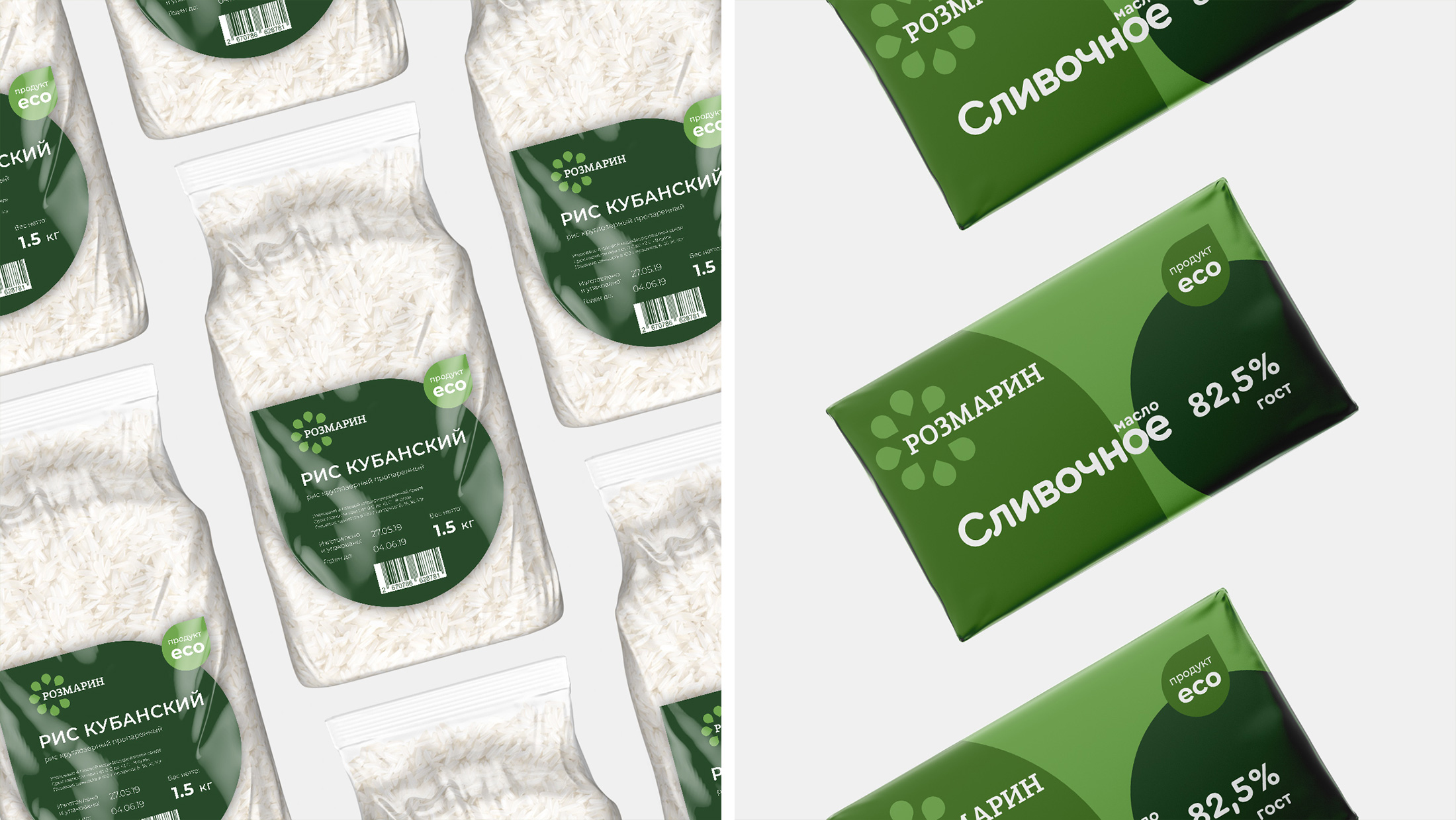
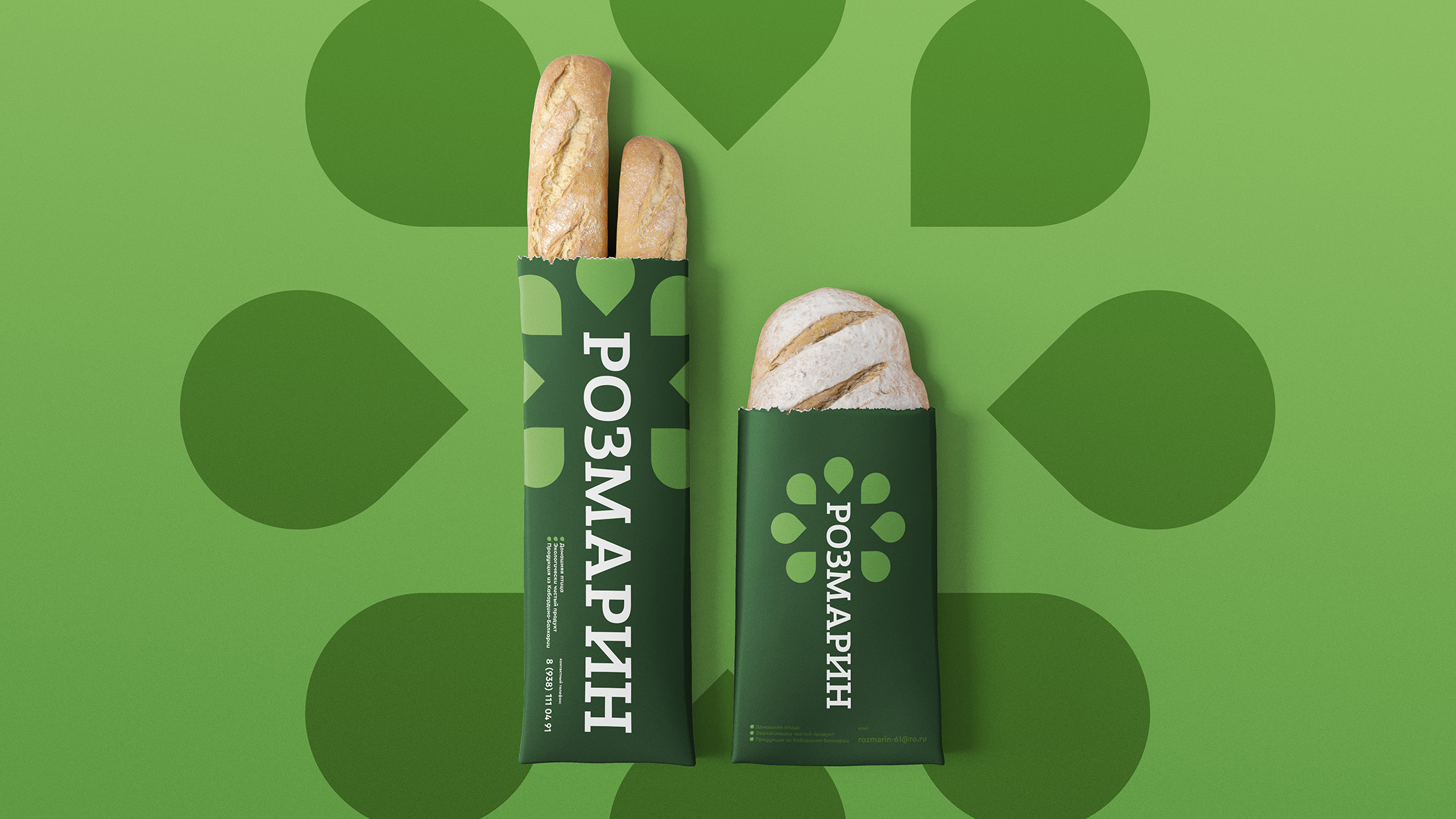
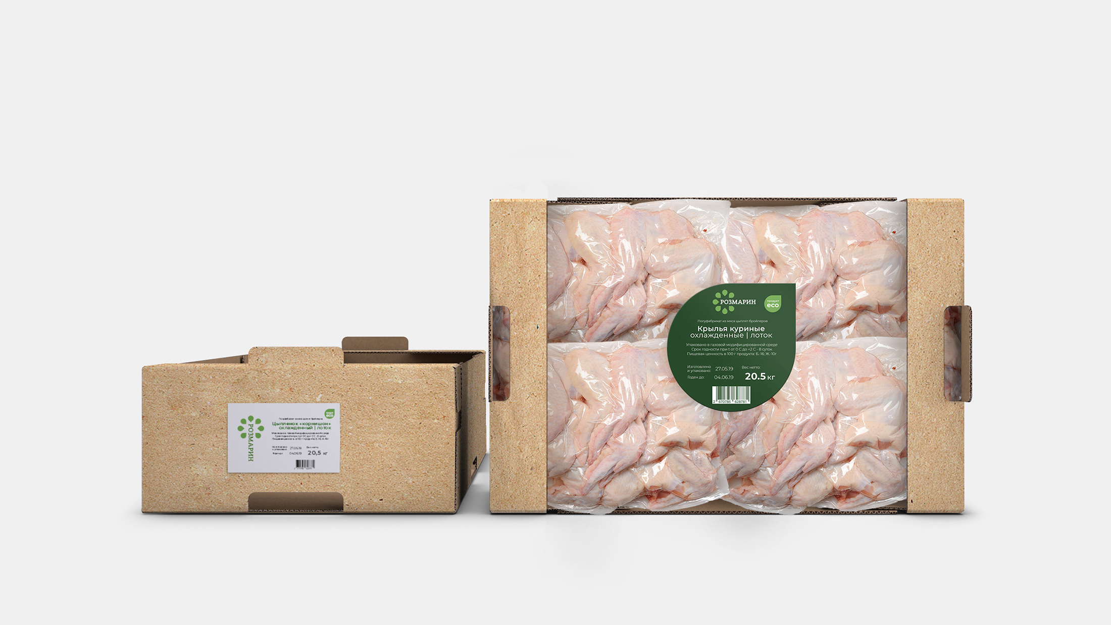
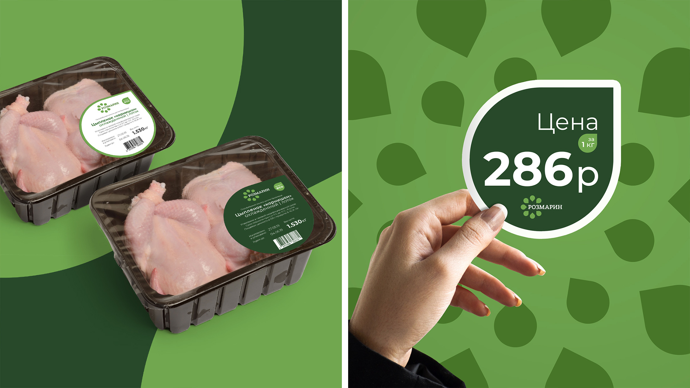
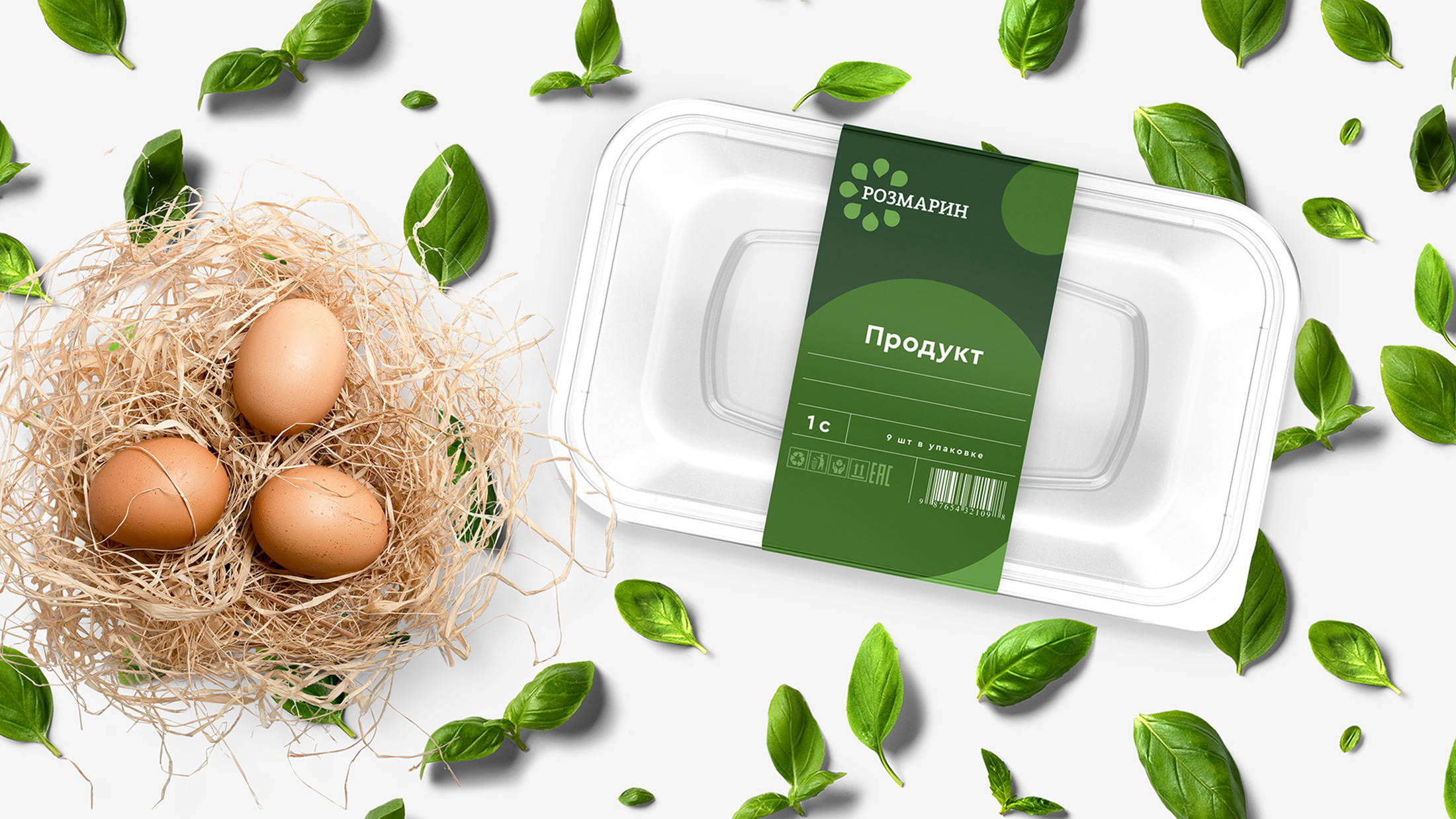
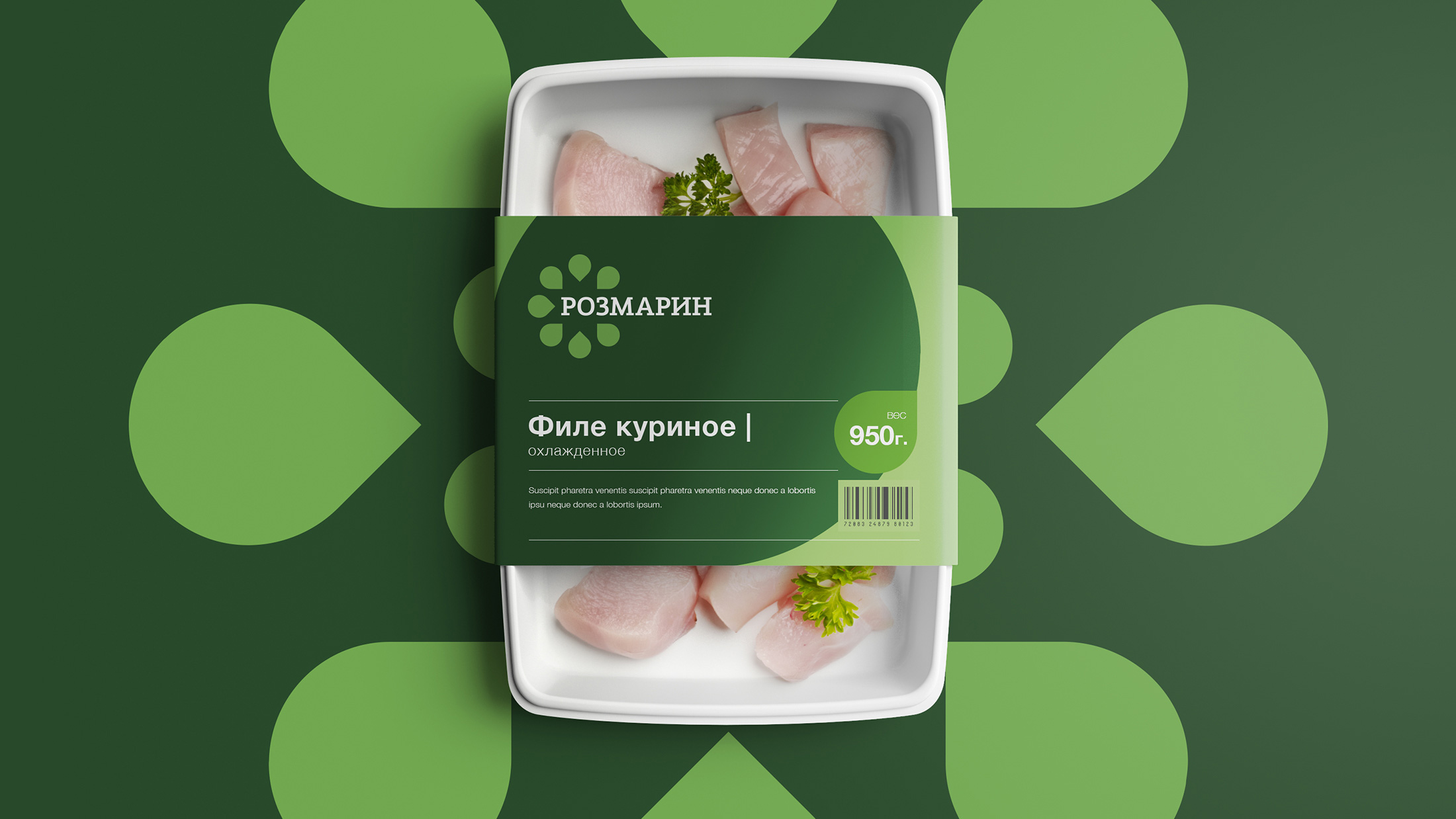
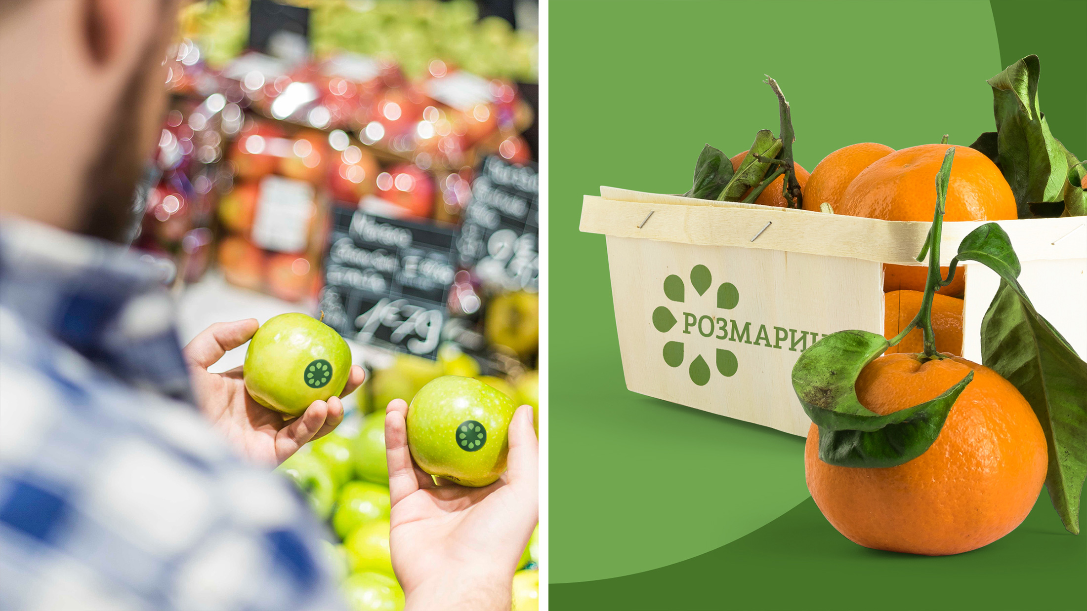
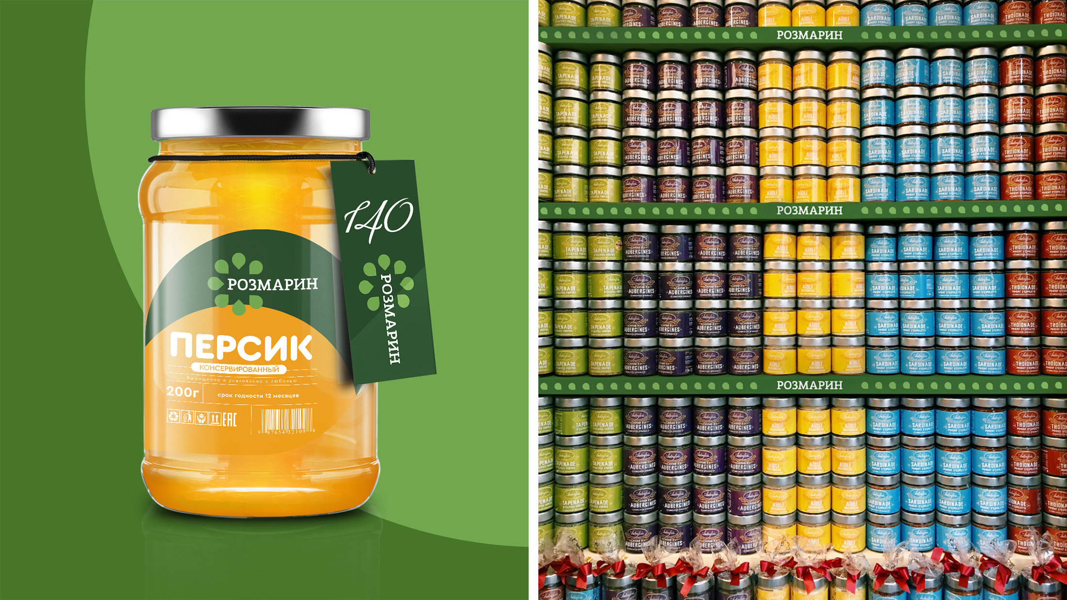
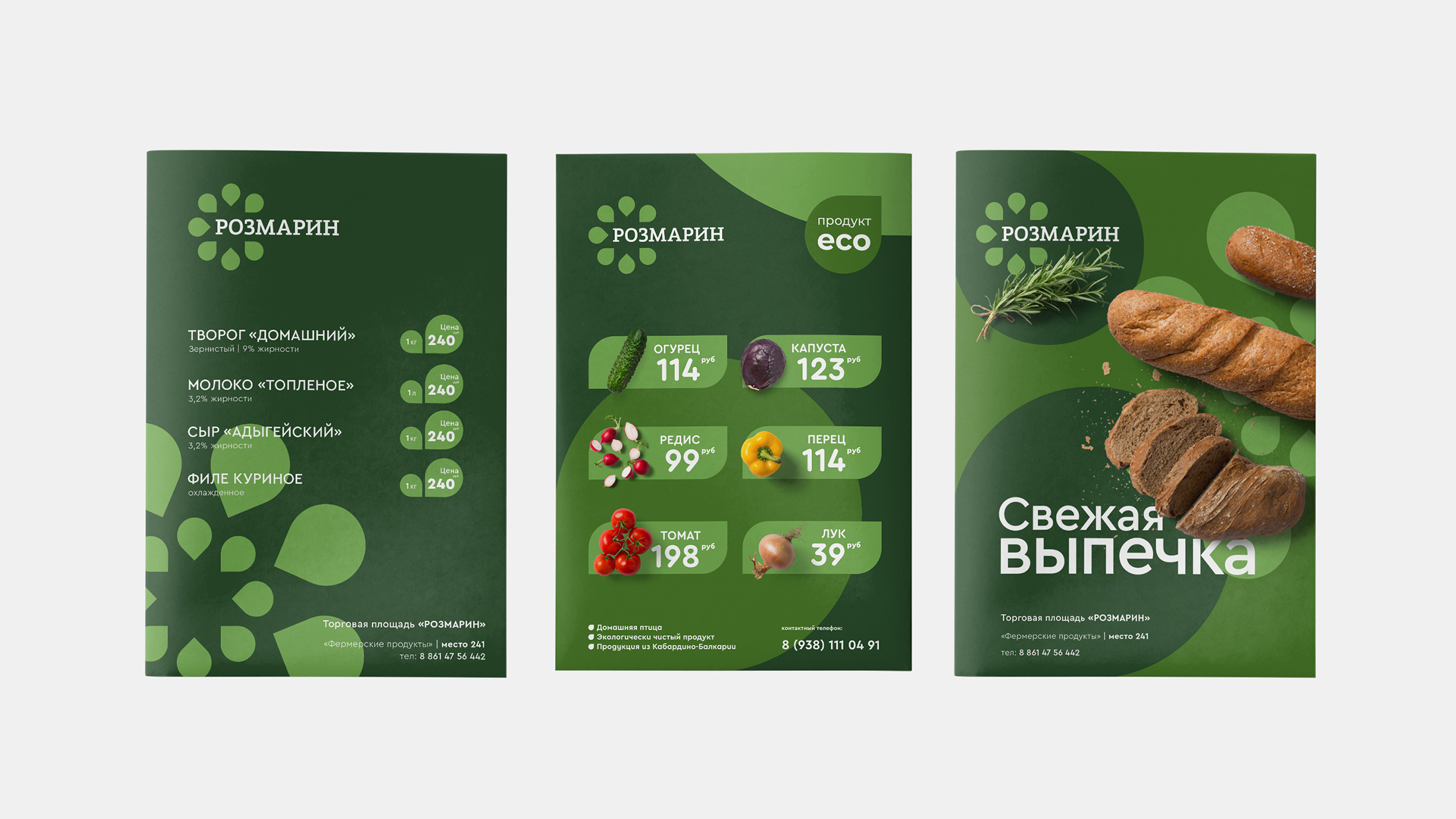
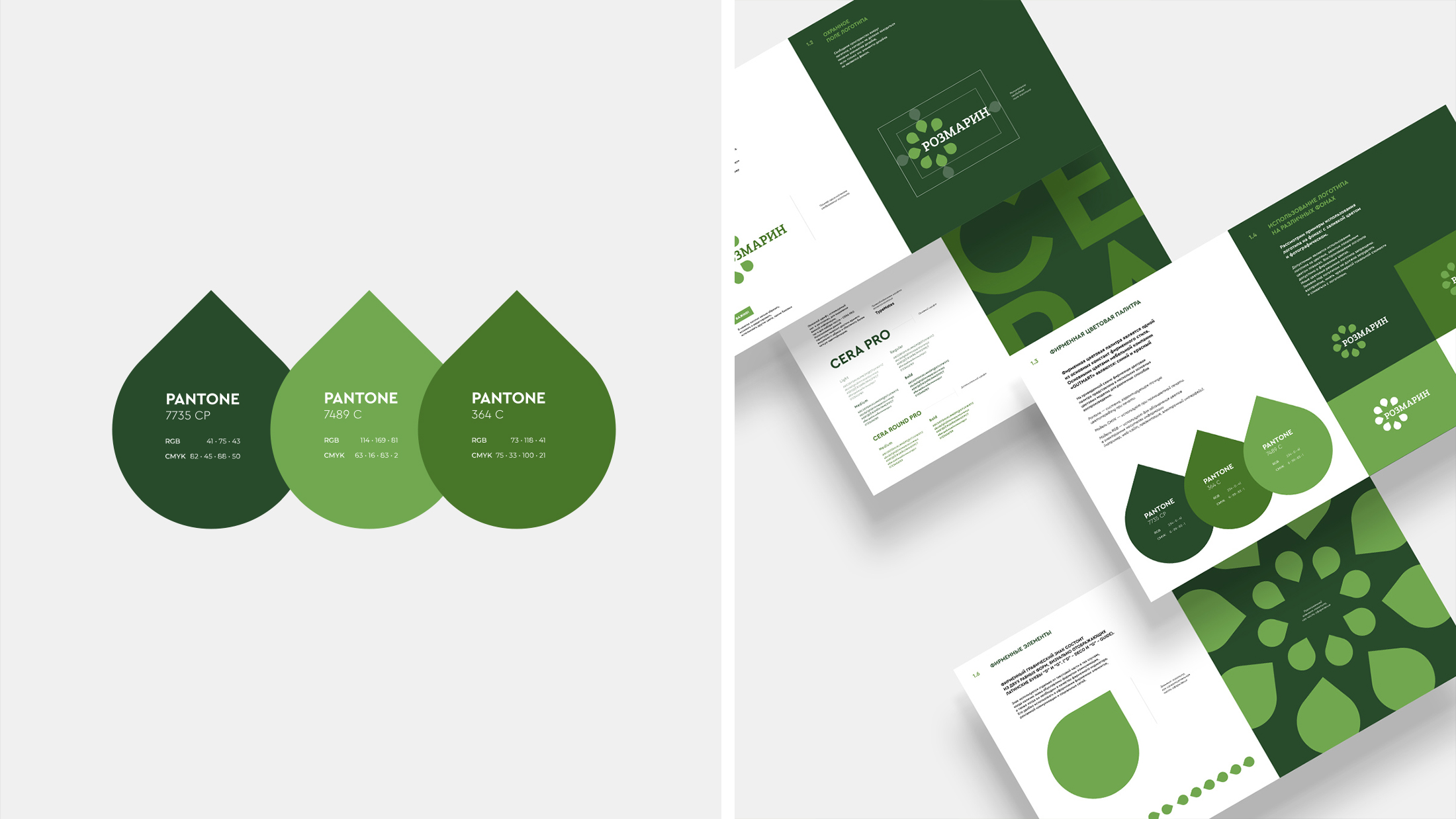
The rosemary plant is associated with spices, herbs, cooking, healthy habits, high taste, so it was decided to move away from the visual stylization of the plant itself and make logo elements unlike rosemary sheets. The shape of the elements resembles a drop and a petal, which speak of freshness and naturalness. Corporate identity will help unite the Rosemary brand, make it understandable, friendly for buyers and suppliers. Colors and elements of corporate identity look bright in the interior of the square itself, in the design of the packaging of their own goods, and on any other media.




CREDIT
- Agency/Creative: around
- Article Title: Corporate Identity for the Rosemary Retail Space in Rostov-on-Don
- Organisation/Entity: Agency, Published Commercial Design
- Project Type: Identity
- Agency/Creative Country: Russia
- Market Region: Europe
- Project Deliverables: Brand Identity, Brand World, Graphic Design, Packaging Design
- Industry: Retail
- Keywords: BRAND GREEN IDENTITY LOGO MARKET RETAIL ROSEMARY STORE VEGETABLES


