


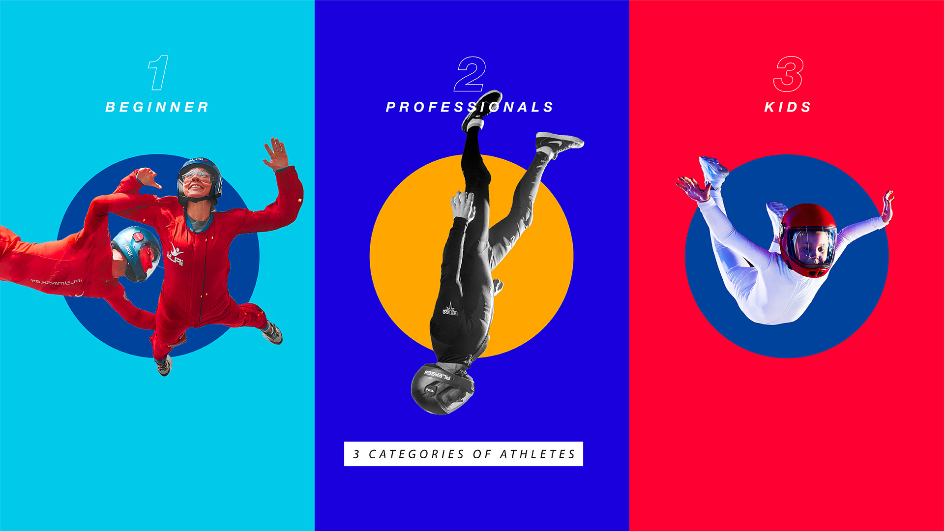
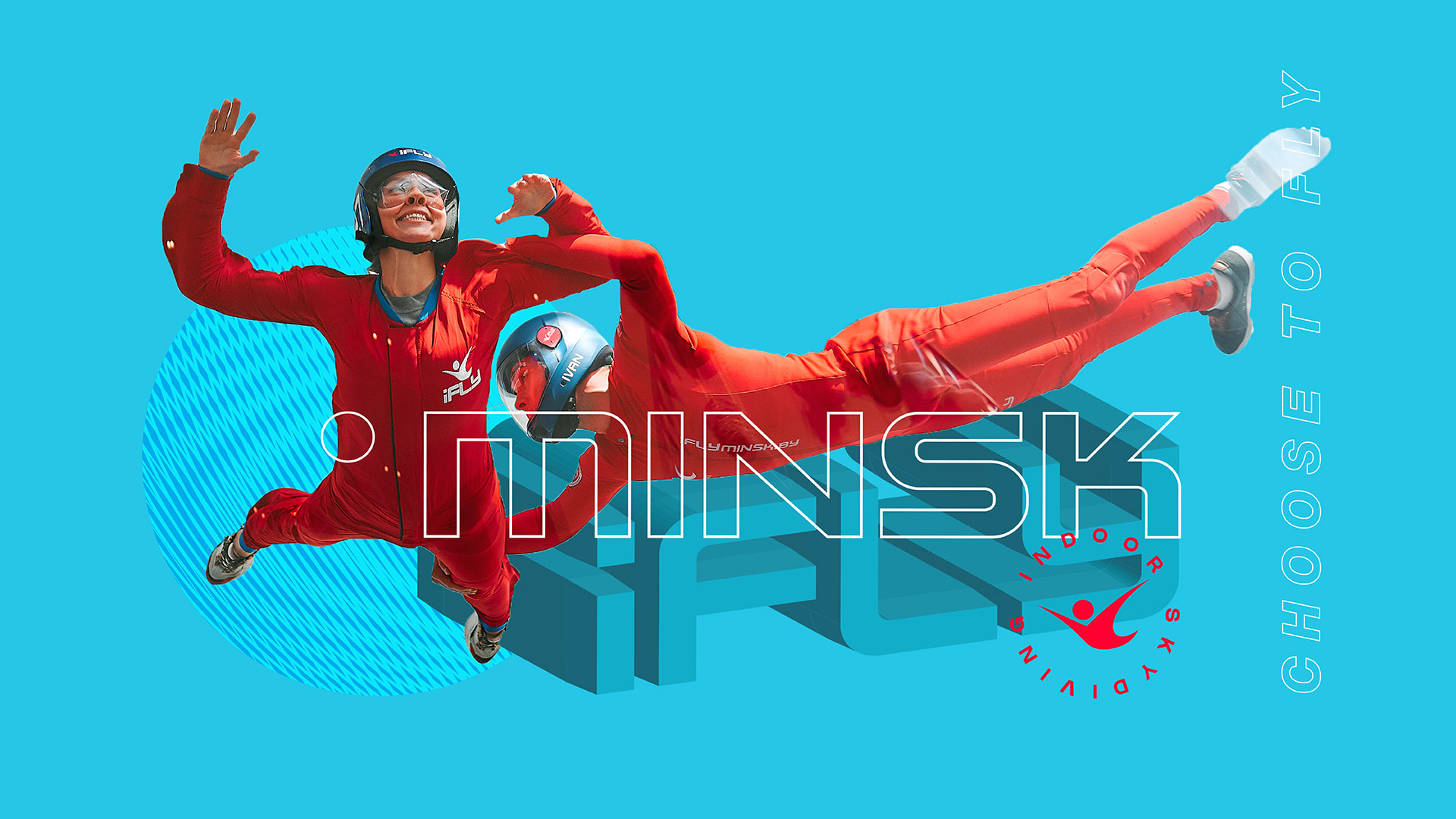
iFly is flight. This detachment from the ground is something that inspires, gives a feeling of freedom and charges with indescribable emotions. This is precisely the main mission of the iFly Minsk aerodynamic tube – a unique high-tech simulator in the center of Europe. Absolutely anyone can experience the delight of free fall with it: a beginner, a professional or a child. The strength of each of them lies in the character and special mood during the flight.
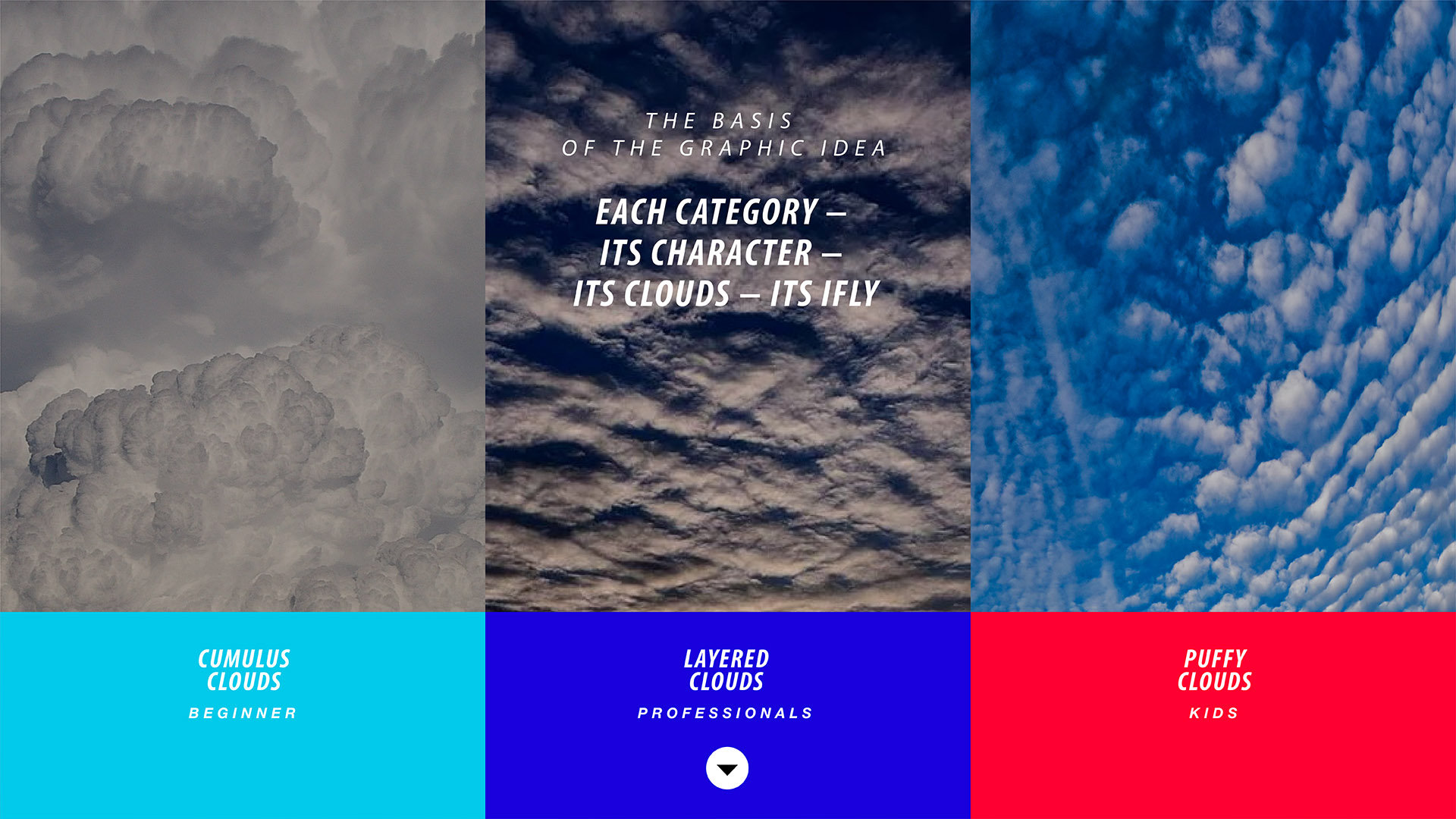
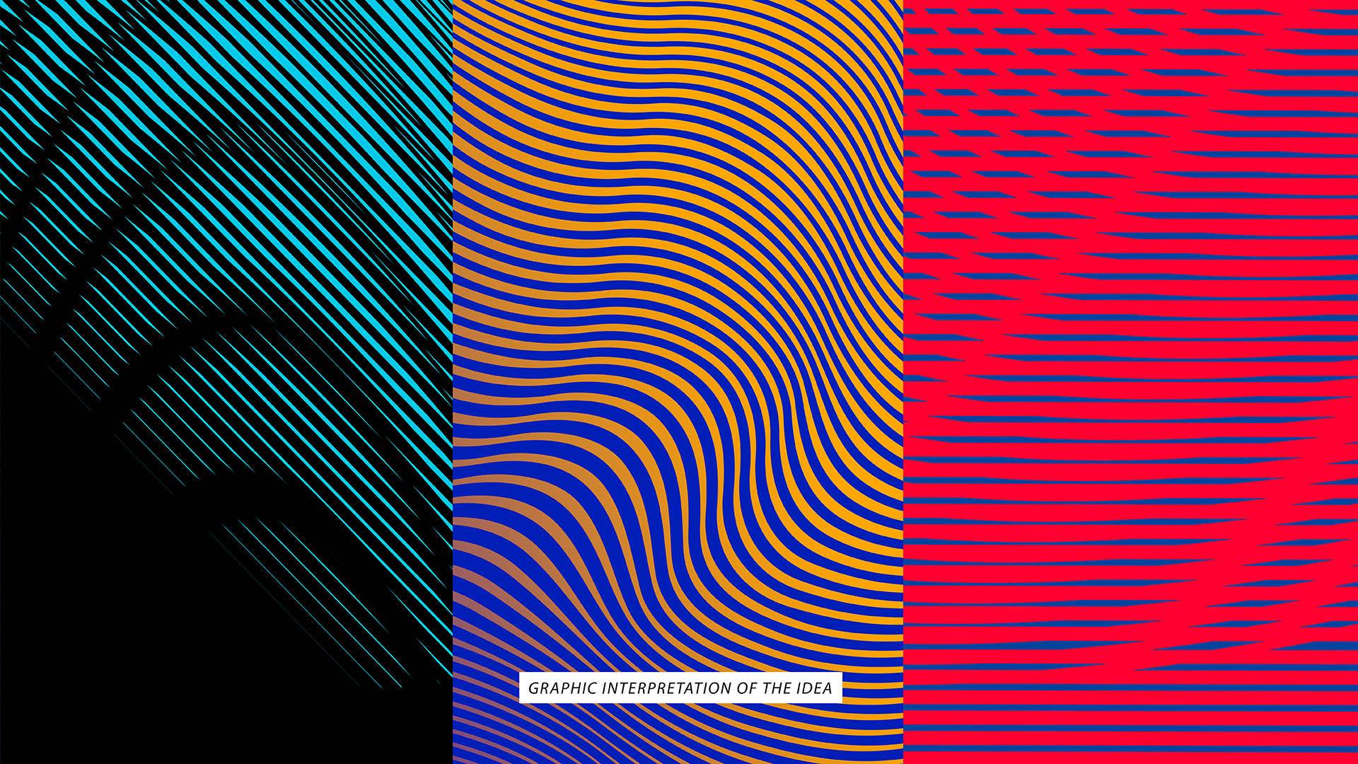
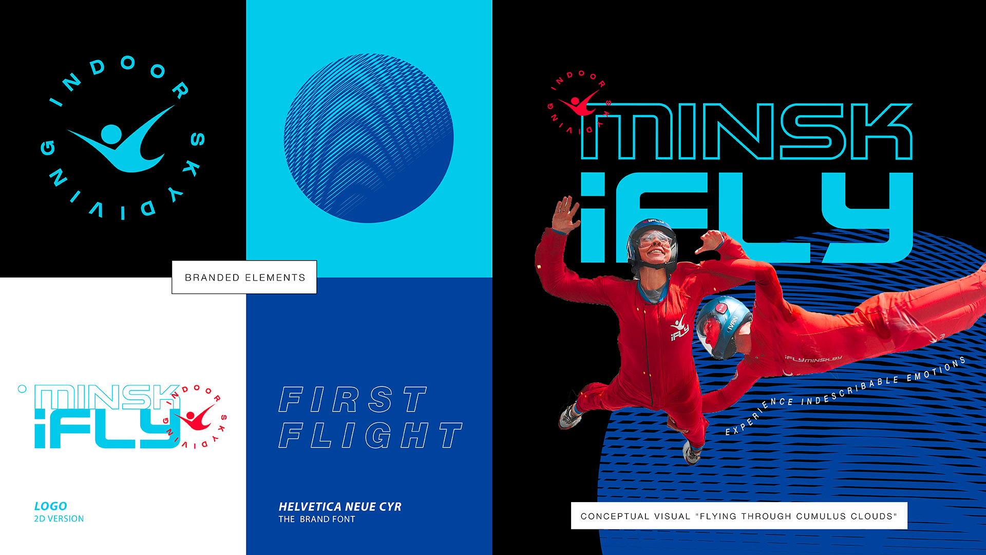
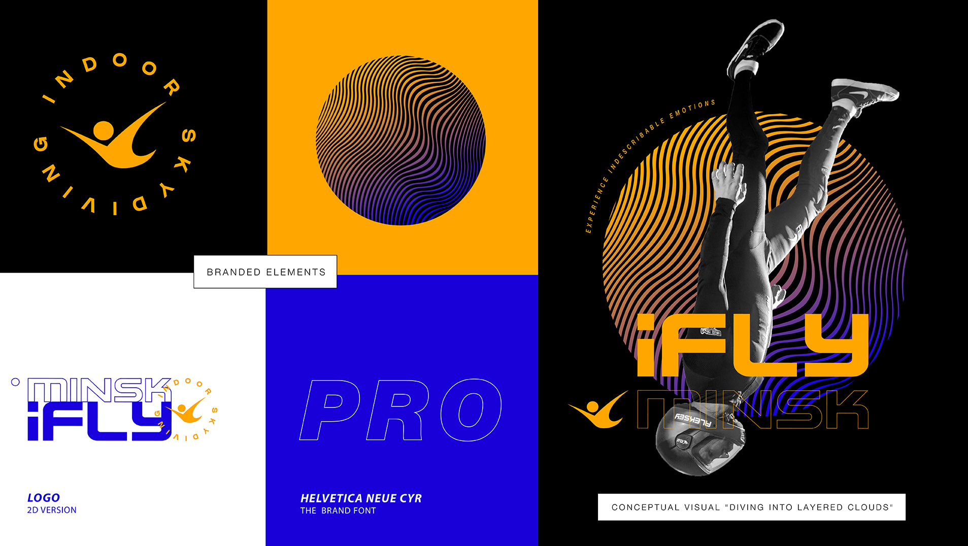
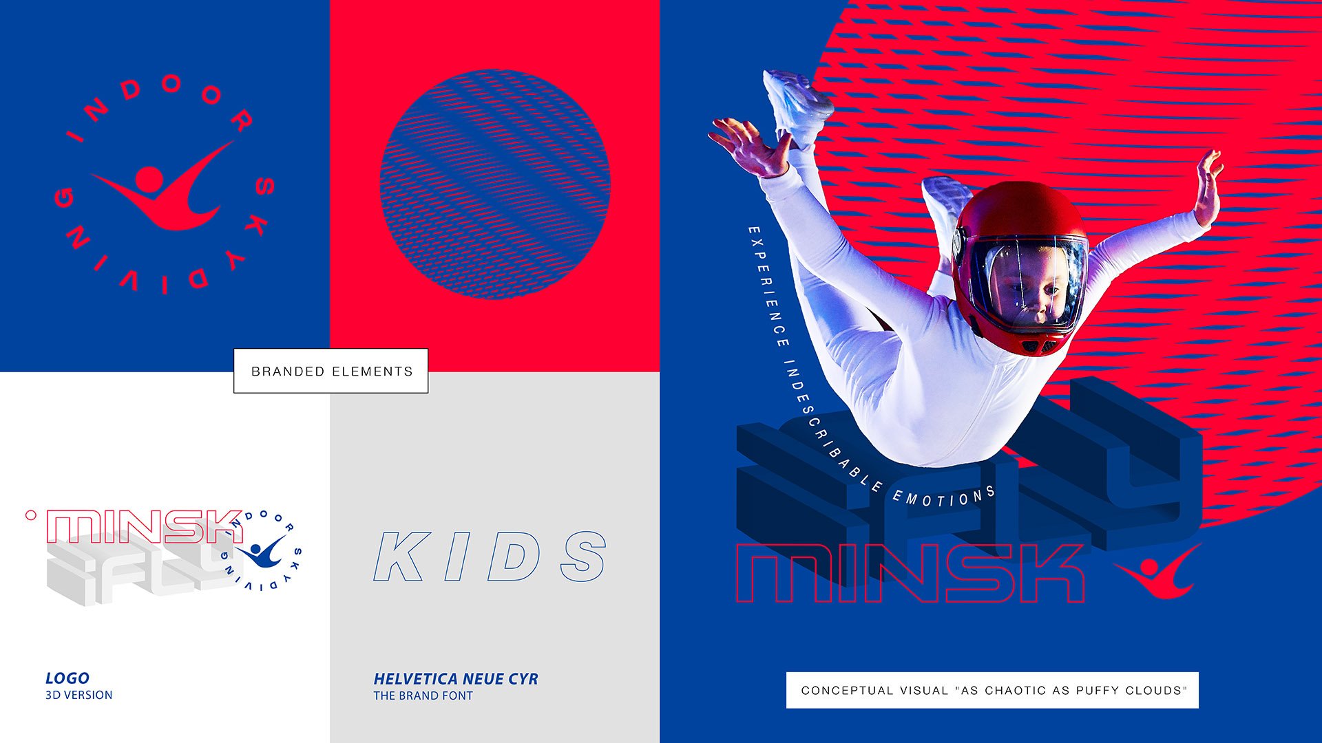
To convey this idea, the new visual identification of the iFly Minsk aerodynamic tube was based on graphic interpretation of three different types of clouds with different shapes and textures. Due to their uniqueness, clouds have become a key visual image for conveying the character and feeling of flying for each category of athletes in iFly Minsk. Thus, with the help of a common symbol – clouds, it was possible not only to create a direct association with flying in the sky, but also to visually distinguish each audience – beginners, professionals and children, emphasizing the main thing: each category – its own character – its own clouds – its own iFly.
Cumulus clouds have become a symbol for identifying the category of beginners. When you get to training for the first time, you are amazed at the scale and just plunge into the whole process, as if overcoming a huge cumulus cloud on your way. A light and calm palette with a predominance of blue was chosen as the base colors for this category. So it was possible to note that most of the visitors are beginners who want to try new things and this unites them.
The category of professionals is stratus clouds. Professional athletes who train in an aerodynamic tube have no fear. They are confident and create clear trajectories in flight, similar to stratus clouds in the sky. The color scheme for professionals is yellow and blue. Yellow is a reference to gold and winning the competition. Intense blue, gradients and shades of ocher in the corporate identity are associated with status and premiality, emphasizing that the category of professionals is more complicated in comparison with others.
Cirrus clouds are taken as the basis for the graphic idea for the category of children. Children are characterized by activity and courage, and their movements in an aerodynamic tube are sometimes chaotic – like cirrus clouds. The color palette for this category is based on vibrant base colors: deep pink and blue. These rather simple shades personify the naivety, courage and insane tenacity inherent in children during the flight.
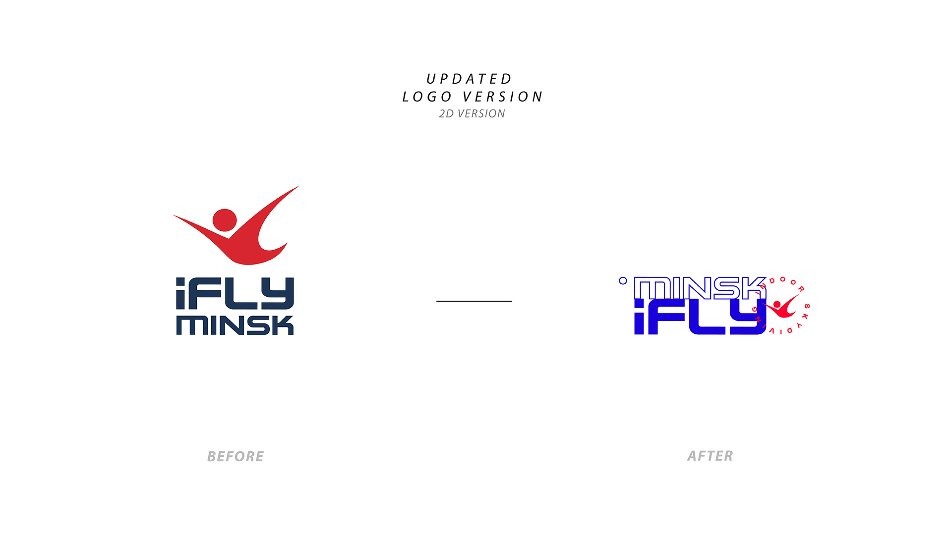
The new corporate identity of iFly Minsk dictated a logical revision of the old version of the logo. The previous flat variation was improved, and as a result of the rearrangement of the elements, it was possible to make the right accents. In addition, an updated 3D version of the logo was created, which perfectly emphasized the theme of volumetric flight, clouds and immersion.


CREDIT
- Agency/Creative: Moloko Creative Design Agency
- Article Title: Corporate Identity for iFly Minsk by Moloko Creative
- Organisation/Entity: Agency, Published Commercial Design
- Project Type: Identity
- Agency/Creative Country: Belarus
- Market Region: Europe
- Project Deliverables: Brand Architecture, Brand Identity, Graphic Design, Research, Tone of Voice
- Industry: Aerospace
- Keywords: identity


