Mk Creative – Haines Architects
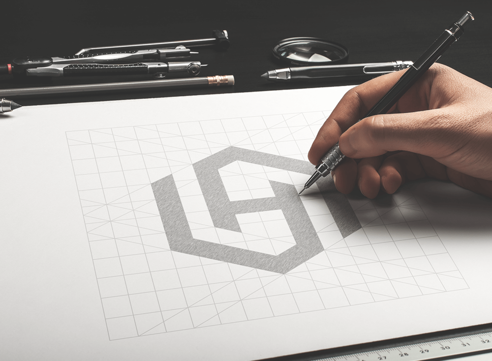
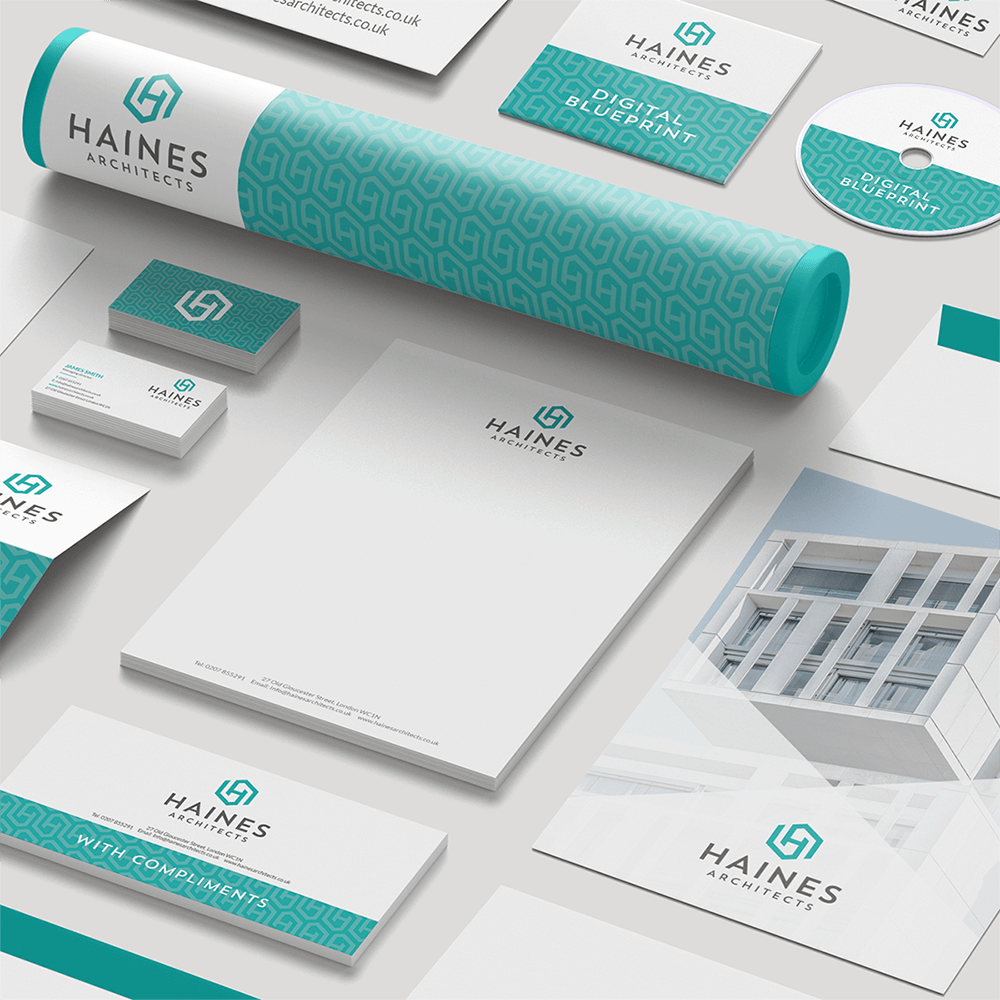
Logo and stationery design for Haines Architects. The client wanted a logo design that makes them stand out from the crowd. So I created the geometric monogram icon using a 10 x 10 grid and then using this icon I created a pattern which has been used on there stationery.


CREDIT
- Agency/Creative: Mk Creative
- Article Title: Corporate Identity and Stationery Design Haines Architects
- Organisation/Entity: Freelance Commercial, Published
- Project Type: Packaging
- Agency/Creative Country: United Kingdom
- Market Region: Europe
- Industry: Construction
FEEDBACK
Relevance: Solution/idea in relation to brand, product or service
Implementation: Attention, detailing and finishing of final solution
Presentation: Text, visualisation and quality of the presentation


