


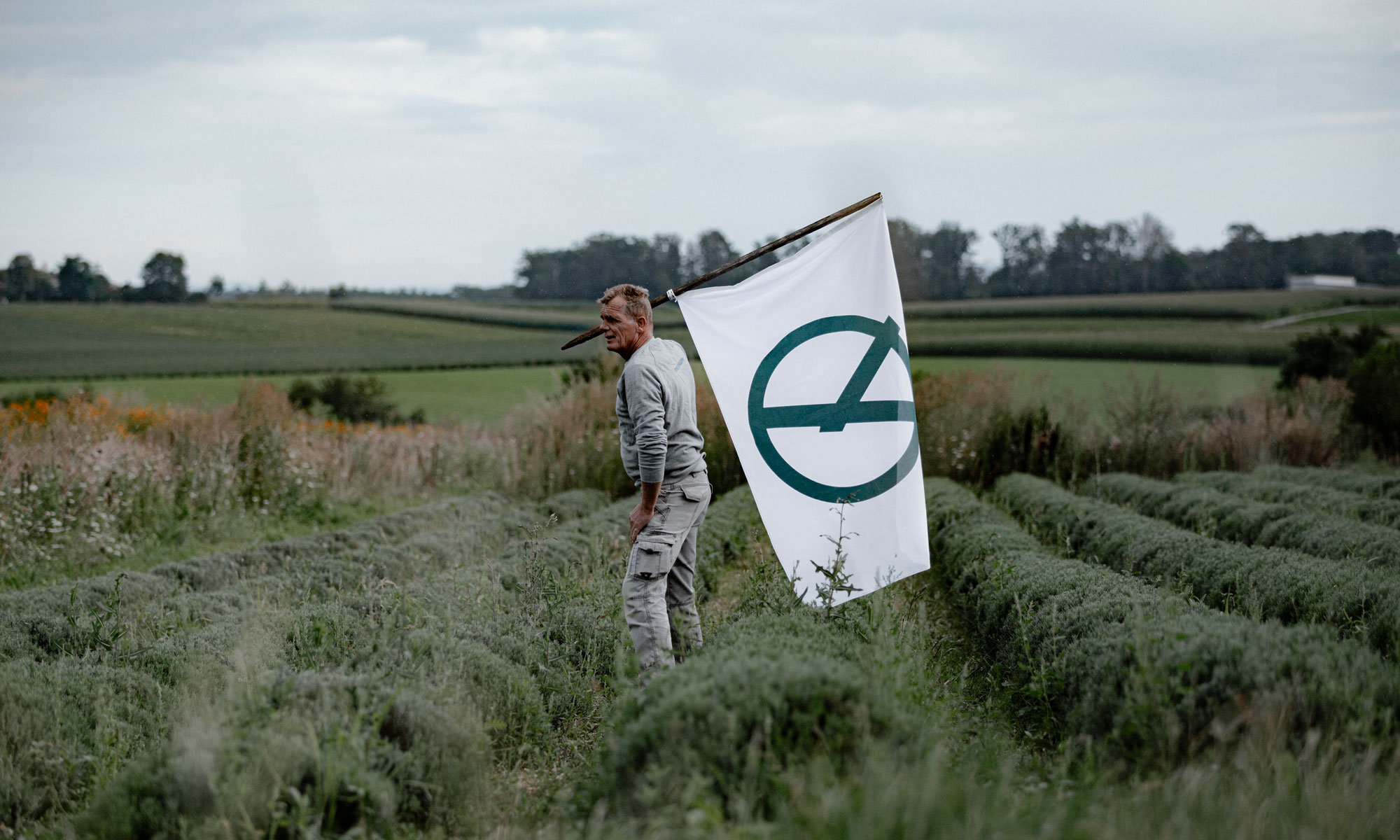
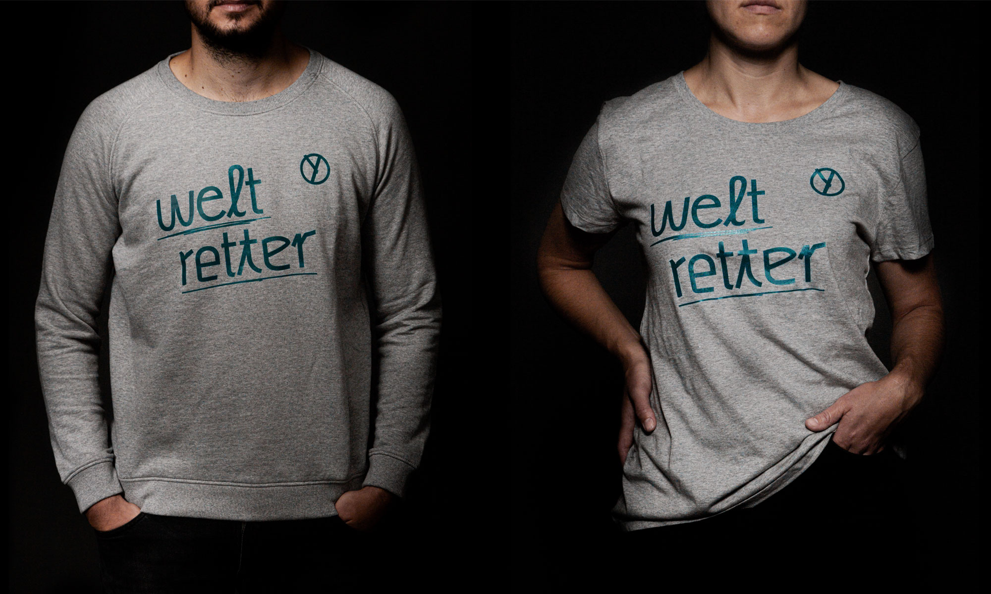
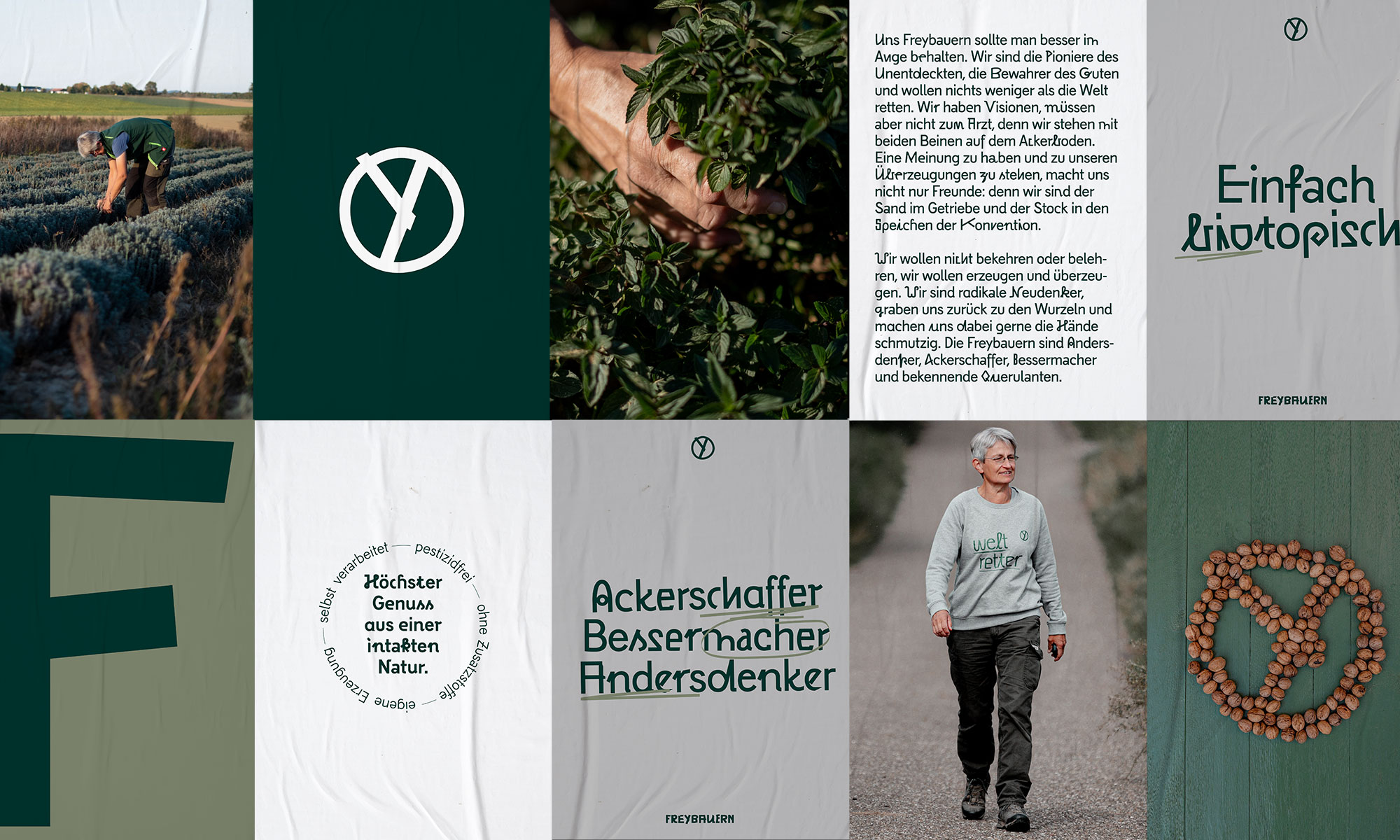
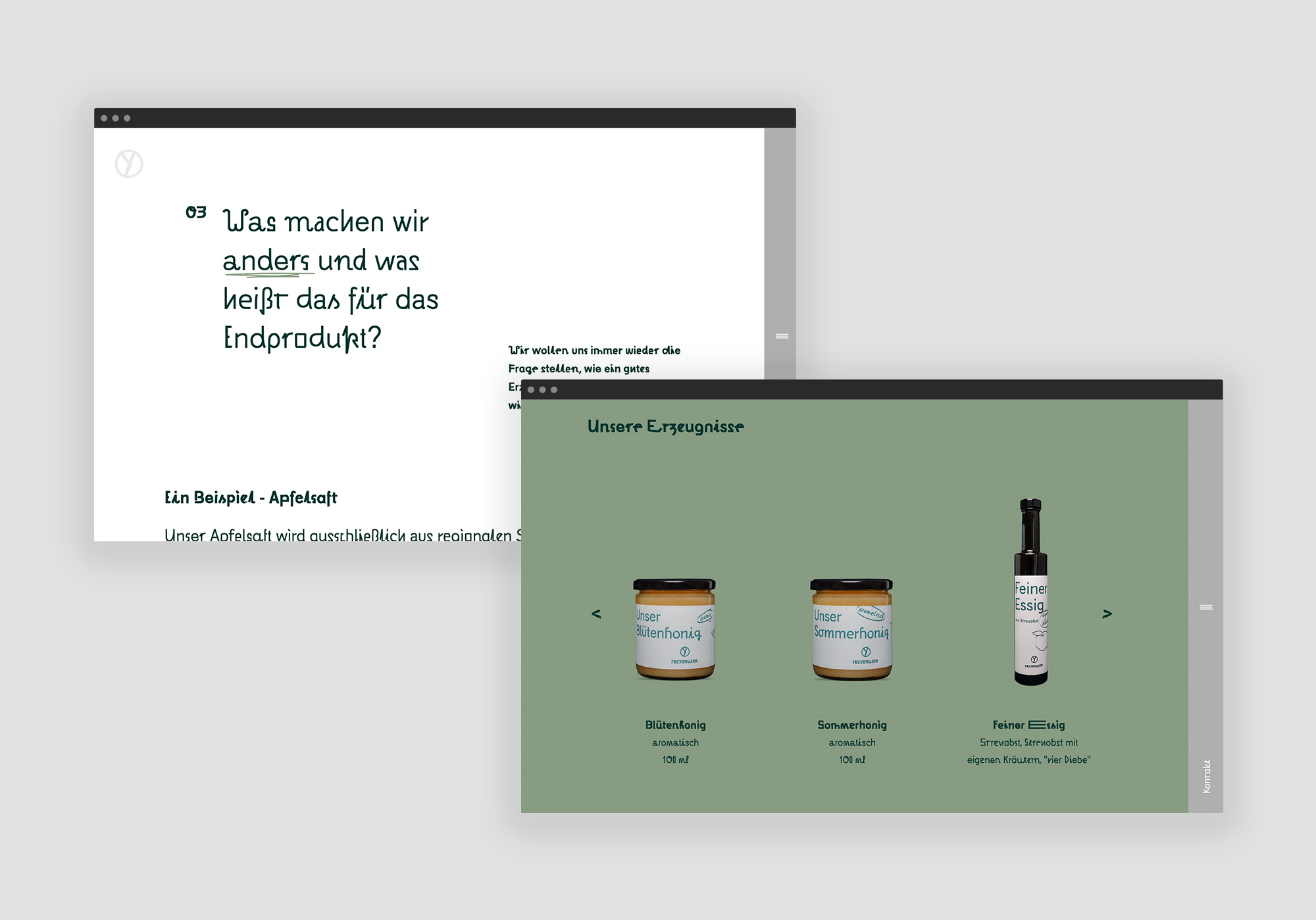
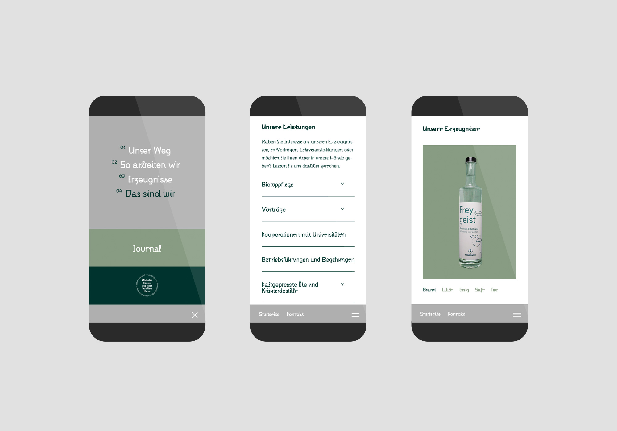
The Freybauern, or Frey farmers, produce in the true sense of the term sustainability: ecologically, socially and economically. Their fields are a source of food as well as a biotope for the protection of species.
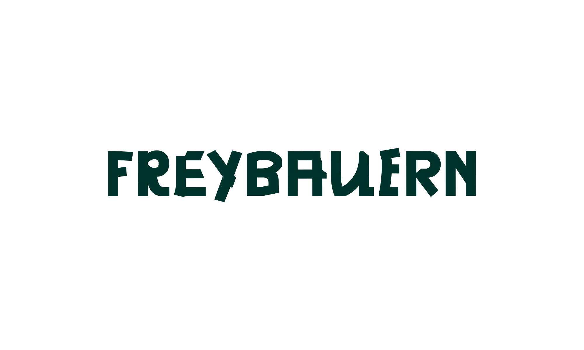
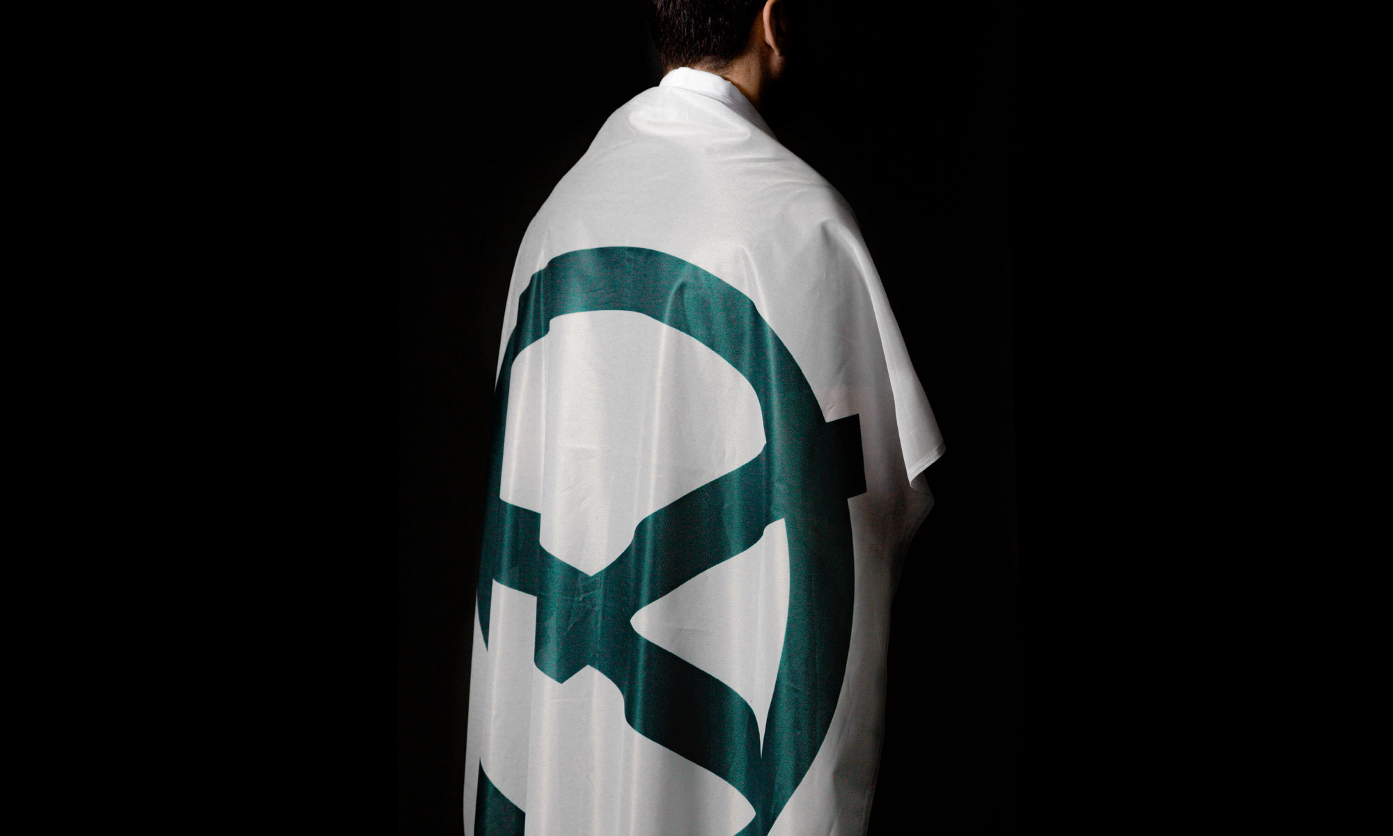
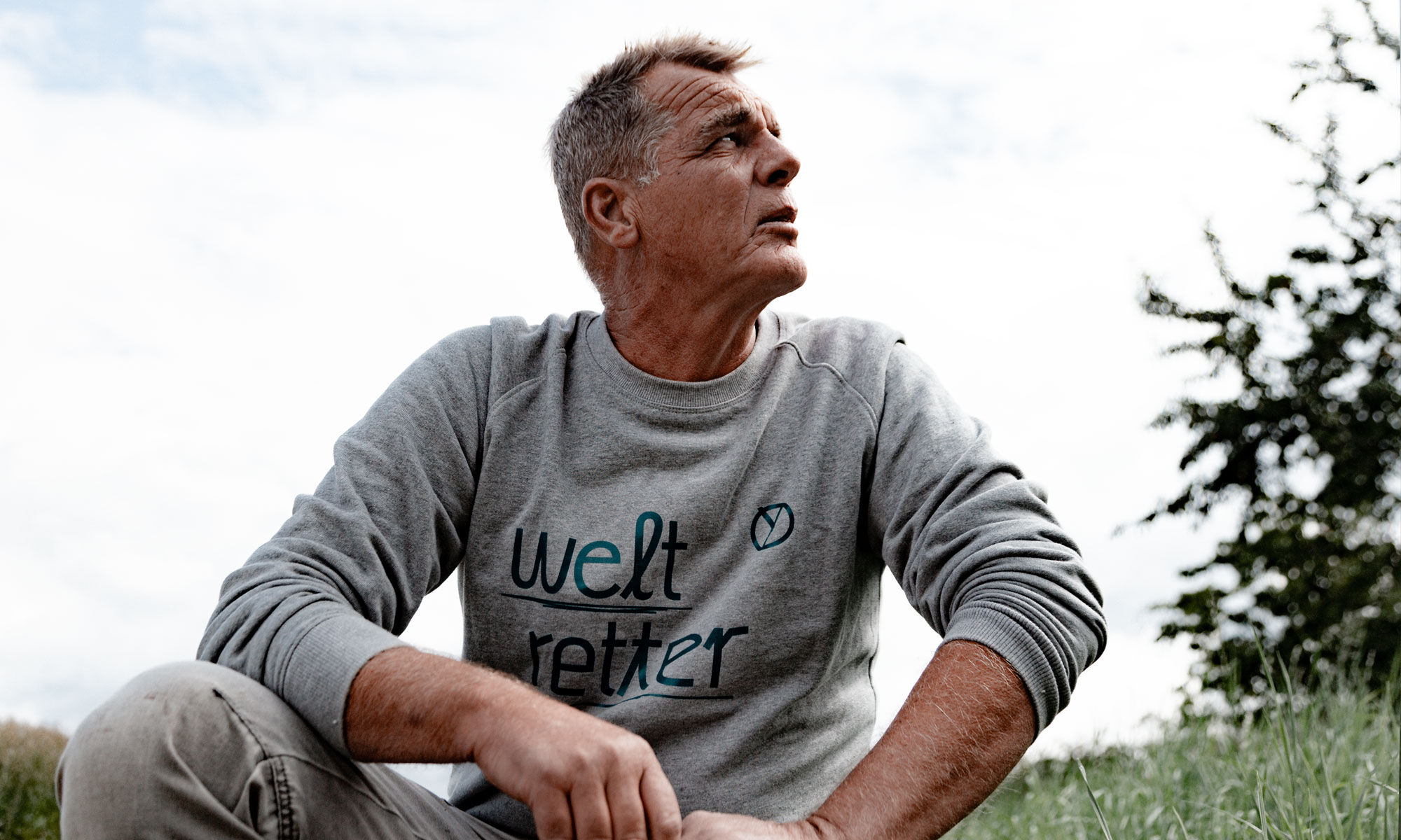
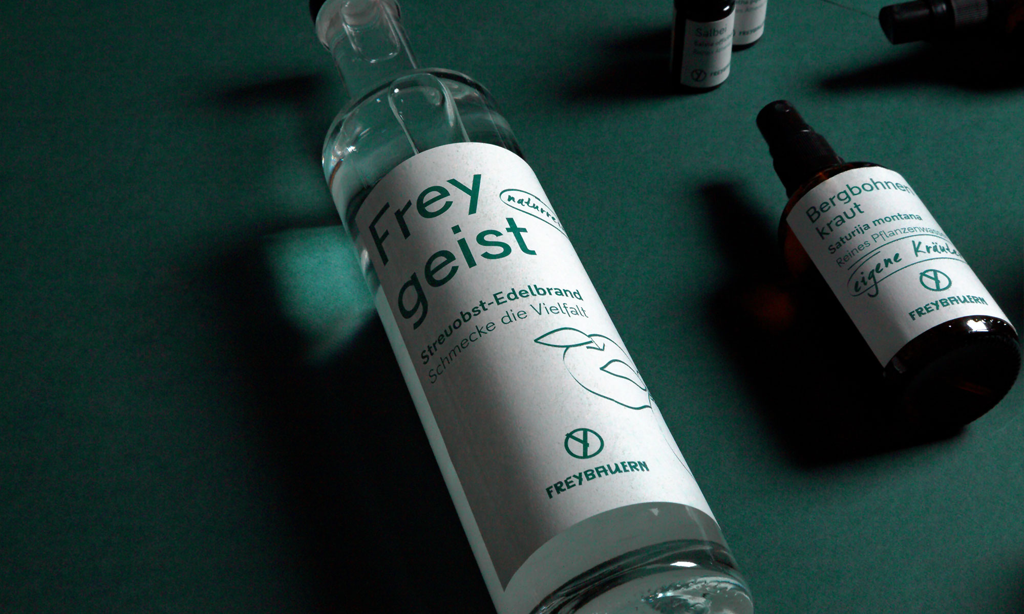
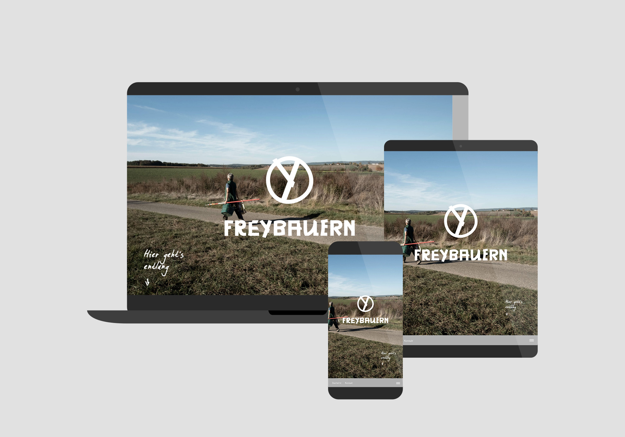
This premise applies to the corporate design: the Freybauern have an opinion. The unconventional typo, Massimo Grafia, underscores the edged and industrious character. The packaging designed conveys the purity and authenticity of the produce. The office stationary of embossed natural paper uses colors that are earthy and close to nature.
CREDIT
- Agency/Creative: papa tom
- Article Title: Corporate Design for Freybauern
- Organisation/Entity: Agency, Published Commercial Design
- Project Type: Identity
- Agency/Creative Country: Germany
- Market Region: Europe
- Project Deliverables: Brand Design, Brand Identity, Brand Naming, Brand Strategy, Brand World, Branding, Graphic Design, Illustration, Packaging Design, Tone of Voice
- Industry: Agriculture
- Keywords: farmers, graphic design, web design, packaging, business card, natural paper, natural, biodiversity, agriculture, visual design, logo, corporate design
FEEDBACK
Relevance: Solution/idea in relation to brand, product or service
Implementation: Attention, detailing and finishing of final solution
Presentation: Text, visualisation and quality of the presentation


