


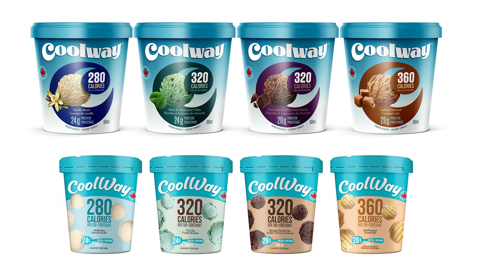
Coolway is a guilt-free frozen dessert that contains around 300 calories, but each scoop has the same taste as regular ice cream, with less sugar and more protein.
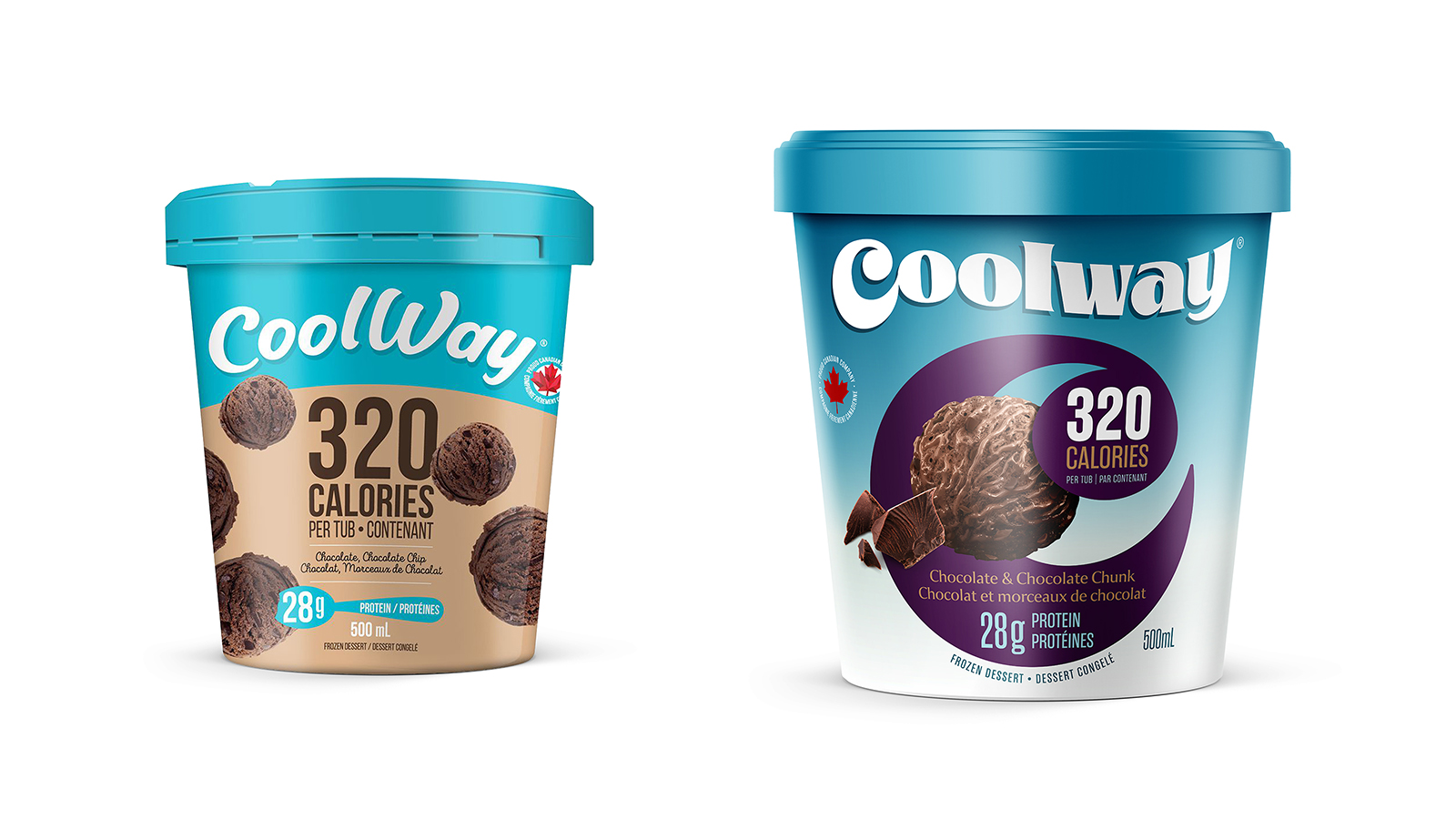
With that in mind, we wanted to emphasize the fact that Coolway is not a compromise for the taste buds and move away from the austerity and banality of the old packaging. Rather than adopting a generic and dull personality, Coolway needed a serious revamp to connect with its audience and to compete on an equal footing with traditional ice cream brands.
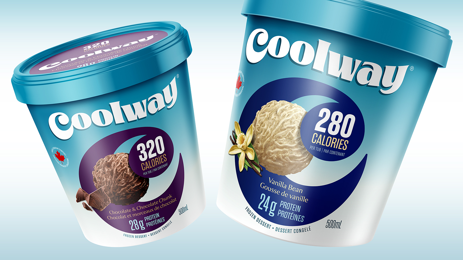
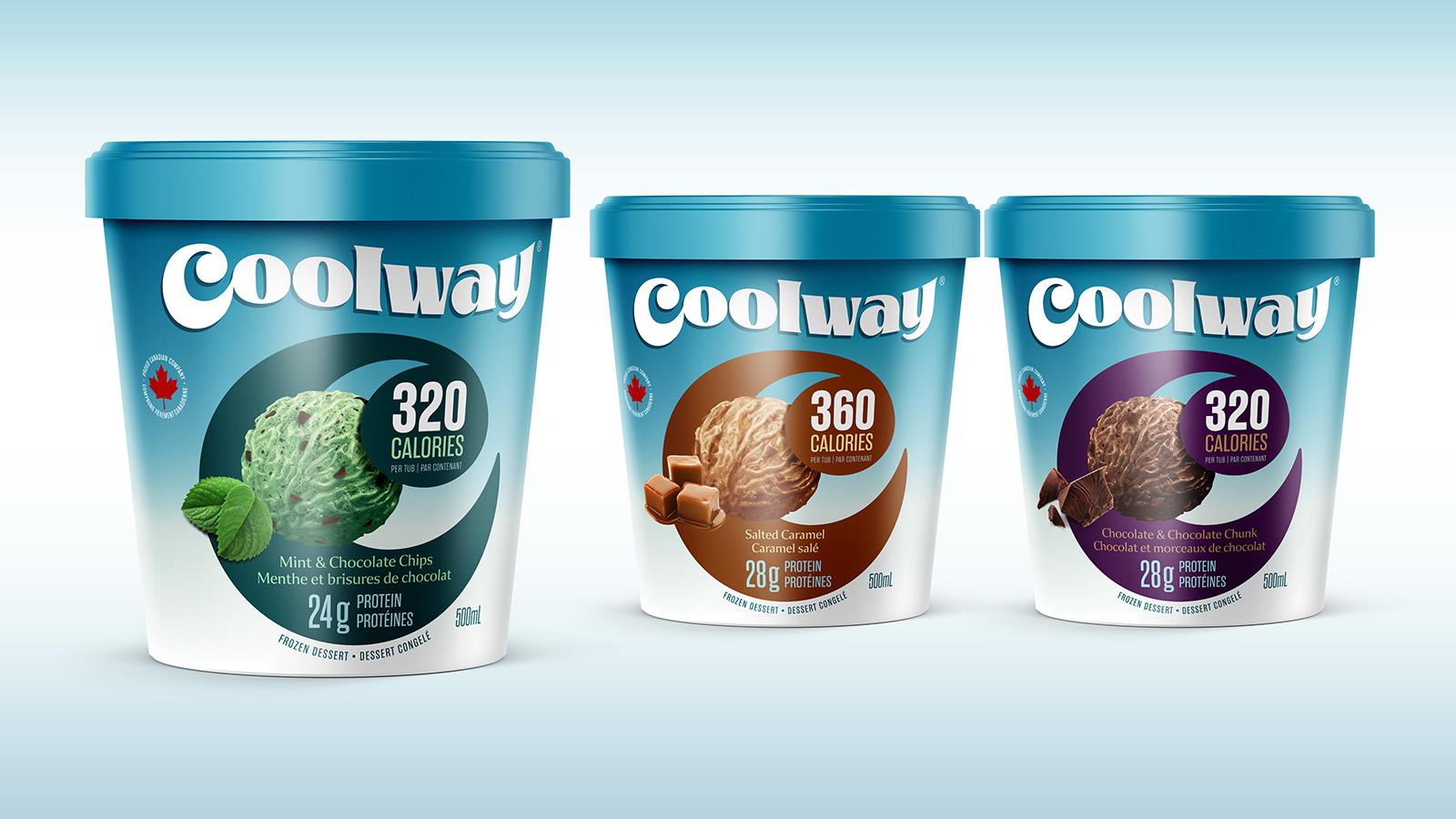
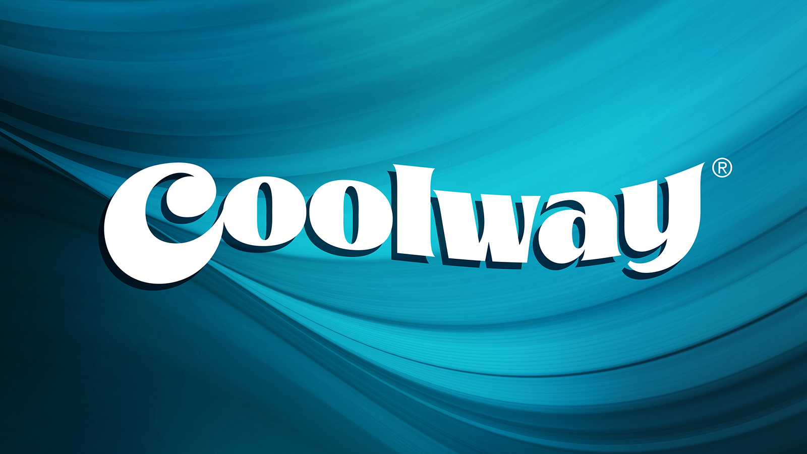
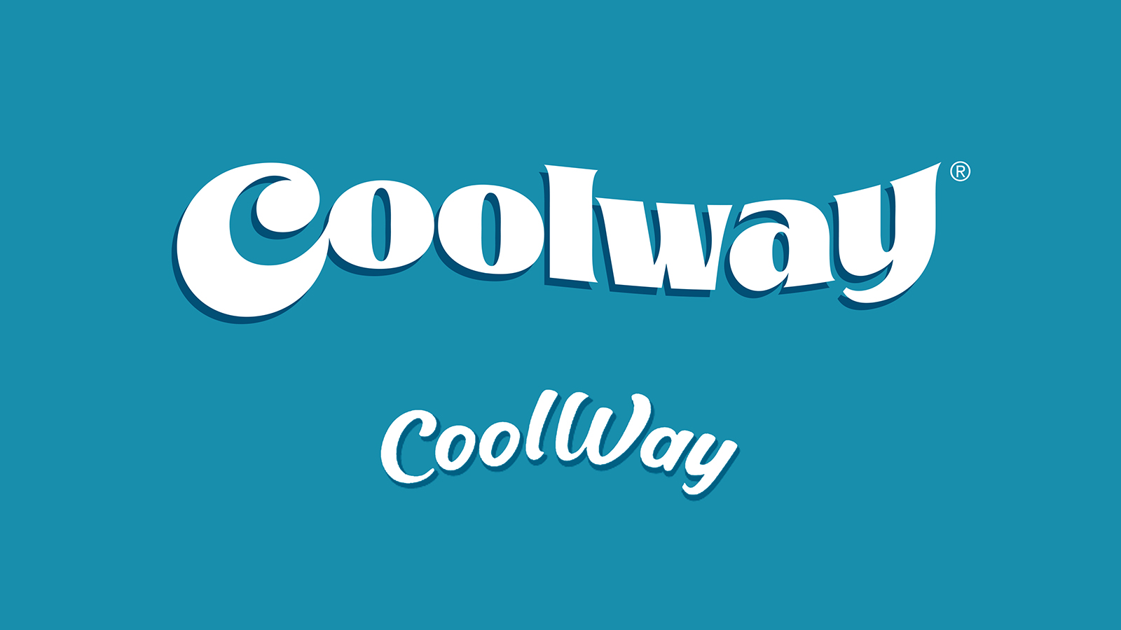
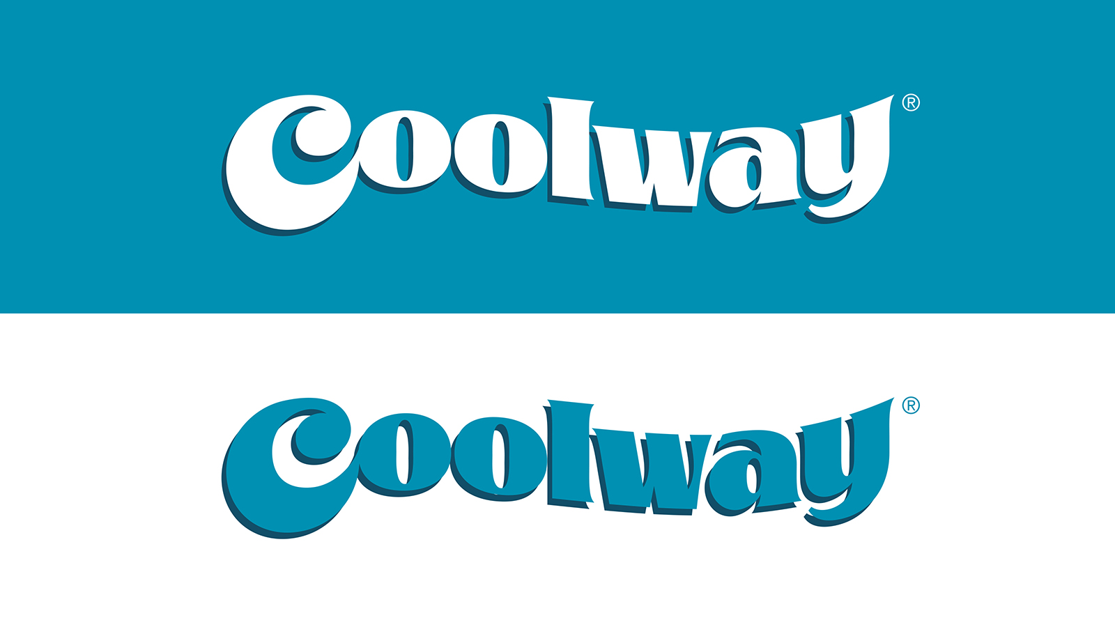
That’s why we created a vibrant and highly distinctive new brand signature, with the initial C representing a scoop of ice cream being rolled by a spoon. Additionally, as the containers are relatively small, it was imperative to focus the ice cream presentation through a single scoop, rather than scattering tiny scoops floating around the packaging, like visual parasites with no effect on appetite appeal.
The C monogram of the brand signature is used as a strong, striking visual target that immediately commands attention, distinguishing the brand from its competitors and elevating the premium aspect of the brand, while also serving as a color-coded identification of the variant.
Thanks to an in-depth strategic approach, the aesthetics and impact of this new design solution are harnessed to make the brand relevant to target consumers aged 24-45.
Every graphic element and descriptor are now carefully calibrated to optimize the hierarchy of information inherent to the brand attributes.
The result is a brand whose visual personality now communicates its premium positioning and conveys appetite appeal instantly, becoming a desirable sweet snack, whatever the time of day.


CREDIT
- Agency/Creative: Roberge Design & Branding
- Article Title: Coolway – a Brand Redesign Whose Visual Personality Now Matches Its Name: Isn’t That Cool!
- Organisation/Entity: Agency
- Project Type: Packaging
- Project Status: Published
- Agency/Creative Country: Canada
- Agency/Creative City: Montreal
- Market Region: North America
- Project Deliverables: Brand Identity, Brand Strategy, Packaging Design, Rebranding
- Format: Pot
- Industry: Food/Beverage
- Keywords: ice cream, Coolway, rebranding, packaging design,
-
Credits:
Creative director/designer: André Roberge


