Coolhaus creates the ice cream of your wildest dreams! Inventive, fun and playful flavors and texture combinations delivered with the most welcoming and friendly personality that celebrates individuality.
This ice cream company has the most inventive ice cream flavors on the market, each one delivering fully on taste & texture. They’ve delivered it for the last 10 years with a great sense of edginess, fun and celebration of individuality — people from all walks of life coming together for the love of great ice cream.
Overall, their visual identity was somewhat confusing. There was a lot of energy, but it was a little chaotic, without a clear hierarchy or focus of communications. They were relying solely on black & white typography and illustrative “drips” as brand elements, so there was a lot of copy without much structure.
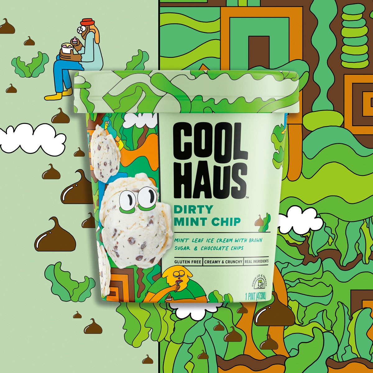
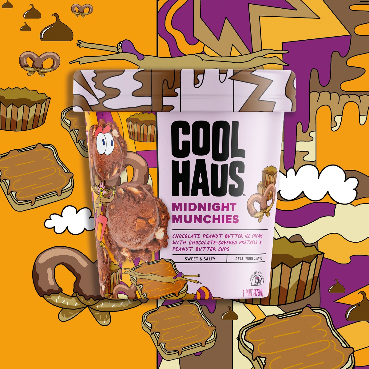
As we developed a new look for Coolhaus, we wanted to maintain some of the visual contrast that originally existed, so we developed a new black logo with strong legibility with flexibility to be used either vertically or horizontally to ensure primary visibility in all brand expressions.
Our next objective was to create a clear hierarchy of communications, so
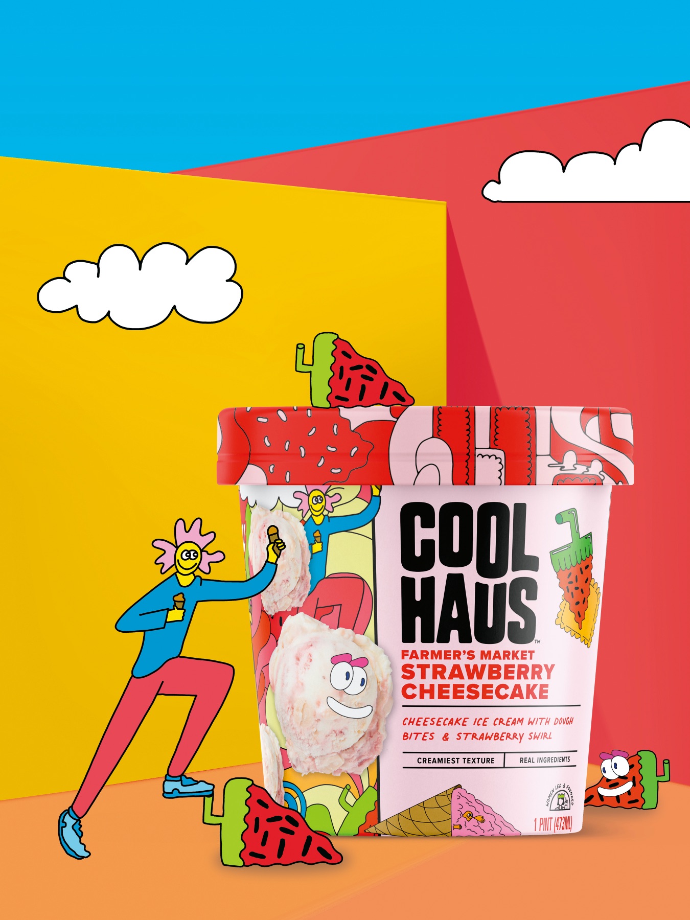
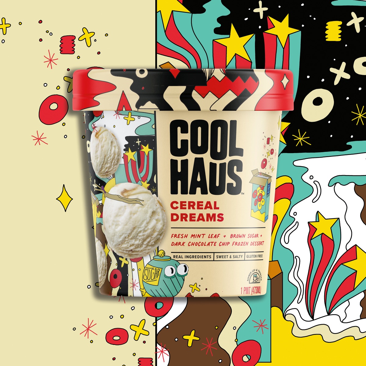
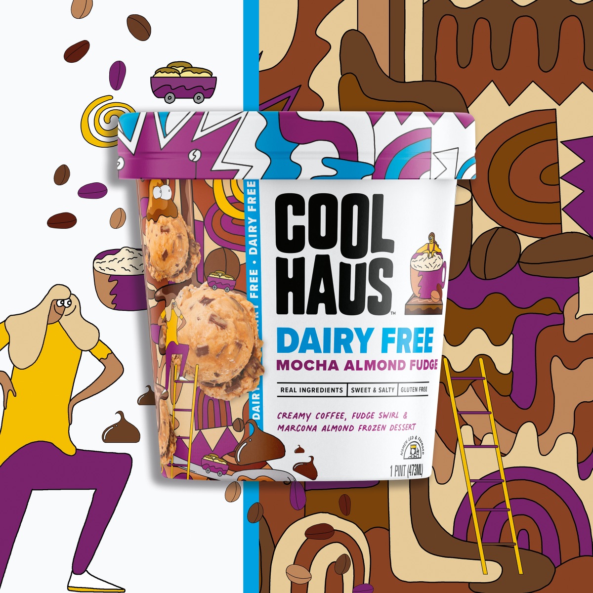
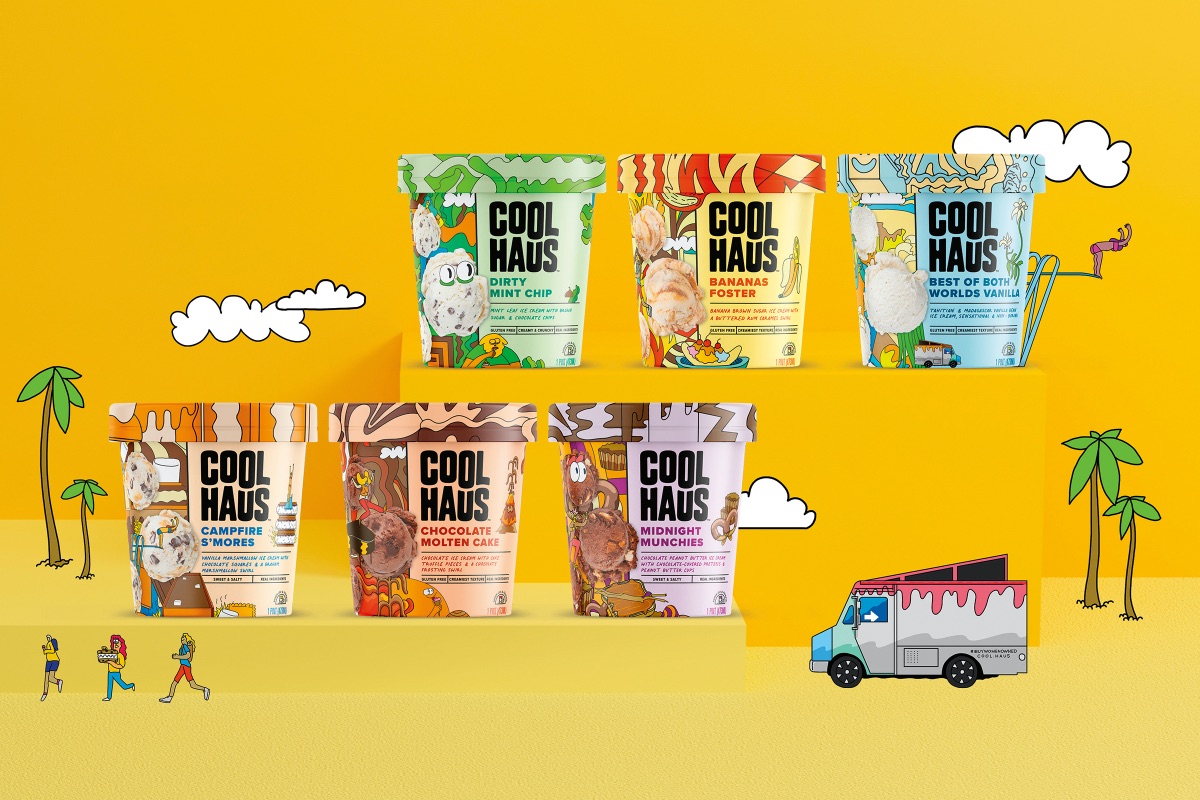
shoppers can find his or her favorite flavors. We used clean & easy to read typefaces to list the colors and changed them to vibrant colors that relate to the flavor of ice cream.
Flavor descriptions used a much smaller, casual typeface to enhance the flavor name, but it’s distinctly smaller on purpose to not confuse with more important communications.
All three of the above elements (logo, flavor name and flavor description) are left aligned, top to bottom, so there’s an easy flow from one to the next.
Next we tackled taste appeal. We employed pastel, creamy colored backgrounds that enhanced flavor and texture. We included photography, but then to make it ownable to Coolhaus, we integrated creamy-dreamy illustrations with pops of crunch and punch courtesy of artist Mike Perry to make each flavor its own ice cream world.
To further enhance the Coolhaus personality, Mike created characters, ice cream eyes and other “stickers” specific to the story of Coolhaus and founders Natasha and Freya.
The overall effect is full of flavor and fun, with far more shopping ease than before.
CREDIT
- Agency/Creative: BexBrands
- Article Title: Coolhaus Ice Cream Rebrand by BexBrands
- Organisation/Entity: Agency
- Project Type: Packaging
- Project Status: Published
- Agency/Creative Country: United States
- Agency/Creative City: San Diego
- Market Region: North America
- Project Deliverables: Packaging Design
- Format: Pot
- Substrate: Pulp Carton
- Industry: Food/Beverage
- Keywords: WBDS Agency Design Awards 2021/22
-
Credits:
Artist: Mike Perry
Client/Founder: Natasha Case
Client/Marketing Director: Kristi Fanning
Creative Directors: Becky & Jeremy Dahl
Designers: Molly Mann, Ian de Lemos
Copywriter: Lindsey Bro


