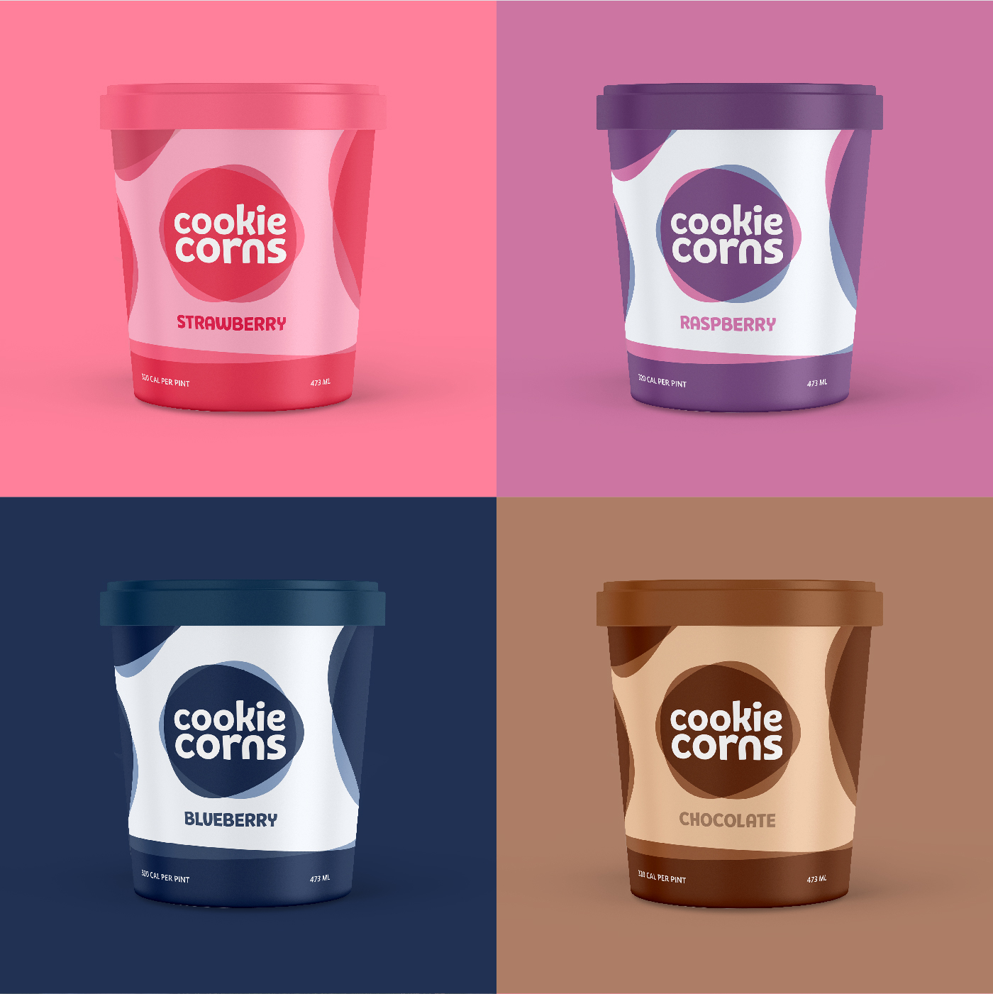
Overview: Cookie Corns is more than ice cream shop or products, it’s a family place where you can come with your family and have fun and good family time by eating their unique ice cream with your family.
Brand: I start visual identity work with deep research of brand metaphors and attributes. Cookie Corns came up with twenty main attributes to describe themselves, and for each attribute, I had five supporting descriptions. I narrow down the attributes to five strong attributes: friendly, youthful, colorful, simple, and playful.
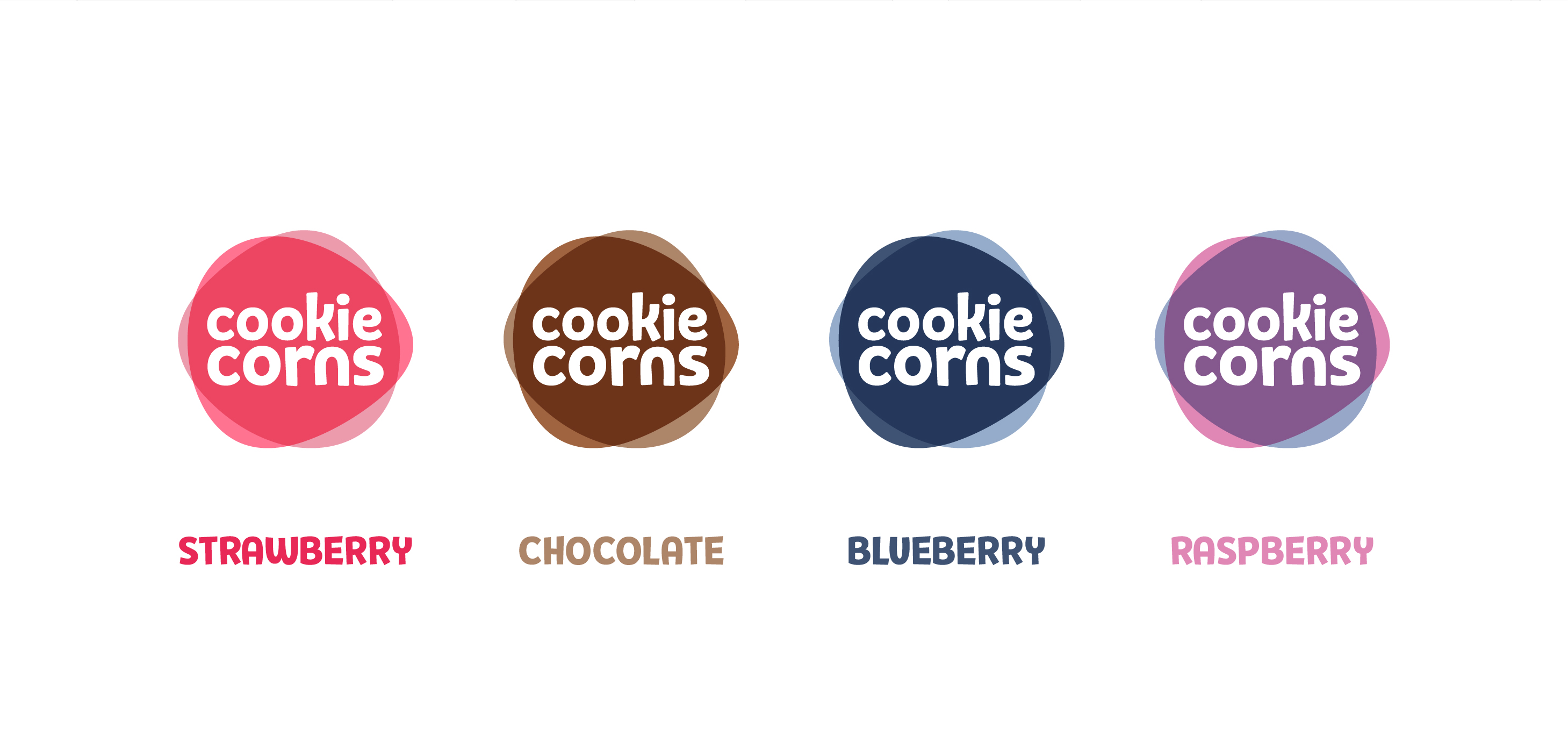
Logo Design: As creatives say, the design is about details. To get the right feeling of a visual brand identity even the roundness of corners matters, and sometimes that leads to a design challenge, as it was in our case. The typeface is born to be sharp and edgy. At the same time, Cookie Corns is friendly and hard shapes are in conflict with Cookie Corns’s mood. Defining the shape took more time than usual, but at the end of the day, I successfully overcame this challenge by customizing the typeface to make it connect with the brand attributes. I double-check everything to make sure that the final logo looks balanced and solid measure, and it’s able to work on different sizes and responsive to work in different places.
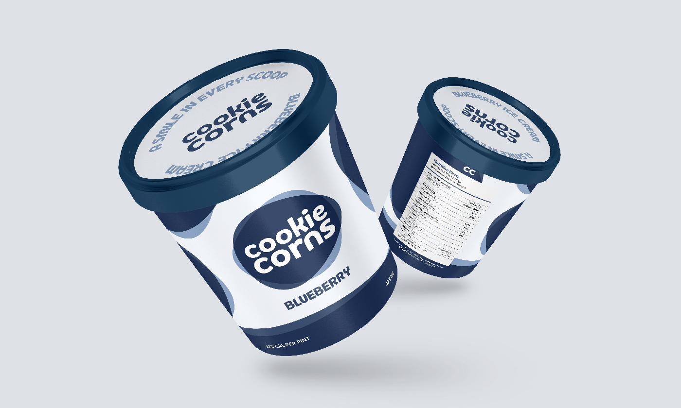
Packaging Design:Product packaging design can play an important role in helping people remember your product and in increasing brand awareness. Packaging becomes a silent salesman for your product. Proper product packaging design provides people with the right first impression even before they pick your product up from the store shelf. Also, when the shelf is stocked with several similar products, the right packaging can help you stand out from the rest. I attractively design the packaging and exhilarating look when consumers see it, and I colorfully designed the four packages to support the message that we want to convey, and the first impression of playfulness and friendliness.
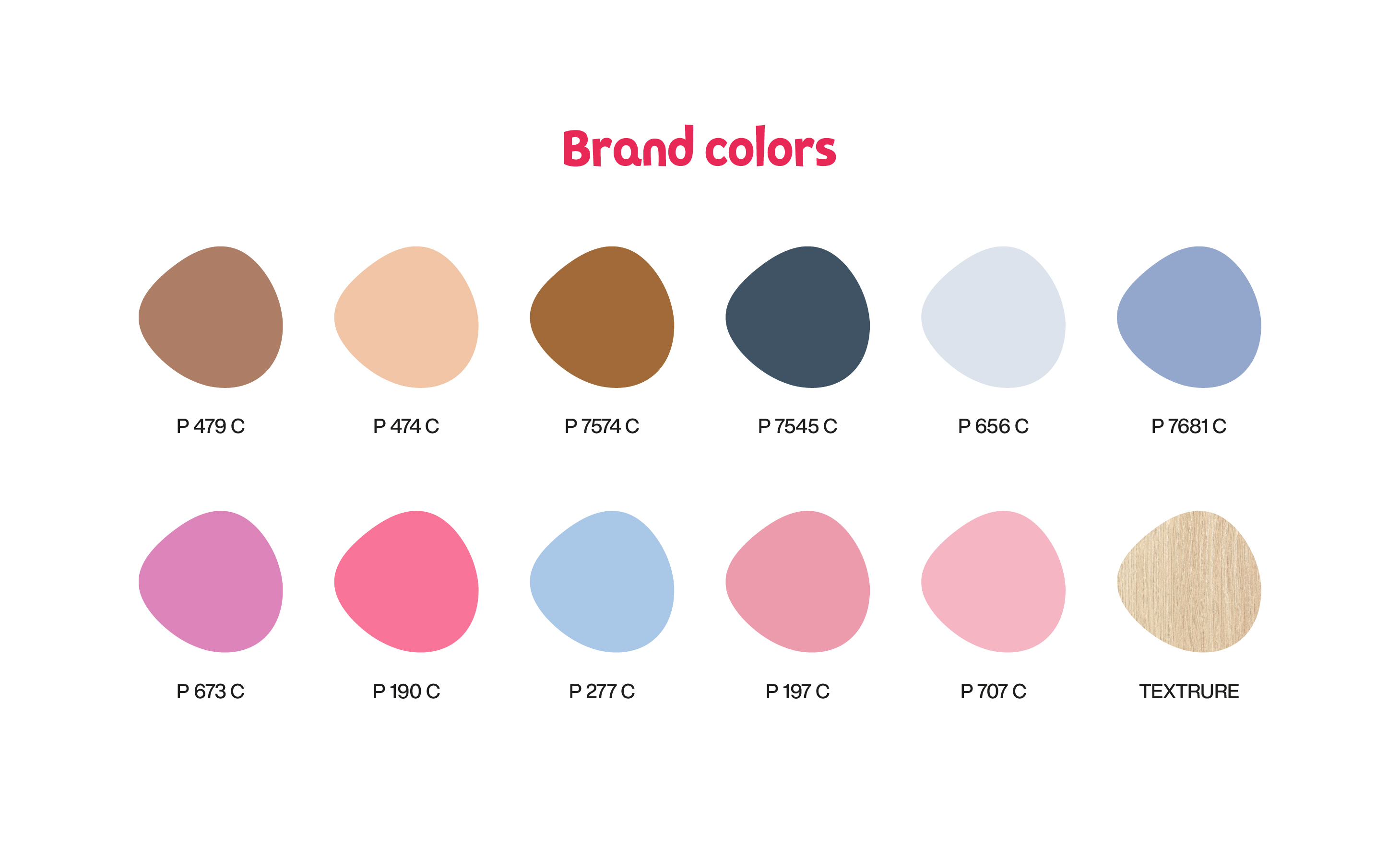
Brand Colors: Colors can set your business visually apart from your competitors. However, the colors should be capable of setting the right tone and deliver the message about what your product is. To differentiate each ice cream flavor variant, I distinguish through the color of the label on the package. I chose the colors inspired by the ice cream flavors: chocolate, blueberry, raspberry, and strawberry.
CREDIT
- Agency/Creative: Elbassraoui Yassine
- Article Title: Cookie Corns Ice Cream Packaging Design
- Organisation/Entity: Freelance, Published Commercial Design
- Project Type: Packaging
- Agency/Creative Country: Morocco
- Market Region: South America
- Project Deliverables: Brand Creation, Brand Guidelines, Brand Identity, Brand Naming, Branding, Graphic Design, Identity System, Packaging Design, Product Naming, Tone of Voice
- Format: Cup, Tube
- Substrate: Plastic


