


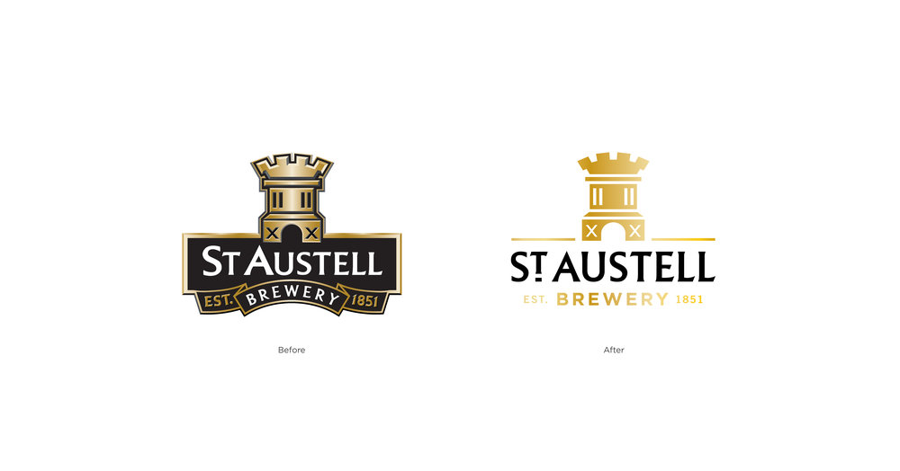
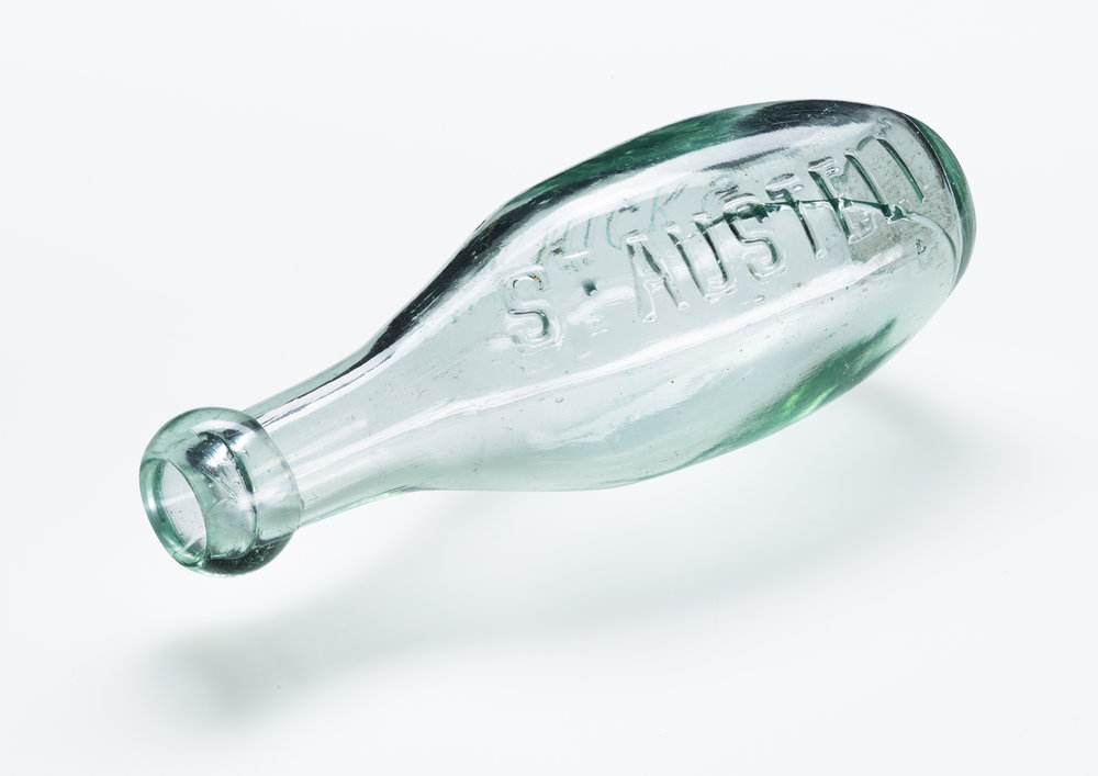
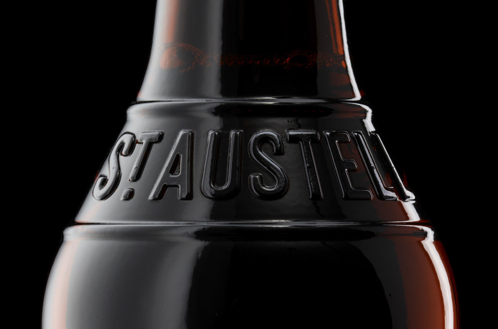
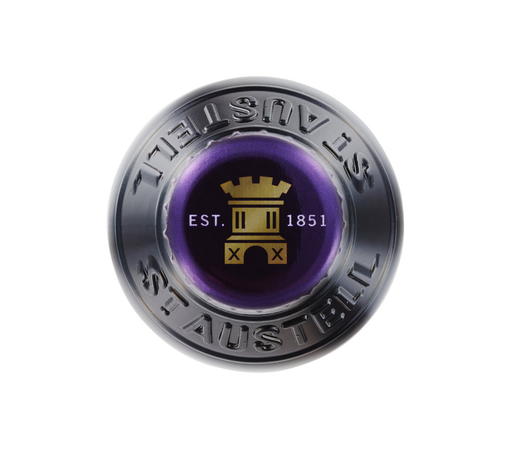
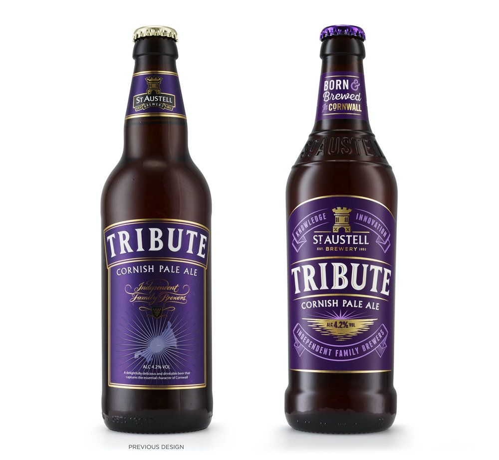
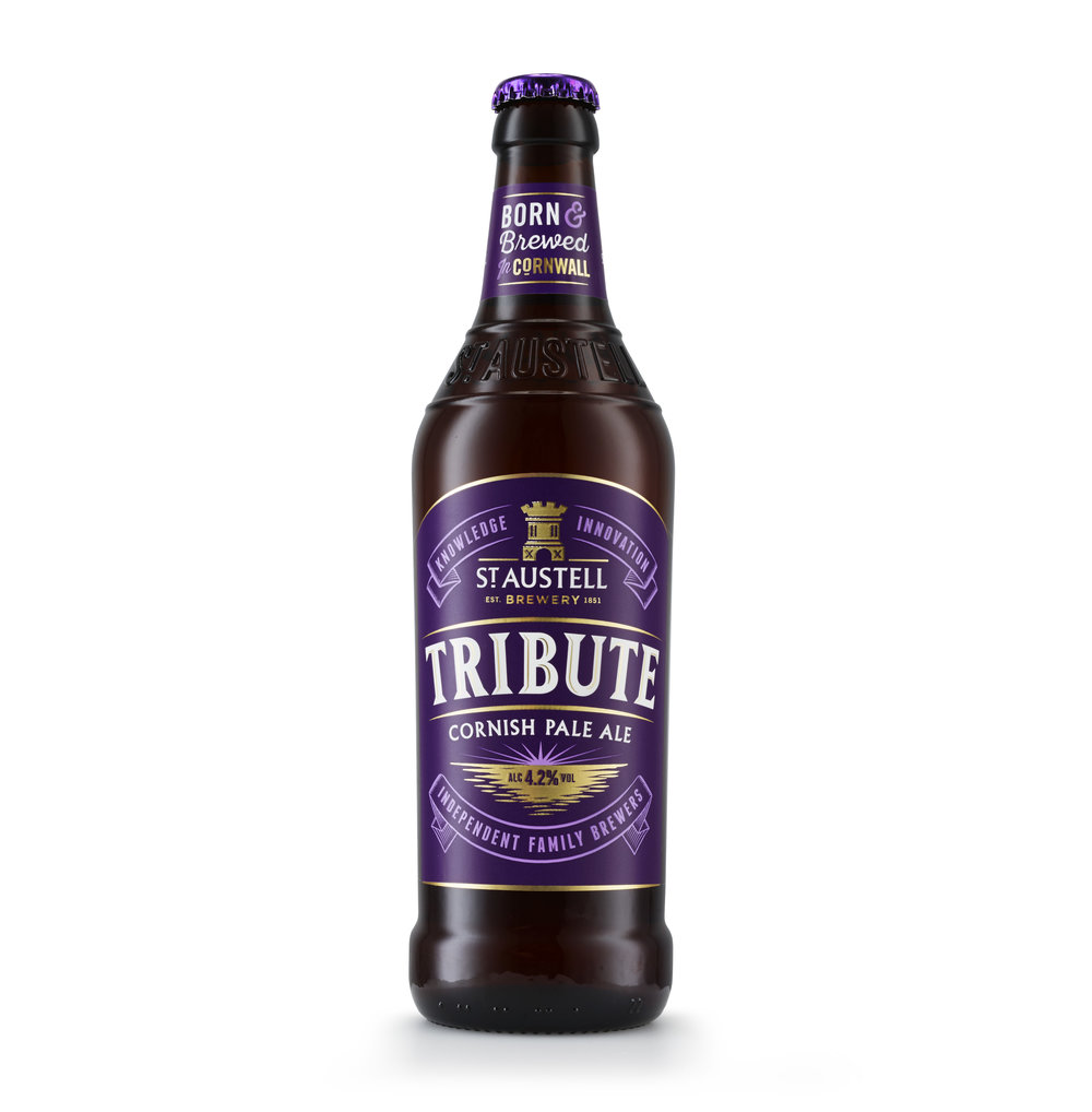
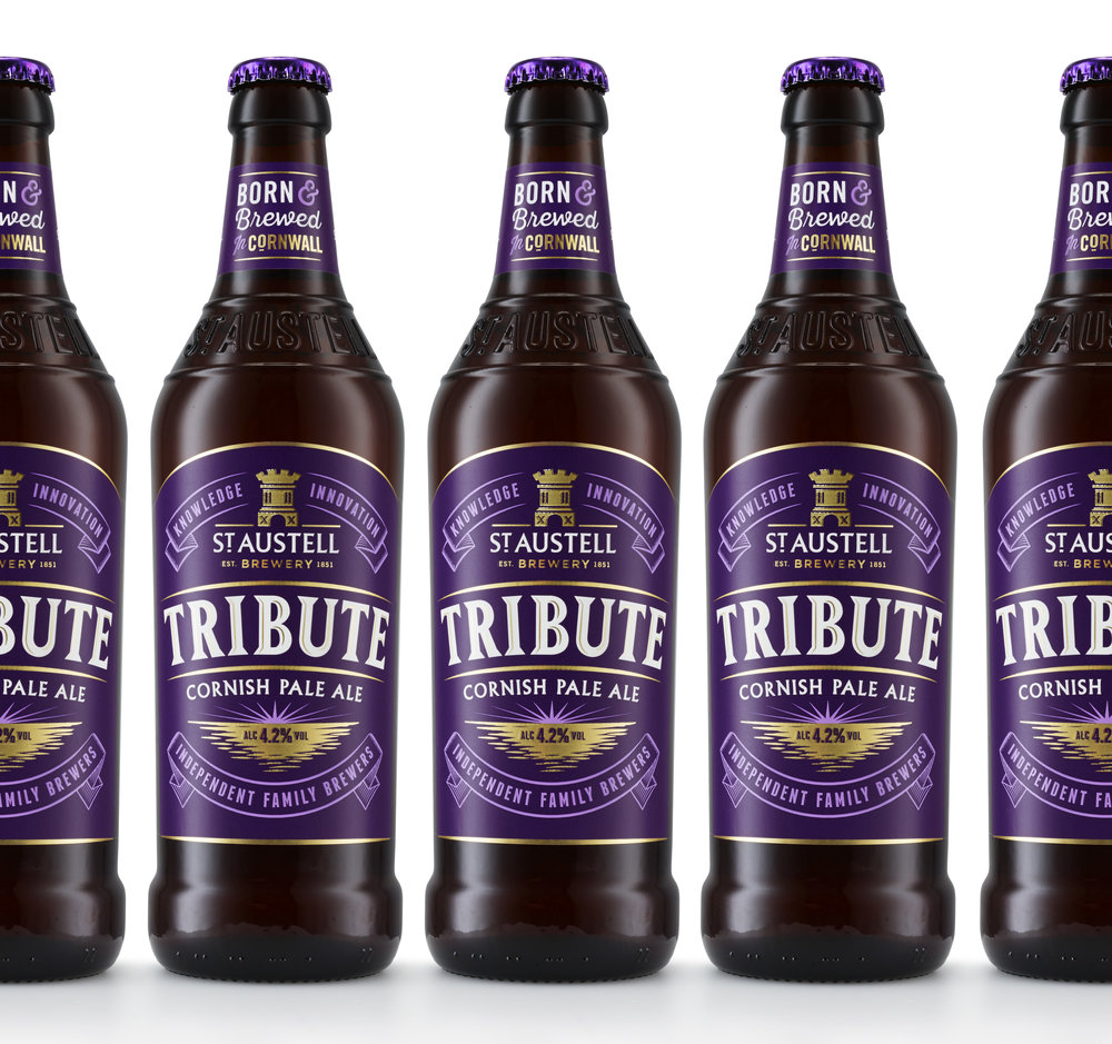
” CookChick Design win a 3 way creative pitch to redesign St Austell’s branding & beer packaging.CookChick Director Lee Cook comments:“ We are very excited to be working with St Austell brewery and the Tribute brand. A long-term favourite in the southwest has now become one of the fastest growing premium cask ale brands in the UK.This independent brewer is fiercely proud of its Cornish origins and brewing history – and quite rightly so. Founded in 1851, the company is still family owned and run.Our approach was to galvanize St Austell Brewery’s knowledge and integrity, but also reflect a more innovative approach by this much-loved local brewer”.CookChick were commissioned to undertake three parts of a brand & packaging overhaul: St Austell Brewery brand identity refinement, creation of a highly individual 500ml bottle and revitalization of the beer branding across their core and craft beer portfolio.St Austell IdentityThe brand identity for St Austell has been simplified back to the key elements whilst still retaining its immediate recognition. This has contemporized a very traditional looking logo into a more flexible rendition along with a short hand version for use on the bottle crown caps and small use applications.The underpinning ‘-’ within ‘ST’ has been reintroduced from an earlier depiction of the branding found in the company’s historical documentation.Bespoke BottleInspired by a heavily embossed ‘Hamilton’ style bottle discovered in the brewery archives, “we wanted to create a distinctive point of difference in a sea of mundane brown bottles”, explains Lee. “The very pronounced St Austell shoulder embossing provides a nod to the past whilst increasing the bottle height provides stature and strong shelf visibility. With clever engineering, all of the above has been achieved within a very lightweight 500ml glass weight.””
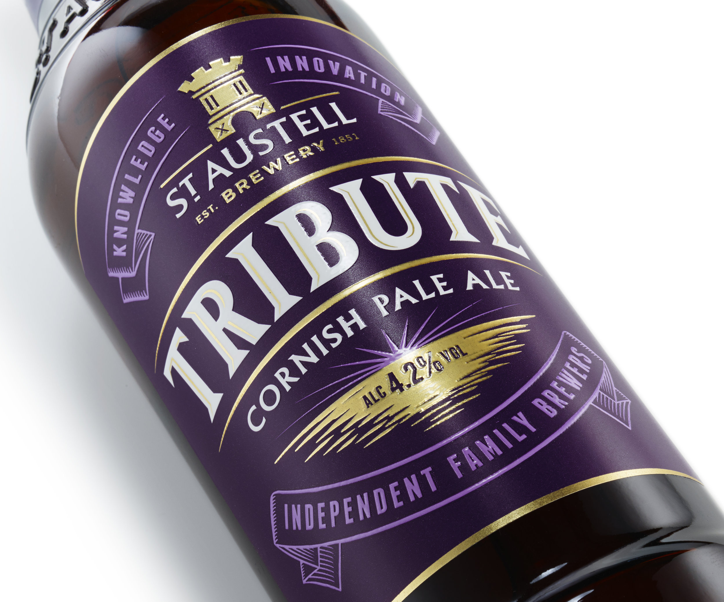
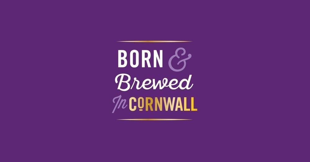
” Beer BrandingFocusing initially on the hero brand Tribute, CookChick have defined a celebratory badge that encapsulates St Austell Brewery’s values of ‘Knowledge and Innovation’ in brewing whilst reinforcing the relationship between brewer and brand.Lee Cook adds “The aim here was to imbue St Austell’s flagship brand with a stronger sense of pride and confidence…a tribute to Cornish brewing”.Each brand has a bespoke neck label statement alluding to the individual characteristics of each beer.This approach is now being applied to their full permanent range along with the introduction of a portfolio of bottled craft beers due to be launched over the coming weeks.St Austell Brewery, which is still family owned and run, is Cornwall’s largest independent brewery and one of the county’s oldest businesses and was founded in 1851.The new bottles have started to appear on supermarket shelves, in pub fridges across the country and they’re available on St Austell Brewery’s online shop.Revamped bottles of Tribute, Korev and Proper Job will start appearing first, and the other permanent beers in St Austell Brewery’s range will be launched in the coming weeks.”


CREDIT
- Agency/Creative: CookChick Design
- Article Title: CookChick Design – St Austell Rebrand
- Project Type: Packaging
- Format: Bottle
- Substrate: Glass


