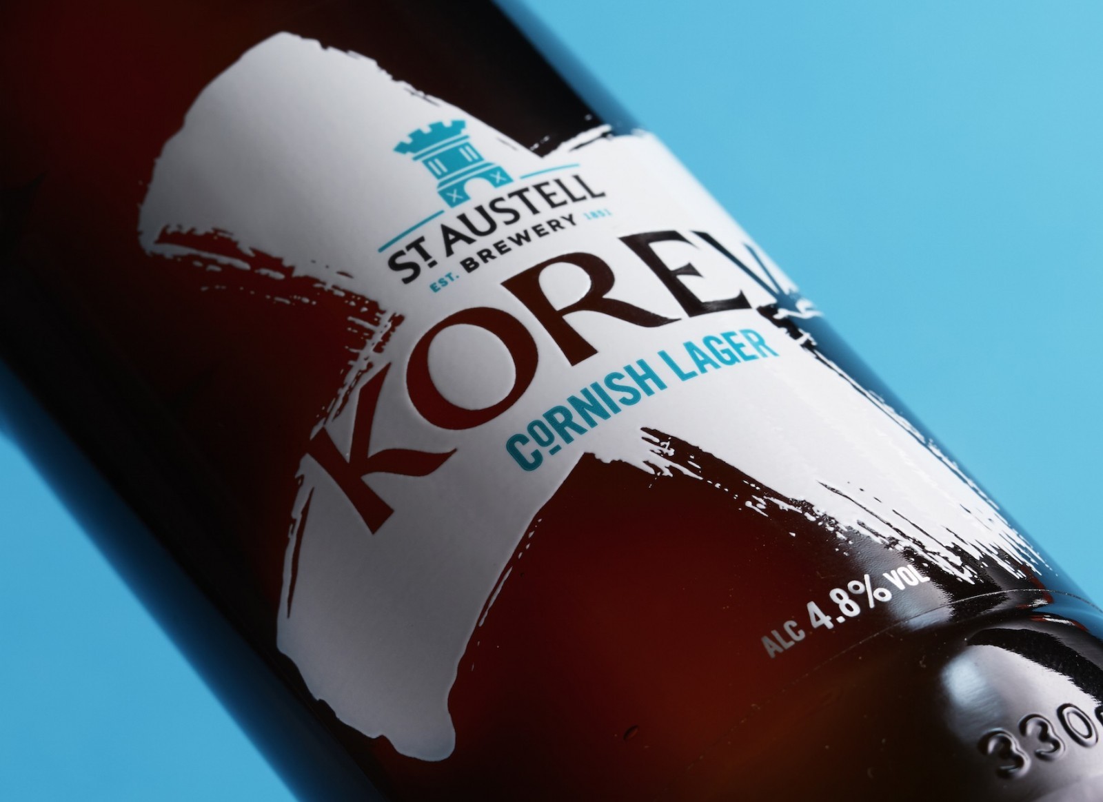
” Korev (pronounced Cor-Eff) is a traditional Cornish word meaning ‘beer’. Crafted as a Helles style lager at the St Austell brewery using the finest lager malt from barley grown locally in Cornwall.
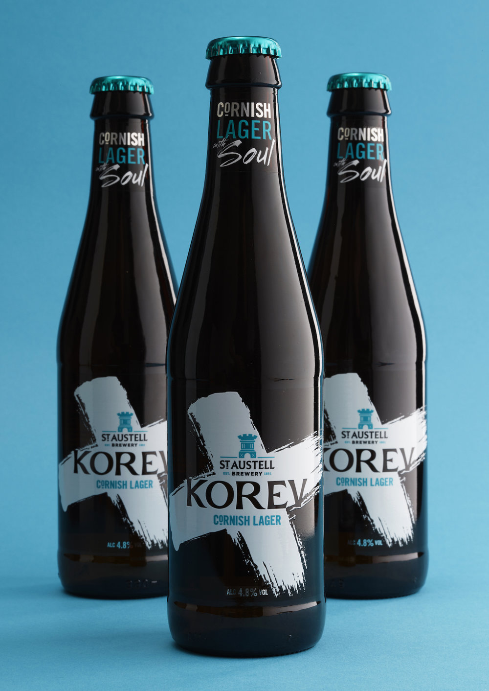
St Austell commissioned CookChick Design to rejuvenate the branding and packaging for their iconically Cornish lager.
CookChick Director Lee Cook comments:
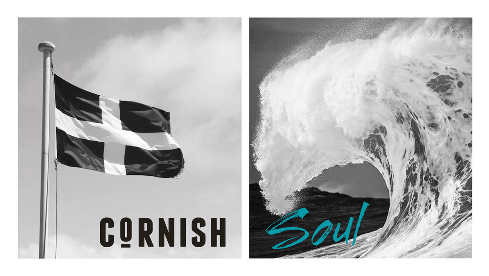
“We wanted to encapsulate the energy and distinct spirit that Cornwall owns. The most immediate icon for their fiercely independent attitude is the Saint Piran’s flag.
Combining the strength of the black & white flag with the brush stroke energy distilled the Cornish soul down to its simplest mark.”
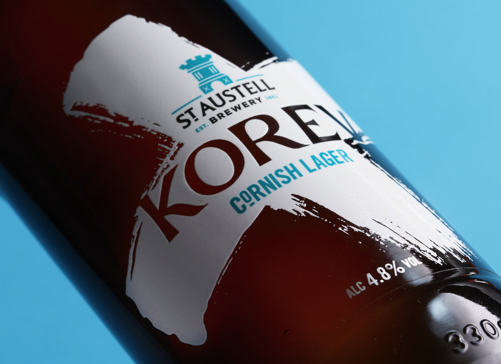
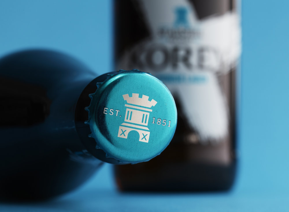
The new 330ml bottle format features direct print effect labeling with raised tactility inks.
Korev. Cornish lager with Soul.”

CREDIT
- Agency/Creative: Cook Chick Design
- Article Title: Cook Chick Design – St Austell: Korev
- Project Type: Packaging
- Format: Bottle
- Substrate: Glass


