


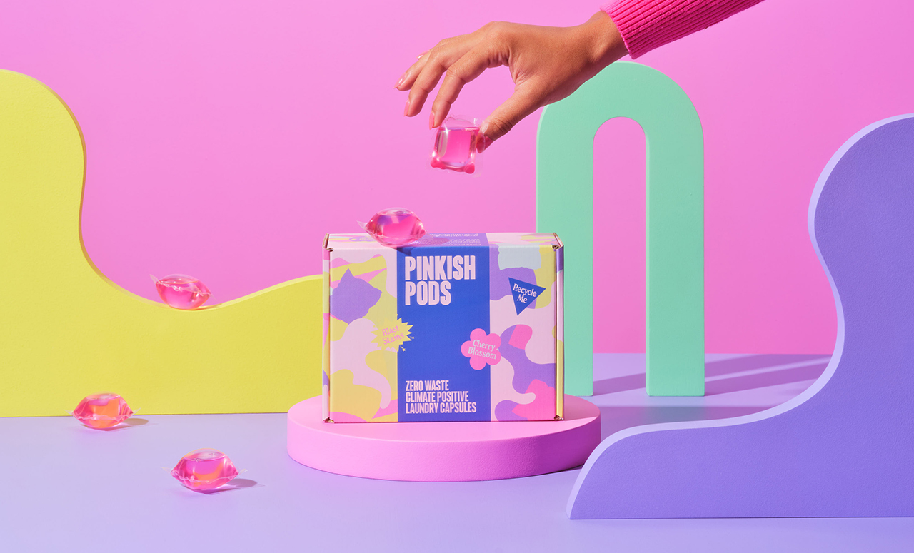
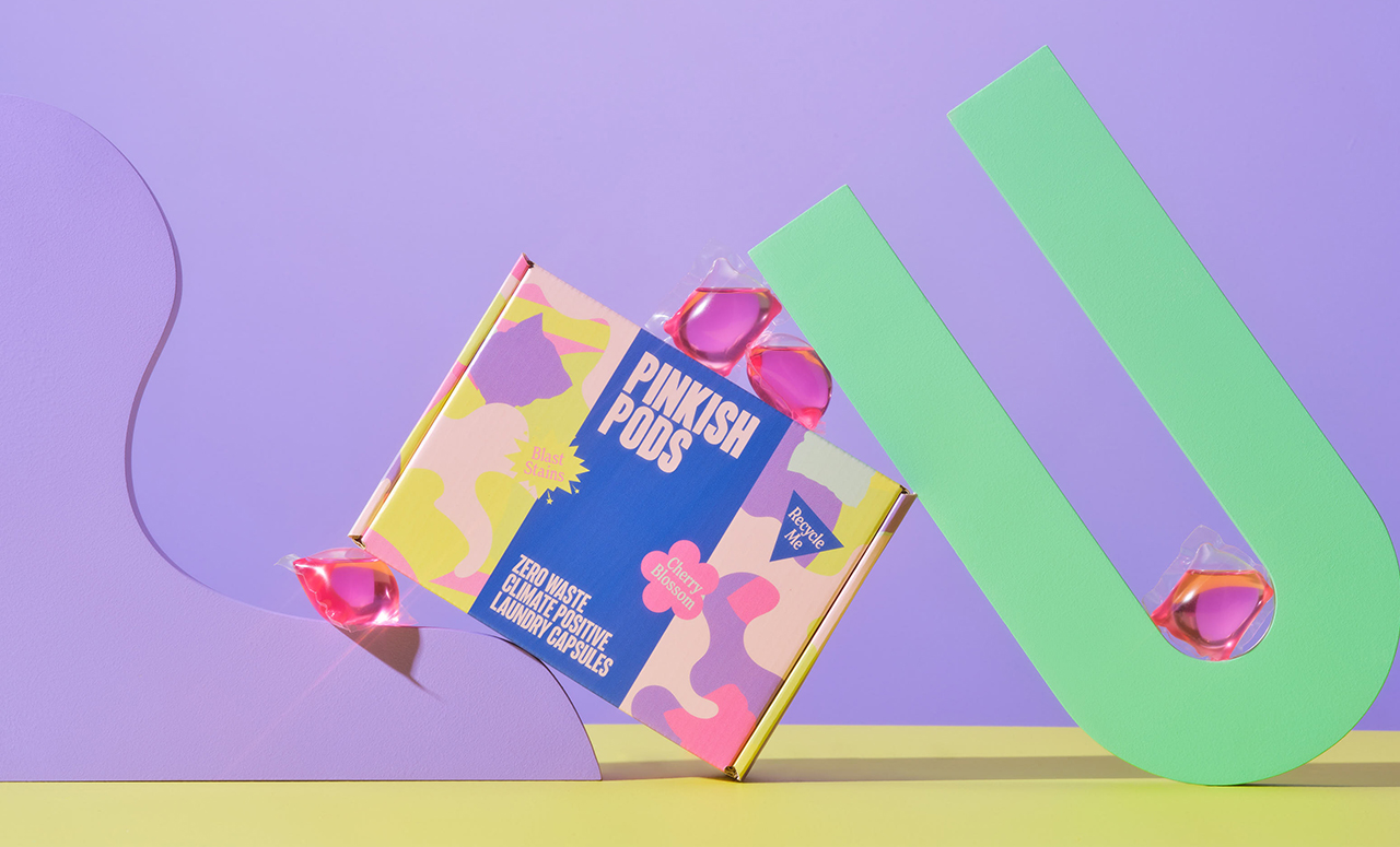
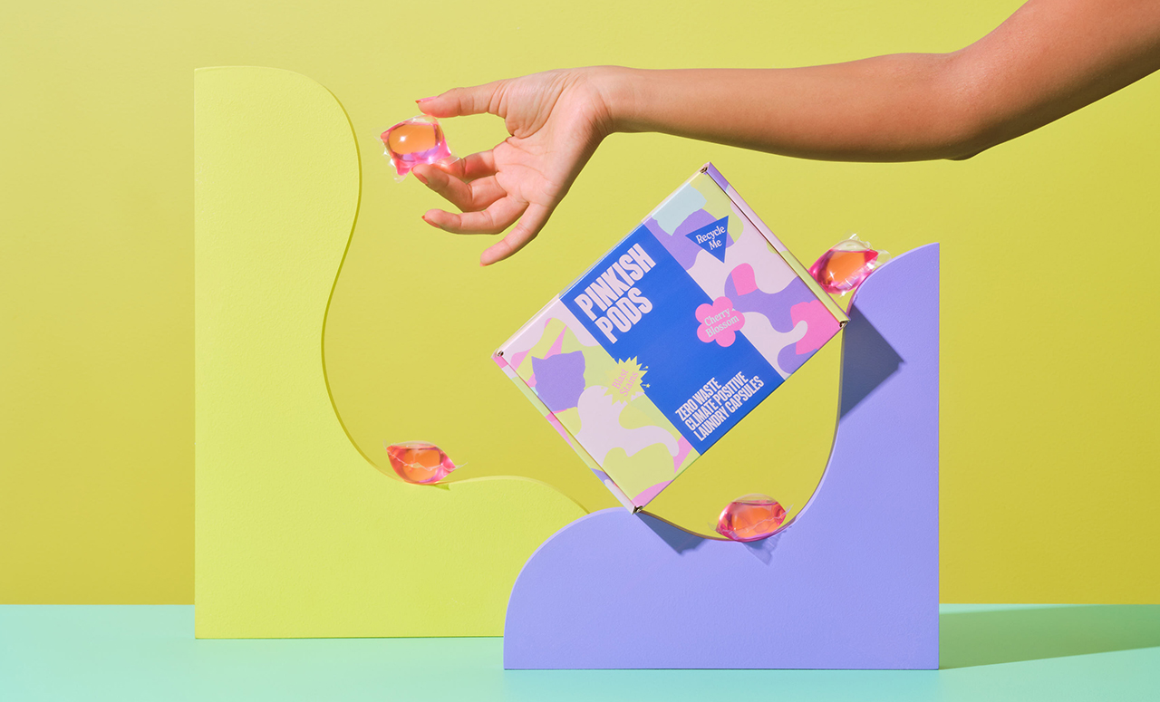
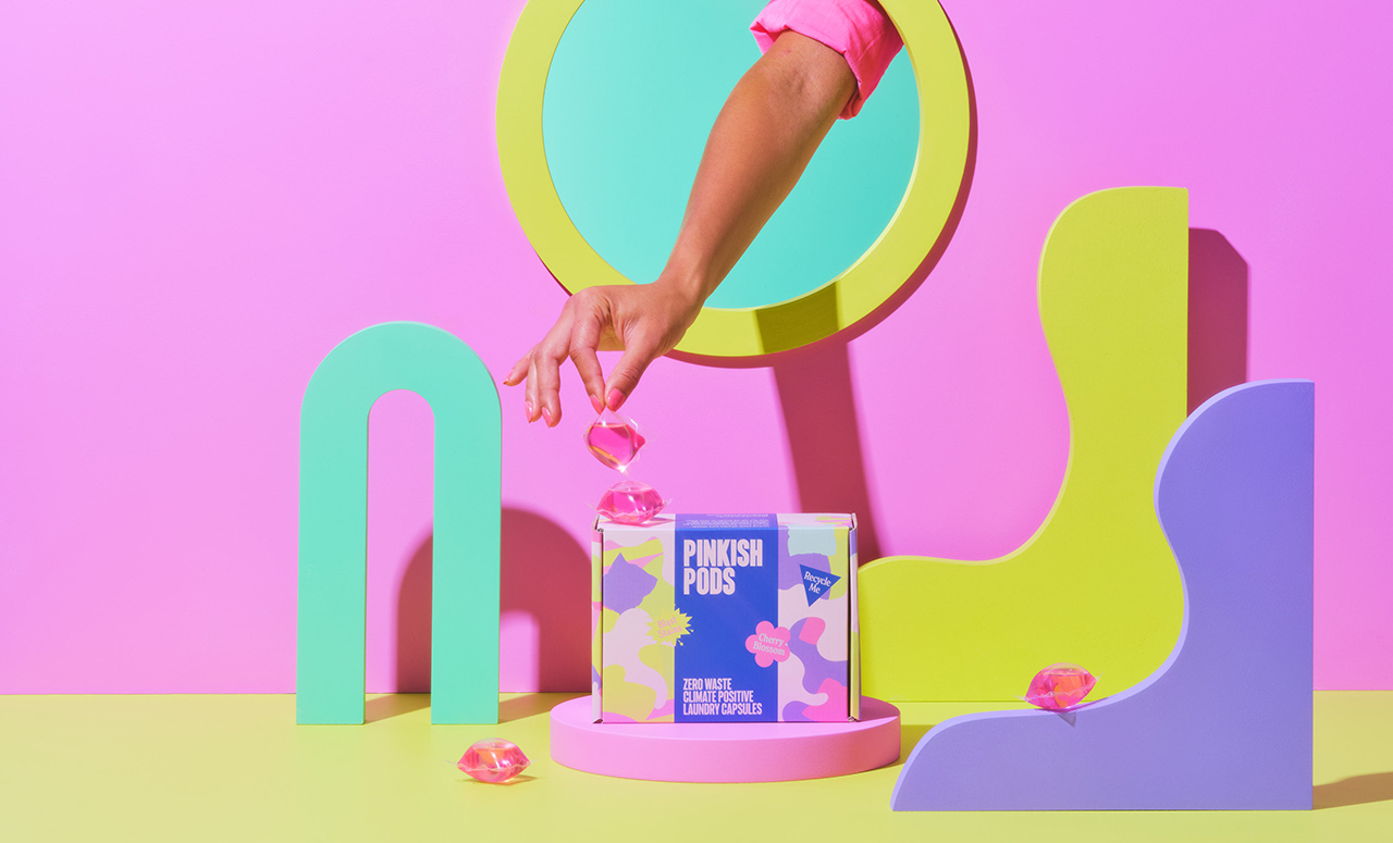
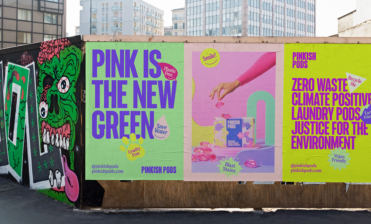
The goal of Pinkish Pods is to become the largest and first carbon-negative FMCG company worldwide. By putting people, animals, and the environment first over profits, they aim to shake up the household products industry. As a company, Pinkish Pods is committed to helping their customers make a positive impact on our planet and themselves by providing high-quality household products, such as laundry pods, that are both better for the environment and healthier for customers. Specifically, they ensure that their products do not contain harmful chemicals that may negatively impact the health of customers or the environment.
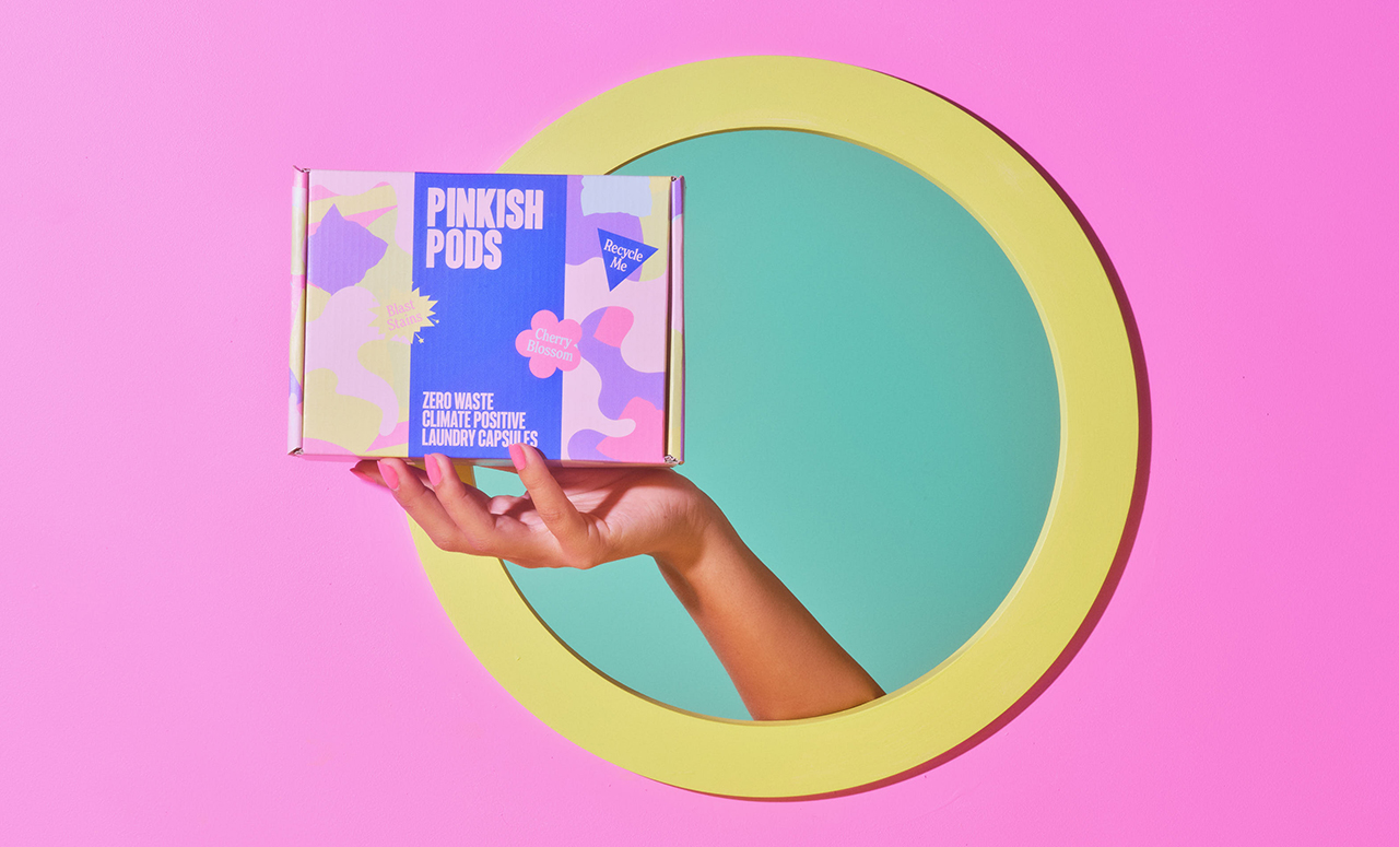
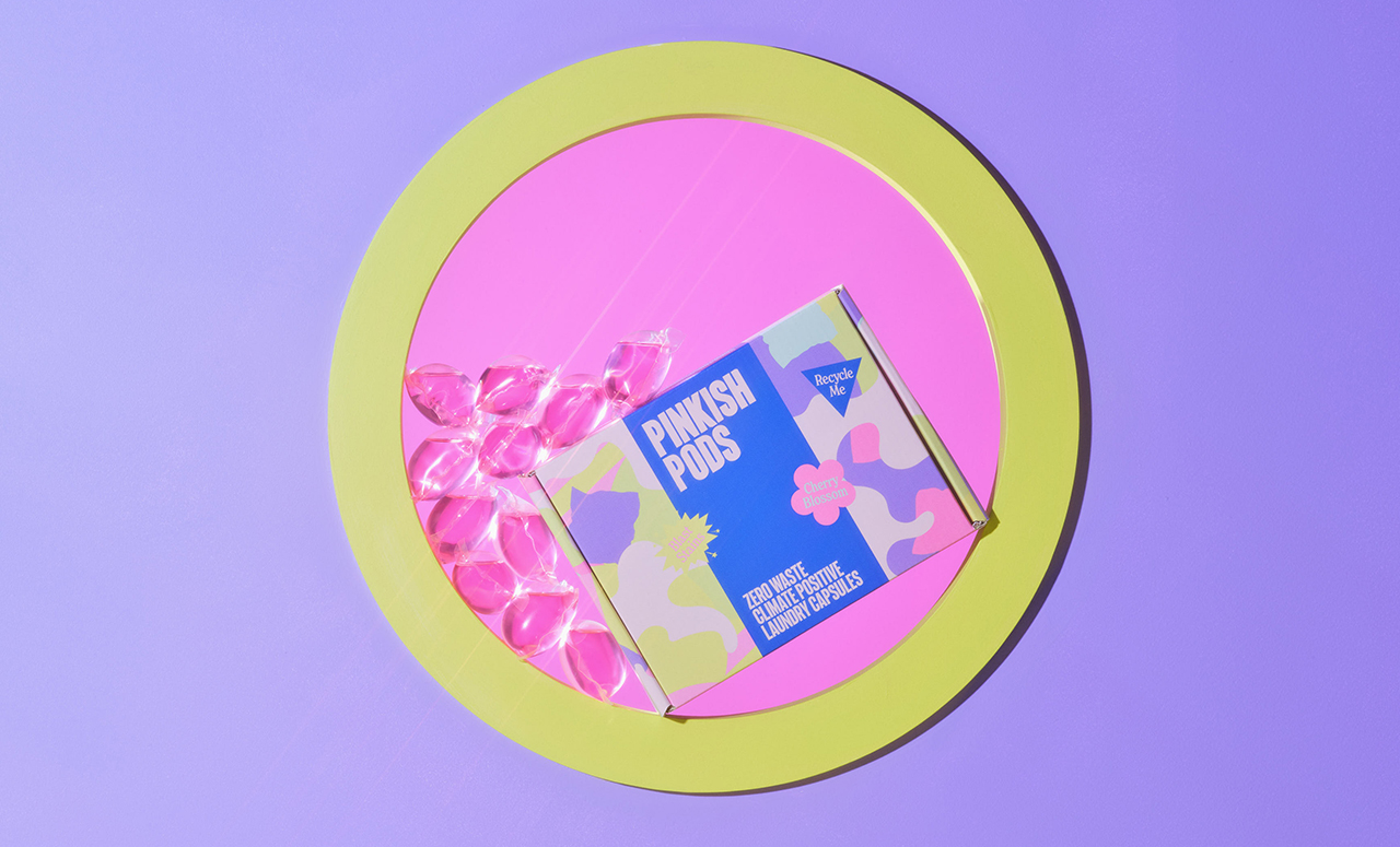
In order to identify Pinkish Pods as a new state of being; a unique and transformative experience, Control Studio was consulted. As part of this, their first laundry pod packaging was also designed, which is zero waste and climate-positive.
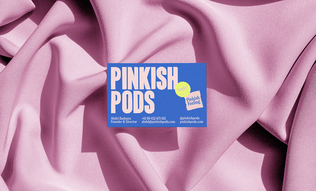
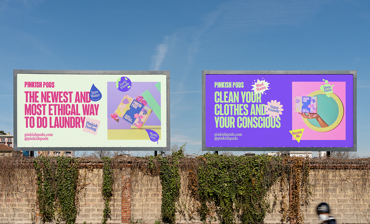
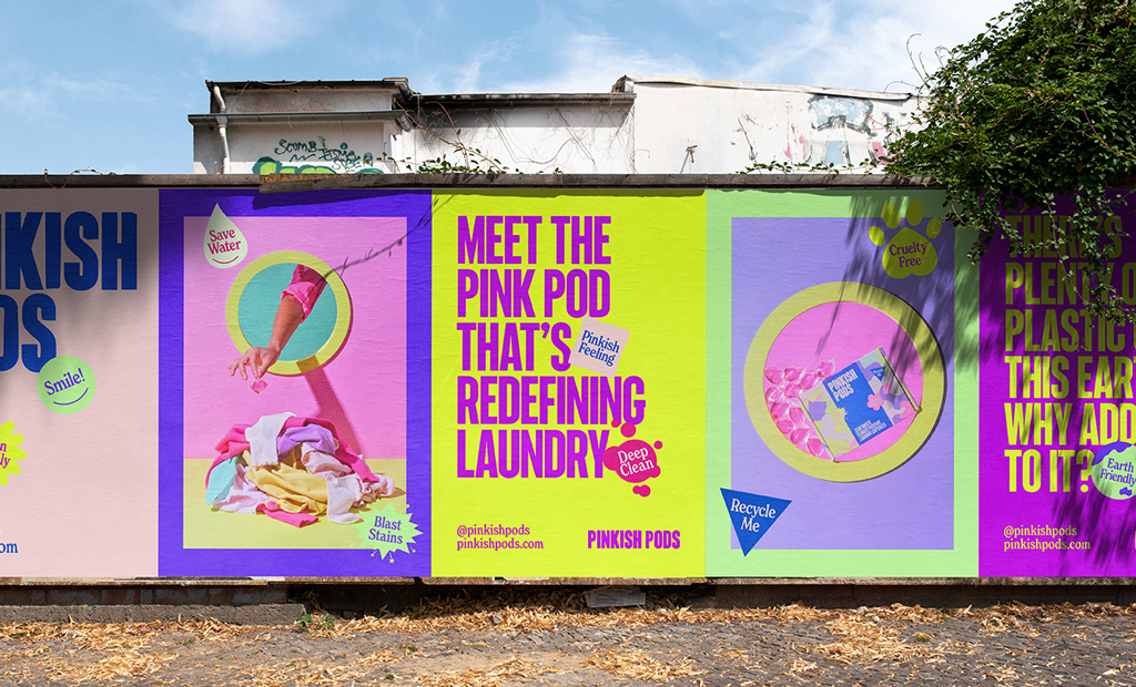
We created a brand that disrupts a sector that feels tired and disingenuous. As a result, Pinkish Pods becomes the new-school, innovative, and effective laundry pod player on the market. We created a bold new visual identity that can’t be ignored. Its entire brand is based on a commitment to eco-justice, something Pinkish Pods is actively working to achieve. This is expressed with an iconic handcrafted organic logo underpinned by quirky badges that express what Pinkish Pods stands for. This brand offers a powerful new visual language and indeed an approach to branding that is truly beyond expectation.
CREDIT
- Agency/Creative: Control Studio
- Article Title: Control Studio Creates Visual Identity and Packaging Design for Pinkish Pods
- Organisation/Entity: Agency
- Project Type: Packaging
- Project Status: Published
- Agency/Creative Country: Netherlands
- Agency/Creative City: Amsterdam
- Market Region: Oceania
- Project Deliverables: Advertising, Art Direction, Brand Design, Brand Identity, Brand Tone of Voice, Packaging Design
- Format: Box
- Substrate: Pulp Board
- Industry: Retail
- Keywords: Laundry Detergent
-
Credits:
Photography & Styling: King & Sobey


