


Choccy Nut Pot was launched in 2019 by former Harlequins professional rugby player, Ali Chisholm. Driven by his need to manage protein and macronutrient levels while still satisfying sweet cravings, Ali created a high-protein potted chocolate snack made from natural ingredients, delivering healthy fuel for the body without compromising on indulgence.
By 2021, Choccy Nut Pot had achieved strong sales through its website and garnered positive brand awareness through sponsorship and participation at key sporting events and exhibitions. A pivotal opportunity arose when Ali secured a potential spot in Sainsbury’s Future Brands program. To prepare the brand for the grocery market, Ali enlisted our expertise.
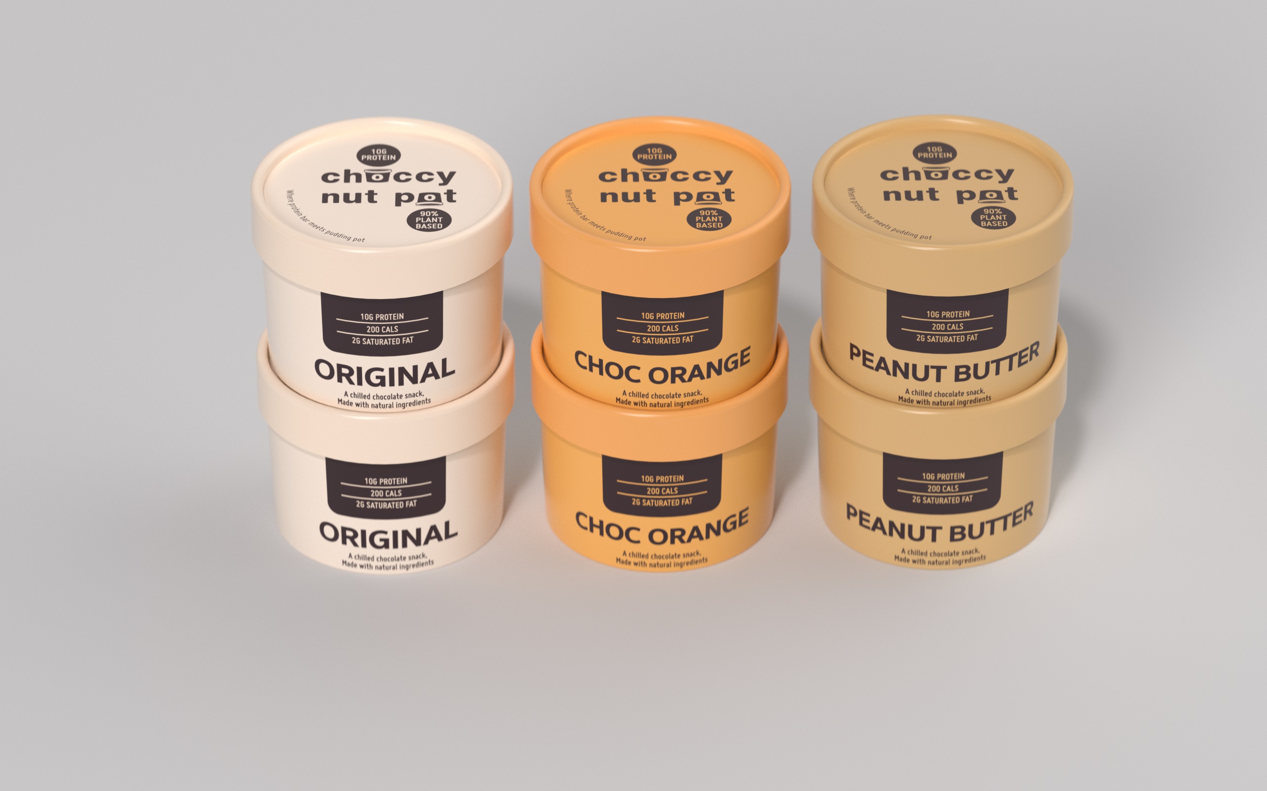
We initiated the project with a kick-off workshop to analyse the brand’s visual identity and messaging. While the minimalist design was clean, it lacked personality and struggled to highlight its unique benefits within the limited packaging space.
Customer insights revealed a post-Covid surge in the sports nutrition market, with a broader demographic seeking products that balanced taste and healthiness. Our challenge was to demystify ingredients and clearly communicate the brand’s benefits to an expanding audience.
Our research identified several customer segments: Sporting Elite, Diet Hackers, Fitness Focused, On-the-Go Families, Mindful Chocoholics, and Busy Workers. To unify these diverse groups, we developed the “Convenience and Passionate Taste Seekers” mindset, emphasizing that health-conscious consumers should not have to compromise on taste.
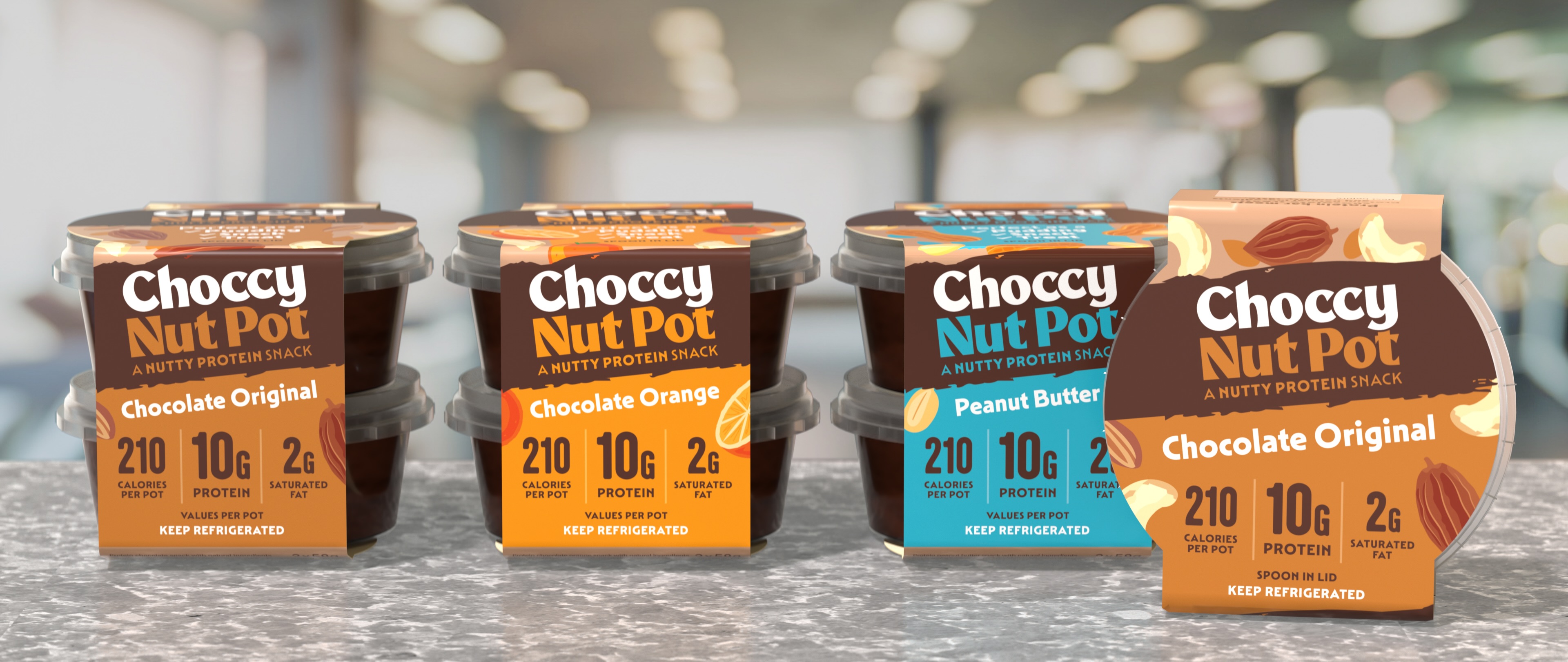
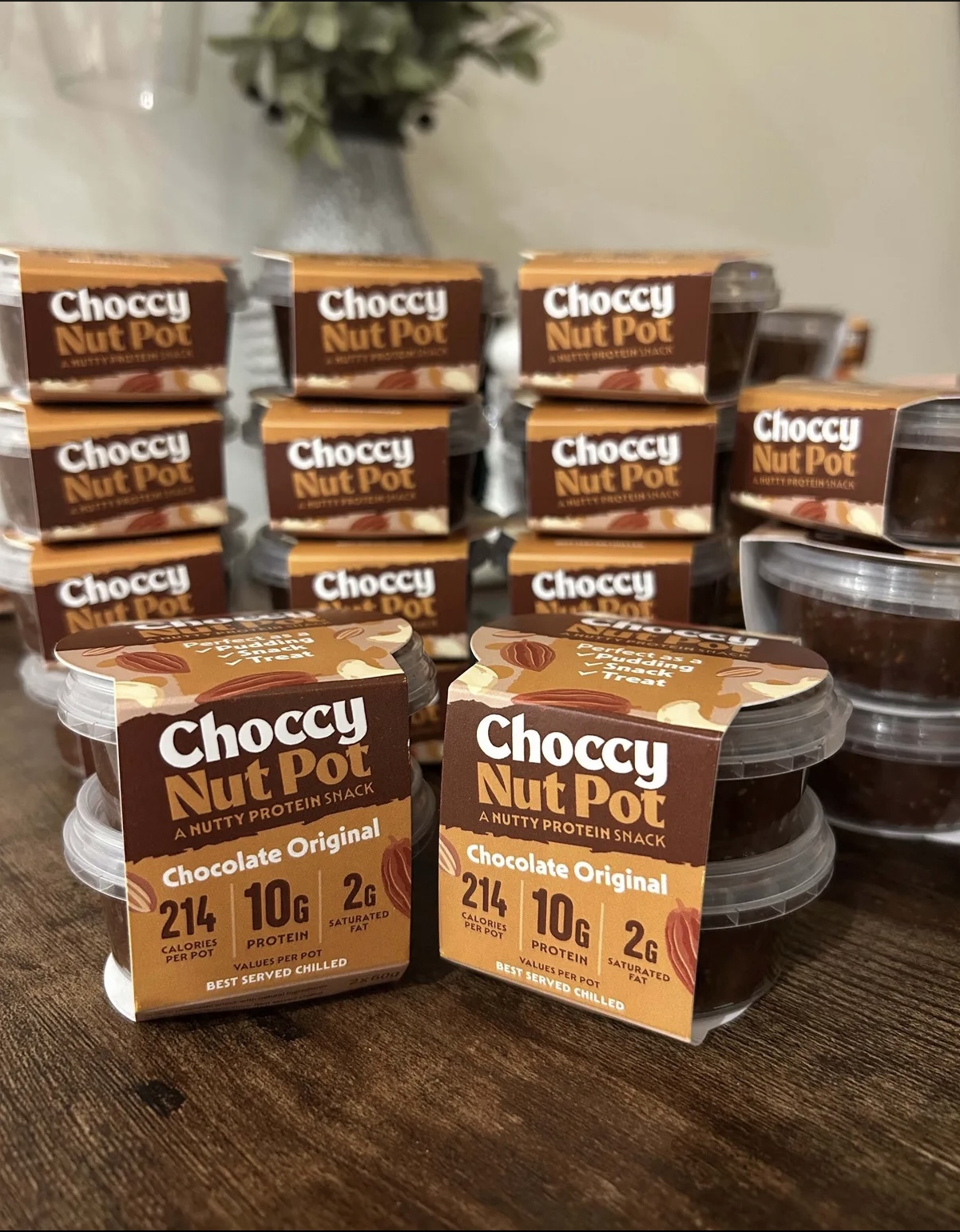
Collaborating closely with Ali, we designed a new sleeve format for single and dual packs, providing the necessary canvas space to showcase the brand’s unique attributes. The rebrand features:
An engaging, vibrant design that celebrates both taste and protein.
Enticing illustrations of natural ingredients.
A clear and accessible tick list highlighting the product’s versatility as a pudding, snack, or treat.
A stacked communication system for macronutrients, emphasizing performance-enhancing benefits and using variant colour coding to navigate the multi-flavour range.
Re-launching in January 2025, Choccy Nut Pot’s web sales have soared. The brand is also in discussions with multiple grocery chains for potential listings.
This project successfully transformed Choccy Nut Pot into a dynamic, visually appealing brand that resonates with a diverse and expanding consumer base. The rebrand not only enhanced its market presence but also reinforced its commitment to providing delicious, healthful snack options.
CREDIT
- Agency/Creative: Contrast
- Article Title: Contrast Creates New Brand Identity for Protein Packed Snack Brand Choccy Nut Pot
- Organisation/Entity: Agency
- Project Type: Packaging
- Project Status: Published
- Agency/Creative Country: United Kingdom
- Agency/Creative City: London
- Market Region: Europe
- Project Deliverables: Brand Redesign, Packaging Design
- Format: Pot, Sleeve
- Industry: Food/Beverage
- Keywords: Protein indulgence snacks
-
Credits:
Managing Director: Claudette Munroe


