


Back in 1994, Contentech sprouted as a seed of linguistic passion. Today, it stands out as a leading global provider of multilingual content solutions. Our team of expert linguists and content specialists, combined with advanced technology, delivers high-quality services in over 100 languages.
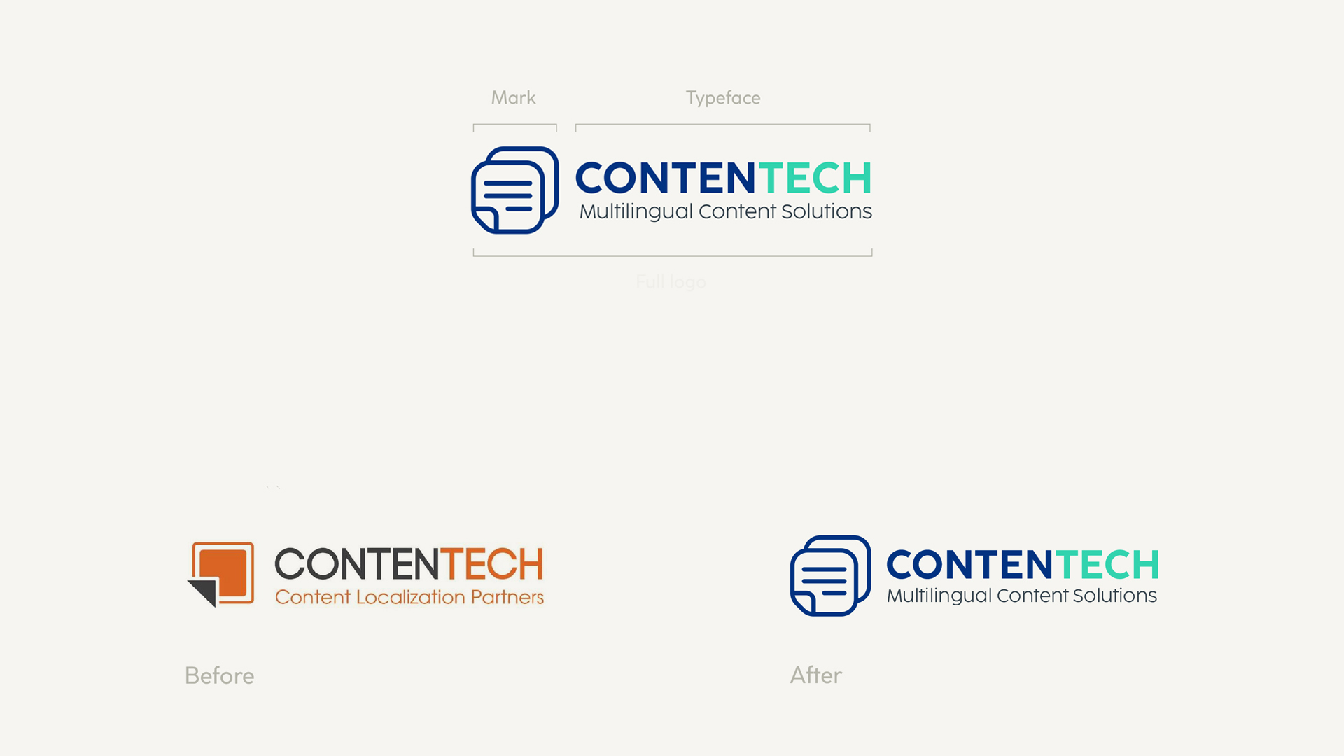
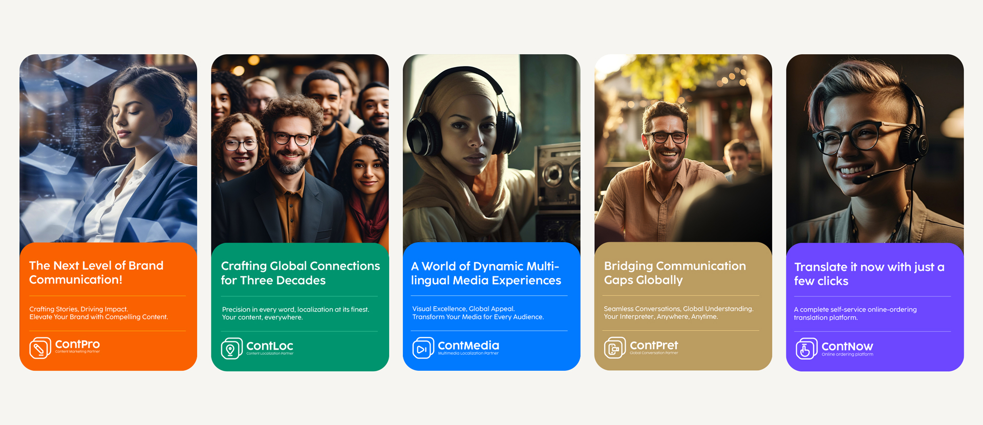
Reimagining a Brand: The primary objective of the branding project was to create a versatile and memorable logo that could resonate across different regions and services. The logo needed to be visually appealing, easy to recognize, and adaptable to various applications. with keeping in mind that The new logo should be designed with scalability in mind, capable of generating a system of logos for potential sister companies.” which already happened 2 years latter
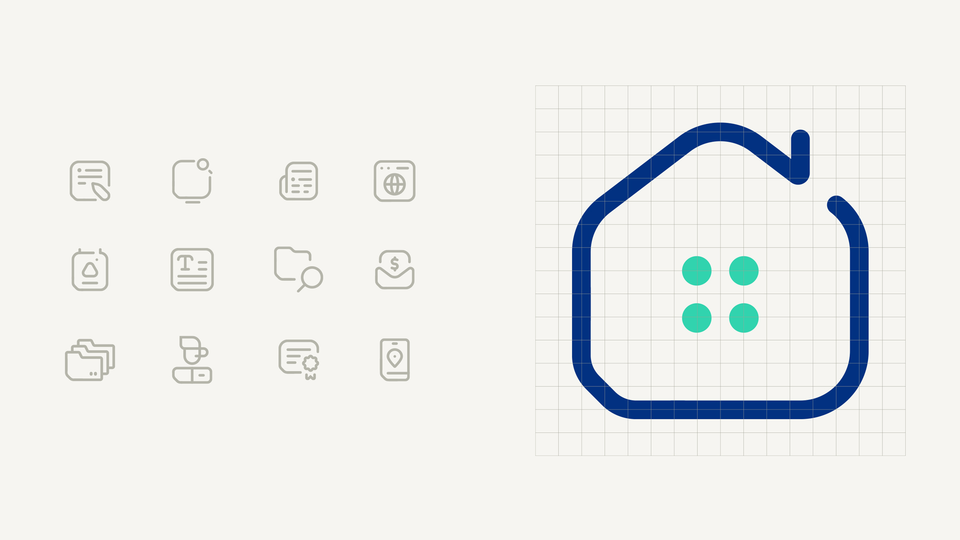
We decided not to deviate too much from the old logo but to evolve it to reflect the new shape of the document and the translation from one language to another. The shape’s flexibility allows for seamless integration into different marketing materials, ensuring a consistent brand presence.
A Harmonious Color Palette and Typography
To complement the logo, a carefully selected color palette was chosen. We chose a radiant blue and a mint green for the logo. with a set of colorful palette te be used as a secondary color palette. The colors evoke feelings of trust, reliability, and professionalism.
The typography chosen for the brand identity is modern and easily legible. The font’s clean lines and neutral tone complement the logo’s minimalist aesthetic.
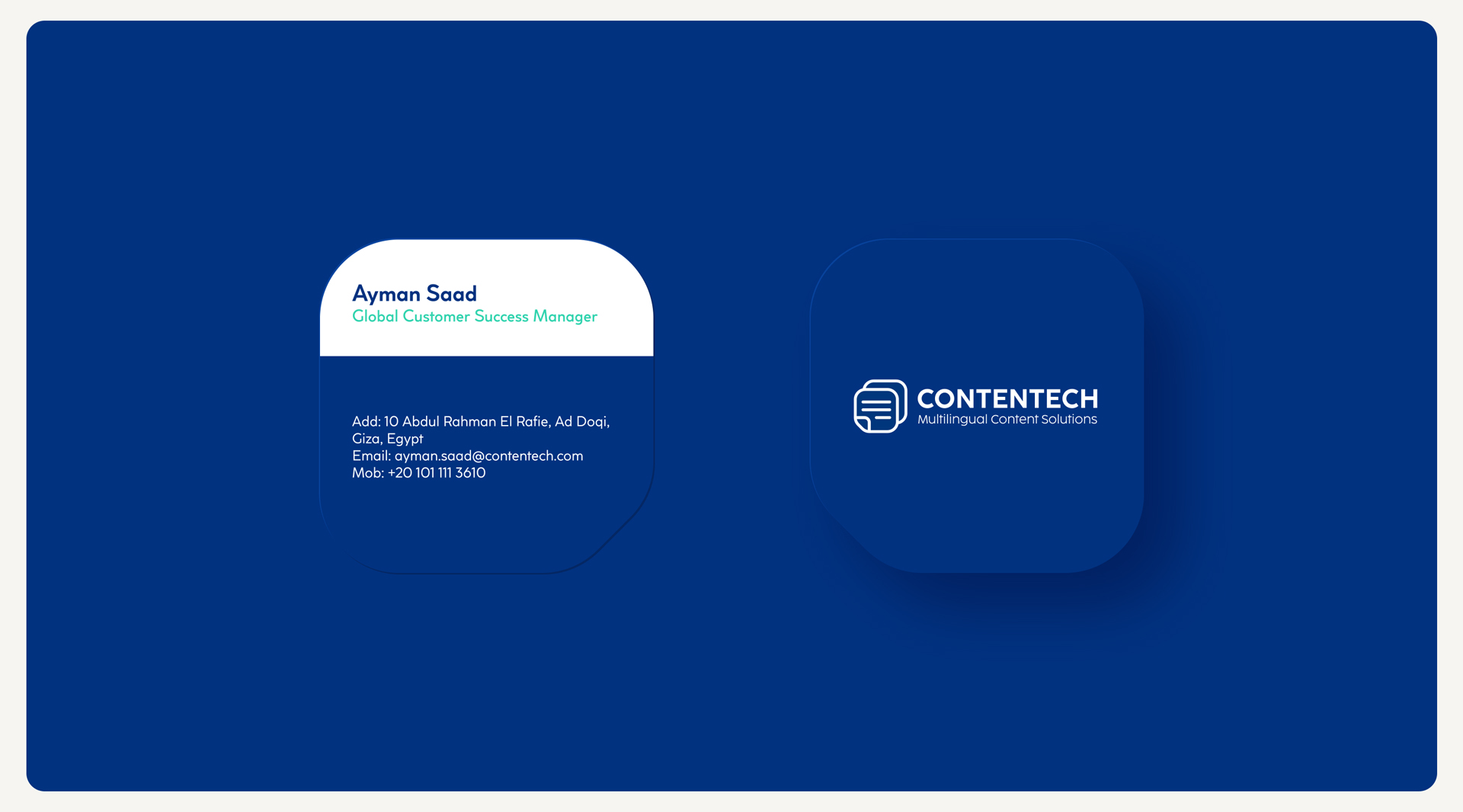
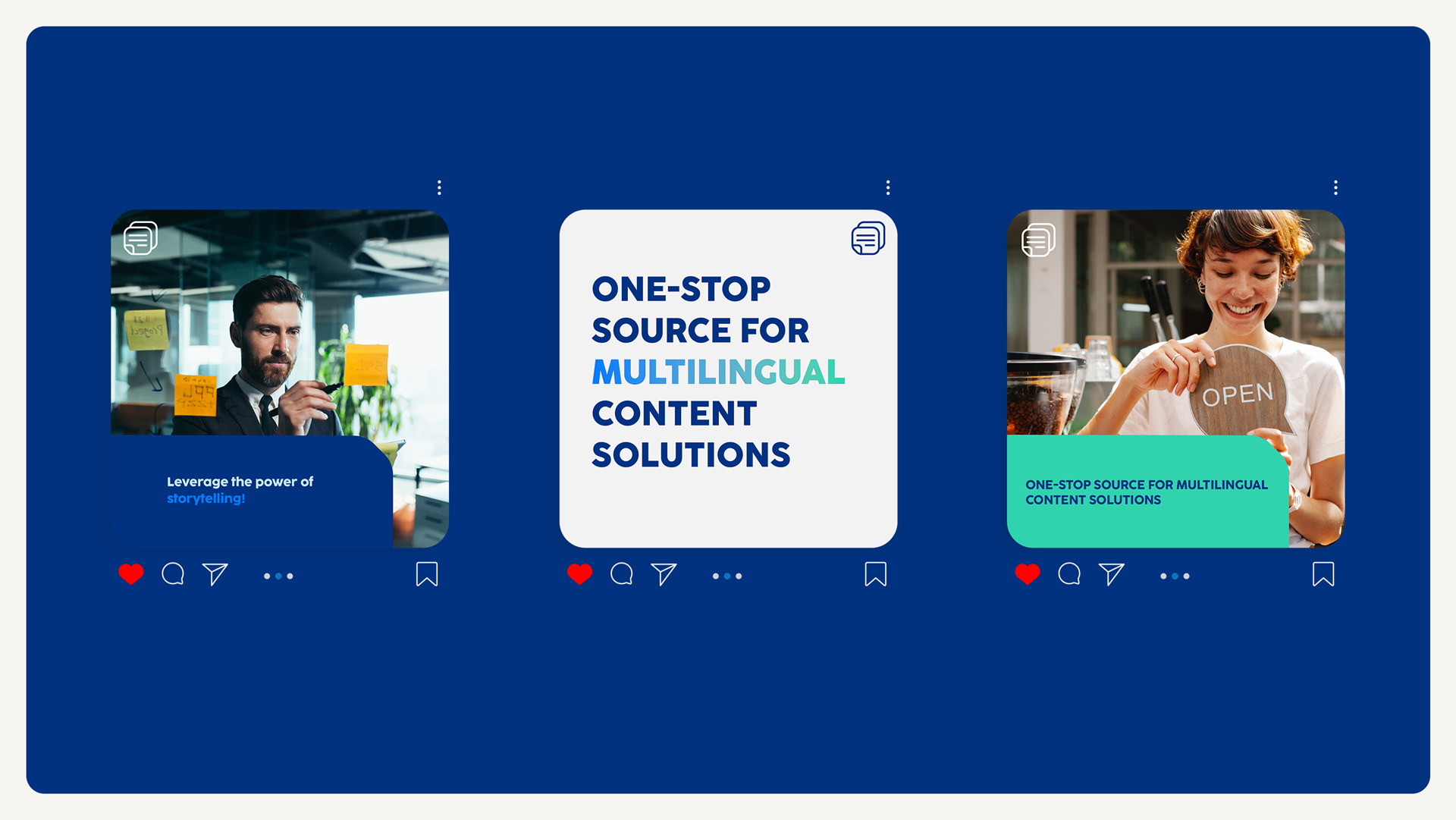
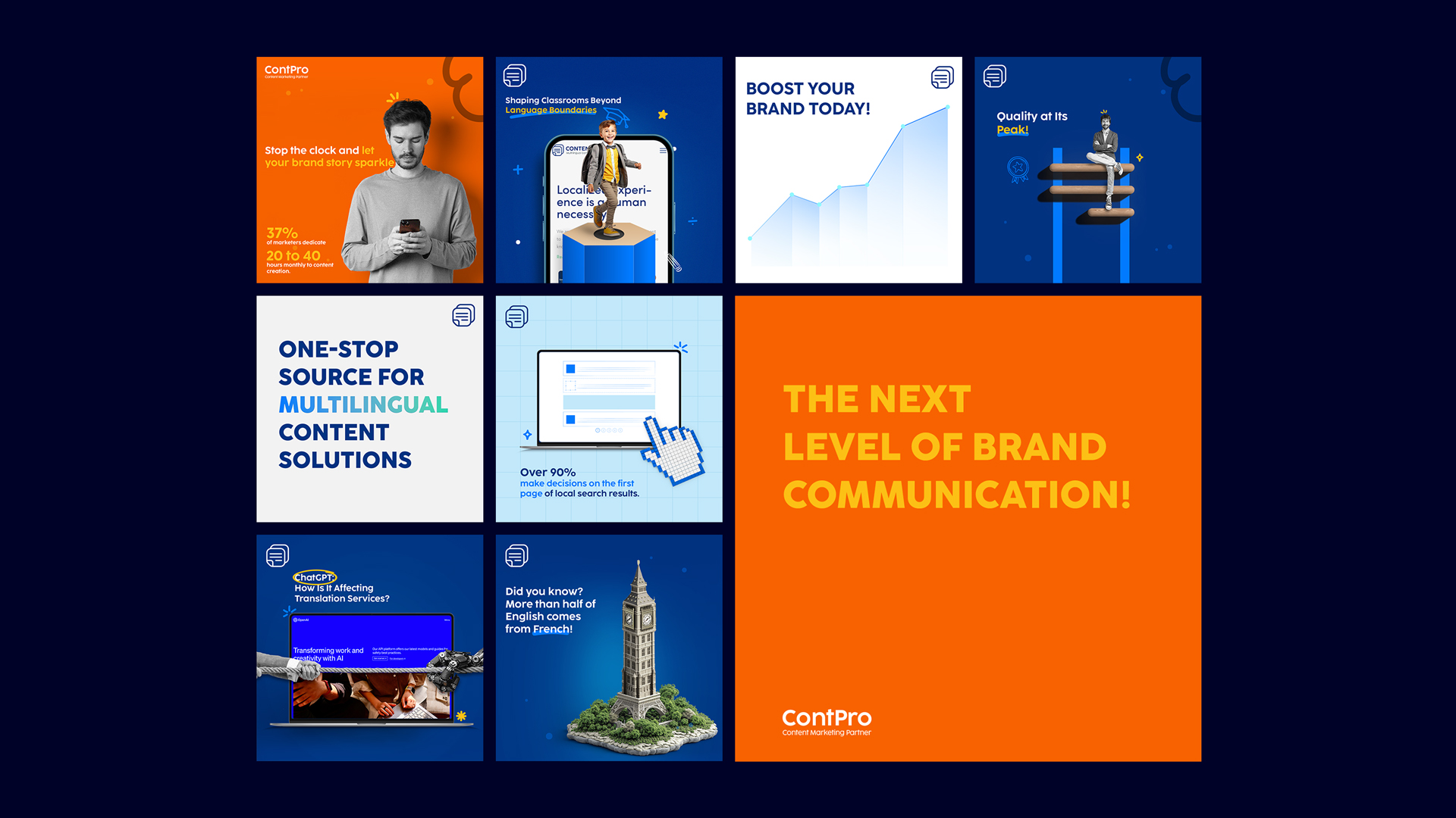
Brand Applications: The new brand identity was applied to various marketing materials, including business cards, letterhead, envelopes, flyers, brochures, and social media posts. The versatility of the logo allowed for creative and engaging designs that effectively conveyed Contentech’s message.
One notable example is the business card, which features a unique die-cut shape inspired by the logo. This distinctive design adds a touch of personality and helps the card stand out from the competition.
Website Redesign: To enhance the user experience and align with the new brand identity, Contentech’s website underwent a complete redesign. The website’s layout and navigation were streamlined, making it easier for visitors to find the information they need. The visual elements of the website, including the color scheme and typography, were carefully chosen to reflect the brand’s aesthetic. You can also see how we used the logo shape across many visual elements in the website, such as the navigation bar and data cards.


CREDIT
- Agency/Creative: yaddly
- Article Title: Contentech’s Brand Evolution: A Global Transformation
- Organisation/Entity: Agency
- Project Type: Identity
- Project Status: Published
- Agency/Creative Country: Egypt
- Agency/Creative City: Dubai
- Market Region: Europe
- Project Deliverables: Art Direction, Brand Identity, Editorial Design, Graphic Design, Web Design
- Industry: Professional Services
- Keywords: Content, Branding, Translation, Multilingual, Interpretation
-
Credits:
Art Director: Ahmed Mamdouh


