


43oz.com – Design Studio – Lord Byron
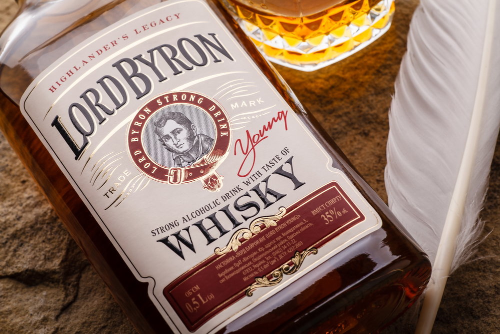
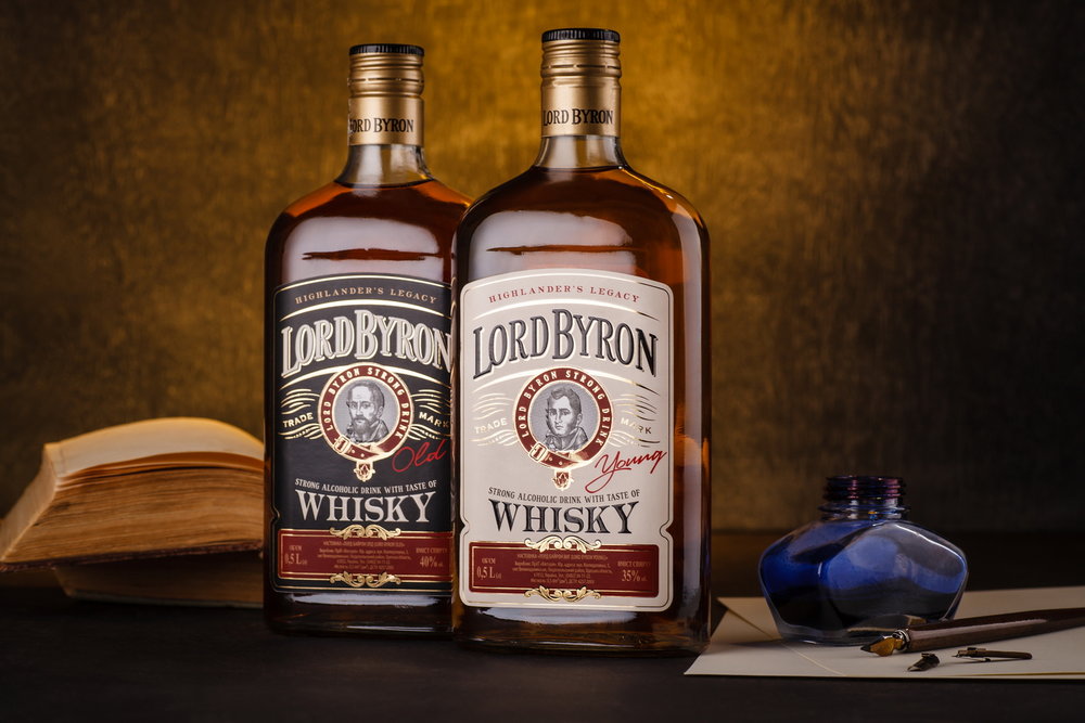
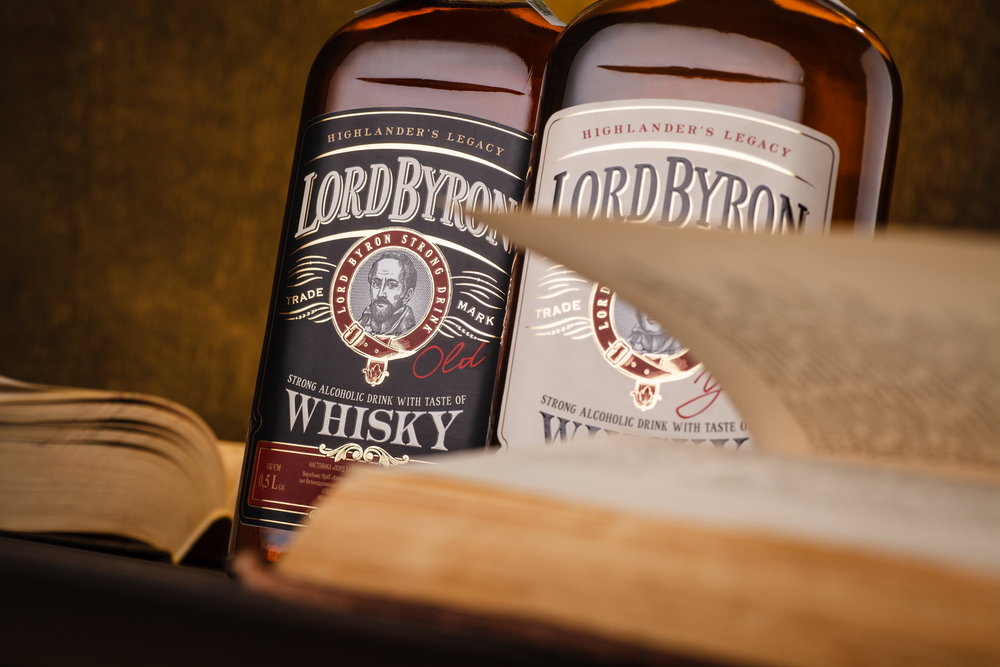
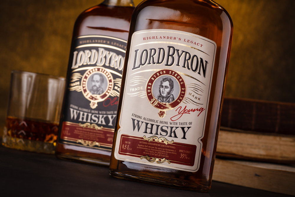
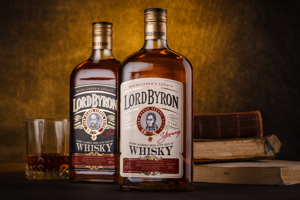
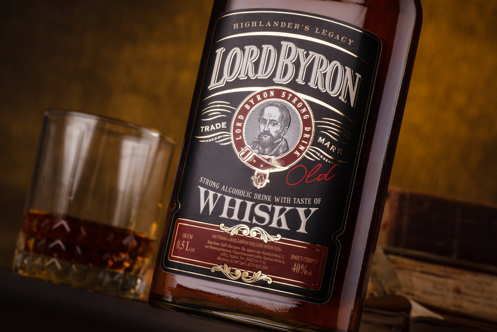
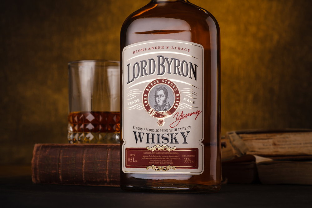
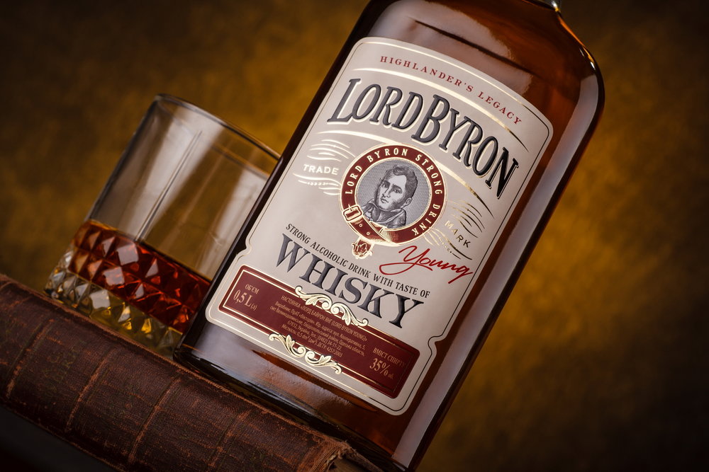
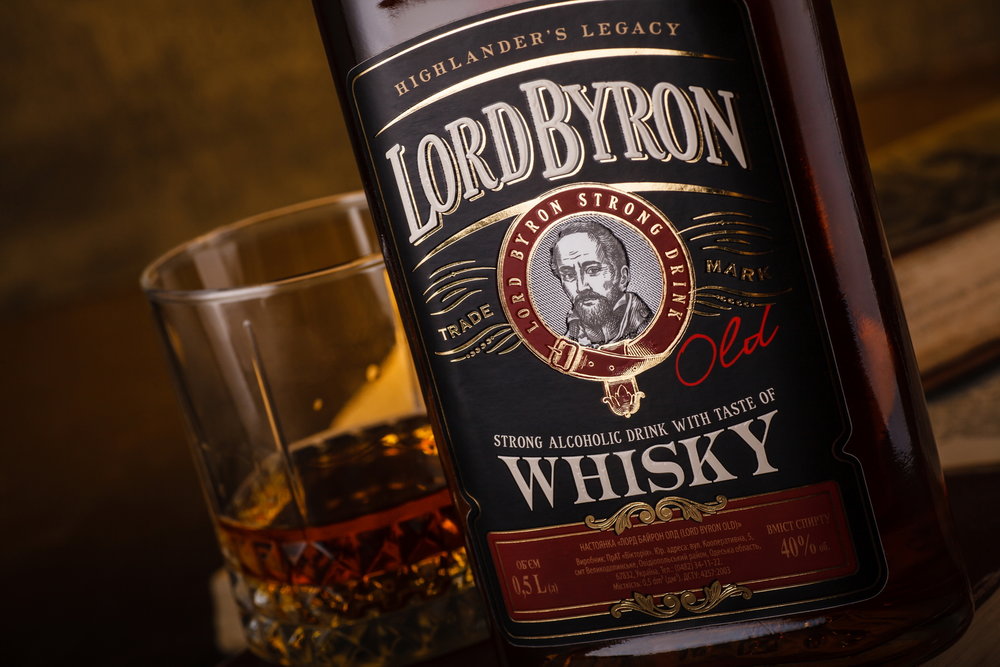
“Lord Byron is a brand of whiskey produced by Koktebel company for the Ukrainian market, based on the image of the great English poet George Byron. This drink is available in two versions – standard and stronger, matured – that are linked to the image of the young and old poet respectively. We were required to create a packaging design, which would effectively reflect the difference between the two iterations of the same character, set in a visual style corresponding to the image of the classic English poet.
The packaging design for Lord Byron whiskey follows the general spirit of packaging design for this particular drink category, with the characteristic set of graphic elements, type font solutions, and a tempered color scheme, which rhymes the color of the drink inside the bottle. The central element of the label is the portrait of the renowned poet, the lighter version featuring an image of young Byron, while the stronger – the man in older age. The SKU division is also carried out through the use of different color schemes.”

CREDIT
- Agency/Creative: 43oz.com - Design Studio
- Article Title: Consumer Visual Brand Identity, Consumer Graphic Packaging Design for Whiskey Label Lord Byron
- Organisation/Entity: Agency Commercial / Published
- Project Type: Packaging
- Agency/Creative Country: Moldova
- Market Region: Europe
- Format: Bottle
- Substrate: Glass


