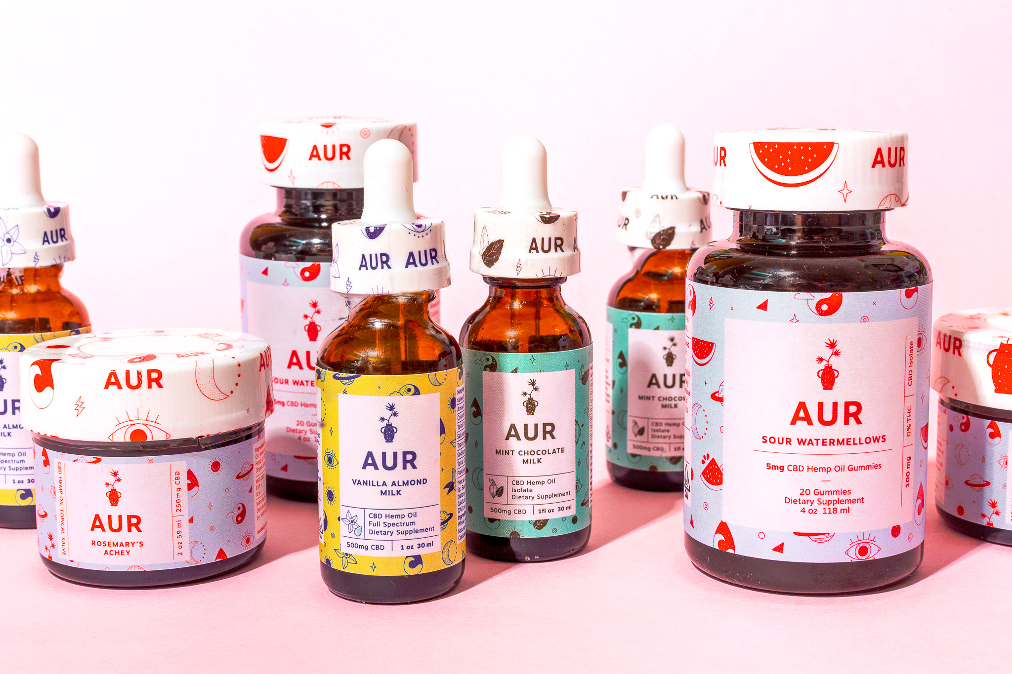
B.O.B – AUR Body Branding
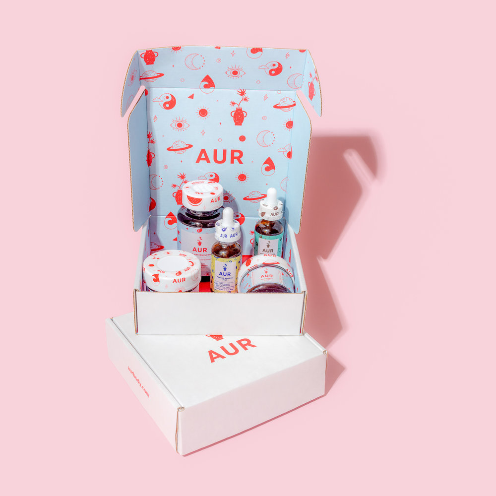
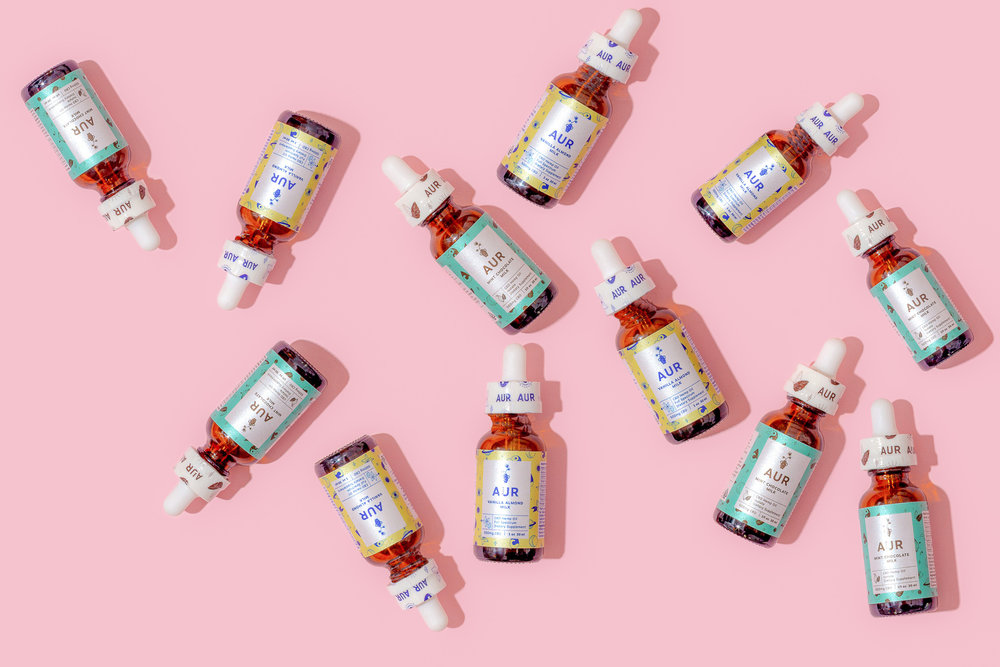
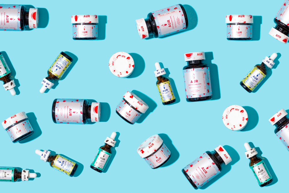
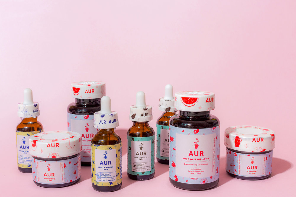
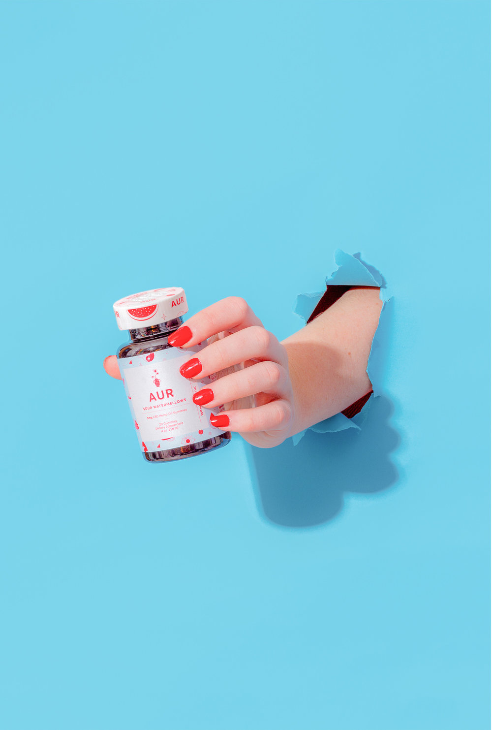
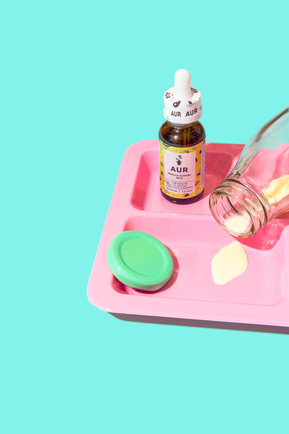
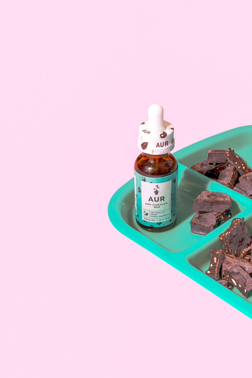
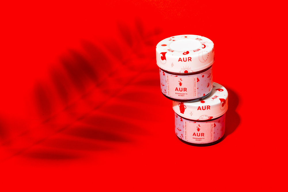
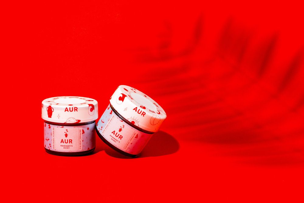
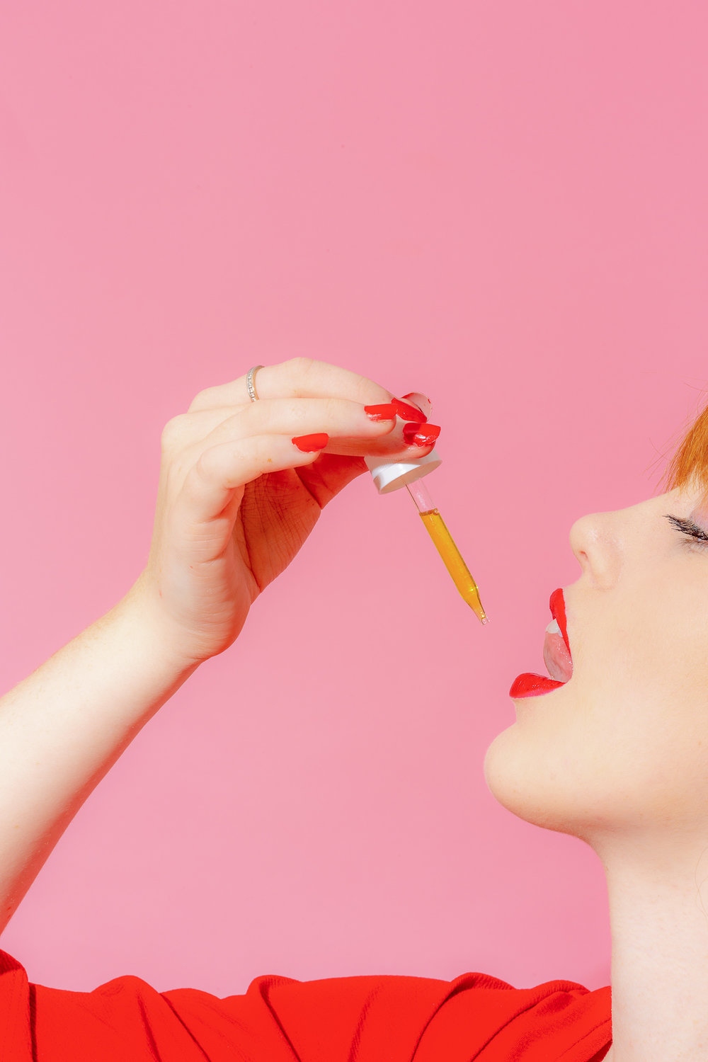
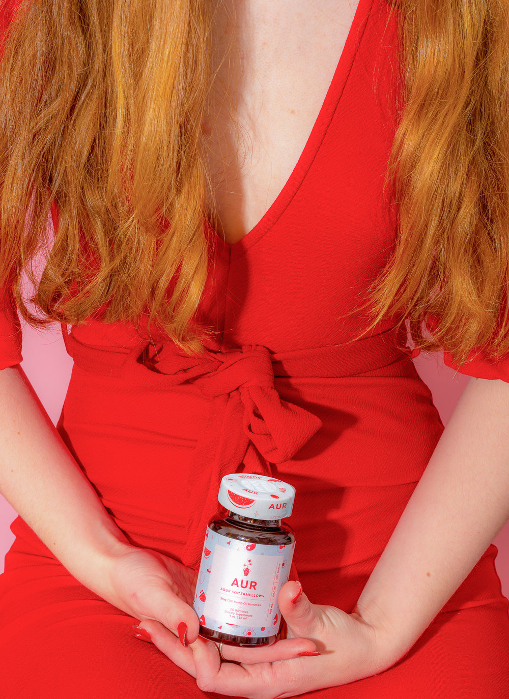
This project concentrated on the brand identity and launch for AUR Body. The idea started with childlike hand drawings that meant to evoke comfort, nostalgia and approachability. From there we aligned on a color scheme that was bright but intentional. Blue for comfort, red for urgency, yellow for energy and green for stability. When you receive the package, inside you will find a branded lunch bag, a branded pencil and a note from the founder imprinted on a napkin. All to encapsulate a feeling of childlike surprise. “What did mom put in my bag today?”

CREDIT
- Agency/Creative: B.O.B
- Article Title: Consumer Brand Design for ‘AUR’ Body Tinctures, Gummies and Oils
- Organisation/Entity: Freelance Promotional, Self Published
- Project Type: Packaging
- Agency/Creative Country: United States America
- Market Region: North America
- Format: Bottle, Box, Pouch
- Substrate: Glass
FEEDBACK
Relevance: Solution/idea in relation to brand, product or service
Implementation: Attention, detailing and finishing of final solution
Presentation: Text, visualisation and quality of the presentation


