Cornershop – Lift
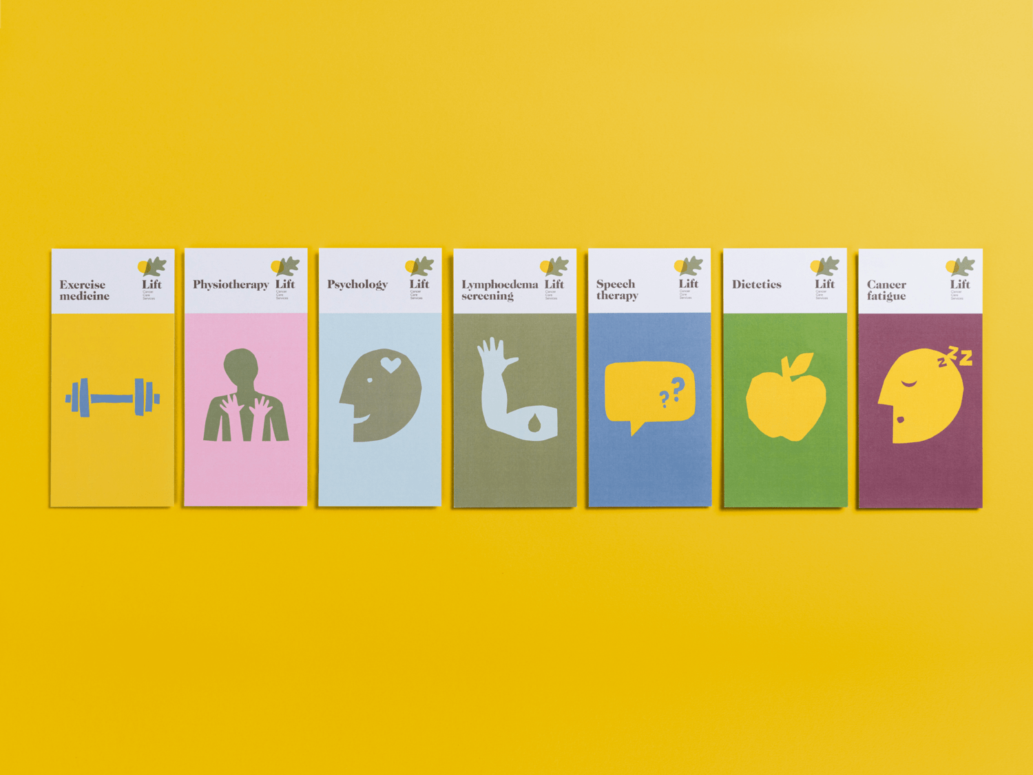
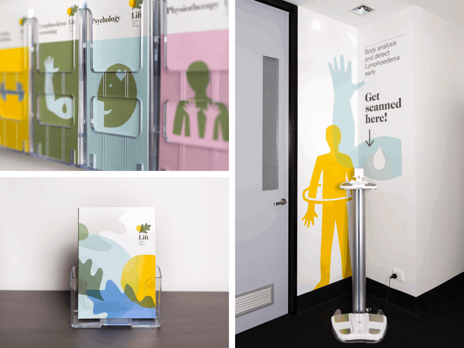
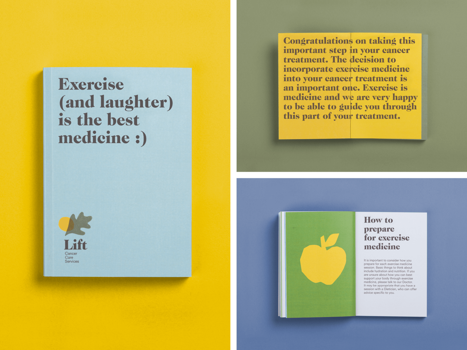
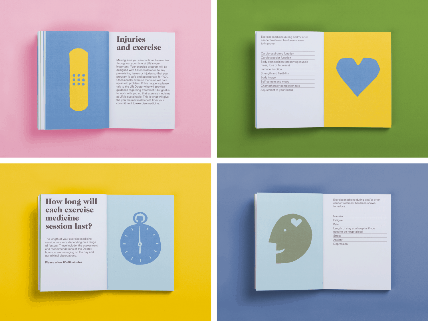
Lift provide support services for South Australian’s undergoing cancer treatment. Specialists include Physiotherapists, Psychologists, Speech Therapists and Dieticians. The heart of their business strategy is offering exercise as medicine. Lift’s ambition was to create an environment that felt like ‘Home’; a warm and welcoming space, unlike cold, impersonal clinics that are common in the health industry. They aimed to establish a brand that was authentic, personal, positive, aspirational and ultimately uplifting.Our brand logo solution features a handmade oak leaf and sun. The oak leaf symbolizes strength, endurance and stability. Some believe that the oak trees essence helps boost energy levels and the ability to manifest our goals. The sun represents life, energy, hope and the dawn of a new day. “The strongest oak of the forest is not the one that is protected from the storm and hidden from the sun. It’s the one that stands in the open where it is compelled to struggle for existence against the winds and rains and the scorching sun.” Napoleon Hill.To complement the logo we developed a range of whimsical illustrations that feature on various brand applications in a happy colour palette and reinforces Lift’s value proposition. To date, the brand identity has been applied to stationery, pamphlets, signage, environmental graphics and a booklet/diary for visitors to record consultations.
CREDIT
- Agency/Creative: Cornershop
- Article Title: Conquering Cancer!
- Organisation/Entity: Agency, Published Commercial Design
- Project Type: Packaging
- Agency/Creative Country: Australia
- Market Region: Oceania
- Industry: Health Care


