


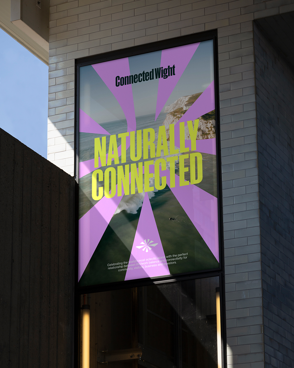
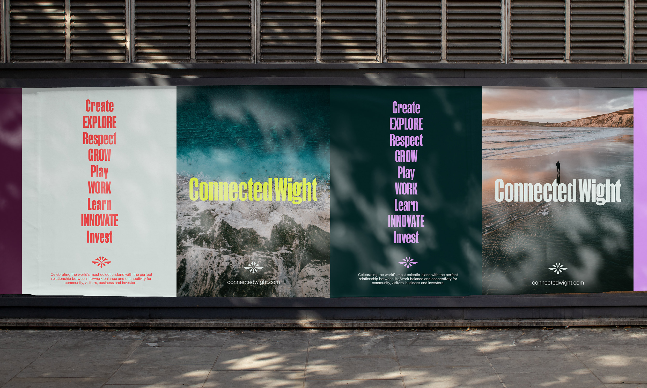
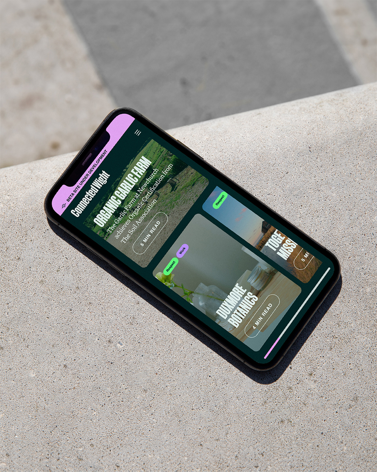
Celebrating the world’s most eclectic island with the perfect relationship between work/life balance, connecting residents, communities, visitors, enterprises, sportspeople, and the simply ‘unknowns.’ Connected Wight is a web portal, a way-finder, not a final destination. It reminds Islanders of where they live and what they have in abundance. And for those who might want to live, work, invest, and grow here, it shines a light on life within a beautiful, inspirational UNESCO Biosphere Reserve.
Our mission—to create an identity and visual language that celebrates and promotes the Isle of Wight whilst embodying the main theme of ‘connection’. A bold, energetic brand unlike anything seen on the Island before—different but unmistakably the ‘Isle of Wight,’ so it’s recognised by audiences near and far.
As huge advocates for the place we’re lucky enough to call home, being asked to develop a brand that promotes the Isle of Wight felt intimidating but also extremely cathartic—an exciting opportunity to truly represent our beautiful island for all that she is.
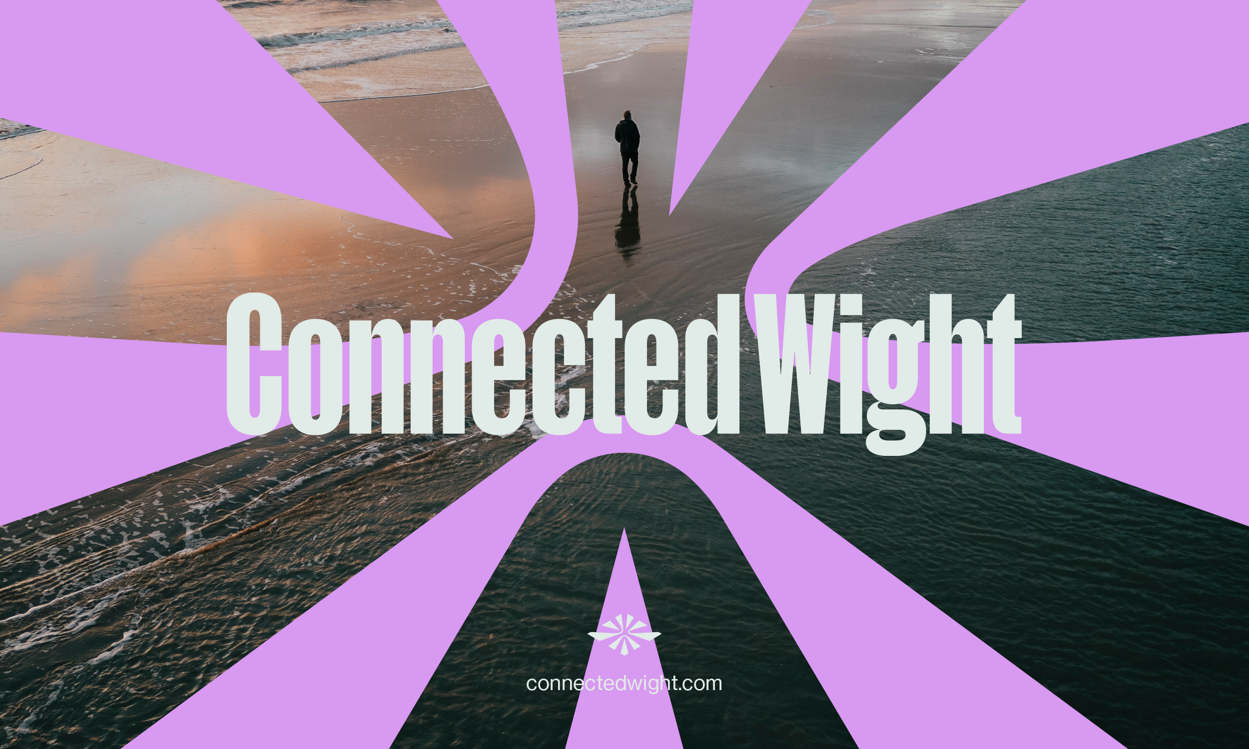
If you’ve ever had the pleasure of visiting the Isle of Wight, you’ll notice a theme amongst local businesses… diamond-shaped logos, everywhere!
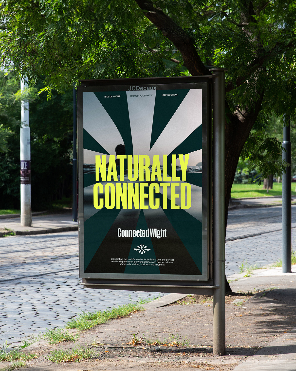
When Thump® Studio was approached for this project, we faced the decision of embracing this seemingly cringe-worthy theme and transforming it into something special. Although this wasn’t explicitly outlined in the brief, it became evident that this was possibly the only time that creating a diamond-shaped brand mark truly mattered. There was a social responsibility to do this right. After all, we were representing our beloved island. Recognised far and wide as the diamond-shaped Island (Jewel of the South), it was imperative that this essence was at the core of our visual identity.
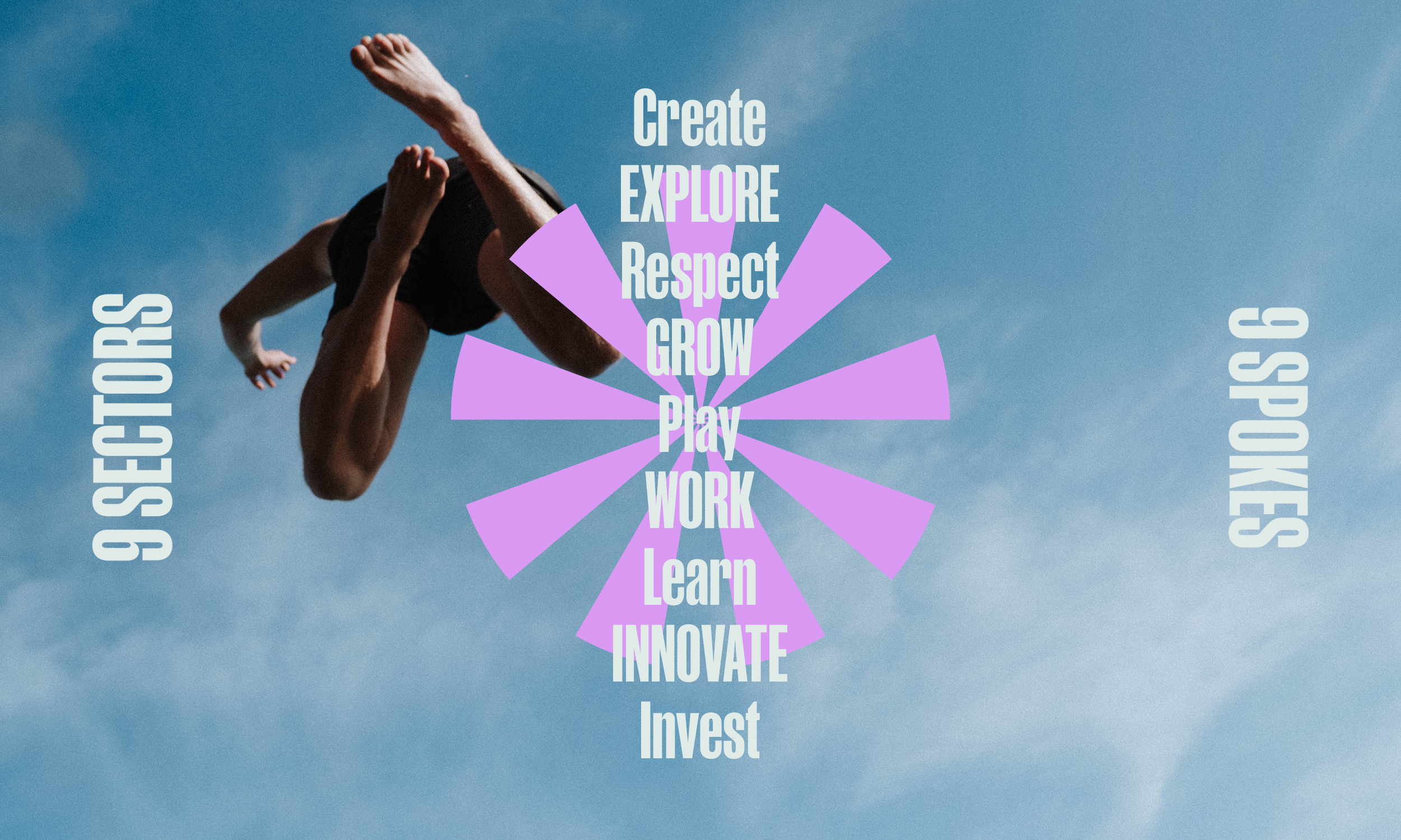
The brand and device had to embody the theme of ‘connection’ – through 9 carefully selected sectors, designed and structured to cover all aspects of living, working and playing on the Isle of Wight.
Utilising the iconic diamond shape of the island ensures that audiences, regardless of distance, can easily associate this graphic device with the Isle of Wight. By positioning the nine spokes within the diamond shape, the mark gains relevance and becomes intertwined with the brand’s narrative. The final graphic device introduces the concept of ‘connection,’ achieving both style and substance by blending sharp points and gentle curves to reflect the energy and calm of the Isle of Wight.
Our hope is that the Connected Wight identity will be known as the ‘unofficial’ identity of the Isle of Wight—a brand for the island to be proud of.
CREDIT
- Agency/Creative: Thump Studio
- Article Title: Connecting Isle of Wight with Thump Studio’s Visual Identity
- Organisation/Entity: Agency
- Project Type: Identity
- Project Status: Published
- Agency/Creative Country: United Kingdom
- Agency/Creative City: Isle of Wight
- Market Region: Global
- Project Deliverables: Brand Design, Brand Identity, Brand Mark, Branding, Creative Direction, Web Design
- Industry: Non-Profit
- Keywords: Connection
-
Credits:
Designer: Samuel Tinson-Wood
Designer: Katie Boast
Photography: Reuben Mowle
Webflow: Nick Dover
Web Development: Georgia Walker


