


About the brand:
Miduty is built on a simple belief — that science, when communicated with clarity and honesty, can empower people to take better care of their health. As a pioneer in India’s premium nutraceutical segment, the brand offers deeply researched formulations for everything from hormonal balance to liver detox, nerve health, and metabolic wellness.
The challenge?
To create a packaging system that looks credible like medicine yet beautiful like lifestyle wellness — inspiring trust, confidence, and calm sophistication in equal measure.
About the product:
Miduty’s formulations are advanced, science-backed, and precision-focused. But we understood that people don’t buy ingredients — they buy outcomes.
Each label had to clearly tell the story of what’s inside and why it matters: the formulation, its function, and its promise.
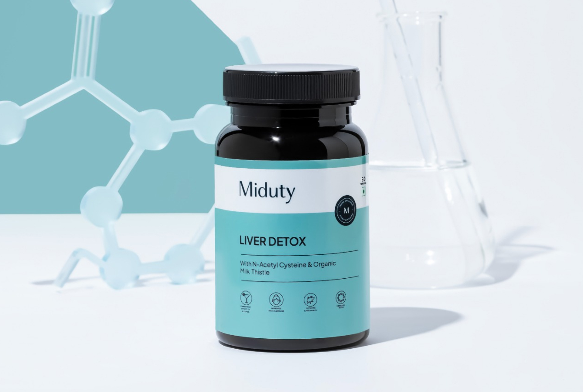
About the design:
Our design philosophy for Miduty was grounded in clarity, calmness, and clinical beauty. The result is a system that feels as intelligent as it looks.
We achieved this through three design choices:
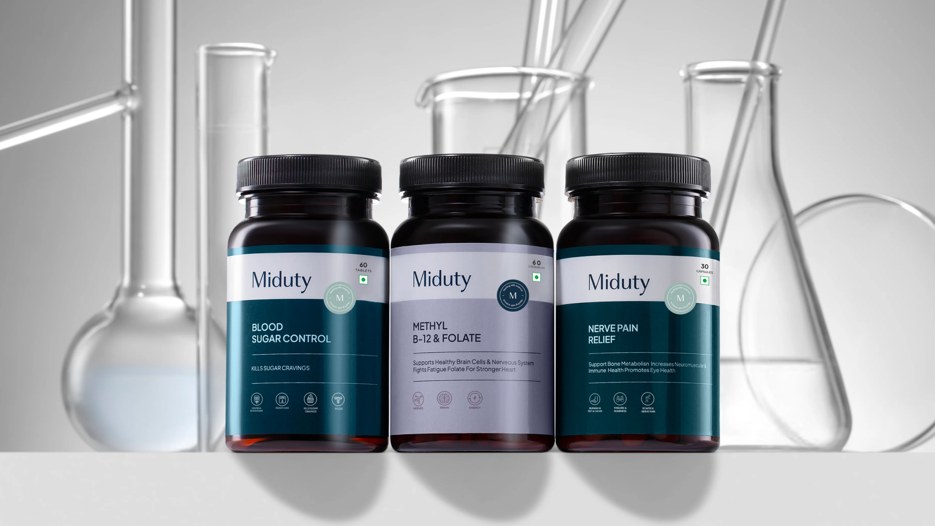
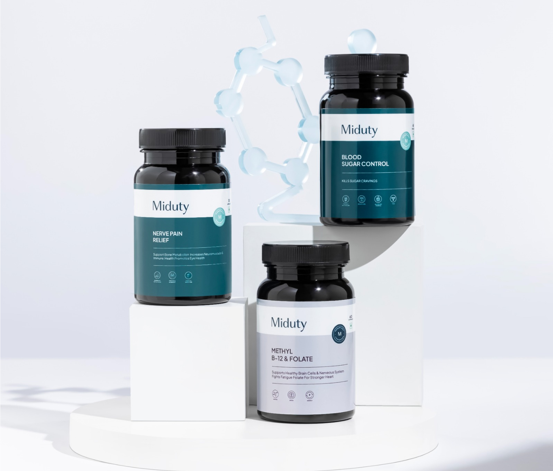
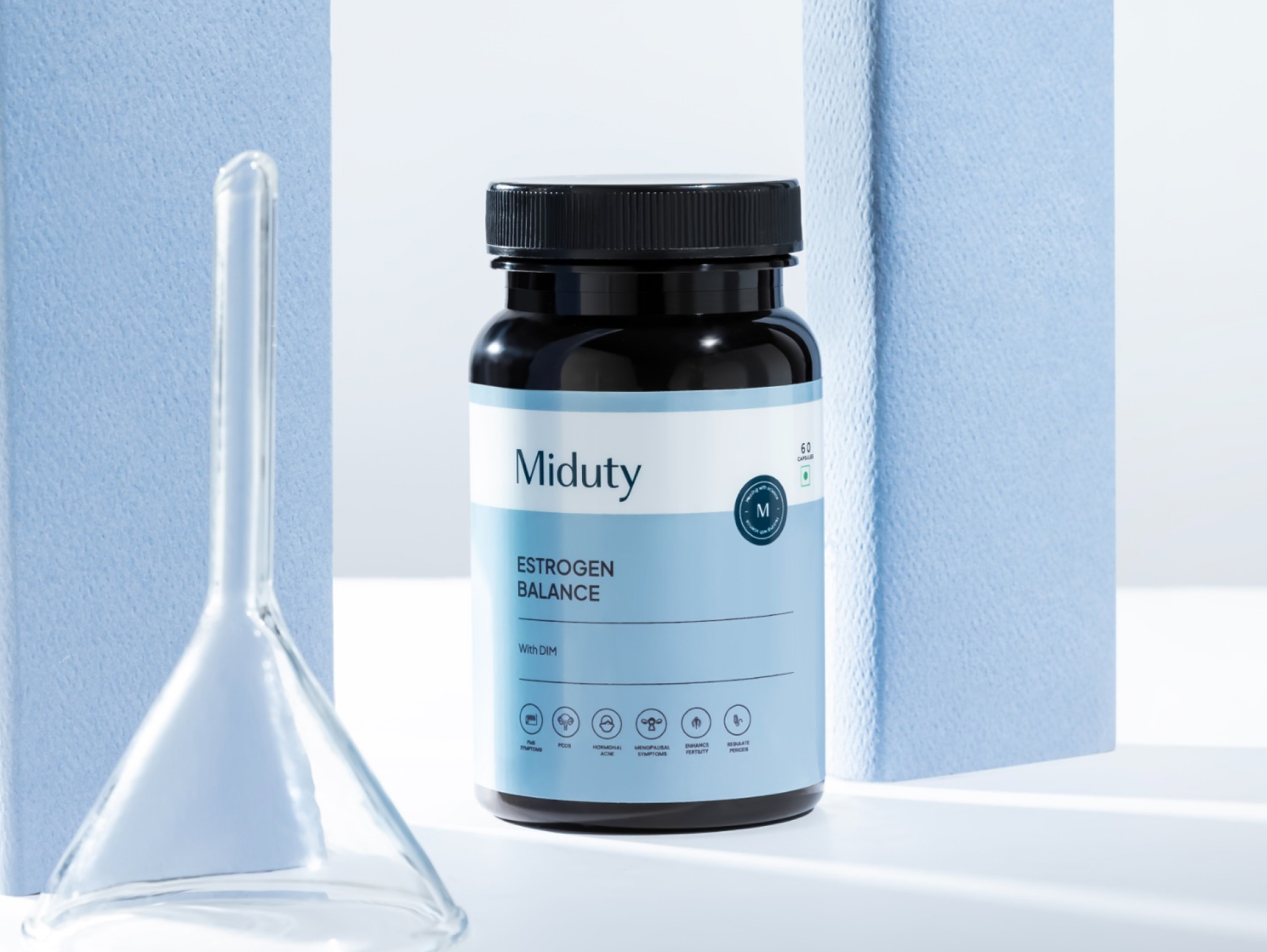
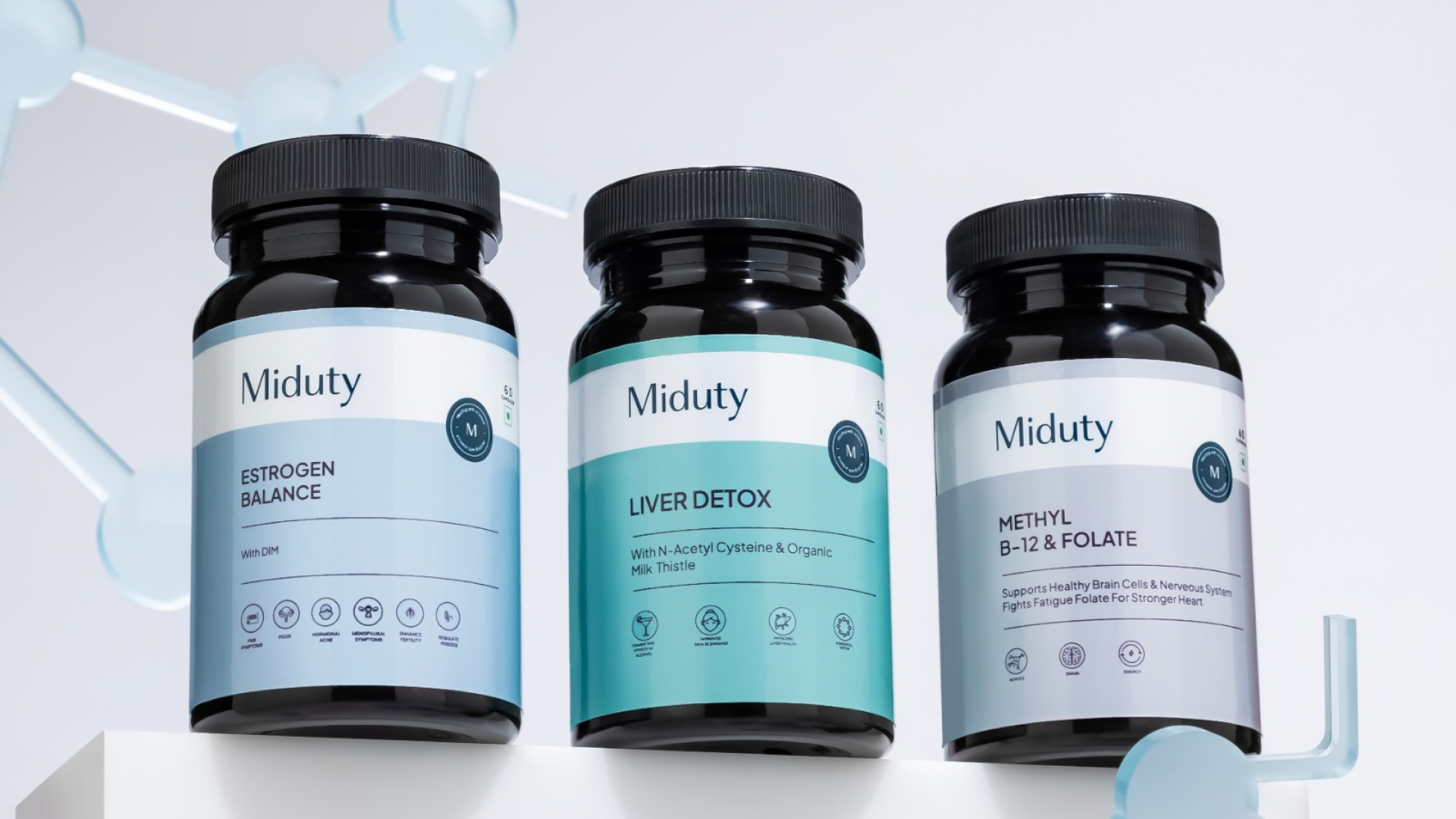
1. Clinical Color System:
A palette of cyan, teal, and soft grey-blues creates an immediate sense of trust and medical reliability. Each color family is chosen to align with specific health categories — subtle yet distinct — forming a cohesive, lab-inspired visual ecosystem.
2. Structured Minimalism:
The label layout follows a precise grid that organizes information into digestible layers — the product name, its key ingredients, and the benefits. This hierarchy makes the science approachable, while icons at the bottom reinforce clarity through visual simplicity.
3. Verification Badge & Wordmark Identity:
Every bottle features Miduty’s signature “M” verification badge, a seal of authenticity and research-backed integrity. The refined wordmark sits prominently at the top, establishing immediate brand recall and trust.
Easter egg:
The label’s subtle curvature mirrors the contours of the amber bottle — an intentional nod to form following function. It’s a small, invisible detail that reinforces the brand’s philosophy: science should feel seamless, not sterile.
Brand’s extension:
Miduty redefines what a nutraceutical brand can look like. It replaces loud, over-promising visuals with an aesthetic of intelligence and transparency. It’s not about shouting benefits — it’s about quietly earning trust through design that feels honest, clinical, and refined.
Current scenario:
Since the redesign, Miduty has solidified its position as one of India’s most credible premium nutraceutical brands. Its packaging has won multiple design awards and is being celebrated for setting a new visual benchmark in the Indian wellness space — a perfect example of how clarity can be the most powerful form of confidence.
CREDIT
- Agency/Creative: Confetti Design Studio
- Article Title: Confetti Design Studio Brings Visual Intelligence and Clarity to Miduty’s Premium Wellness Range
- Organisation/Entity: Agency
- Project Type: Packaging
- Project Status: Published
- Agency/Creative Country: India
- Agency/Creative City: Mumbai
- Market Region: Asia, Middle East
- Project Deliverables: Brand Guidelines, Branding, Packaging Design
- Format: Bottle
- Industry: Pharmaceutical
- Keywords: Branding, Brand Guidelines, Packaging Design, Personal Wellness, Pharmaceutical
-
Credits:
Director: Rishabh Jain
Creative Director: Himal Hazra


