Challenge
After 138 successful years on the market and worldwide recognition as one of the globe’s most admired brands, Viña Concha y Toro finally decided to release its namesake icon brand: the Concha y Toro wine line.
As one of the company’s most emblematic projects to date, one of the most complex, ever-evolving markets was chosen for the launch: China.
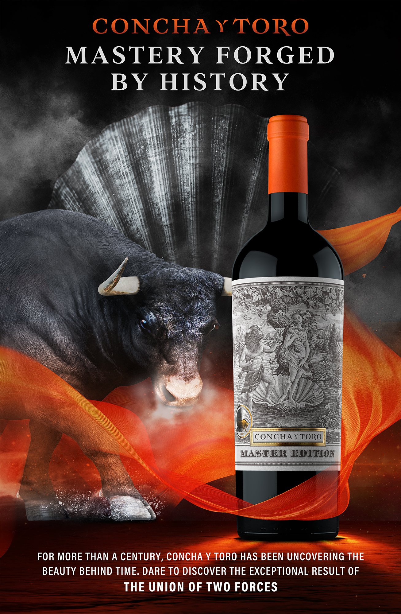
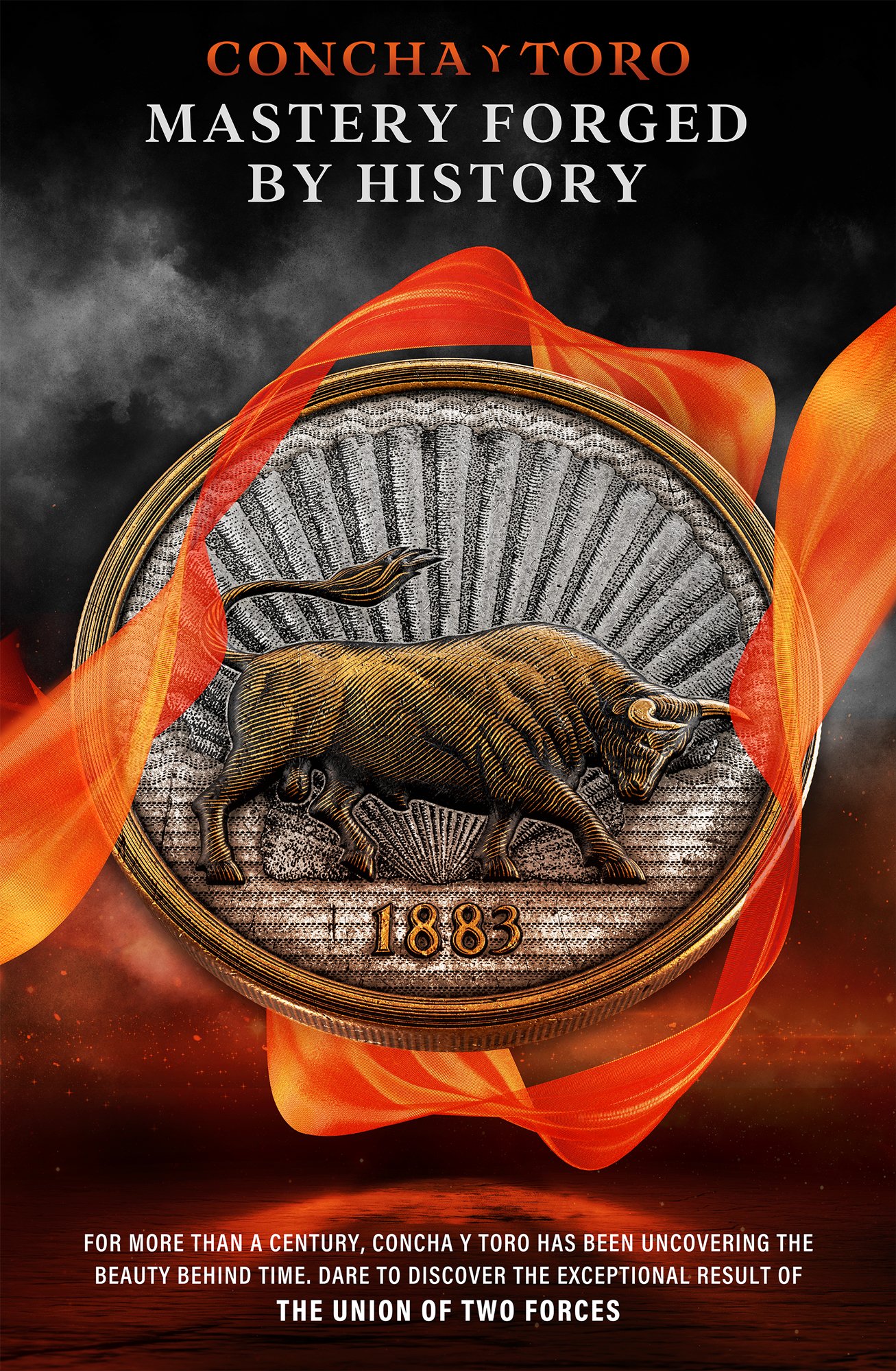
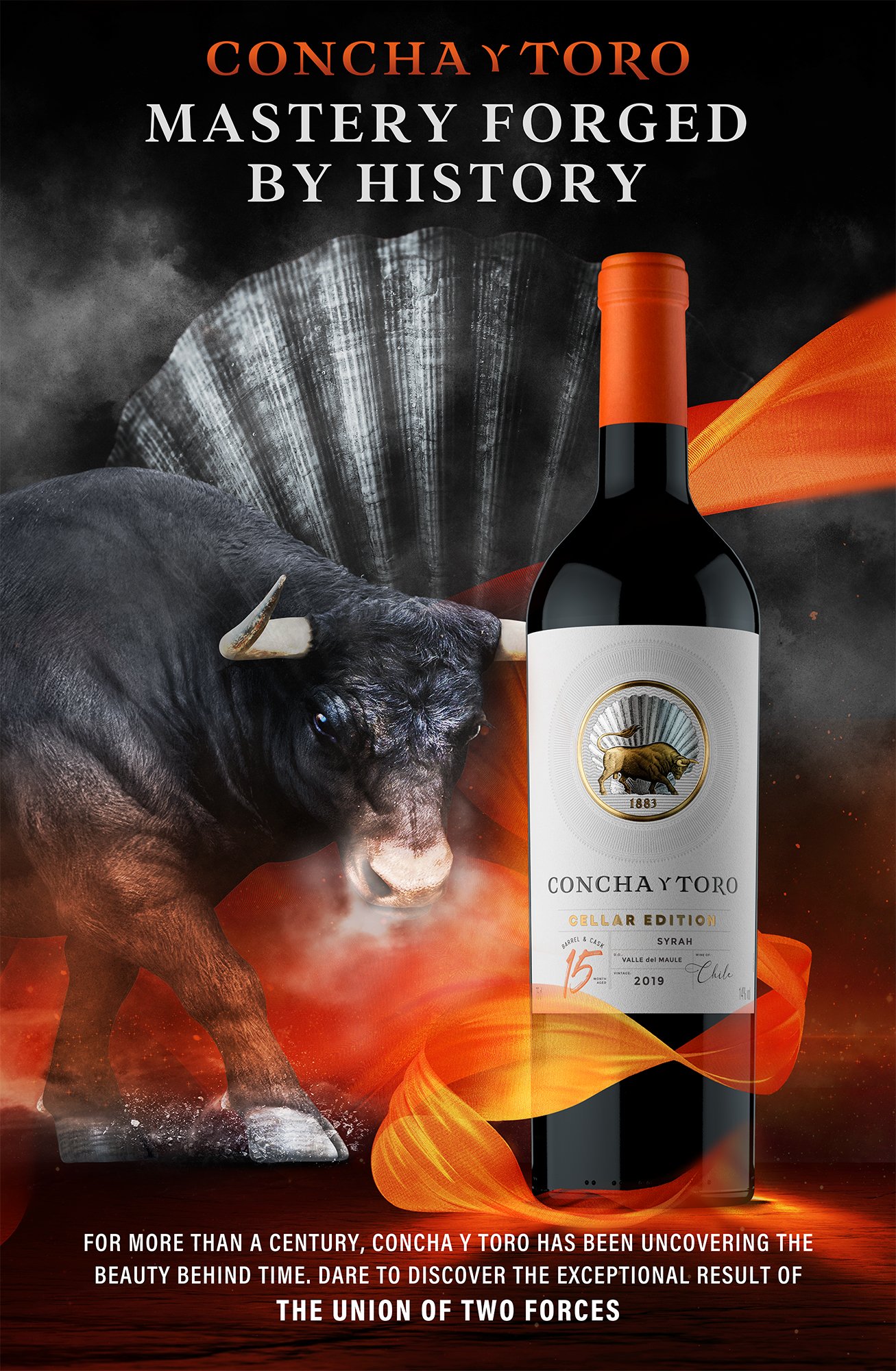
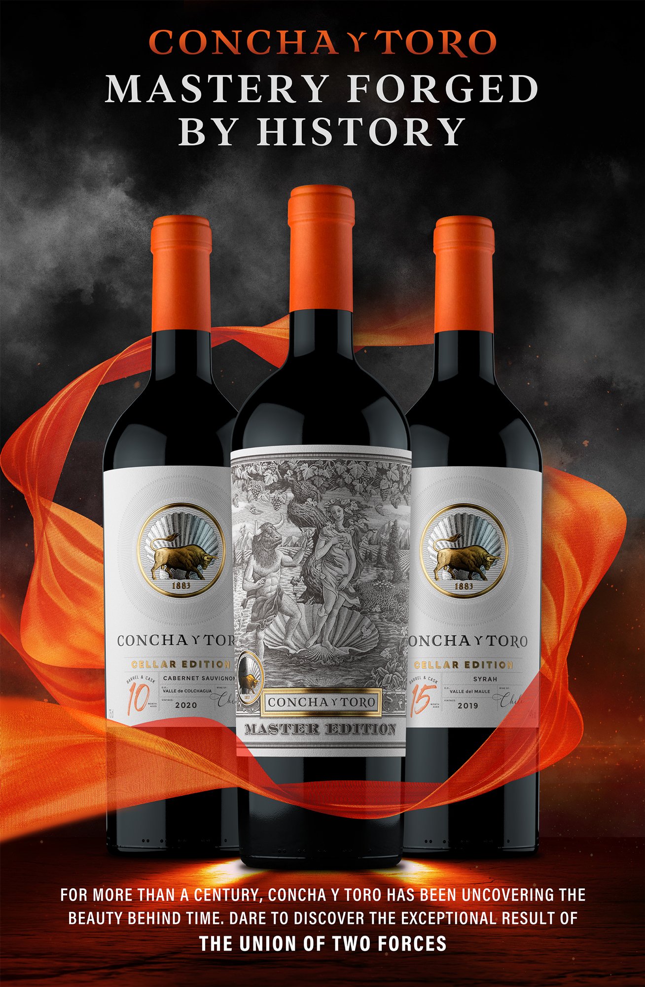
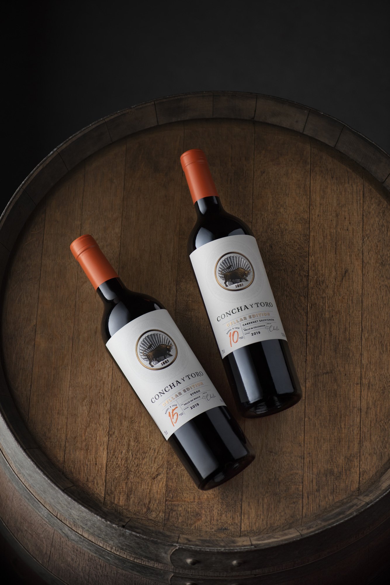
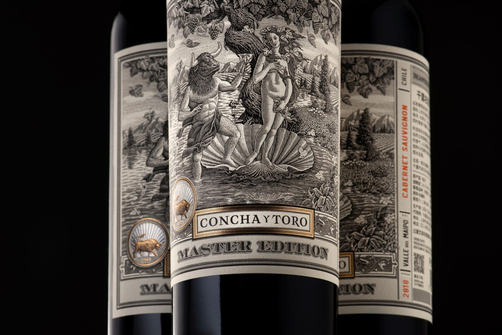
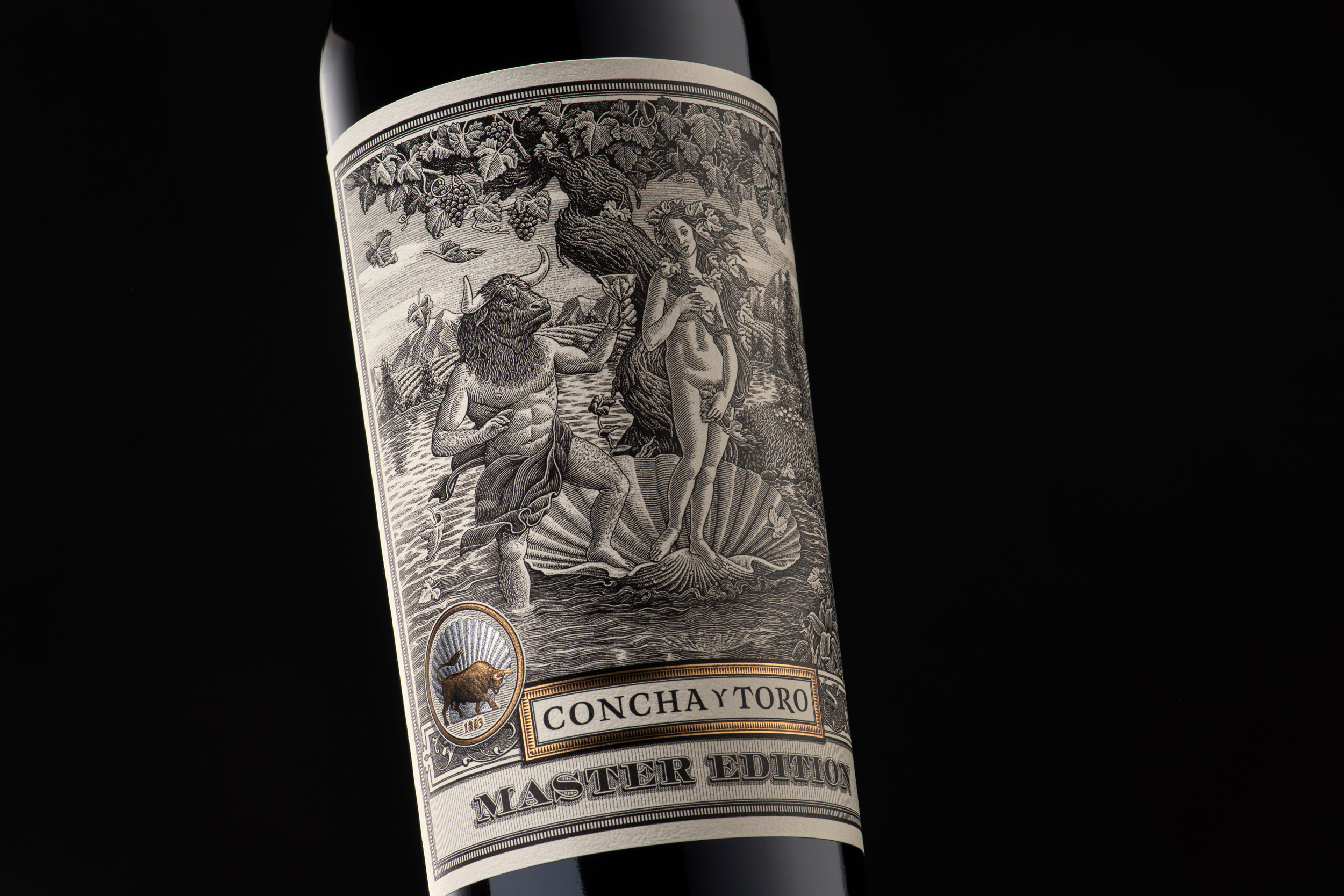
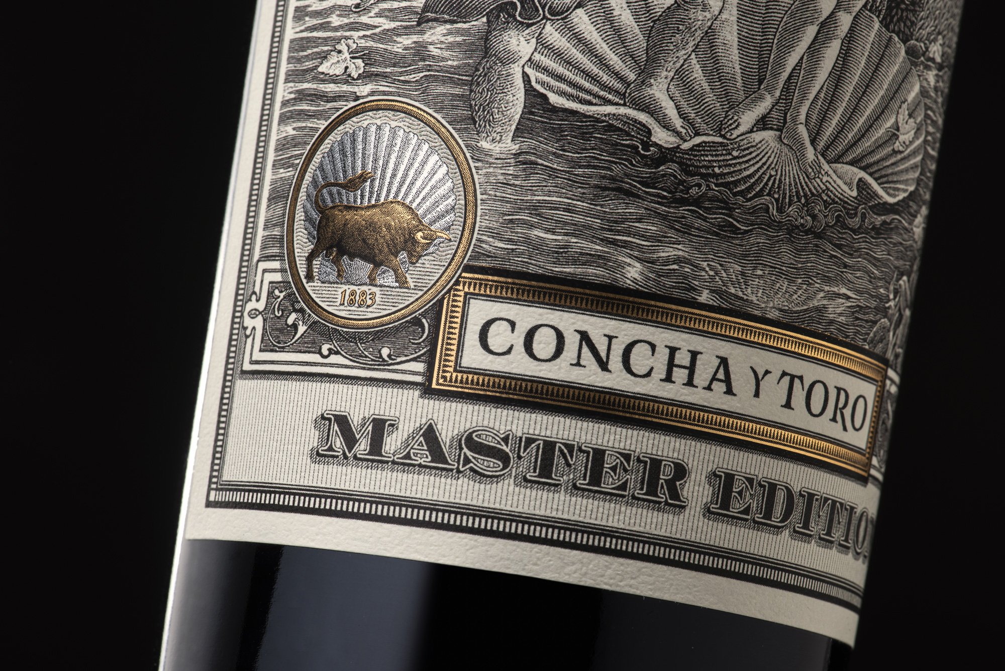
Seeking to reinforce and deepen the company’s foothold on the Chinese market, we were tasked with creating a narrative specifically targeted to this audience, highlighting the exclusive and premium quality of the brand through an iconization of the figure of a shell (Concha) and a bull (Toro).
Our Approach
Since both the product and the campaign had been specifically created for the Chinese market, our strategic work began with a thorough investigation of our audience and what they sought in a premium wine brand.
This provided a framework from which the narrative, icons, colors, and key visuals would come to life. Once we had a better understanding of this, we began to develop what would become the soul of the brand: the history behind its name and its icons –a shell and the bull- and how the entire ethos of the line can be traced back to them.
The bull would represent strength, patience, and energy, while the shell stood for intuition, sensitivity, and imagination, thereby founding a brand that encompasses and conveys all of the elements that come together in the making of these wines. The notions of heritage and contemporary vision were also worked in, highlighting how, throughout the extensive history of the company, they have worked together in perfect balance.
The Result
This campaign resulted in the successful launch of the brand’s first icon wine created specifically for the Chinese market, featured in Chengdu International Airport and the Chengdu fair, generating a strong resonance with the key target market.
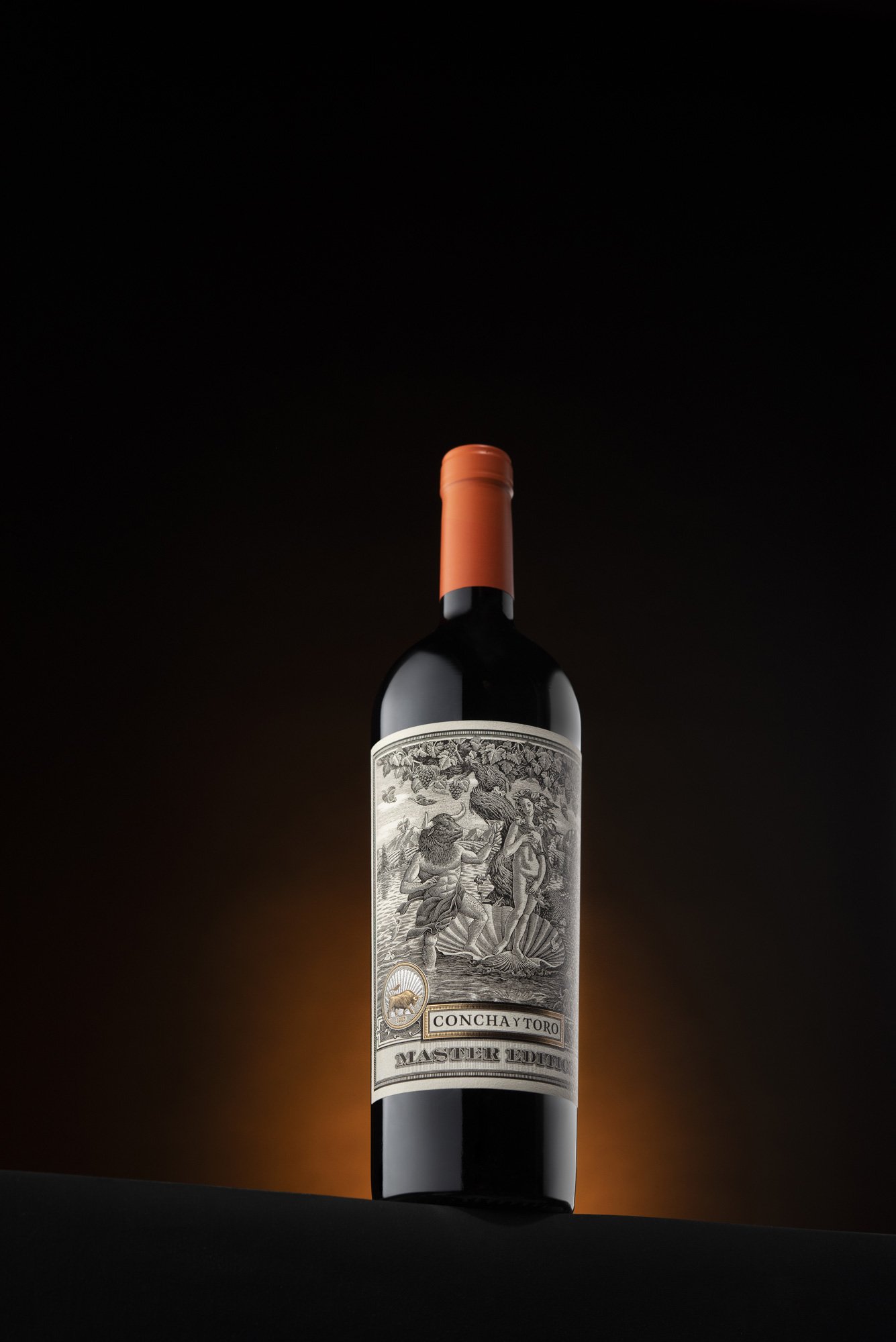
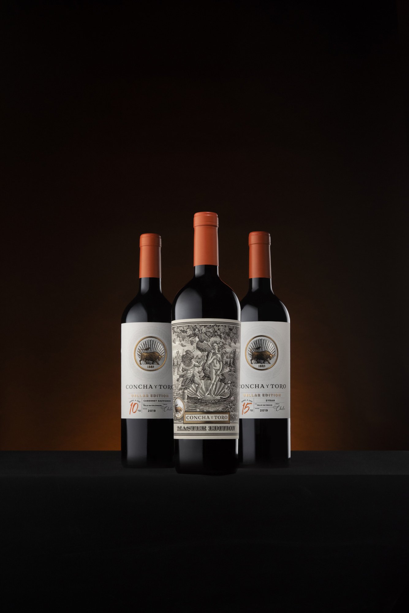
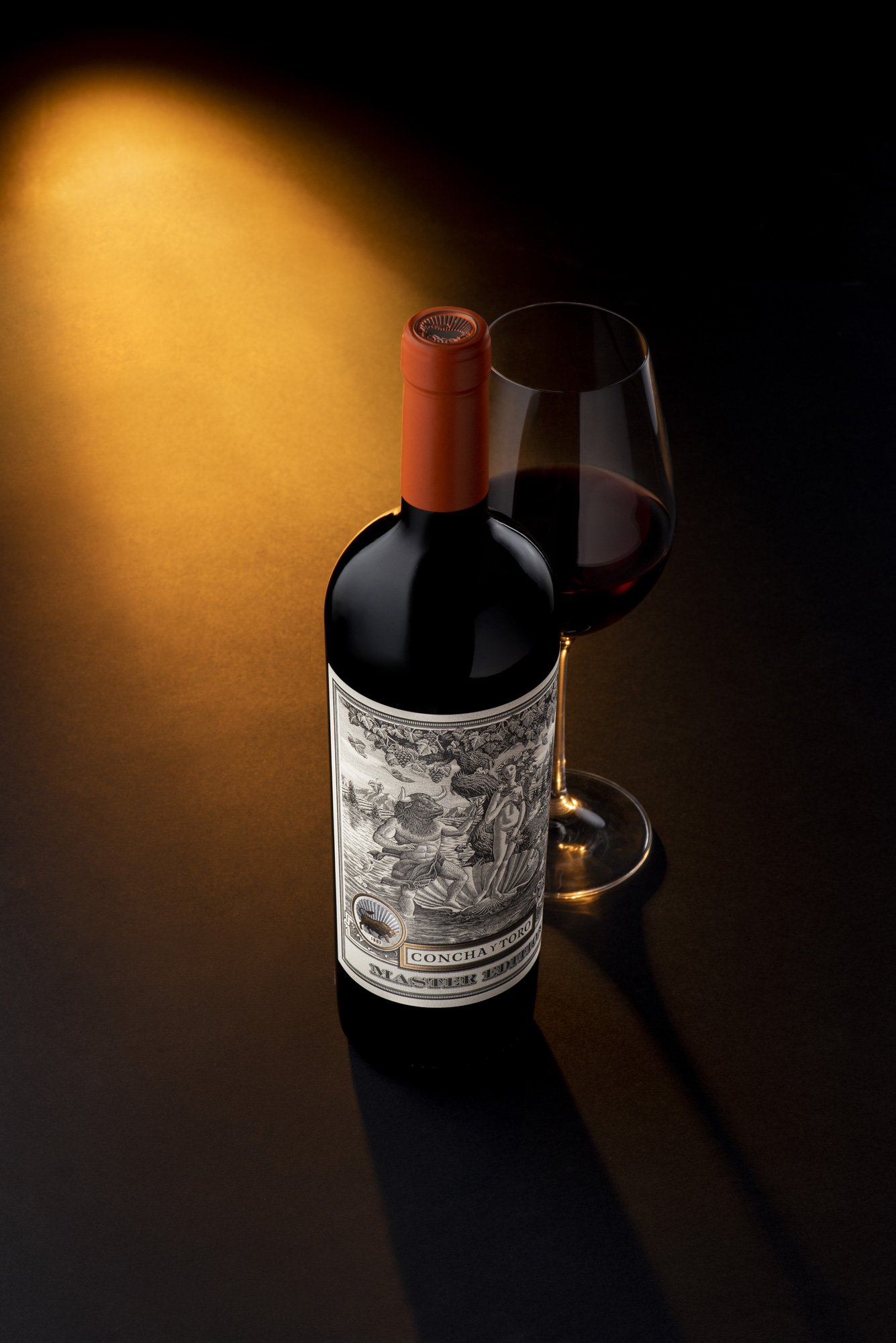
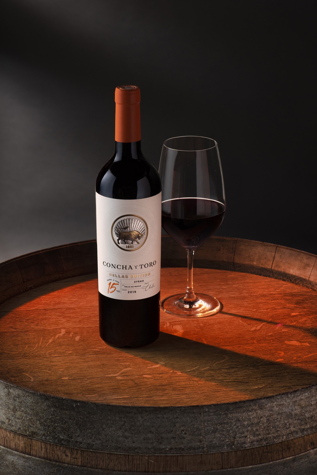
Within Concha y Toro, it has been hailed as one of the most successful and beautiful campaigns ever created for the company. Our work also spanned an array of audiovisual content, including videos of the winemaker, the brand’s history, and the brand’s icons, as well as key visuals, product photography, and other pieces.
The release campaign was so well-received it was renewed for a second year, focused on strengthening the insertion of the product in China and seeking to bolster the Concha y Toro brand.
CREDIT
- Agency/Creative: GRIT STDO
- Article Title: Concha y Toro Wine Campaign – Mastery Forged by History
- Organisation/Entity: Agency
- Project Type: Campaign
- Project Status: Published
- Agency/Creative Country: Chile
- Agency/Creative City: Santiago
- Market Region: Asia
- Project Deliverables: 3D Design, 3D Motion, Advertising, Advertising Photography, Art Direction, Brand World, Poster Design
- Industry: Food/Beverage
- Keywords: WBDS Agency Design Awards 2022/23
-
Credits:
Creative Executive Director: Daniela Belén
Creative Executive Director: Jaime Loor
Photographer: Diego Agurto


