Afterhours – The Toast Office
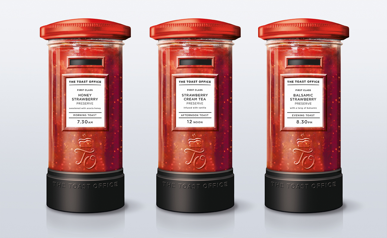
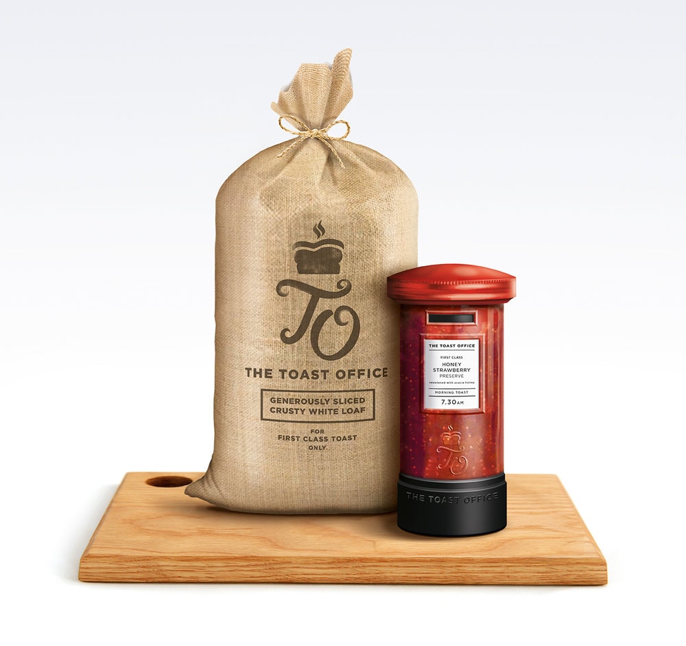
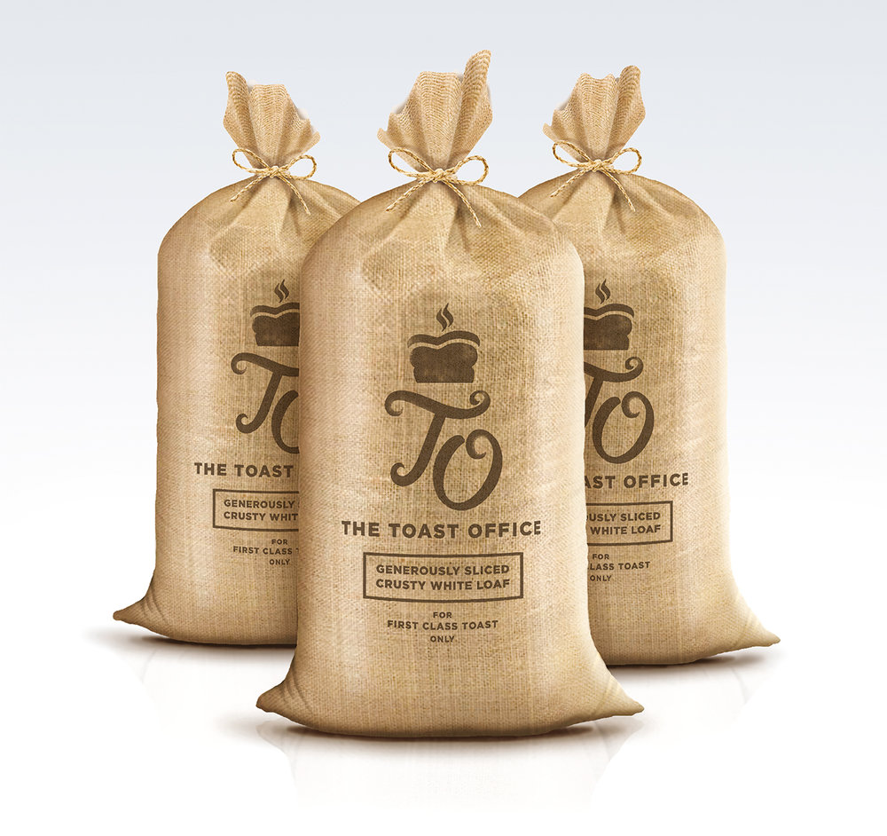
“Conceptual identity and packaging for a range of jams and bread, both designed to make perfect partners and first class toast.The jam jar format and structure is modeled on the traditional British post box- with each variant in the range being a unique twist on a classic strawberry jam where each recipe is the perfect partner for ‘morning’, ‘afternoon’ or ‘evening’ toast.The jar would be an embossed glass to capture the post box features and the metal lid would echo the proportions and moulding details too. Finally, the product information is contained on a white paper label in the style of postal information signs.The novel, iconic format, the ownership of the ‘red’ strawberry jam and the new approach to marketing flavour profiles through time of day, all help to create an original brand proposition and execution that would offer something unique in a staid category.To partner the above, an accompanying range of bread was created, designed to be perfect for toasting. The bread packaging would be created on a natural, textured paper bag stock to project the correct values of taste and naturalness whilst stillencapsulating the brand theme and tone of voice in its reference to the traditional postal sack.As a brand idea, the theme is intended to ‘own’ this modest British culinary staple and elevate its status to that of a popular British ‘institution’ in a playful and distinctive way.


CREDIT
- Agency/Creative: Afterhours
- Article Title: Conceptual Identity and Packaging Design for a Range of Jams and Bread to make Perfect First Class Toast
- Organisation/Entity: Agency Concept / Non Published
- Project Type: Packaging
- Agency/Creative Country: United Kingdom
- Market Region: Europe
- Format: Bag, Jar
- Substrate: Glass


