43oz.com Design Studio – Felicitas
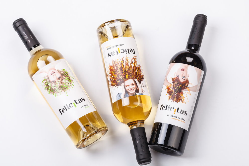
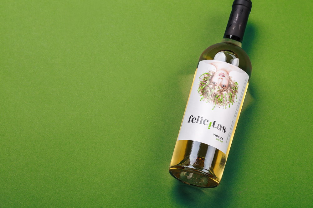
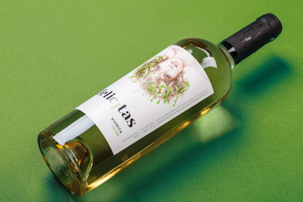
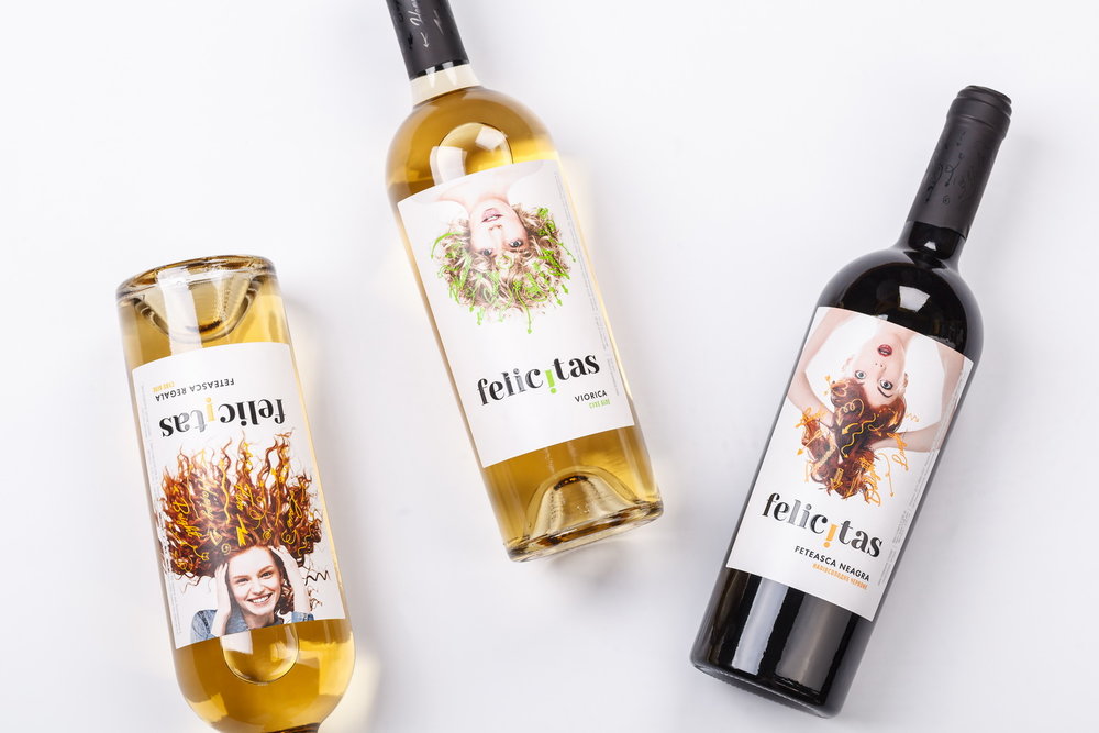
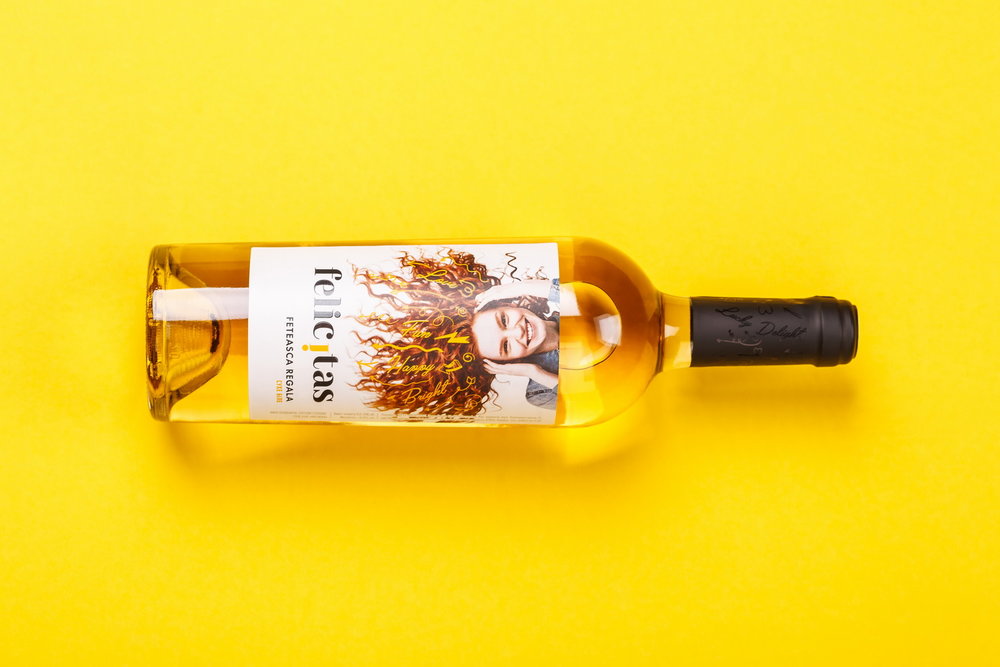
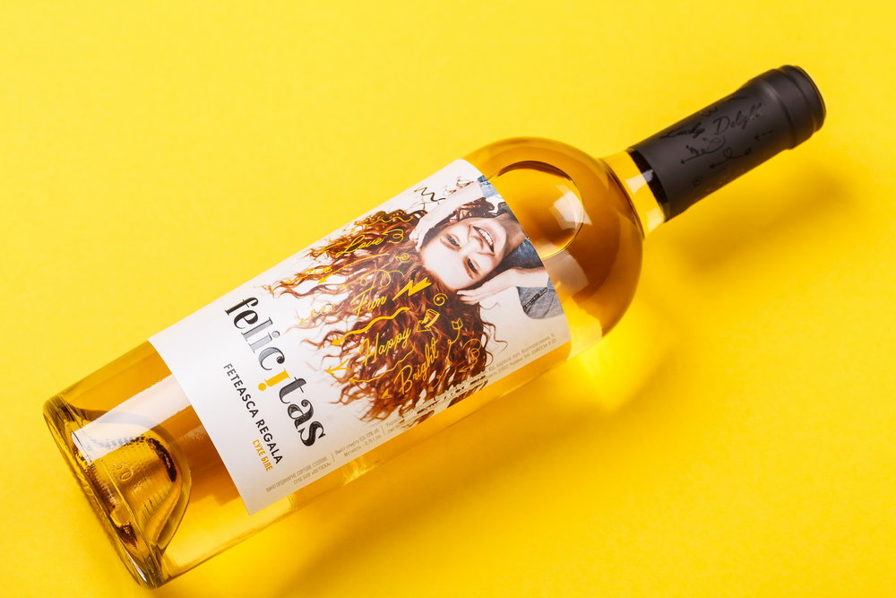
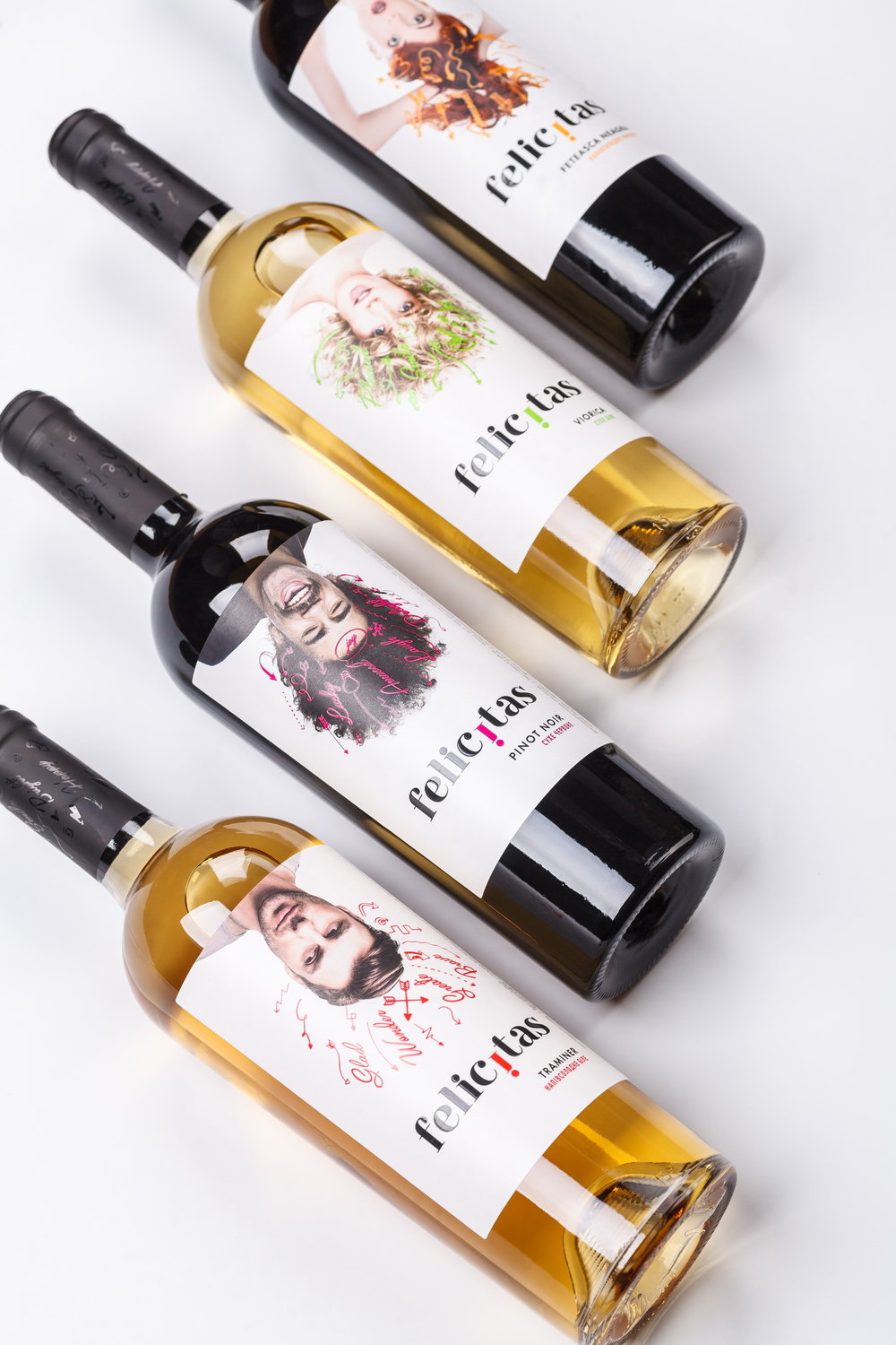
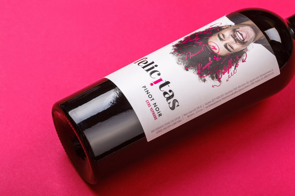
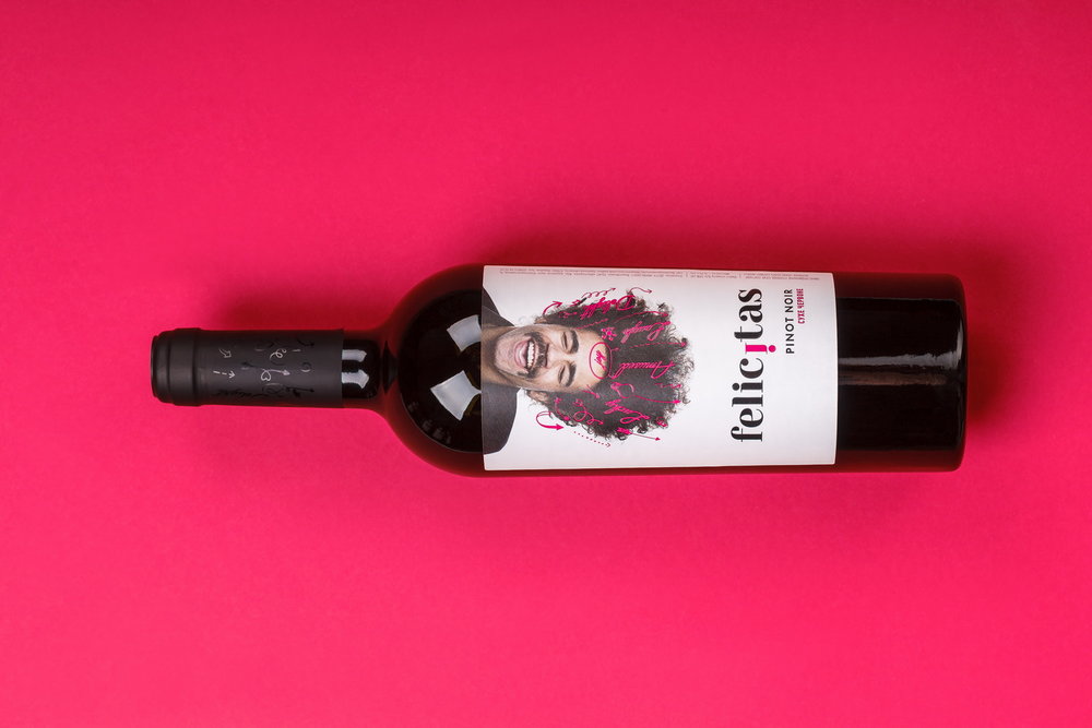
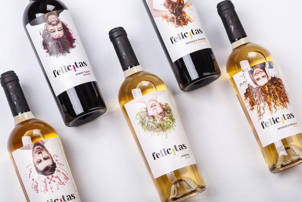
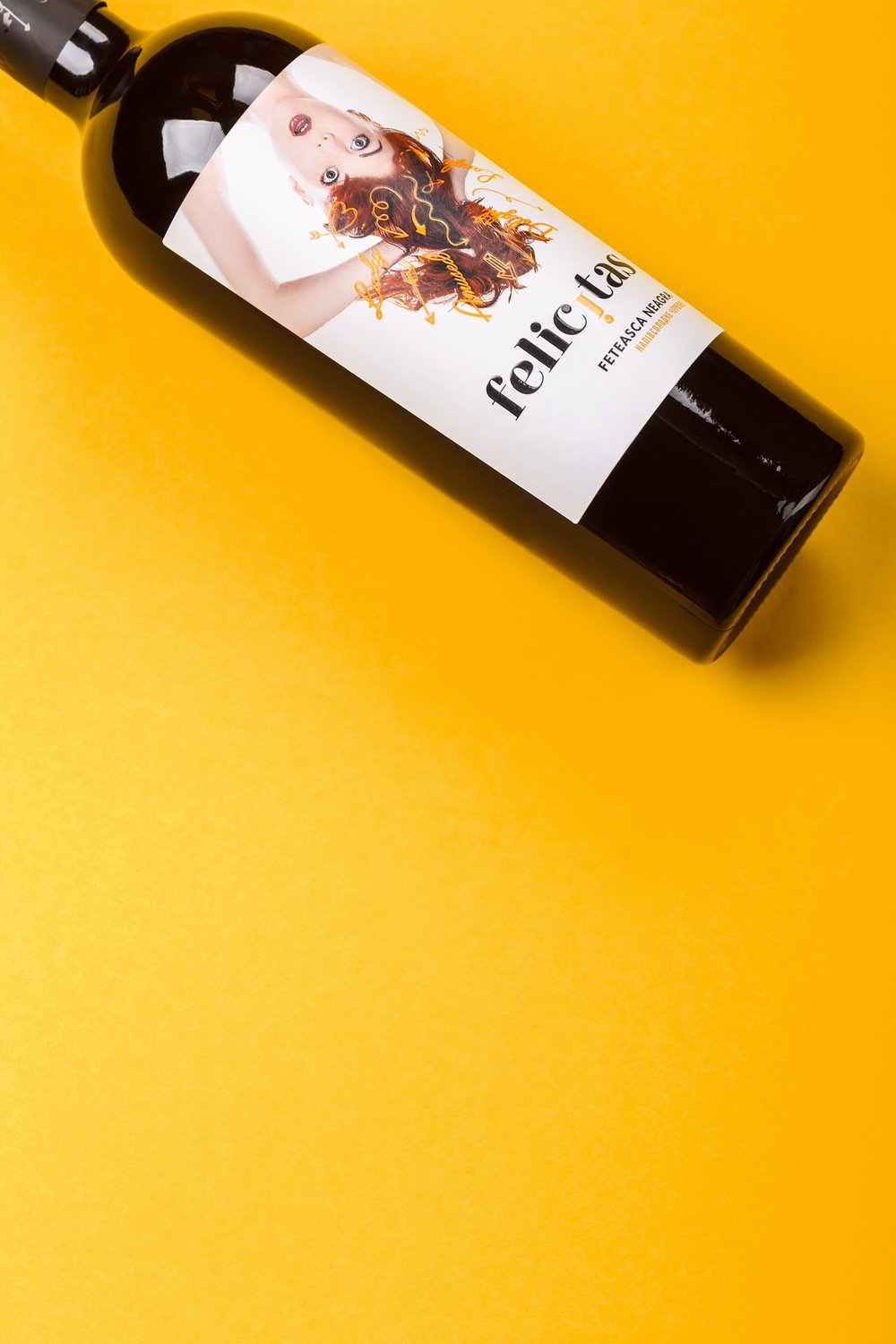
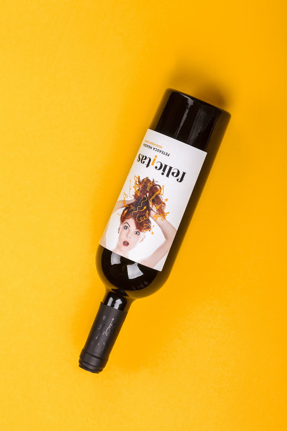
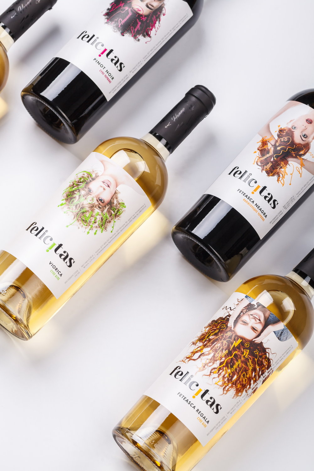
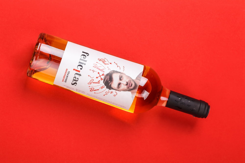
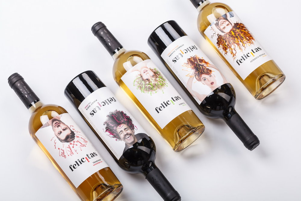
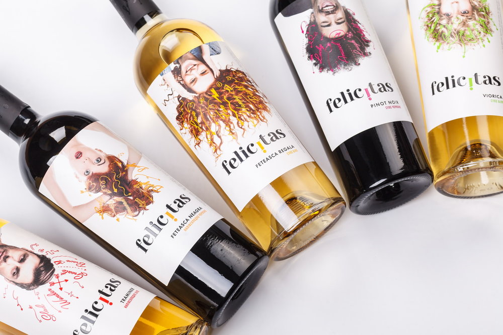
“A fresh outlook, vivid colors and emotions, the ease of being and the ability to savor the moment – these concepts have laid the foundation for the new series of wines Felicitas, which our studio has developed the label design for. The product has been aimed for the medium price segment of the Ukrainian wine market, which is dominated by traditional packaging styles. The client wanted to break the mold and make the product communicate with young and interesting people – namely those, for whom the wine was made for.The label design for Felicitas wines instantaneously catches the eye with the vivid images of young people in the central part of the label. It was important for the client to show who the product is destined to – young, bright people, who want to try something new and different. The portraits are enhanced with vivid colorful doodles, which emphasize the light and playful mood of the composition. And thanks to the inverted placing of the portraits upside down, the product momentarily draws the consumer’s attention on the shelf with its unusual look, different from the temperate classic solutions common for this market segment.”
