Tea fields. The rustle of herbs. Calm. Everything related to the natural is embodied in traditional Chinese tea drinking culture.
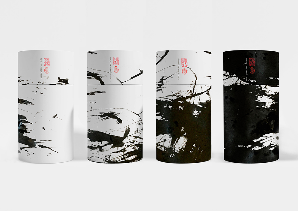
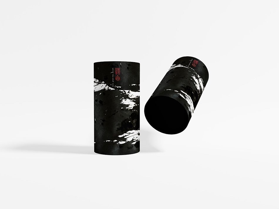
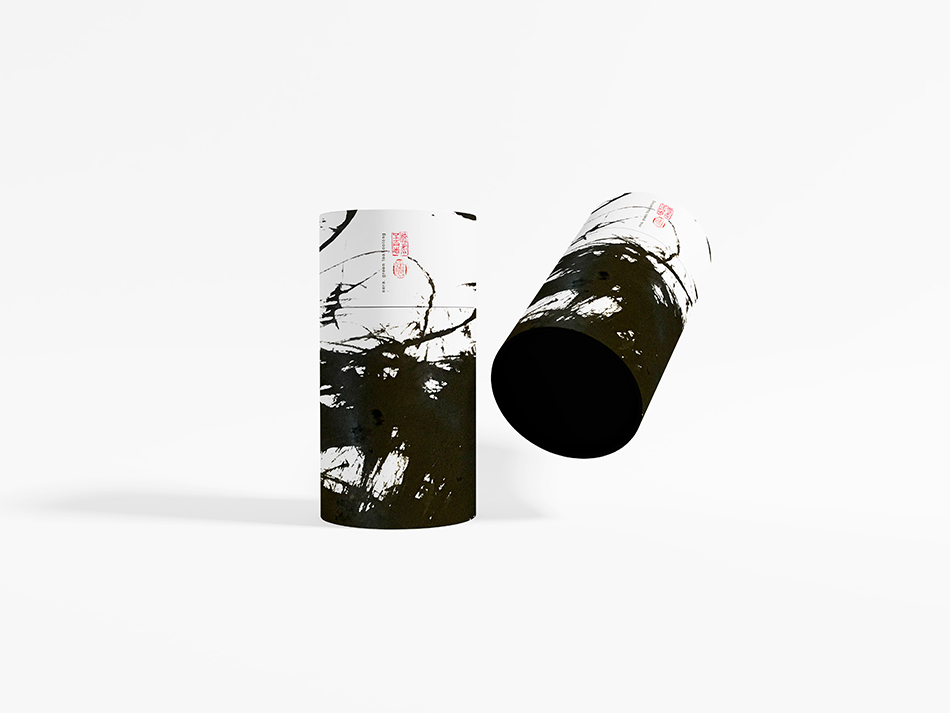
Harmony and lack of stress and worries are what is concentrated in the two characters that you can see on the tea packages. They mean ‘No Worry’(Joseph Hwang) and ‘Everything in Harmony’ (Young Hee Koo).
The philosophy of life is conversion. We are drinking tea, time is passing, we are changing. The patterns on the packaging are also changing.
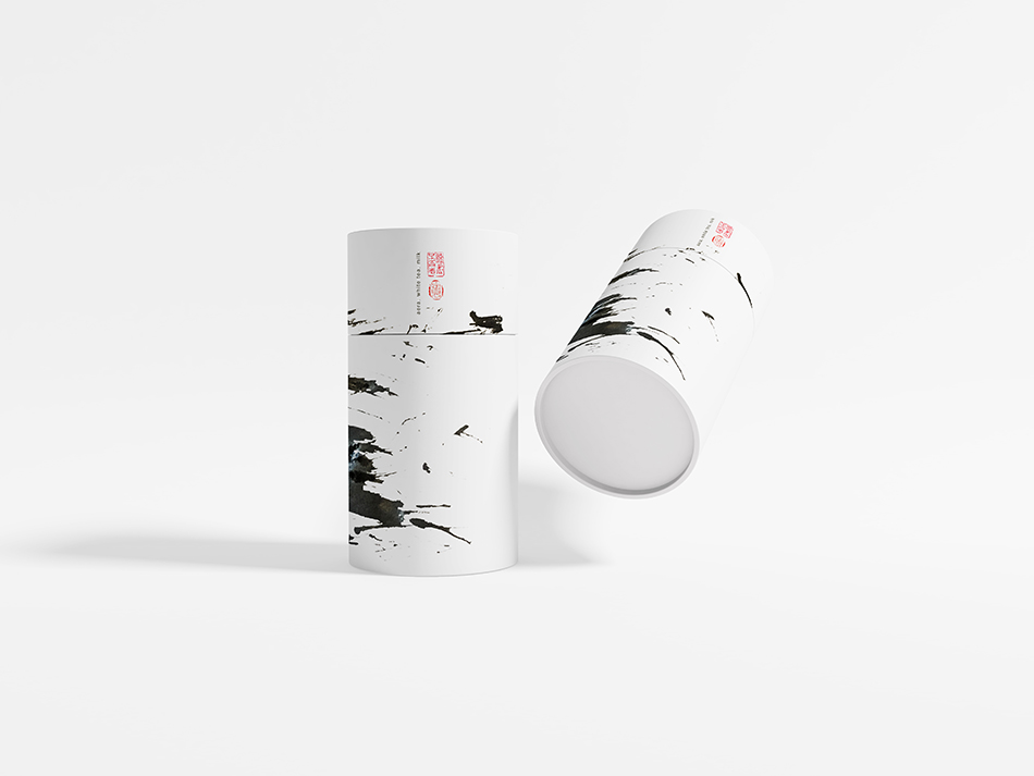
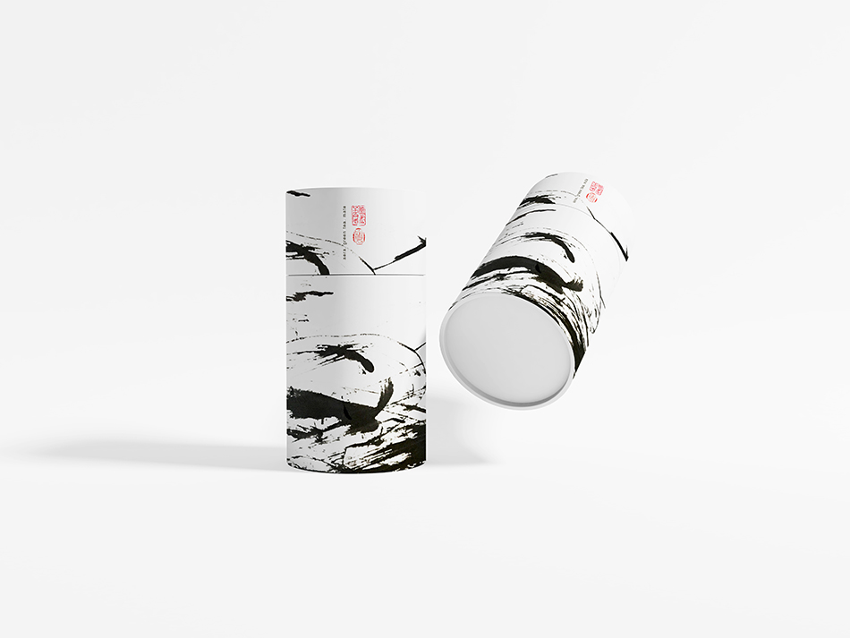
Who are you today? What would you like? Calm White Tea? Thoughtful Mate or saturated Oolong? Determined Pu-erh?
Now it is time to return to nature and to show our attitude to life through the choice of tea.
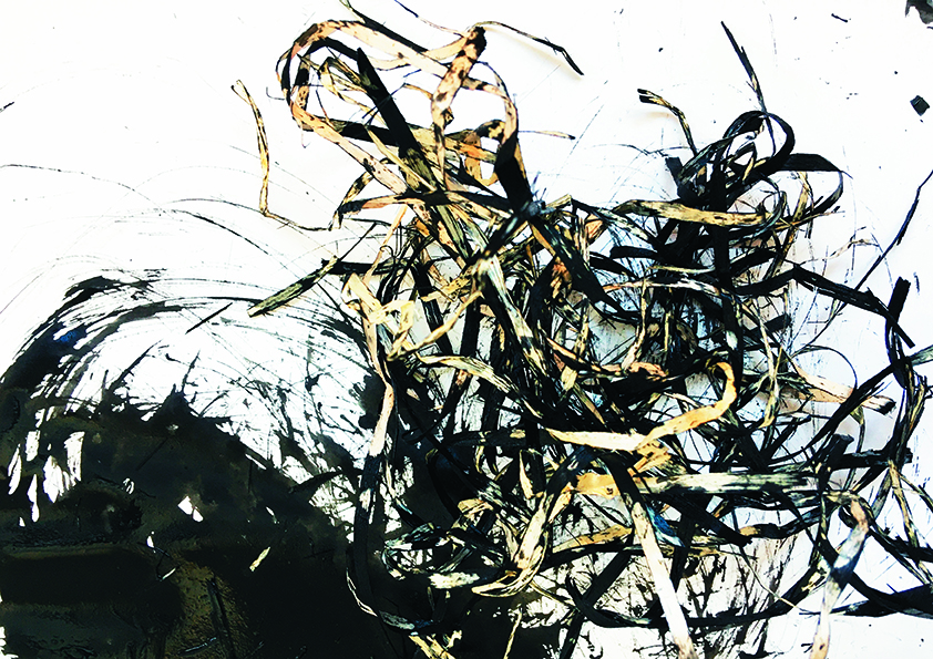
Unique: all the visual metaphors that are used on the packaging are unique ink drawings. The main drawing tool is dried grass. These materials give the project feeling, fills it with the breath of nature. Hieroglyphics belongs to the authors of Art of Ink 2010 (Joseph Hwang and Young Hee Koo).
CREDIT
- Agency/Creative: Maria Vishnyakova
- Article Title: Concept of Packaging Aera Green & White Tea
- Organisation/Entity: Student, Non Published Concept Design
- Project Type: Identity
- Agency/Creative Country: Russia
- Market Region: Europe
- Project Deliverables: Brand Identity, Brand Naming, Branding, Graphic Design, Packaging Design, Product Naming, Research, Tone of Voice
- Industry: Food/Beverage
- Keywords: Packaging, Tea, Ink, Graphic Design, Brand, Illustration, Tradition, China


