


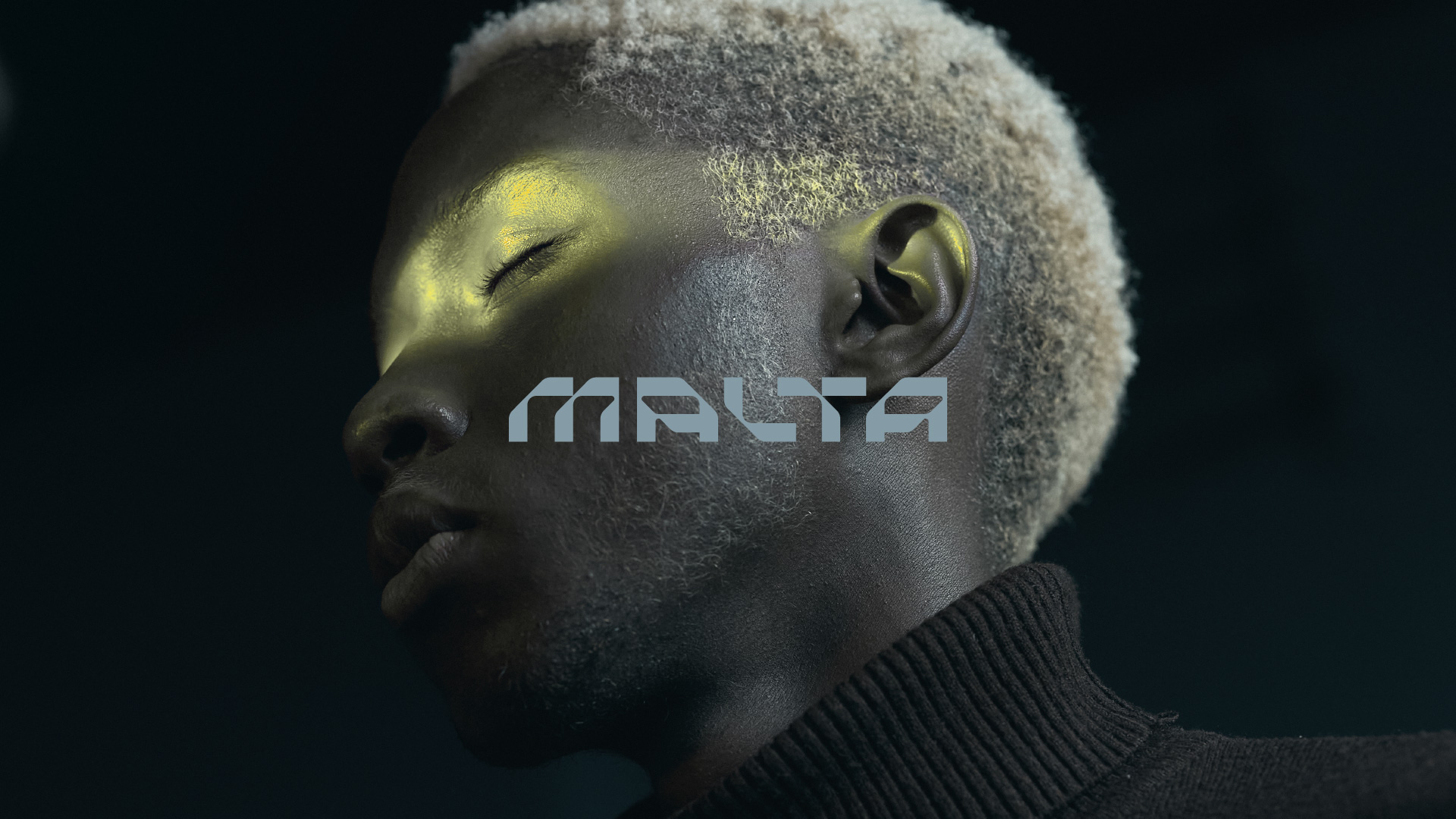
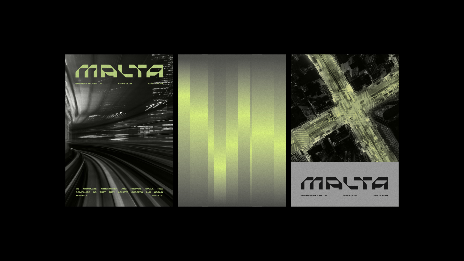
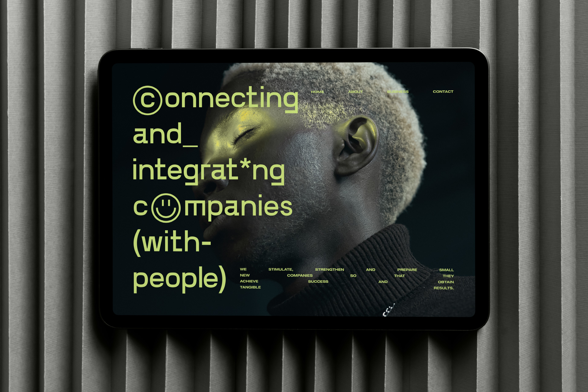
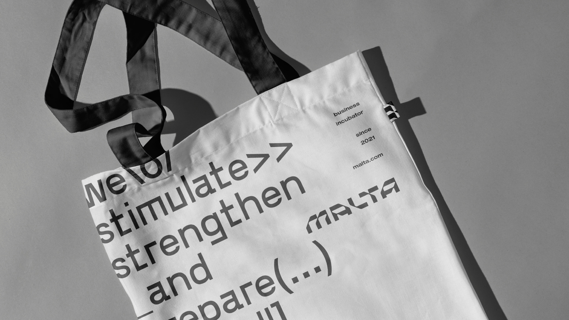
Malta is a Brazilian business incubator based in New York, United States. Its mission is to stimulate, strengthen and prepare small new companies so that they achieve success and obtain tangible results.
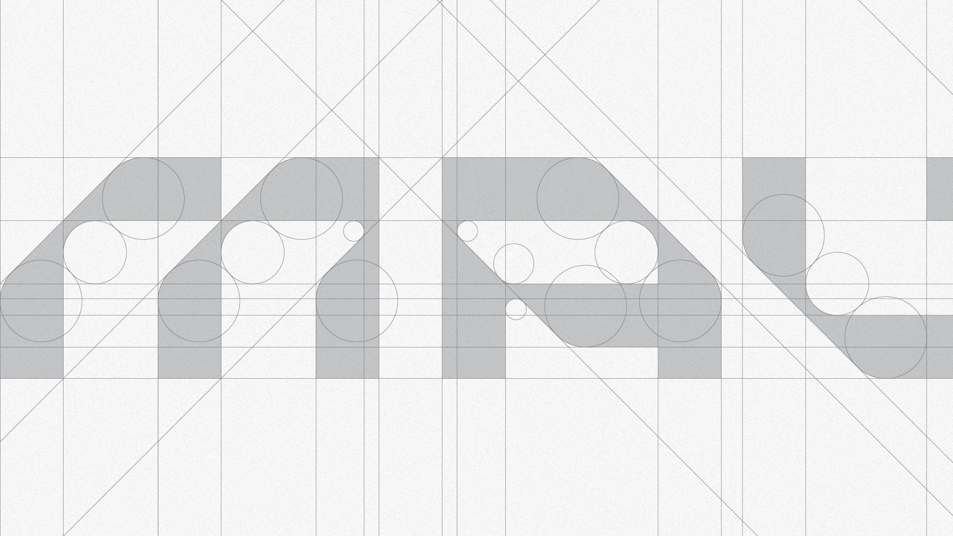
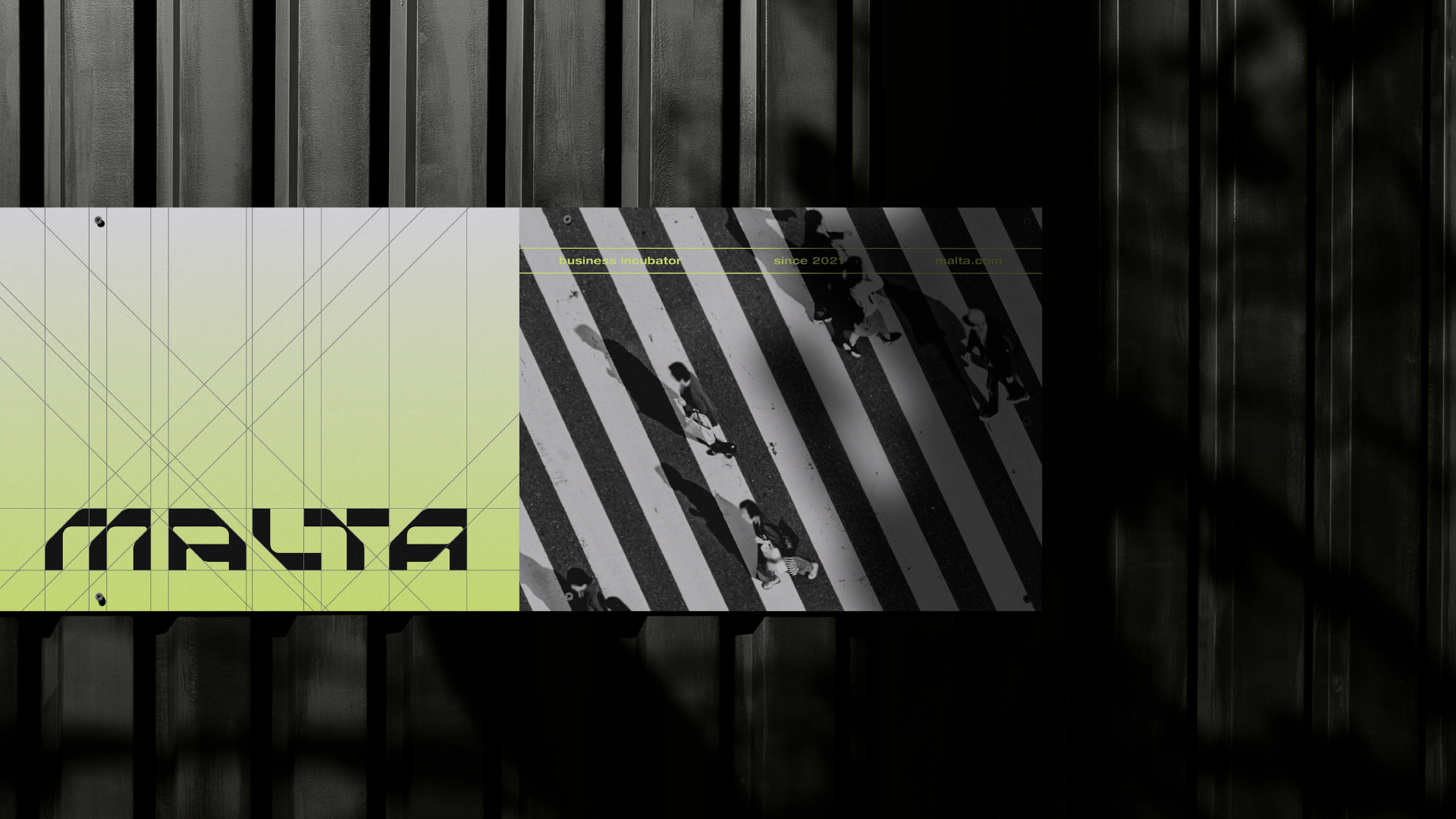
Based on the pillars, attributes and positioning of the brand, the concept addressed for Malta’s logo and visual identity was a simple line. Behind a relatively simple graphic element, there is a clear and objective guide that guides the entire identity.
This “guiding” factor directly reflects on the work performed by the business incubator, which is precisely to direct, mentor, train, among other activities that seek to promote and encourage entrepreneurship abroad and around the world.
To reflect Malta’s main purpose, a unique typography was developed based on concise lines. With straight and smooth endings in some corners, the type has a strong personality and characteristics that translate technology, confidence and evolution.
The characters developed for the incubator also explore diagonal cuts, which convey a sense of speed, agility and transformation.
The combination of letters, due to their shapes, not only results in a typography with a modular characteristic, but also a visual identity with countless possibilities for exploration. These characteristics make the Malta logo unique.
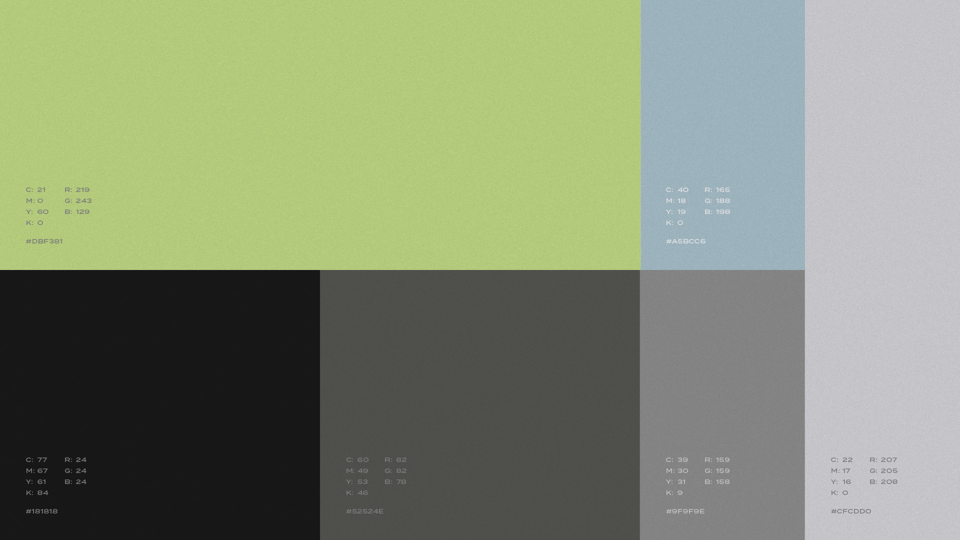
The colors of Malta’s palette were designed so that its visual identity conveys technology and evolution.
The combination of all these colors creates a perfect environment for digital, within the technological advances and platform where we seek to transmit information through mentorships, courses, classes and accessories.
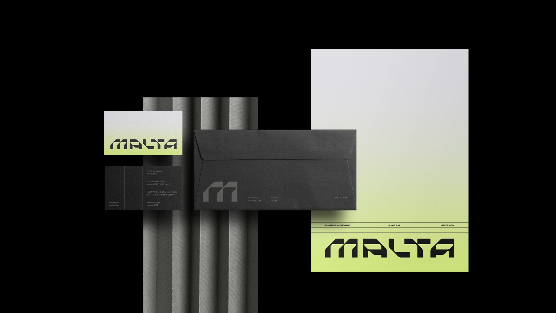
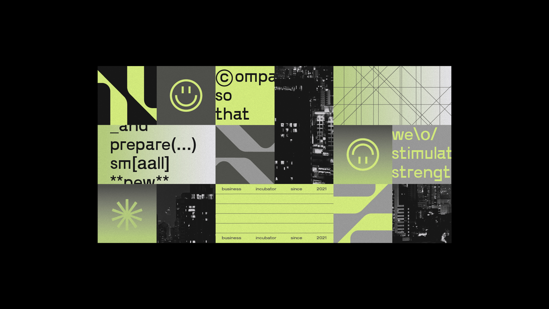
As for the visual identity, created from the graphic representation of a “guide” (straight lines in its infinite applications), the elements created to compose the look of Malta drink little of minimalism and information in its essence, where typography gains prominence. .
Backgrounds with solid colors, lines guiding the layout of the statements and gradients that bring a sense of freedom and countless possibilities, form the visual identity of the incubator that needs to have communication as an ally in any of its services provided.
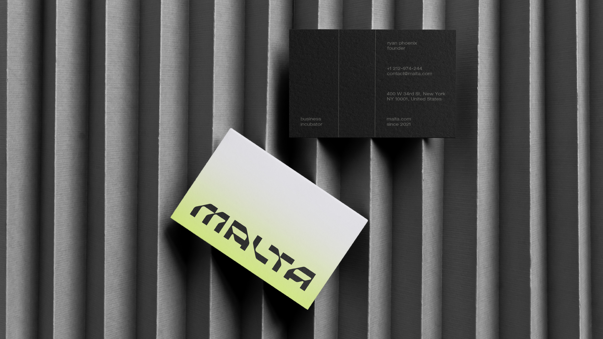
The result is a direct and clear identity, but which also gives interesting creative possibilities to dare, as well as the type of business that Malta seeks to serve.
CREDIT
- Agency/Creative: Matheus Ferreira
- Article Title: Malta Brand and Visual Identity Concept by Matheus Ferreira
- Organisation/Entity: Freelance
- Project Type: Identity
- Project Status: Non Published
- Agency/Creative Country: Brazil
- Agency/Creative City: Matheus Ferreira
- Market Region: South America
- Project Deliverables: Art Direction, Brand Design, Branding, Design, Graphic Design
- Industry: Technology
- Keywords: corporative, business, startup, visual identity, brand, brand design, logo, logotype
-
Credits:
Art Director: Matheus Ferreira


