


Co-wood is a brand of wooden play sets from Russia. Its peculiarity lies in the fact that it is not intended for children, but for adults. Many people love puzzles and building toys, but the stores offer mostly children’s sets. Co-wood solves this problem. In addition, the sets will become a stylish detail and a great addition to any interior. And no plastic here! In the best traditions of Russian folk wooden toys.
The naming of co-wood comes from the idea of combining wooden parts together and creating a single stylish composition.
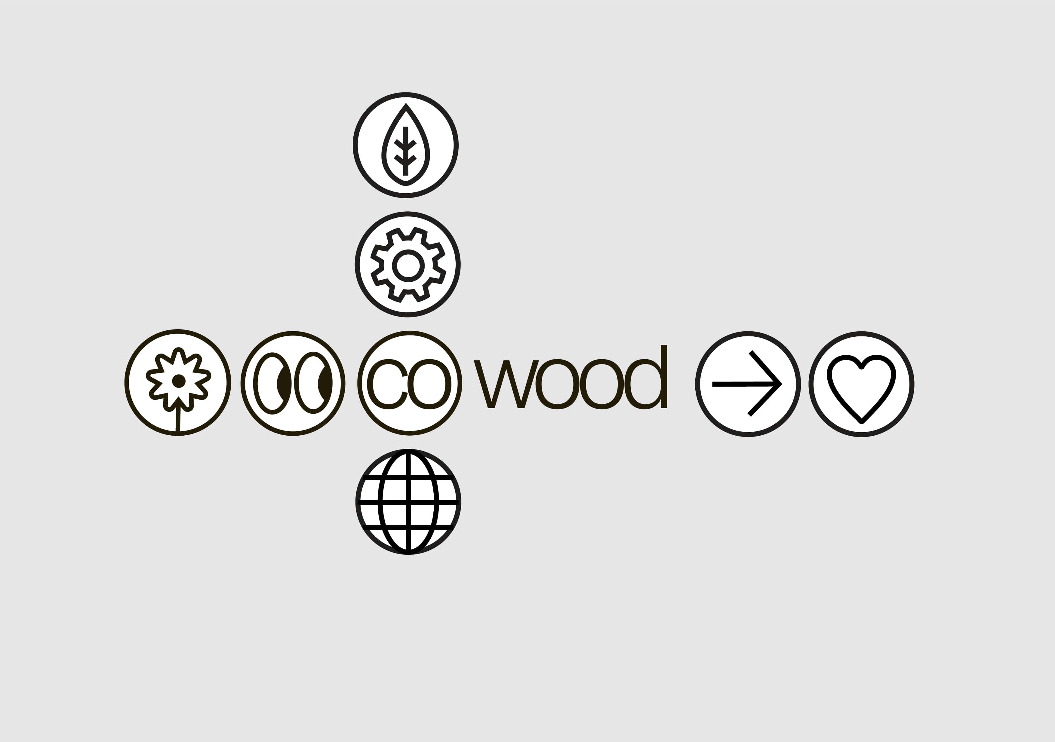
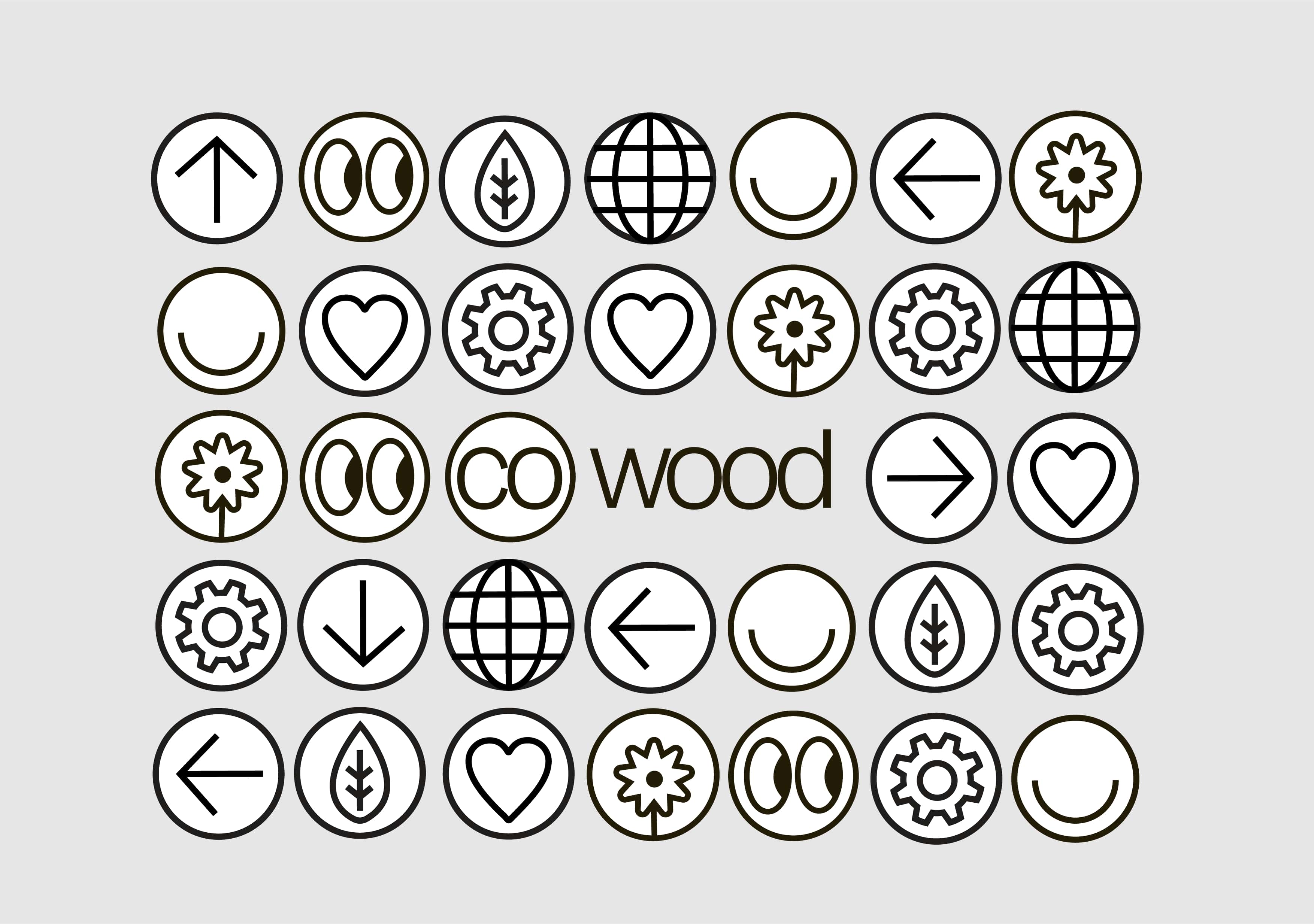
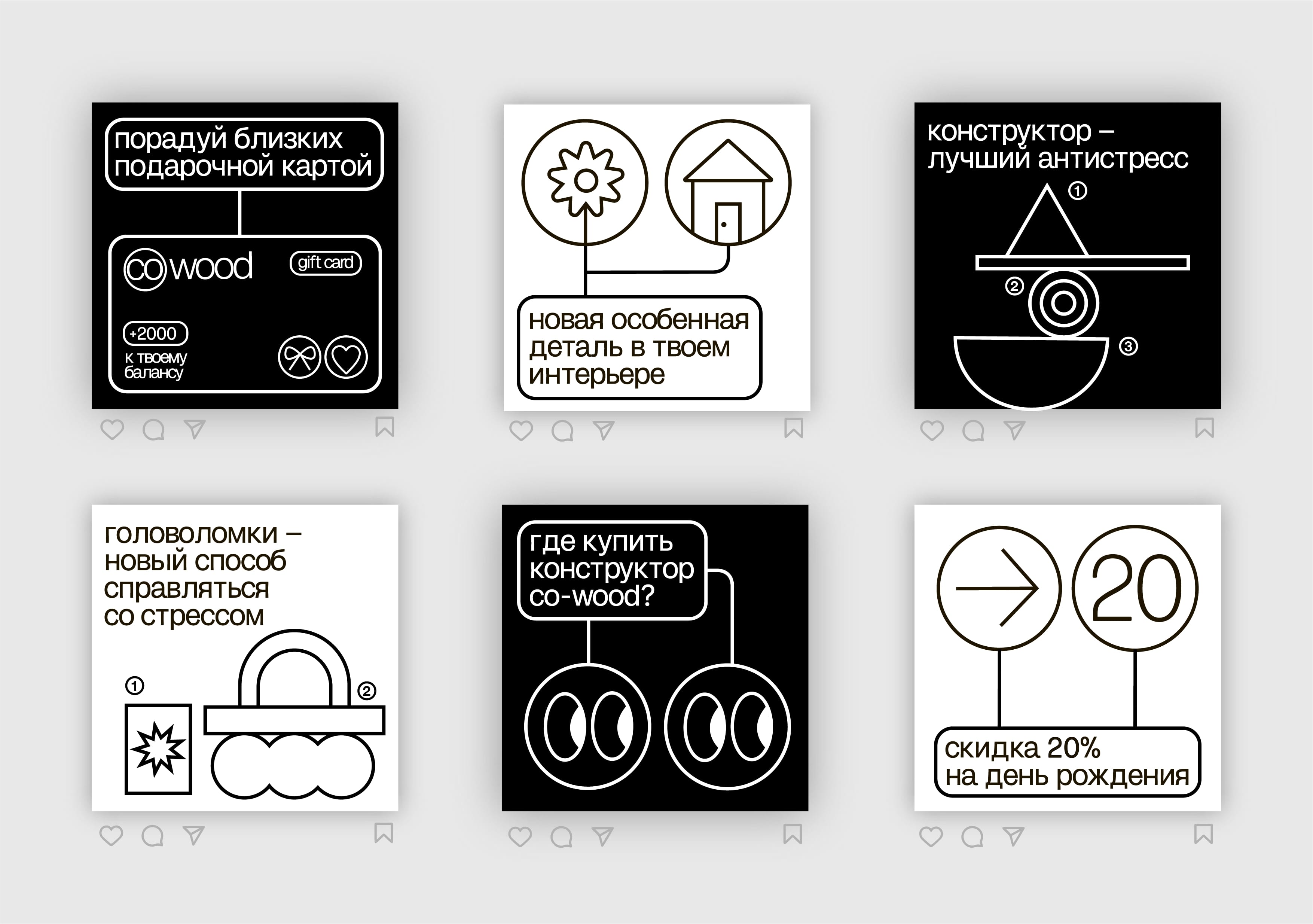
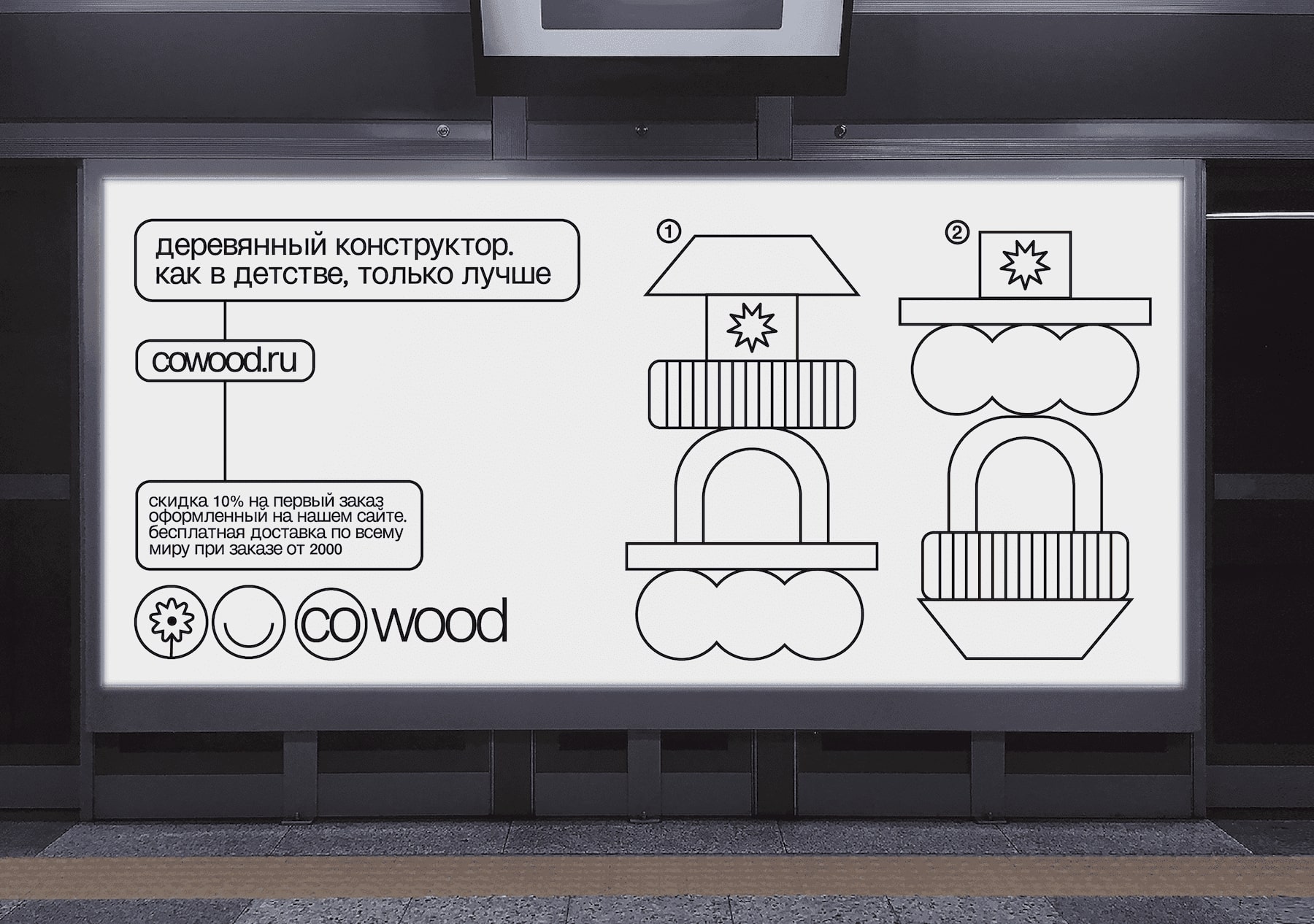
The basis of corporate identity is assembly instructions. No constructor is complete without instructions, so icons, arrows, frames, footnotes and schematic illustrations have become the basis of the brand’s visual identity.
A significant part of the style are round icons that are attached to the logo and create dynamic compositions. They can be multiplied throughout the entire design object, or they can “stick” to the logo in several pieces. All icons indicate the functions, features, properties of the product or the emotions that it brings.
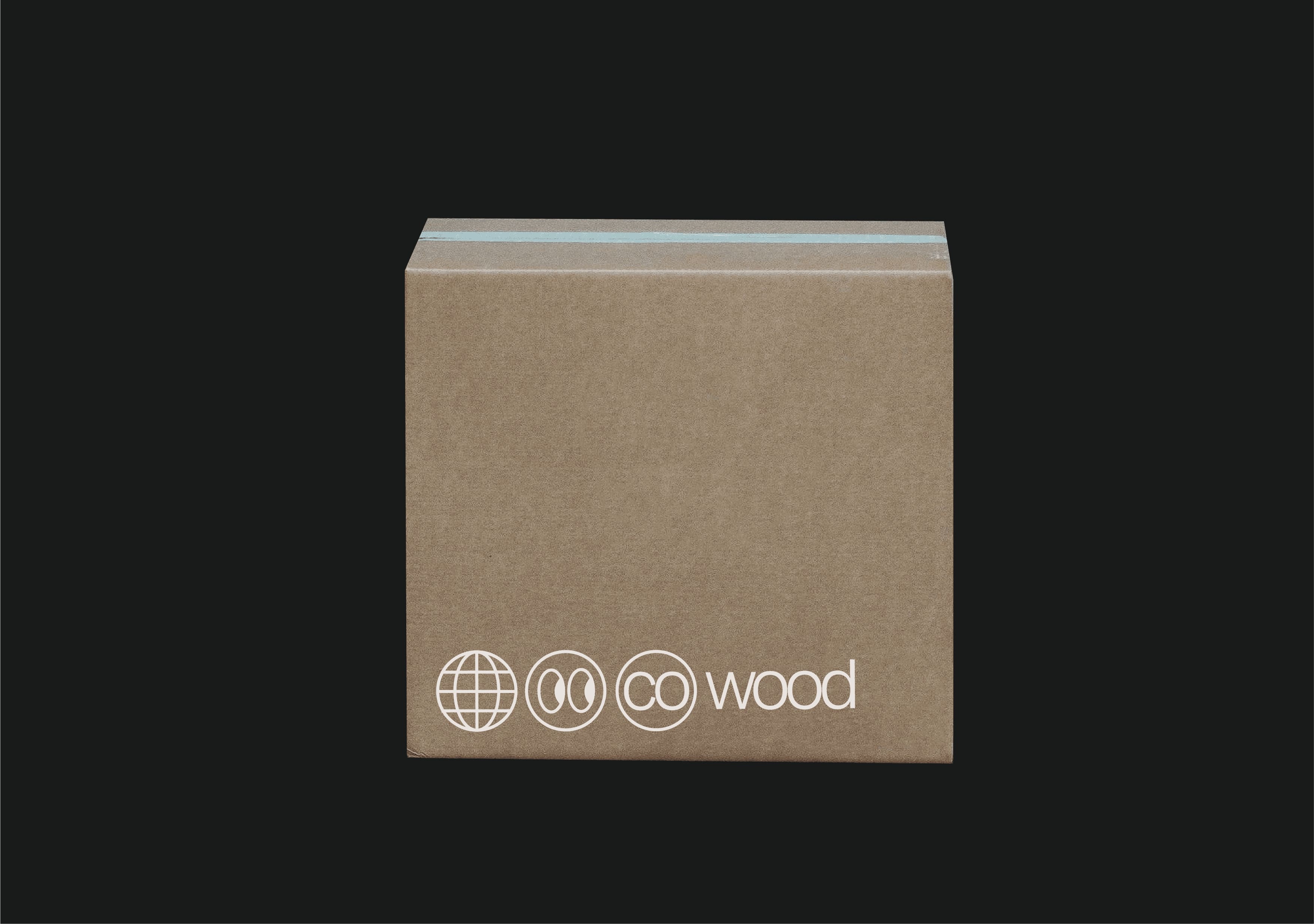
There are only two color combinations in the style: black on white or white on black, in the tradition of proto-design. But for special events, the background can also be used in other colors, in particular, printing on colored office paper.
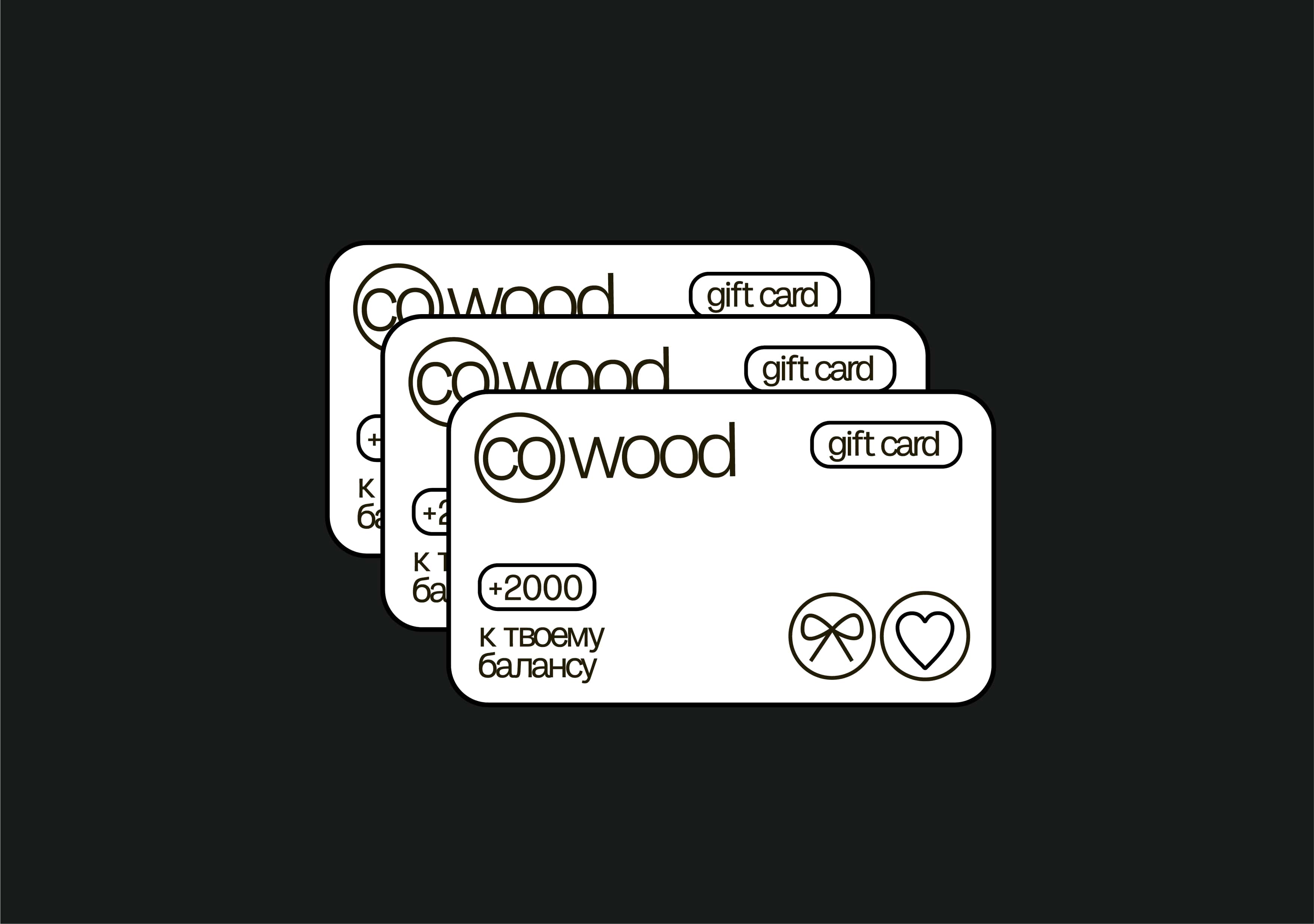
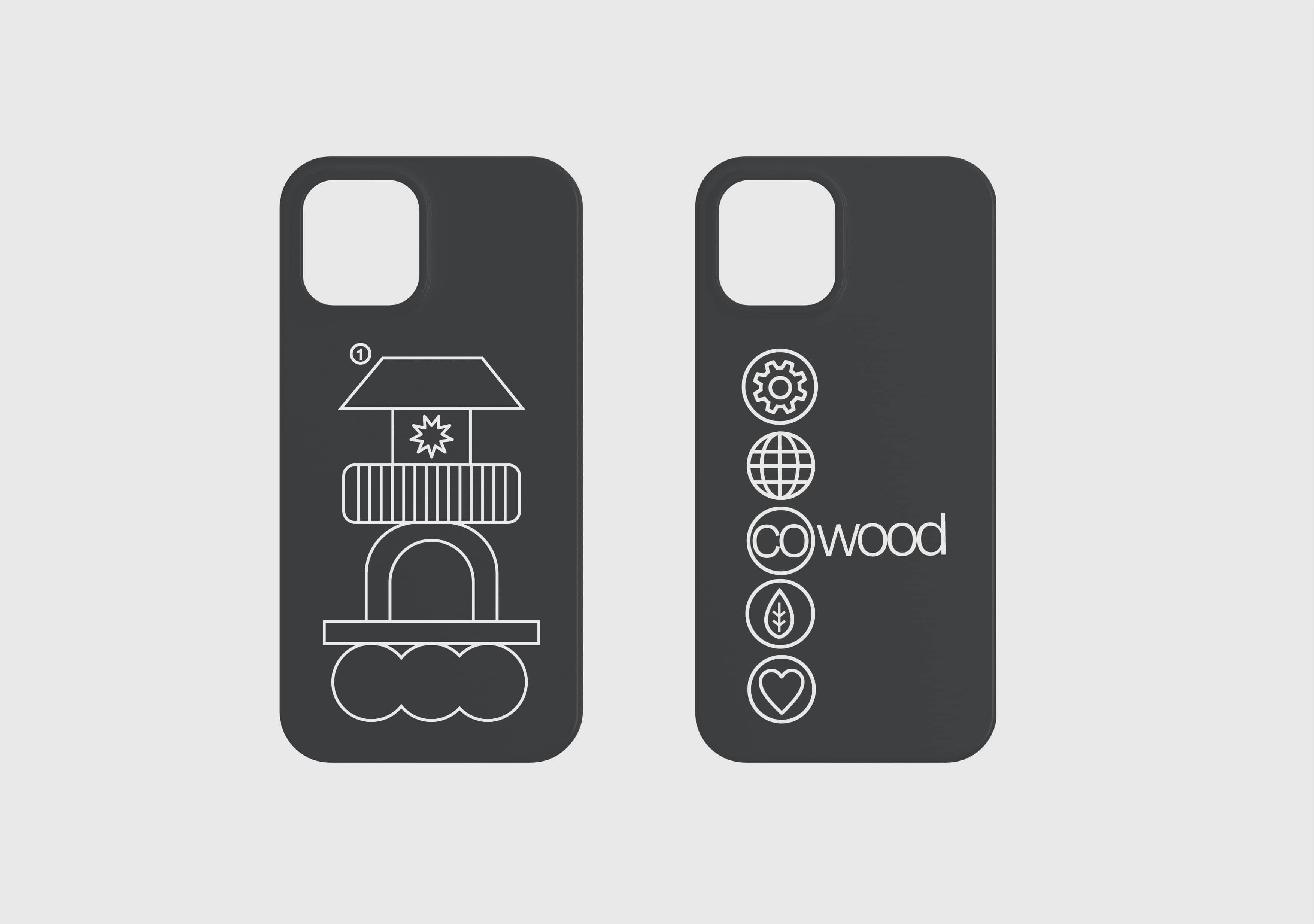
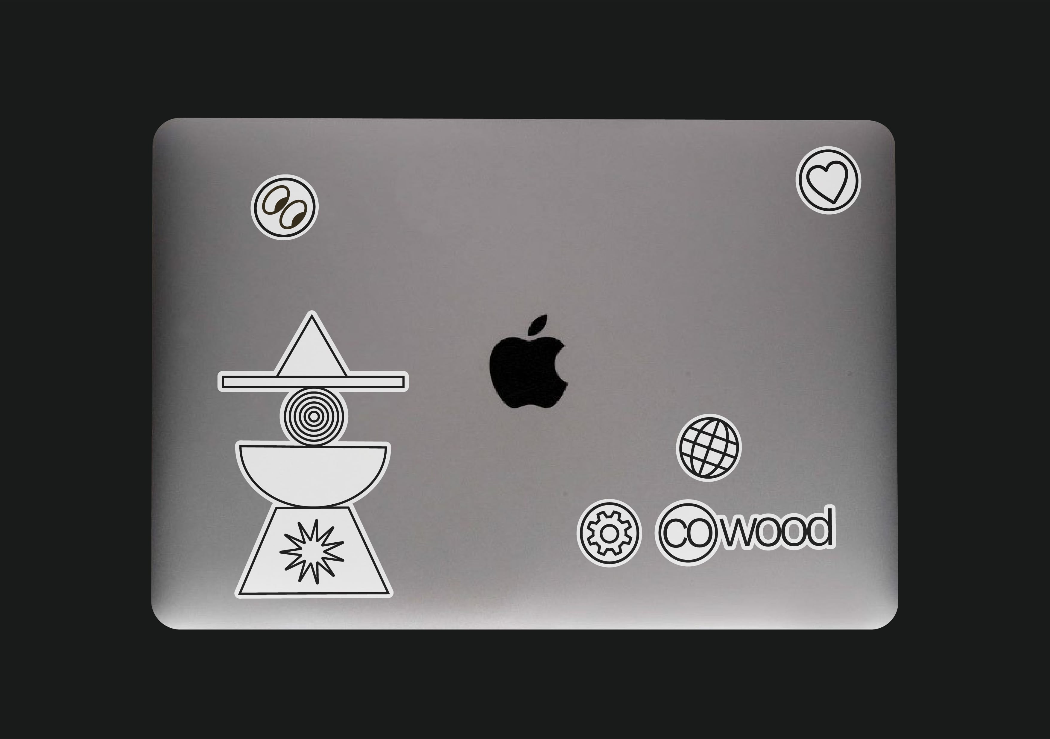
Co-wood has its own merch and souvenirs: t-shirts, stickers, phone cases, postcards. The brand also has its own gift cards.
Now it is interesting to play the constructor for adults too!
CREDIT
- Agency/Creative: Mariia Mozgolina
- Article Title: Concept for The Brand of Wooden Constructor «co-wood»
- Organisation/Entity: Student
- Project Type: Identity
- Project Status: Non Published
- Agency/Creative Country: Russia
- Agency/Creative City: Moscow
- Market Region: Europe
- Project Deliverables: Brand Design, Brand Identity, Branding
- Industry: Non-Profit
- Keywords: brand design, toy design, visual identity
-
Credits:
Curator (HSE UNIVERSITY ART AND DESIGN): Burdenkova Natalya Andreevna


