Coccoá is a brand of vegan and healthy chocolates, produced in Brazil. The creation of the brand came from the idea of producing and marketing chocolates free of trans fats, gluten, and other villains of common chocolates, but still tasty.
With raw material (cocoa) exported from the frozen lands of Norway, the concept behind the creation of the logo, visual identity and packaging of Coccoá’s first line of chocolates, takes place precisely from the phenomena of the nature of the planting and extraction location of the cocoa.
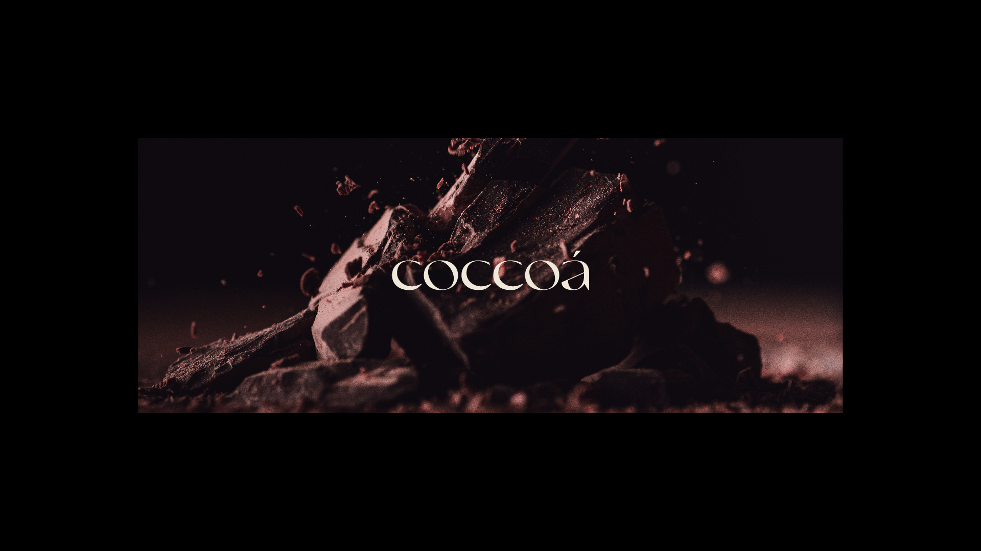
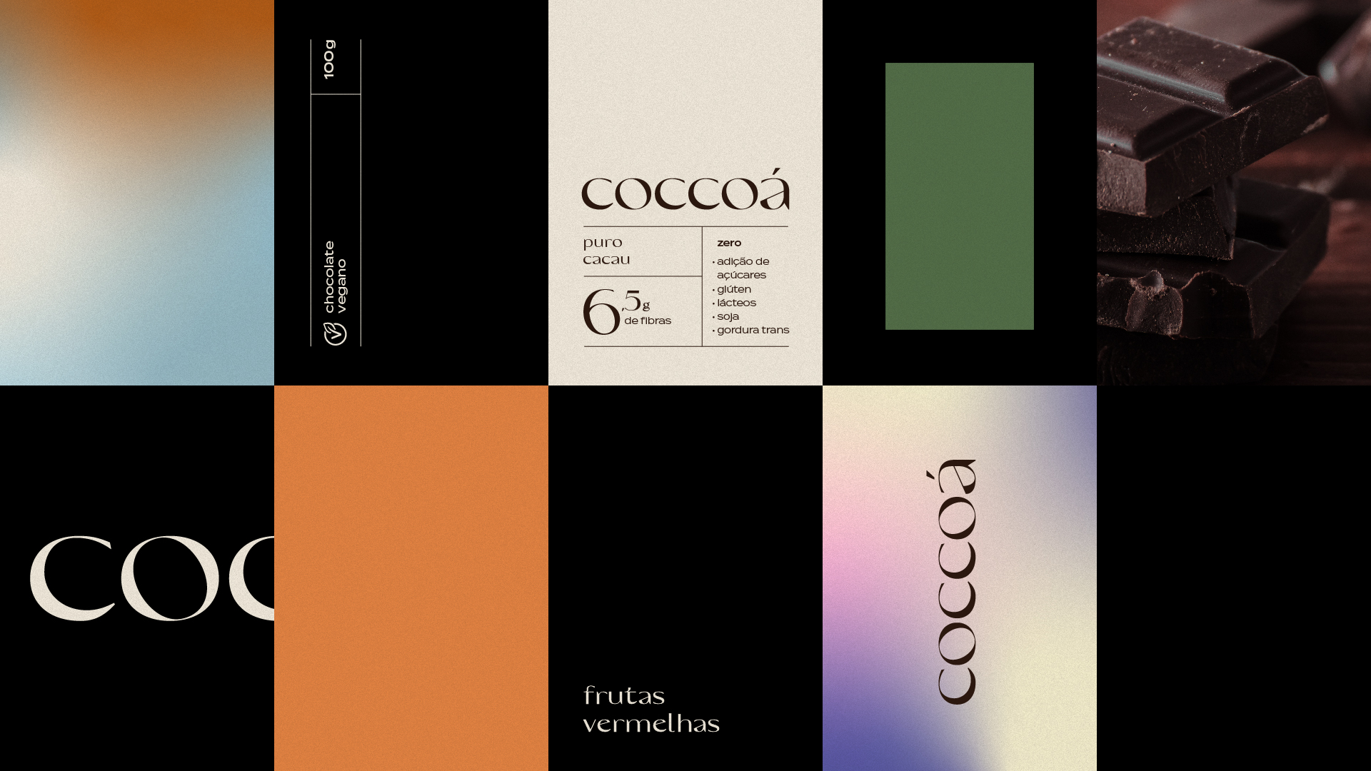
For the fully typographic logo, the idea was to bring the crescent phase of the moon into the font’s strokes, which in this case is represented by the letter “C”. In the growing movement, the cocoa plant more easily distributes nutrients throughout its structure. This effect influences the aesthetics of leaves and flowers, making them more alive and vibrant. The growing movement period is perfect for planting fruit trees and for pruning the plants, as they will grow faster and more vigorously.
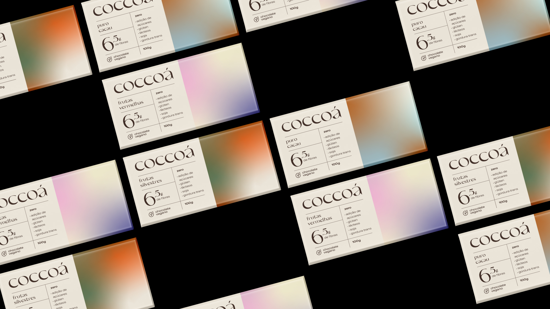
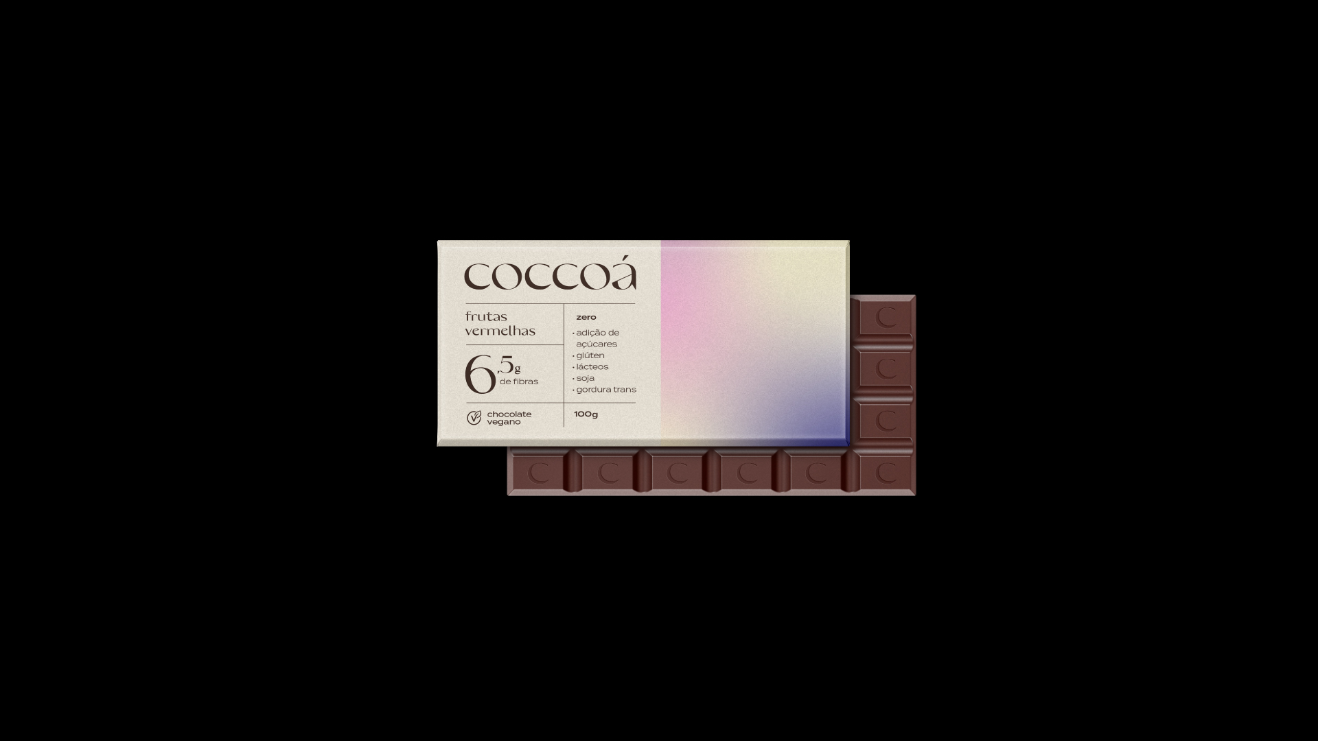
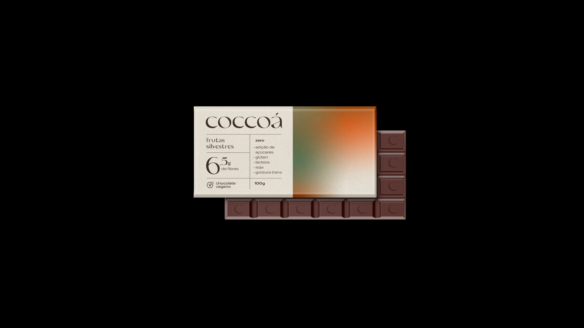
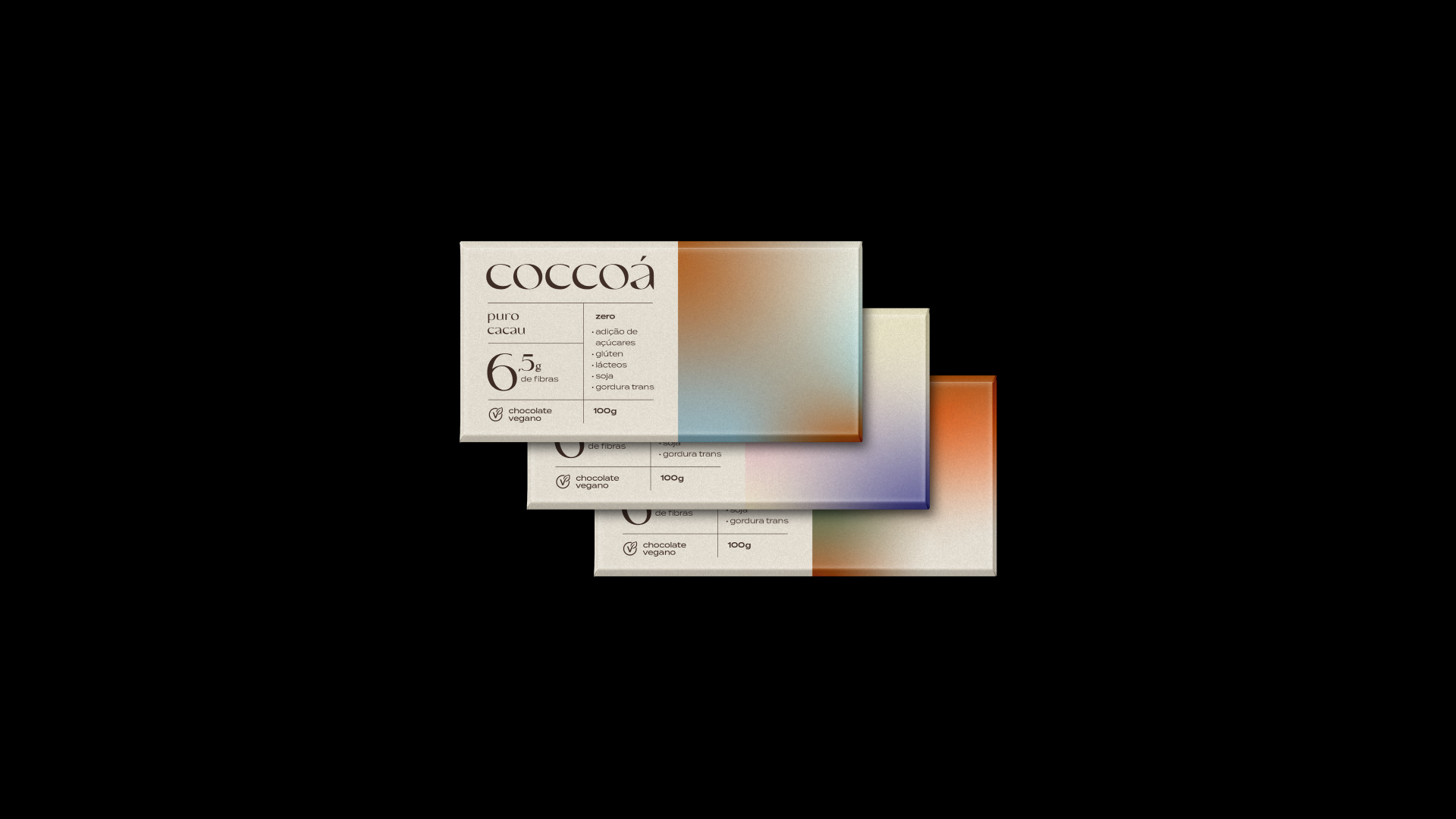
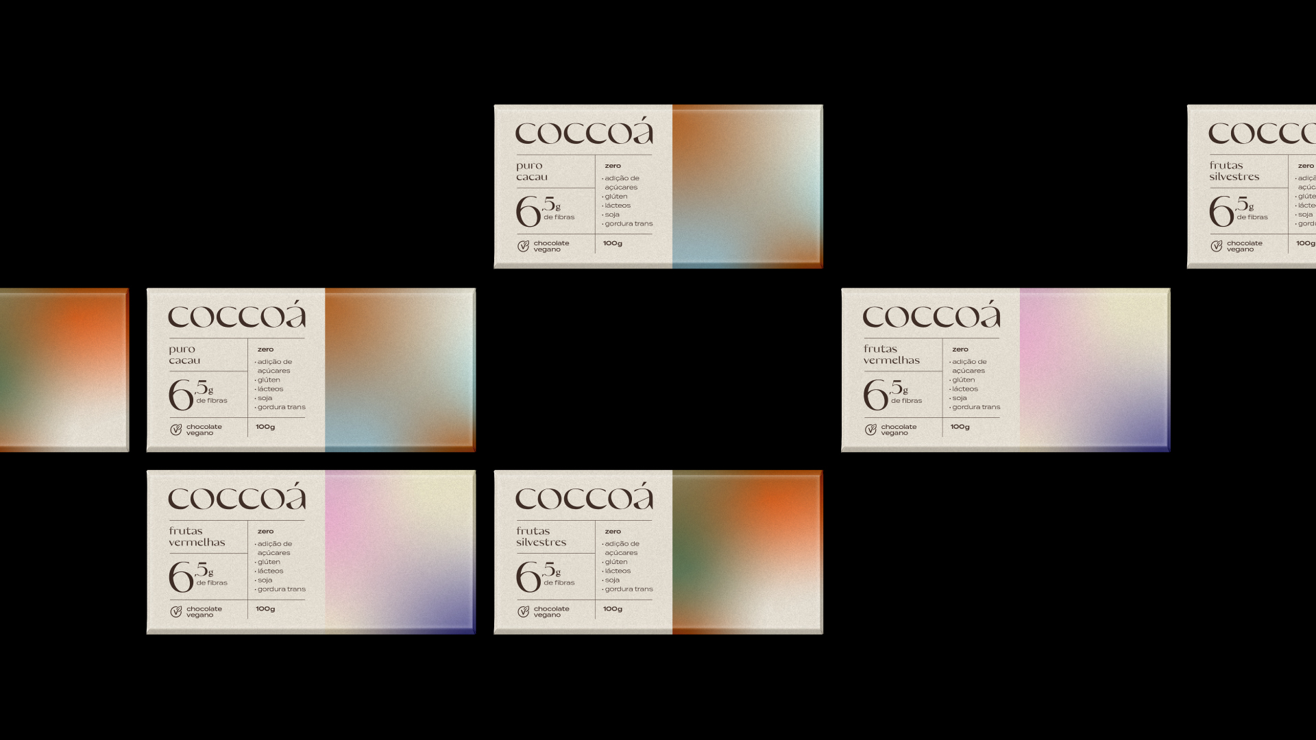
As for the visual identity and packaging, the inspiration came from the northern lights of Norway, as well as the physical and emotional sensations that this phenomenon of nature causes. The mixtures of colors also seek to represent: lightness, pleasure and delicacy, characteristics of chocolates with striking flavors from Coccoá.
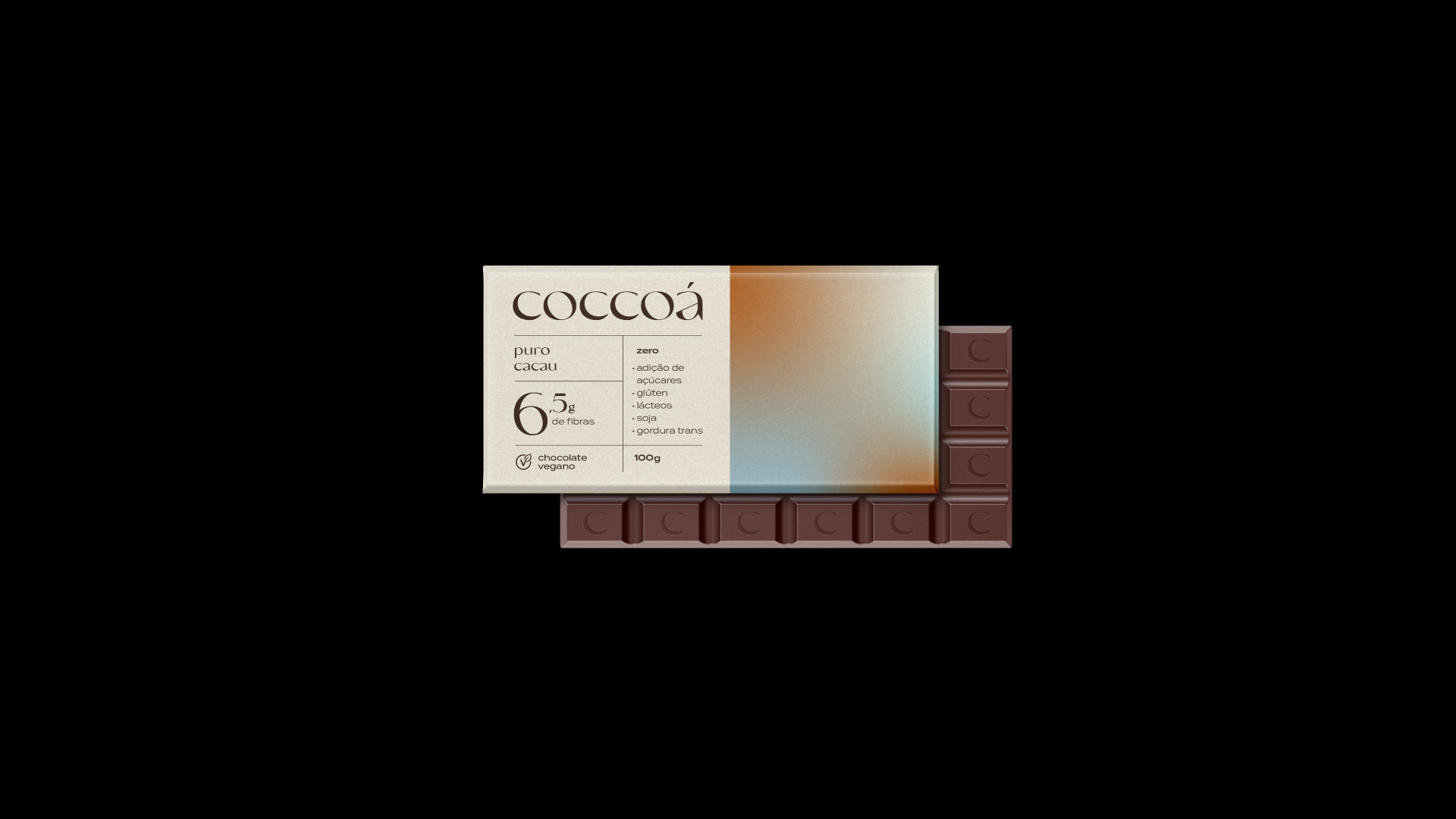
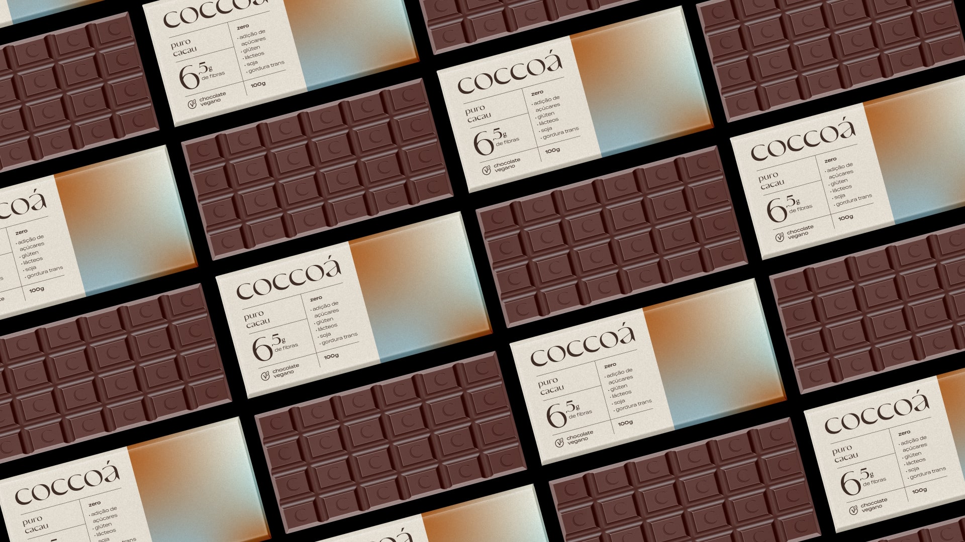
For the gradients that make up the visual identity and packaging of Coccoá chocolates, contrasting colors were chosen that refer to the flavors of the first line. Based only on three shades of colors in each gradient, the packages come to life and become strongly identified on the shelves of the points of sale.
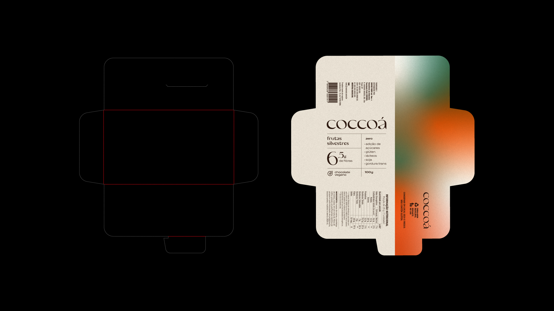
The packages that involve the products are composed of 180g couché paper, which brings a glossy finish to the print. With snap closure, this type of packaging facilitates the opening of the product by consumers.
With all the elements united, the visual identity created for Coccoá highlights and individualizes the brand in relation to competitors.
CREDIT
- Agency/Creative: Matheus Ferreira
- Article Title: Concept Coccoá Brand and Packaging by Matheus Ferreira
- Organisation/Entity: Freelance
- Project Type: Packaging
- Project Status: Non Published
- Agency/Creative Country: Brazil
- Agency/Creative City: Matheus Ferreira
- Market Region: South America
- Project Deliverables: Art Direction, Brand Creation, Brand Design, Brand Identity, Design, Packaging Design
- Format: Wrap
- Substrate: Pulp Paper
- Industry: Food/Beverage
- Keywords: Concept, Non-Published, Chocolate, Visual ID, Packaging, Package, Logo, Brand
-
Credits:
Art Director: Matheus Ferreira


