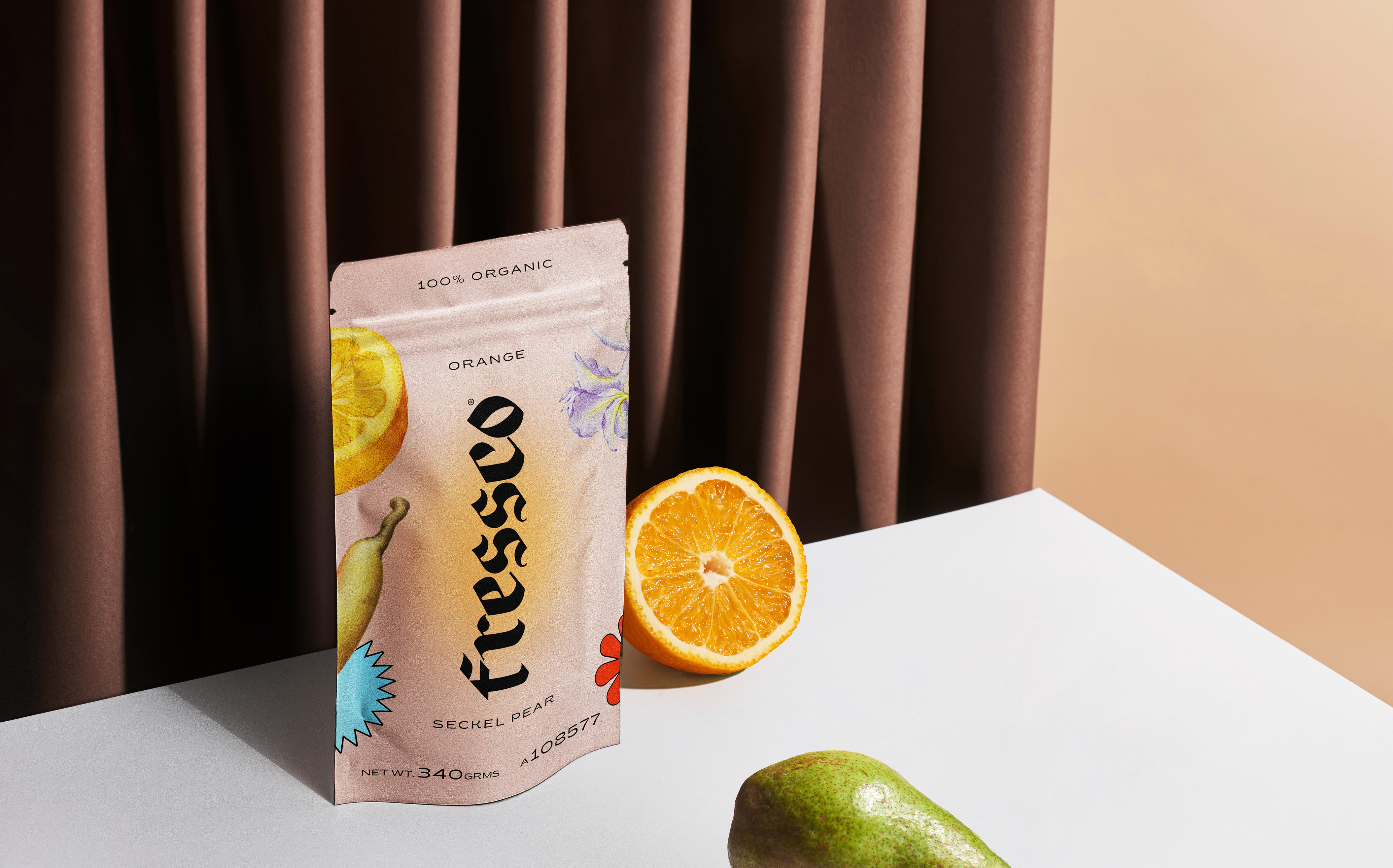
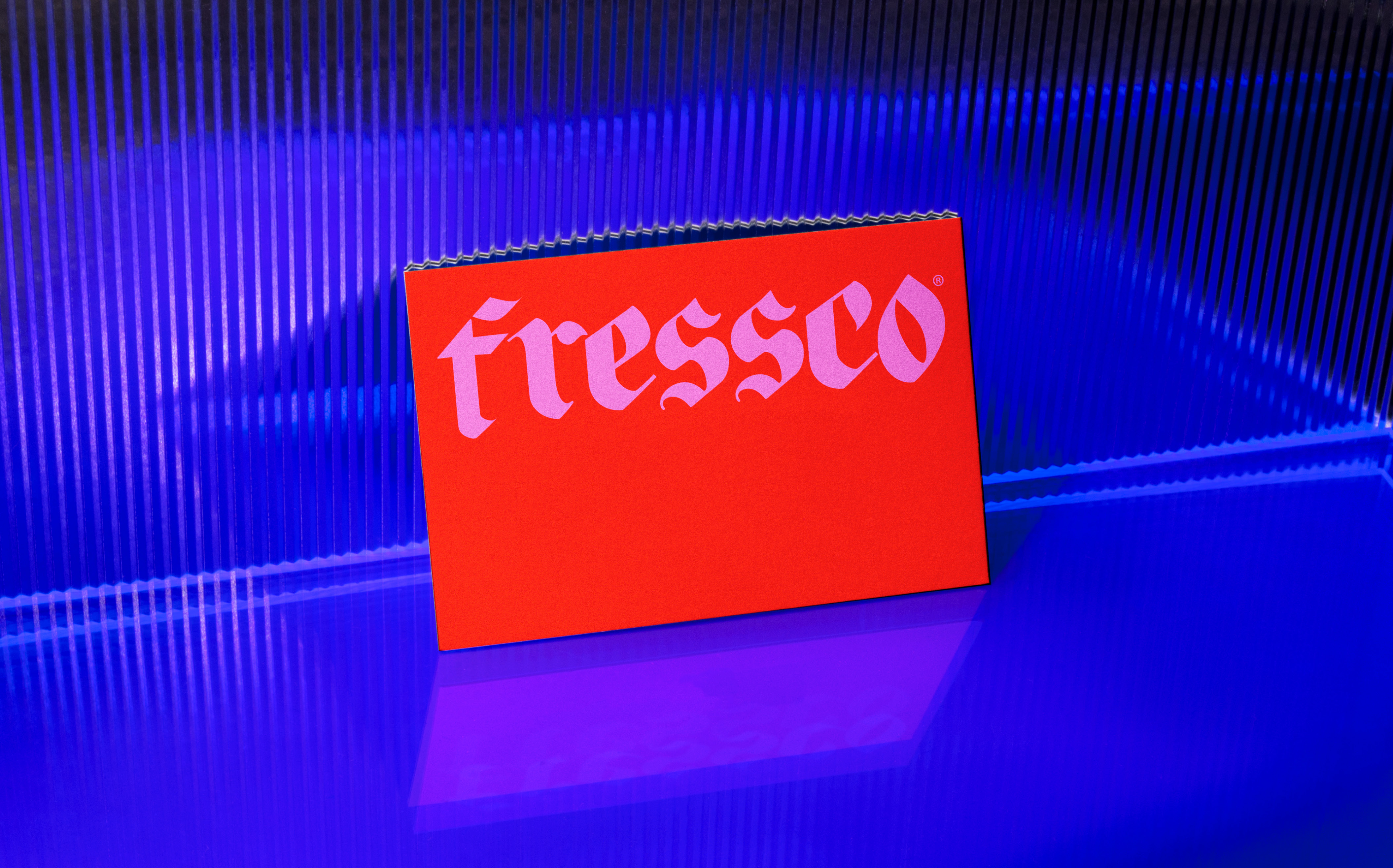
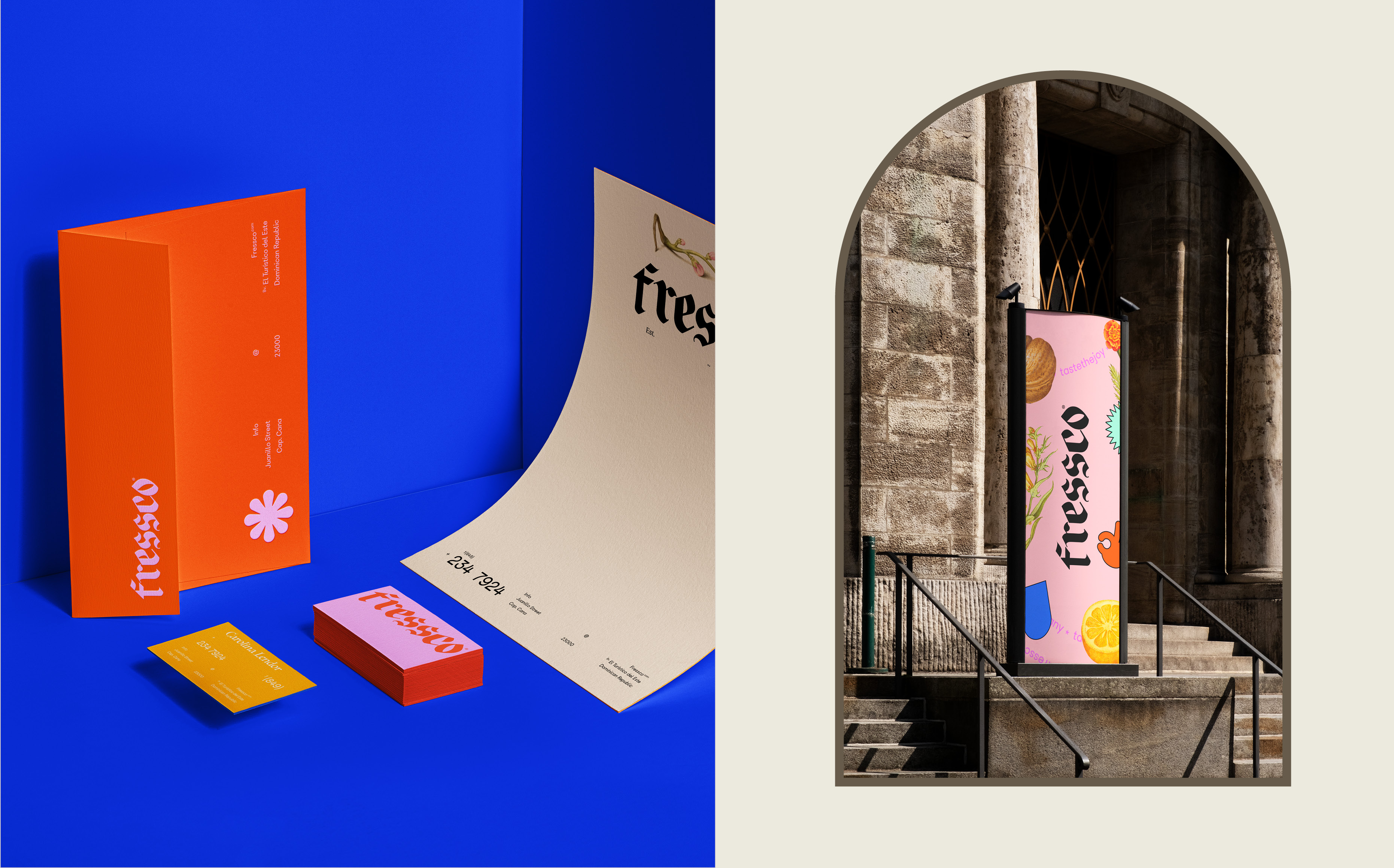
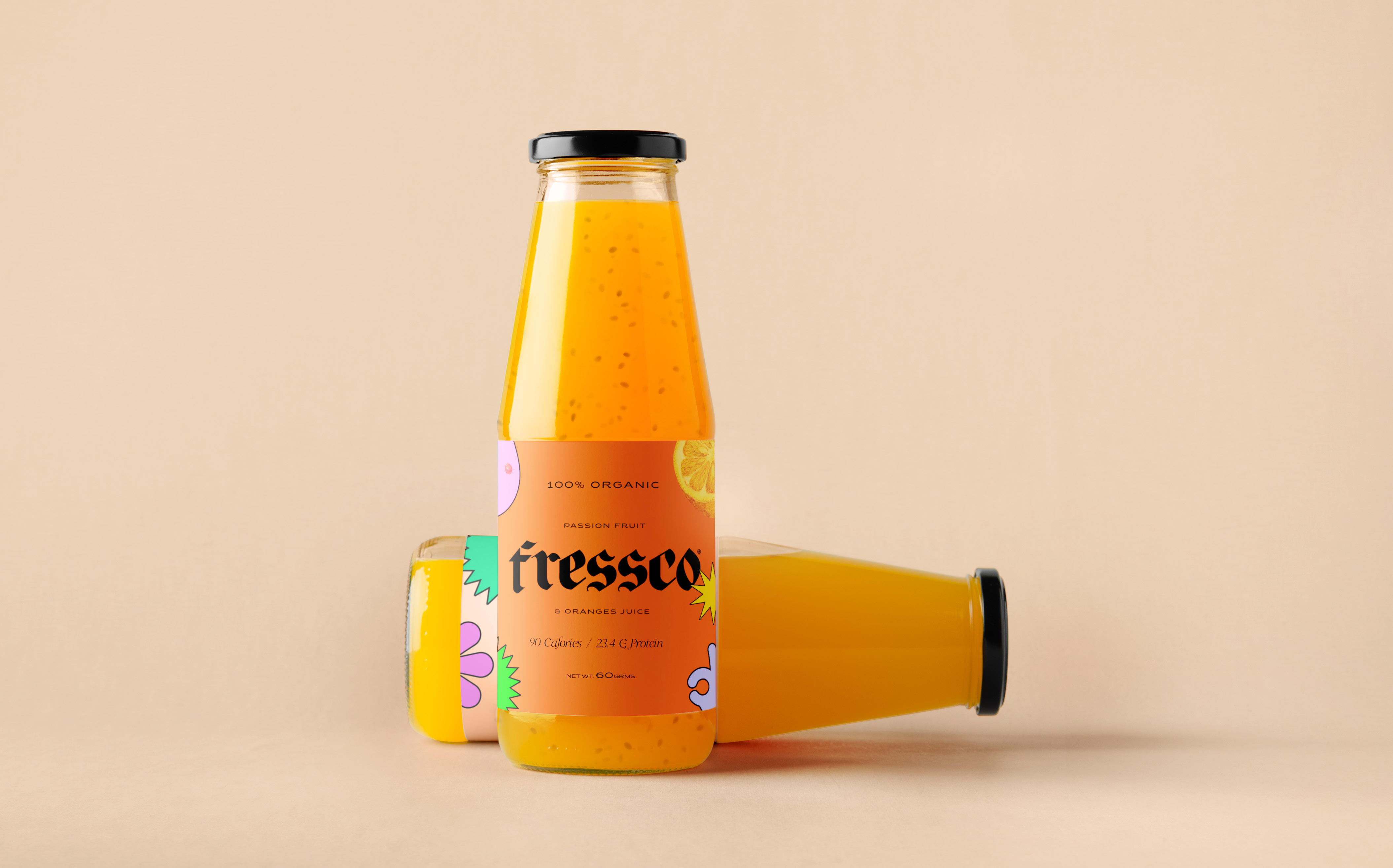
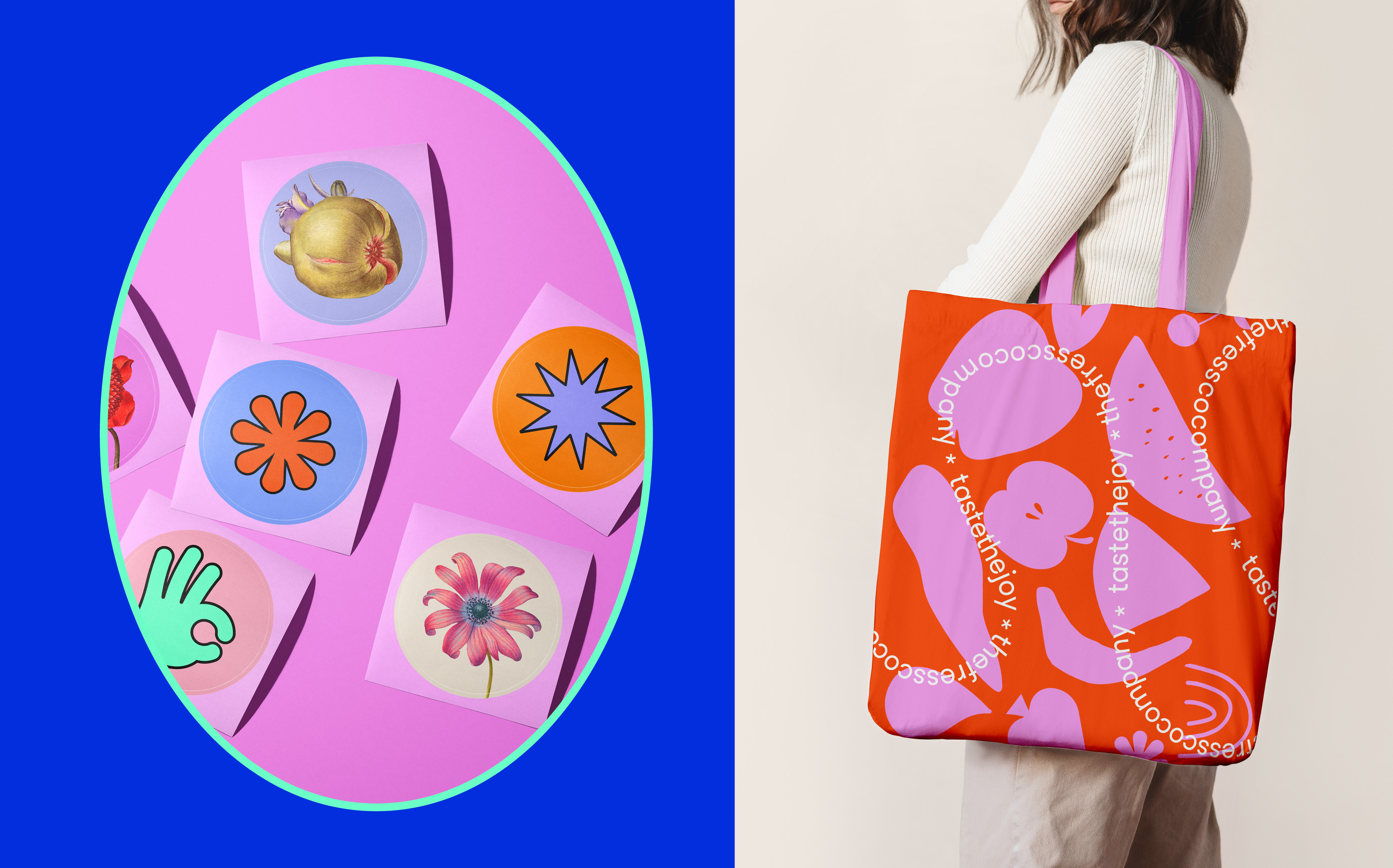
Fressco’s brand identity was conceived with the unconventional goal, that its consumers can enjoy a moment of escape while immersing themselves in the contrast of its faithful origins and the freethinking present. The colors are expressive and bright, building a system that implies a sense of reinvention, communicated in their packaging where each one is a little bit different depending on the flavor. This goes in contrast with its typography full of the fressco’s heritage, which will never accuse of lacking nature. Illustrations dated from 16th-century botanical calligraphic artwork by Georg Bocskay and Joris Hoefnagel support this individuality.
CREDIT
- Agency/Creative: Tiare Payano
- Article Title: Concept Brand Identity Design for Fressco by Tiare Payano
- Organisation/Entity: Freelance, Non Published Concept Design
- Project Type: Identity
- Agency/Creative Country: Dominican Republic
- Market Region: Multiple Regions
- Project Deliverables: Brand Creation, Brand Design, Brand Experience, Brand Guidelines, Brand Identity, Brand Naming, Brand Strategy, Branding, Graphic Design, Identity System, Packaging Design, Product Naming, Structural Design, Tone of Voice
- Industry: Food/Beverage
- Keywords: Branding, juices, Fressco, Naming, design, Brand Identity, fresh, identity System, Branding, Brand Creation, Graphic Design, Shakes, colorful, old, origins, natural, organic
FEEDBACK
Relevance: Solution/idea in relation to brand, product or service
Implementation: Attention, detailing and finishing of final solution
Presentation: Text, visualisation and quality of the presentation


