For this Bespoke Range release, Compass Box worked with bourbon enthusiasts, William Schragis and T8KE of US-based Project Optimist, to create an opulent mid-Atlantic whisky that connects the whisk(e)y-drinking heartlands of Scotland and the USA. The main challenge was to deviate from traditional markers of “Scotchness”, focusing instead on deliciousness and the fun of people and ideas intermingling.
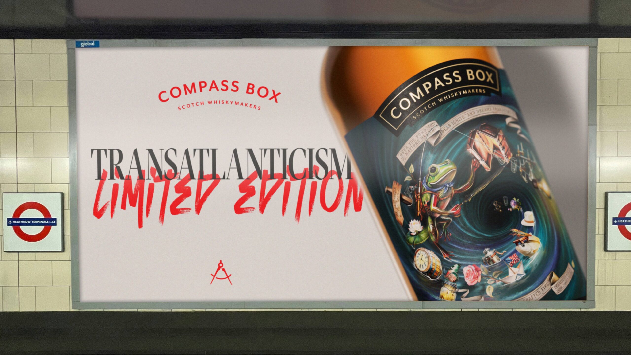
Transatlanticism is an opulent Scotch whisky which retails for around $200 a bottle, and so the label needed to read that it was blended for power and loudness and saying goodbye to the common category norms of restraint or nuance.
When it came to the bottle packaging, Compass Box’s collaborators wanted to see a more maximalist and surreal style label for this release – something which incorporated the storytelling scope of a Rogues’ Banquet with the colour palette and symbolism of Phenomenology. Compass Box’s recent brand repositioning promises to ‘dare to be interesting’, and the client relishes in pushing both their blends and design to a place where boring no longer exists.
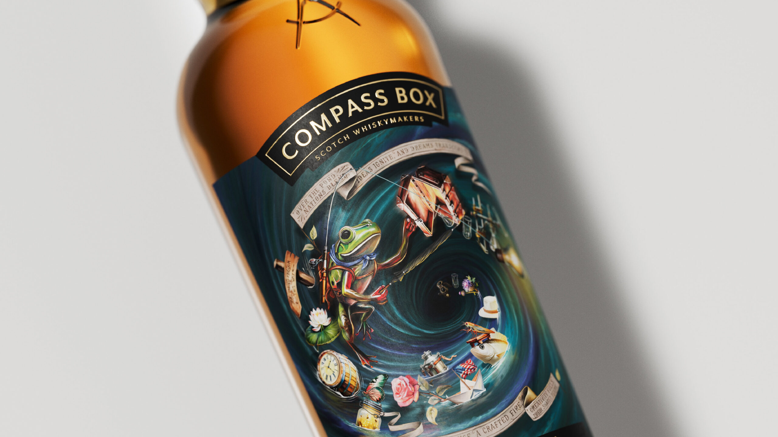
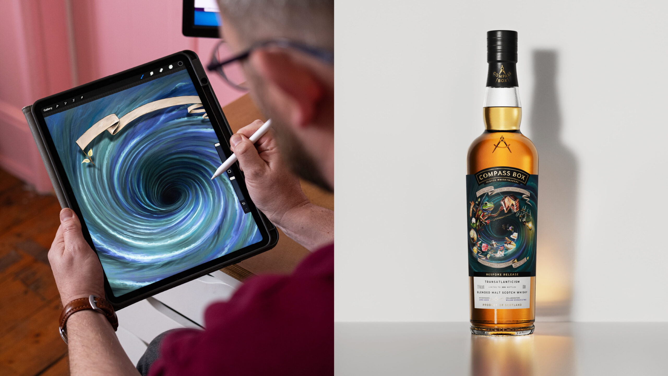
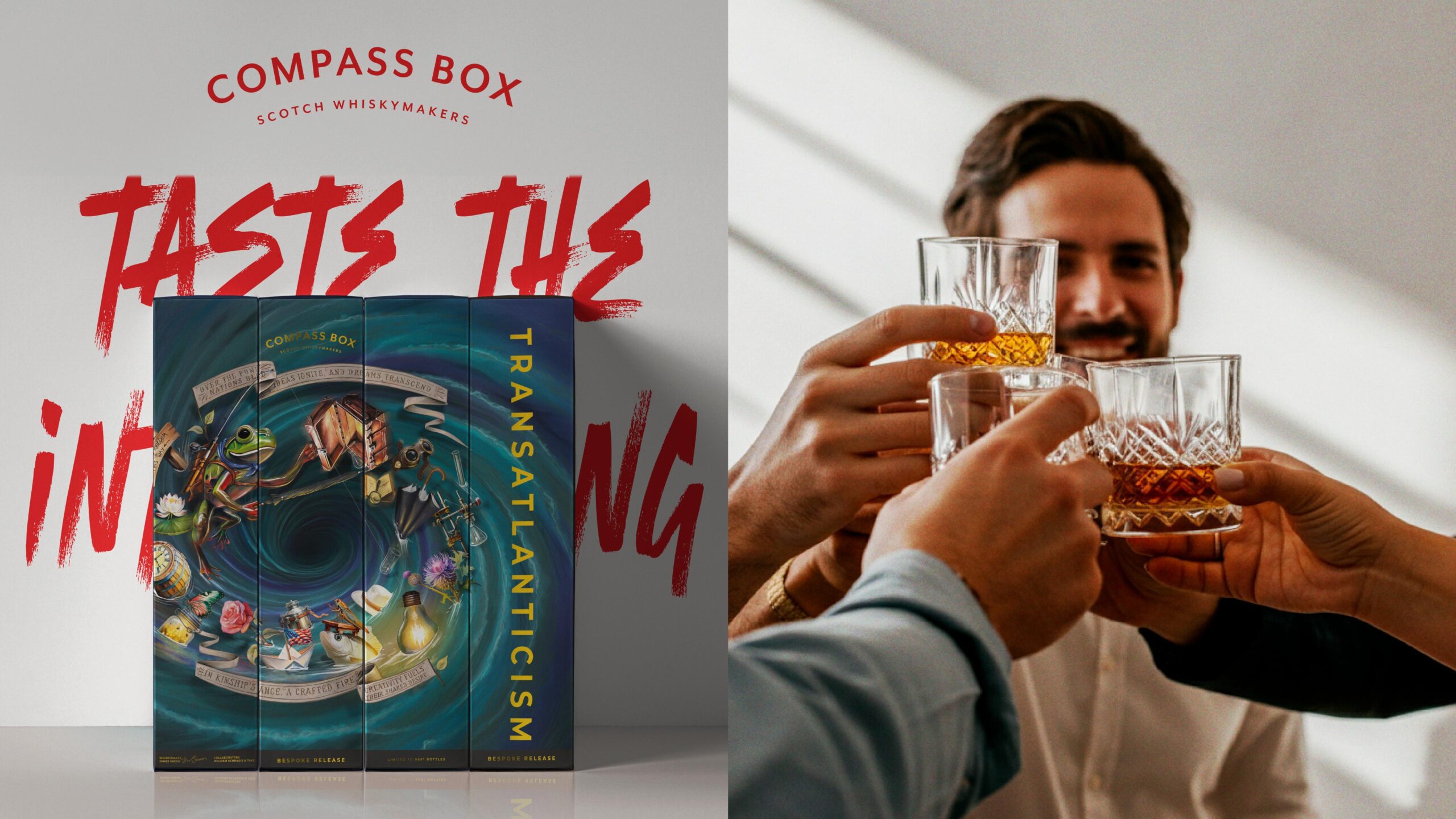
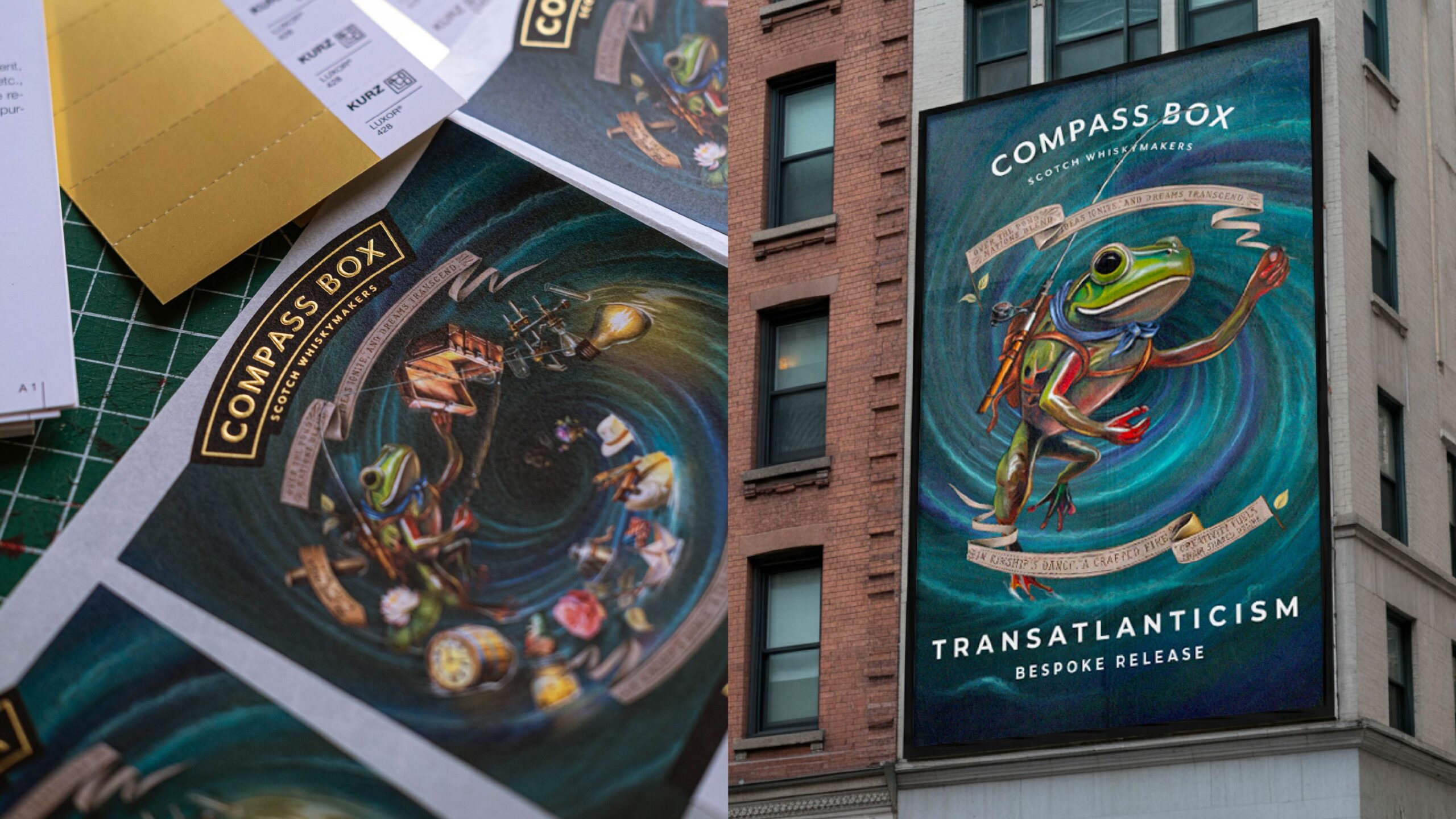
Illustratively, the concept was to create a complex world that tells the story of the Project Optimist team crossing the ocean in some metaphorical way, either through symbolism or a sense of movement in the artwork. To achieve this, we created a narrative that focuses on a central protagonist – an adventuring frog, what else? – on a journey across the Atlantic, when his suitcase opens and his possessions start spilling out and falling into a swirling, blending whirlpool that represents the giant Atlantic pond, with a porthole to the UK at the centre. His possessions include an eclectic mix of curious objects chosen in collaboration with the client, including blending apparatus, adventure ephemera and location references. The consumer is invited on the frog’s adventure as they discover each of the illustration’s small details.
A digital painting by our in-house design team, the artwork evokes a dream-like, surreal quality with soft purples and turquoise brushstrokes, merging together to create a sense of movement, blending and depth. The circular composition frames the central focal point; the place where all of the elements combine to make something new. Emphasising the burst of energy when everything comes together, the illustration pauses a moment in time, as the frog’s journey suddenly evolves into something dramatic and powerful, like the liquid itself.
The poem selected to surround the diorama speaks to a creative collaboration between two nations that starts with the spark of an idea. The words are contained in fluid banners that frame the illustration and gesture to both the use of flags for communication between seafaring travellers, and the traditional framing devices used to contain wording in historic American and British fine art.
CREDIT
- Agency/Creative: Kingdom & Sparrow
- Article Title: Compass Box Transatlanticism – Connecting the Whisk(e)y-Drinking Heartlands of Scotland and the USA by Kingdom & Sparrow
- Organisation/Entity: Agency
- Project Status: Published
- Agency/Creative Country: United Kingdom
- Agency/Creative City: Falmouth
- Market Region: Cornwall
- Project Deliverables: Art, Art Direction, Craft, Digital Art, Digital Painting, Illustration, Packaging Design
- Industry: Food/Beverage
- Keywords: WBDS Agency Design Awards 2024/25 whisky whiskey packaging design illustration digital painting
- Keywords: WBDS Agency Design Awards 2024/25 whisky whiskey packaging design illustration digital painting


