


Today, the majority of people who opt for plant-based products live predominantly in vast and bustling cities, where life never stops. These individuals highly value their time and do everything they can to save it. One of the ways they achieve this is by purchasing various ready-to-cook meals since their preparation takes no more than 10 minutes.
The Same produces patties and other ready-to-cook products from cultivated meat, which perfectly fit the city’s fast-paced rhythm, as not every city dweller can dedicate their entire day to cooking. That’s precisely why the goal of their branding is to address several aspects at once: to attract those who don’t want to seek alternatives to meat products and those who don’t want to spend a lot of time preparing it.
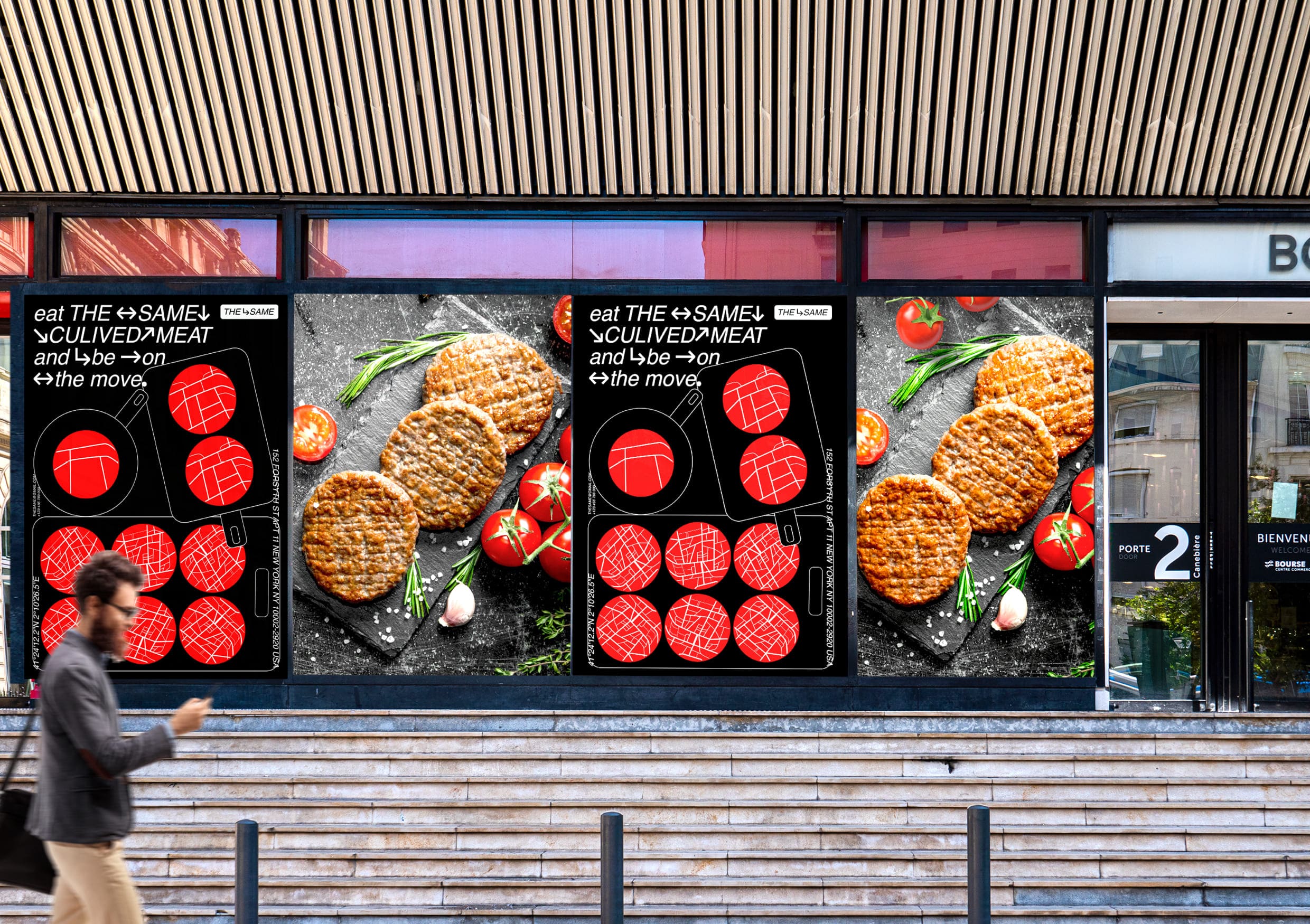
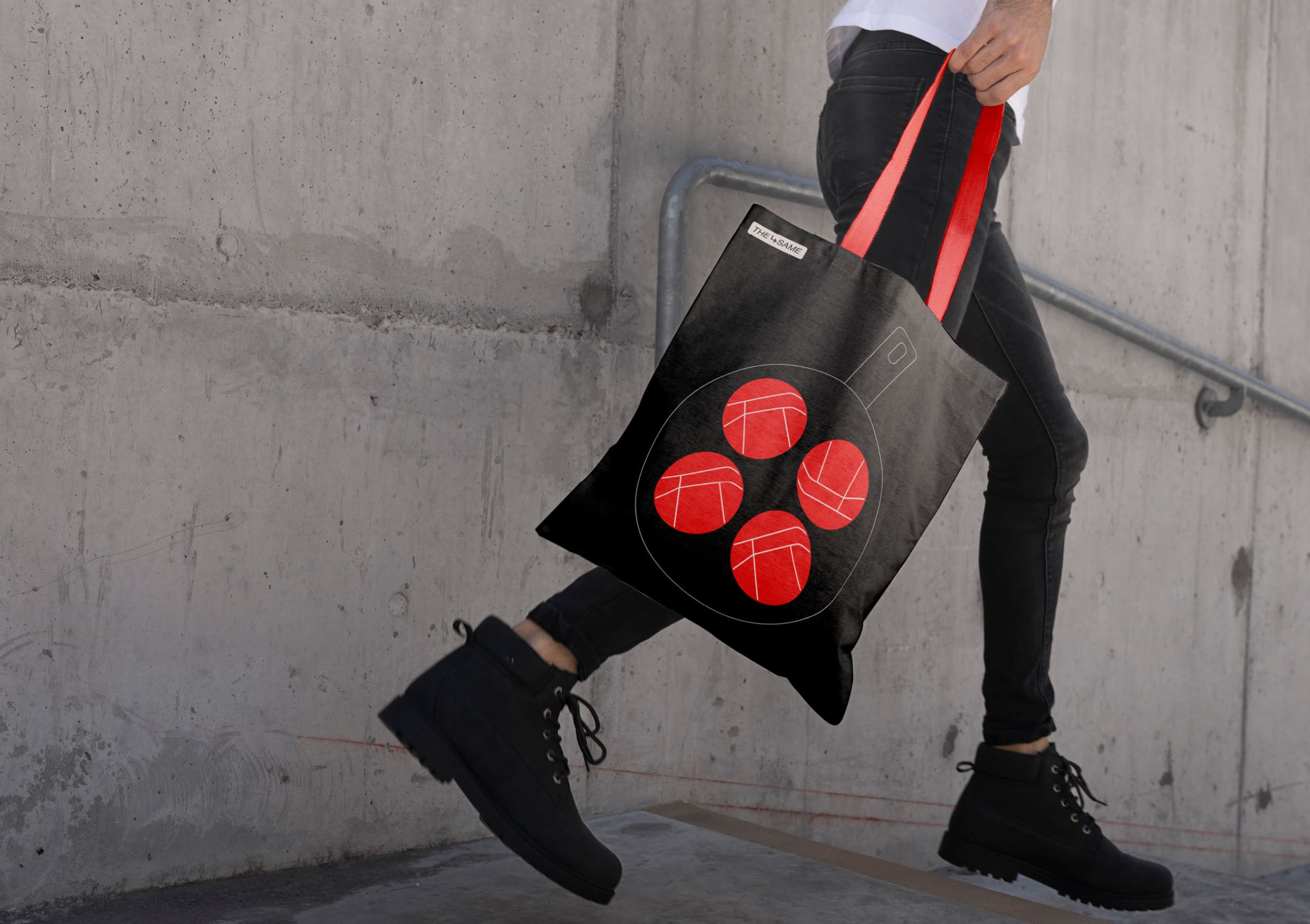
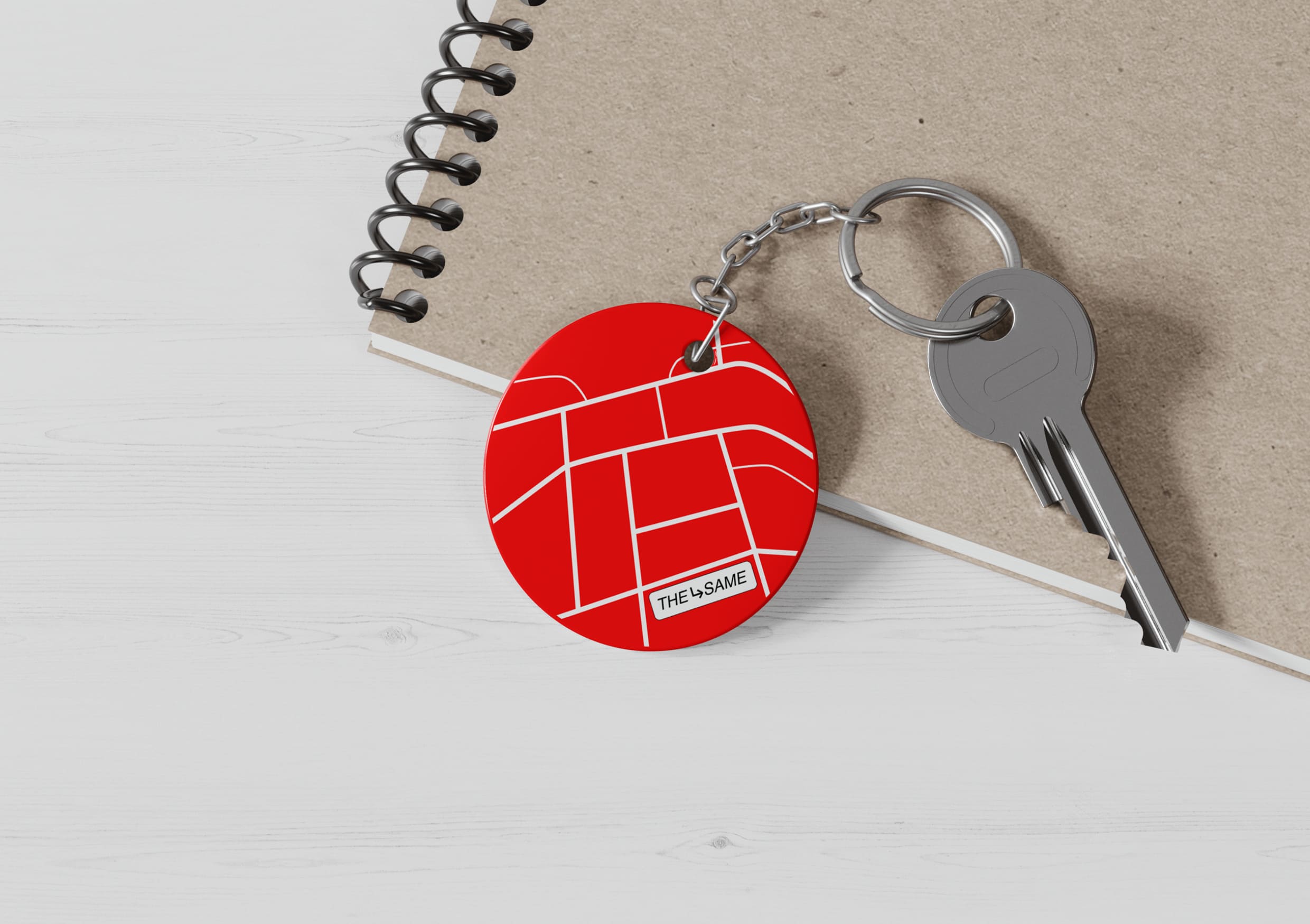
The idea was inspired by a typical city map. By coloring it in a monochromatic red hue, the streets resemble meaty veins. To make the pattern of these veins more interesting and diverse, street density was added, which also correlates with the fattiness of the meat: the more streets, the more veins, and juicier the steak. To further evoke an urban feel, the branding also incorporates additional elements like directional arrows commonly seen throughout the city, guiding people on the right path.
The graphics are vibrant and dense, just like city life. Circular silhouettes of patties are complemented by linear contours of objects used in the cooking process: cutting boards, frying pans, and grilling racks. This addition immediately places the viewer in a culinary context and draws attention to the product.
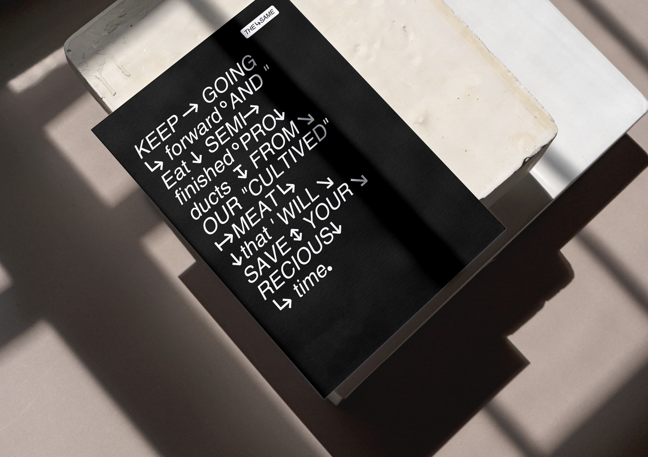
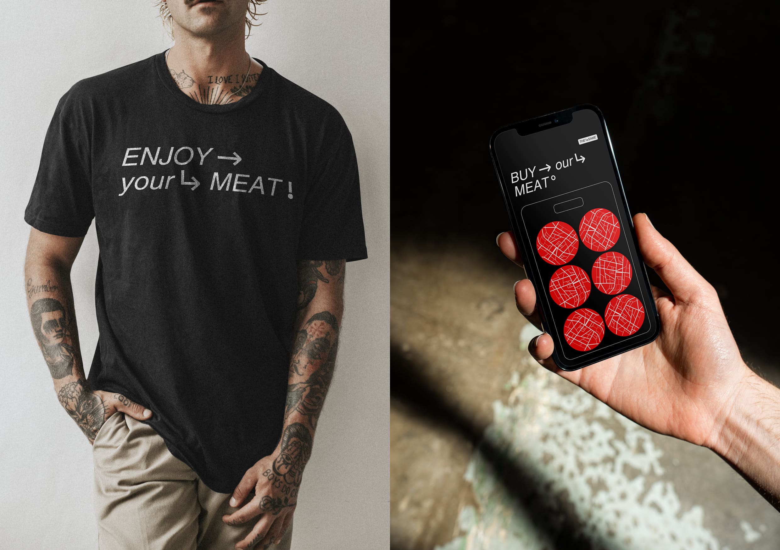
The dynamism of The Same logo is emphasized by its slanted typography. Additionally, one of the graphic elements of the branding is an arrow. The background uses black color, which gives richness and brightness to the red color used to represent meat, and the logo stands out prominently in white, making it distinct amidst the dense graphics and intricate typography.
For artificial meat enthusiasts, a stylish and minimalist merchandise was developed, such as a vibrant keychain shaped like a patty. And if you feel that there’s too much red, you can opt for a trendy t-shirt with just the typography.

CREDIT
- Agency/Creative: Katya Nadina
- Article Title: Company Growing Cultivated Meat Brand Identity Concept by Katya Nadina
- Organisation/Entity: Student
- Project Type: Identity
- Project Status: Non Published
- Agency/Creative Country: Russia
- Agency/Creative City: Katya Nadina
- Market Region: Global
- Project Deliverables: Brand Identity
- Industry: Food/Beverage
- Keywords: Katya Nadina brand identity concept company growing cultivated meat
-
Credits:
Tutor: Tanya Dunaeva


