Compadre Boteco is a restaurant and bar specializing in regional food located in the state of Rio Grande do Norte, Brazil. Based on the northeastern cuisine, the company offers a cozy and familiar environment for those who like tradition but with a touch of modernity. The public is made up of people who love bohemian environments and nightlife in cozy bars with friends and a good snack.
Brief: The restaurant’s communication objective was to transmit this feeling of a traditional “boteco” (bar) that has a very strong cultural force in Brazil in a modern and almost sophisticated way. The name refers to a regional way of calling a friend or bar companion, for example. So using this dialectical feature in the visuals also needed to be something relevant.
Challenge: In addition to working on the brand look, it was also necessary to develop a language strategy commonly used in traditional bars, with the aim of making the environment more natural and comfortable. The goal was to make the restaurant something to be desired at the end of a heavy friday workday.
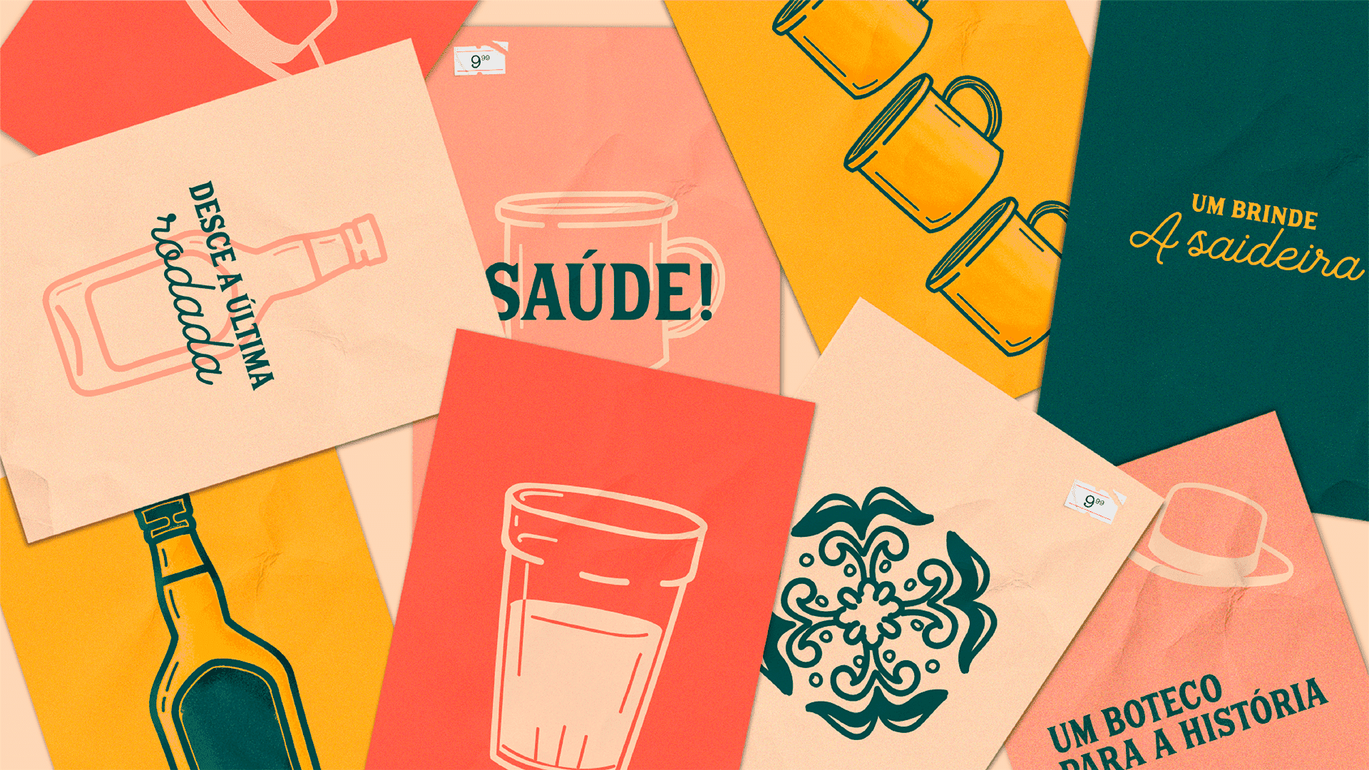
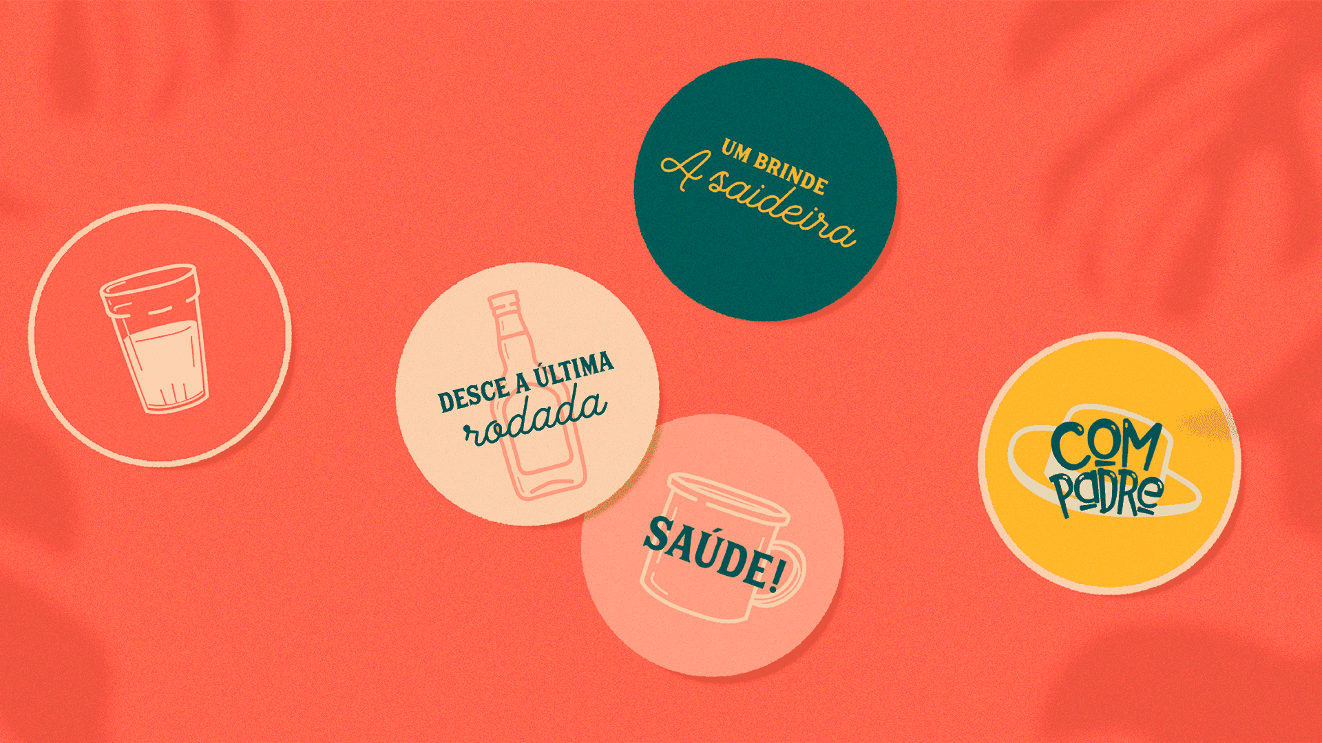
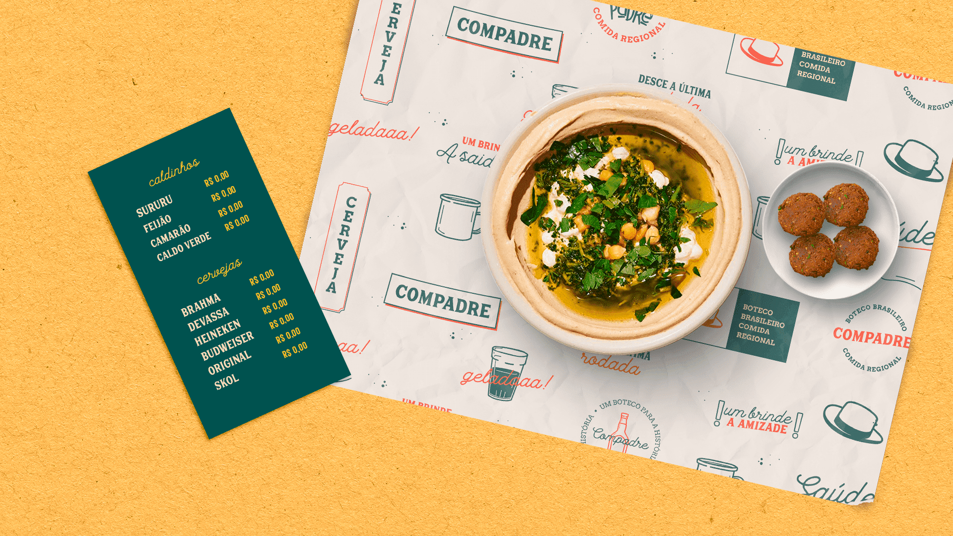
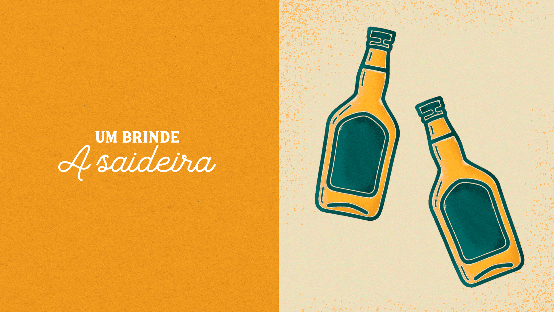
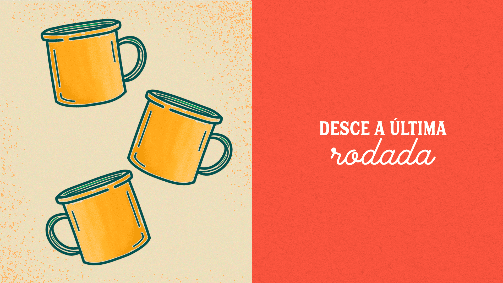
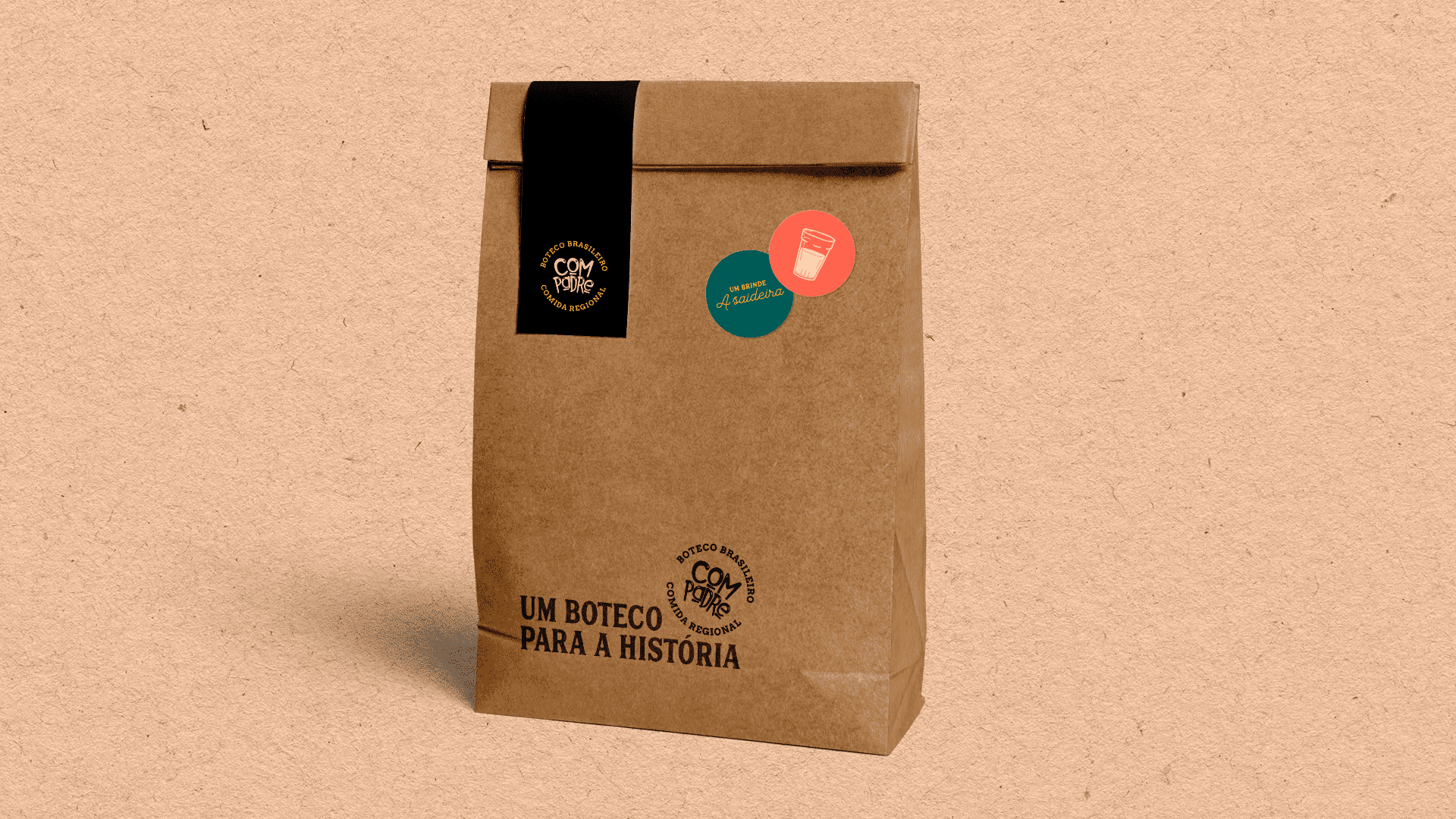
Solutions: After determining the language strategy it was decided that the visual part of the brand would make use of supporting illustrations along with commonly used expressions in bars as a way to familiarize the customer. So in the illustrations, common bar or restaurant objects were used in conjunction with very Brazilian expressions such as “desce a última rodada”, something like ordering the last beer.
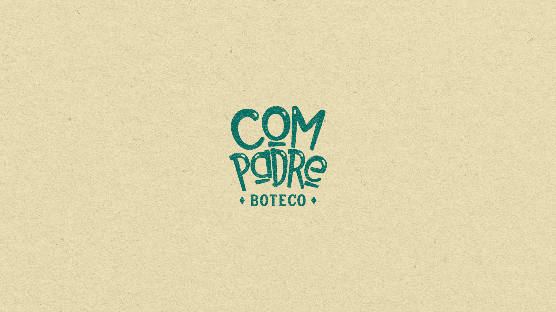
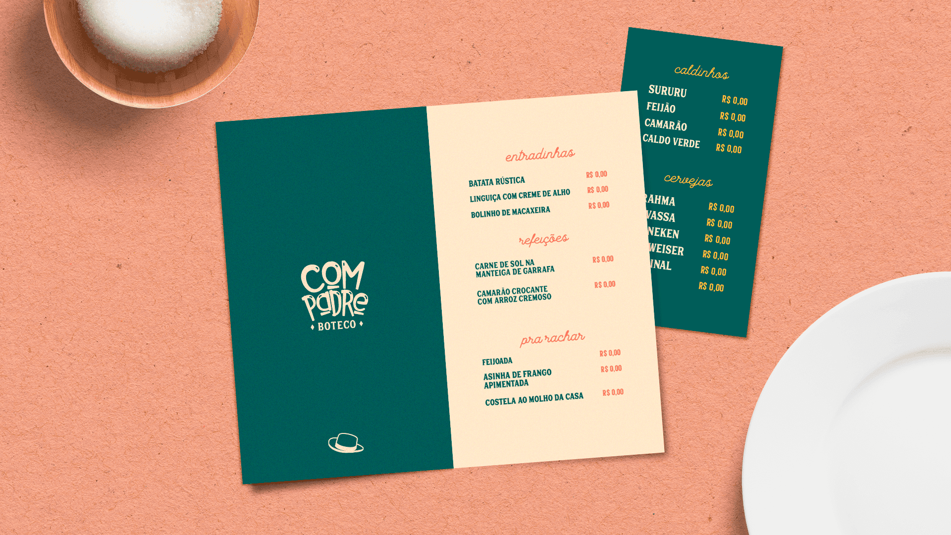
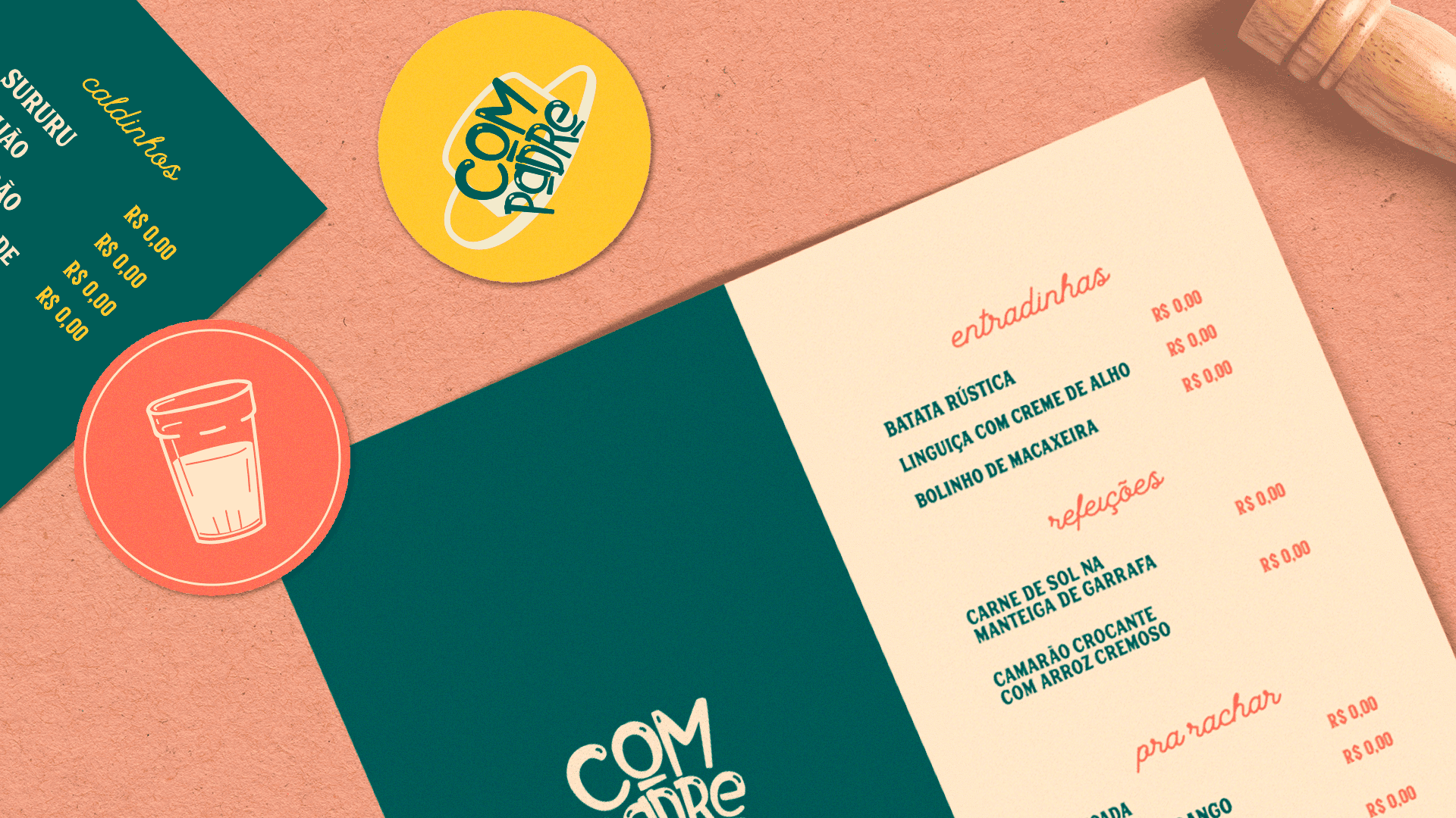
The primary logo design was developed from scratch inspired by vernacular typography, something common in bohemian areas in Brazil. The supporting typefaces chosen for secondary compositions have different characteristics (one with serif and heavier and one sript) to create contrast.
The colors used had as a reference the mix of tones that referred to Brazil (yellow and green) but also created good combination through complementary colors in the chromatic circle. This palette of multiple colors together with the graphics created gives dynamism in the deployment of the restaurant’s visual identity, creating a kind of unique atmosphere in the space.
CREDIT
- Agency/Creative: Castilo Design
- Article Title: Compadre Restaurant Branding by Castilo Design
- Organisation/Entity: Freelance, Published Commercial Design
- Project Type: Identity
- Agency/Creative Country: Brazil
- Market Region: South America
- Project Deliverables: Brand Creation, Brand Identity, Branding, Illustration, Tone of Voice
- Industry: Food/Beverage
- Keywords: Restaurant, Branding Design, Restaurant Bradingn, Branding Identity


