


Context and Opportunity:
America’s energy conversation was broken, fragmented across states, steeped in jargon, and inaccessible to the people most affected by rising bills and grid instability. Distributed energy assets (solar, batteries, EVs, smart devices) were delivering real impact nationwide, yet their story lived in isolated pockets: local protests, policy hearings, industry forums, and technical documents.
Common Charge was formed to fix that. A first-of-its-kind coalition of nonprofits, businesses, advocates, and consumer groups that needed more than a brand. They needed a unifying force: one clear identity capable of rallying innovators, shaping national discourse, and making a complex topic human, urgent, and actionable.
This was the challenge:
Build a brand powerful enough to shift a national narrative, and simple enough for every American to understand.
Insight:
Through interviews, messaging audits, and ecosystem mapping, we uncovered a defining tension: Americans want control, fairness, and reliability, yet the energy system was built for insiders, not the public.
The opportunity was hiding in plain sight: distributed assets were already working, already saving households thousands, and already stabilizing the grid. But without a unified story, that power stayed invisible.
The strategy became clear:
Build a unified, national voice that cuts through complexity and elevates distributed assets as the solution to affordability, reliability, and consumer power.
The Challenge:
Common Charge needed an identity capable of:
• Cutting through decades of energy jargon and insider language
• Making complex technology feel human, hopeful, and accessible
• Bridging dozens of organizations into one coherent movement
• Speaking credibly to policymakers while inspiring the public
• Elevating affordability from a local frustration to a national issue
This was not a traditional branding exercise. It was building the rallying point for a movement.
Design Strategy:
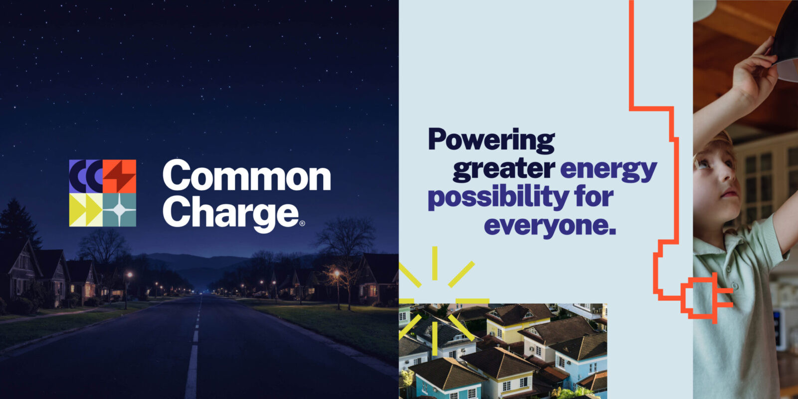
We developed a brand system rooted in unity, clarity, and forward momentum.
The guiding creative idea: Powering greater energy possibility for everyone.
Every design and writing decision laddered back to three imperatives:
1. Make it human. Focus on people, not policy.
2. Make it clear. Translate the complexity into everyday impact.
3. Make it unifying. Give dozens of voices one story to stand behind.
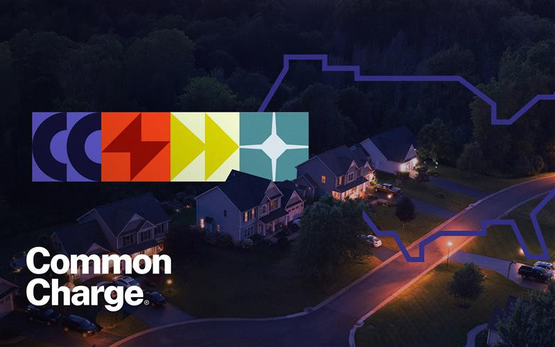
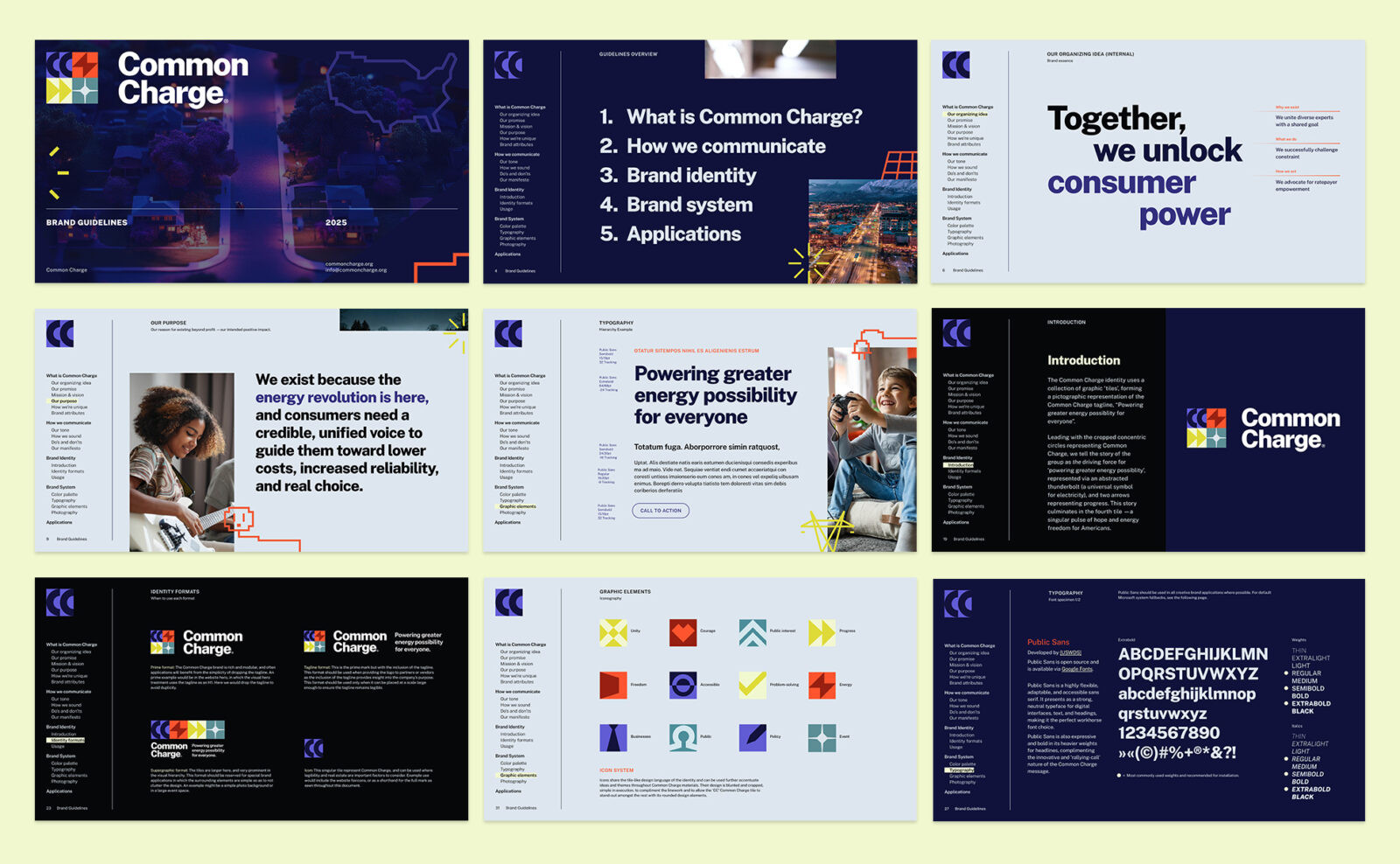
Visual Identity:
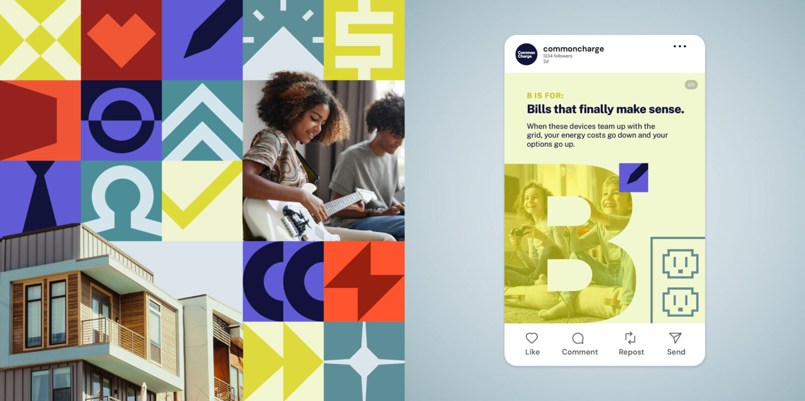
A modular tile system became the core of the identity:
• Concentric energy rings represent the coalition as a shared center
• A stylized bolt embodies stored and shared power
• Directional arrows signal momentum and collective progress
• A final pulse symbolizes the brighter energy future the coalition is building
Color and type were chosen to balance credibility and optimism:
• Deep purples for authority
• Electric oranges and yellows for urgency and energy
• Public Sans for modern, accessible, government-adjacent clarity
The system is flexible enough to scale from national campaigns to coalition partner toolkits.
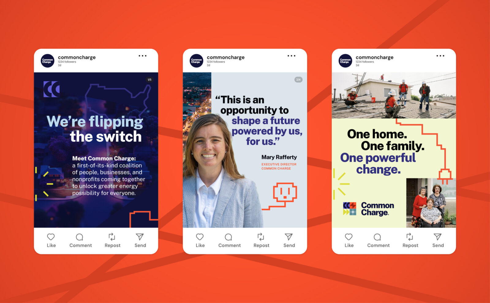
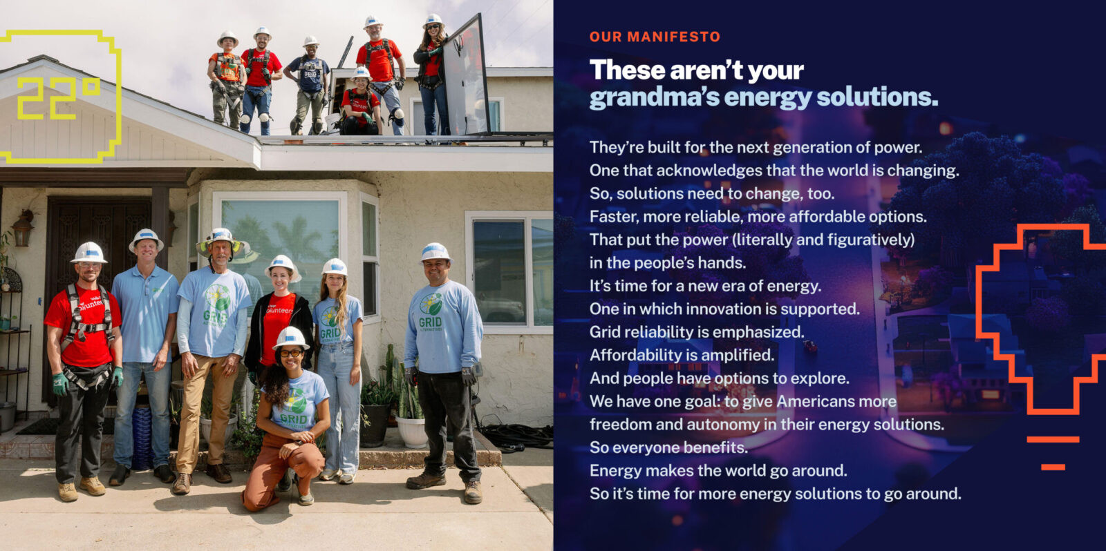
Verbal Identity:
We created a voice that is:
• Clear (no jargon or acronyms)
• Confident (unapologetically truth-telling)
• Optimistic (focused on solutions and progress)
• Inclusive (built for all communities and political leanings)
To get there, we immersed ourselves in the coalition. Through interviews with members across nonprofits, businesses, and advocacy groups, we uncovered where language aligned, where it clashed, and where a new narrative needed to emerge. That discovery phase shaped a messaging strategy grounded in unity, accessibility, and impact.
We also led a full naming exploration—generating dozens of strategic territories and name directions before landing on Common Charge, a name that does three critical things:
• Signals unity across a diverse coalition
• Feels accessible and trustworthy to the public and policymakers
• Connects directly to the mission: power built by people, for people
From there, we built a verbal identity that reframes the energy future as something people shape, not inherit.
These aren’t your grandma’s energy solutions. They’re built for the next generation of power.
This voice now anchors everything—from policy explainers to national recruitment campaigns—giving the coalition a consistent, compelling way to speak.
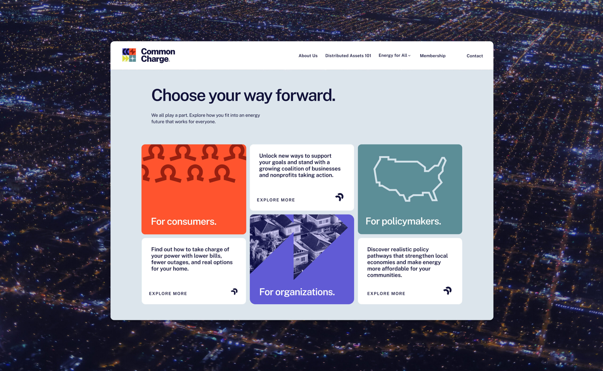
Digital Experience:
We transformed the website into the movement’s national hub, a platform built to:
• Educate consumers with clarity
• Give policymakers trustworthy guidance
• Showcase member achievements
• Recruit new organizations
• Translate complexity into action
Instead of policy jargon, the site leads with human outcomes: lower bills, fewer outages, and more reliability.
The content system scales effortlessly across explainers, toolkits, thought leadership, and social storytelling.
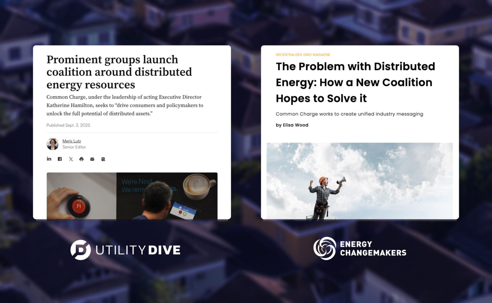
The Outcome:
Common Charge now has a brand that:
• Unifies more than 45 member organizations
• Provides a single national narrative for a previously fragmented movement
• Elevates distributed assets into mainstream understanding
• Positions affordability as a national priority
• Builds trust with policymakers and credibility with media
• Mobilizes new partners and accelerates recruitment
• Sets the foundation for national advocacy in 2026 and beyond
It is more than a brand. It is a catalytic platform powering national alignment.
Common Charge can now do what the old system never could: give every family, business, and community the power to shape their energy future.
CREDIT
- Agency/Creative: Antenna Group
- Article Title: Common Charge: Powering a National Movement Through Unified Design by Antenna Group
- Organisation/Entity: Agency
- Project Status: Published
- Agency/Creative Country: United States of America
- Agency/Creative City: Hackensack
- Market Region: United States of America
- Project Deliverables: Art Direction, Brand Architecture, Brand Creation, Brand Design, Brand Experience, Brand Guidelines, Brand Identity, Brand Mark, Brand Naming, Brand Strategy, Brand Tone of Voice, Branding, Copywriting, Creative Direction, Design, Graphic Design, Icon Design, Identity System, Information Architecture, Logo Design, Web Design
- Industry: Energy
- Keywords: WBDS Agency Design Awards 2025/26 , Brand identity system, Modular design, Messaging framework, Naming development, Verbal identity, Iconography, Digital ecosystem, Narrative strategy, Audience insights, Energy equity storytelling, Distributed energy communication, National awareness platform, Mission-driven identity architecture
-
Credits:
Executive Creative Director: Chad Krulicki
Creative Director: Arrabelle Stavroff
Associate Creative Director: Andrew McNamara
Developer: Richard Pisarski
Designer: Jon Kutt
Copywriter: Hannah Deaton
Digital Producer: Kirk Dammeier
Senior Interaction Designer: Sarah Miller
Project Manager: Monica Watson
Industry Expert (PR): Adam Guarneri
Industry Expert (PR): Caleigh Bourgeois
Industry Expert (PR): Carly Cao


