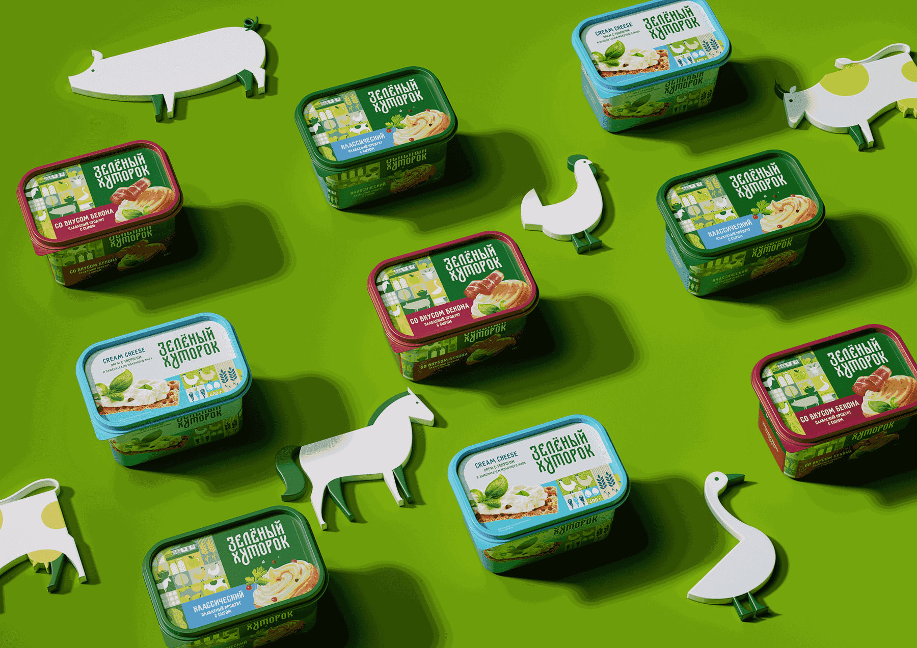
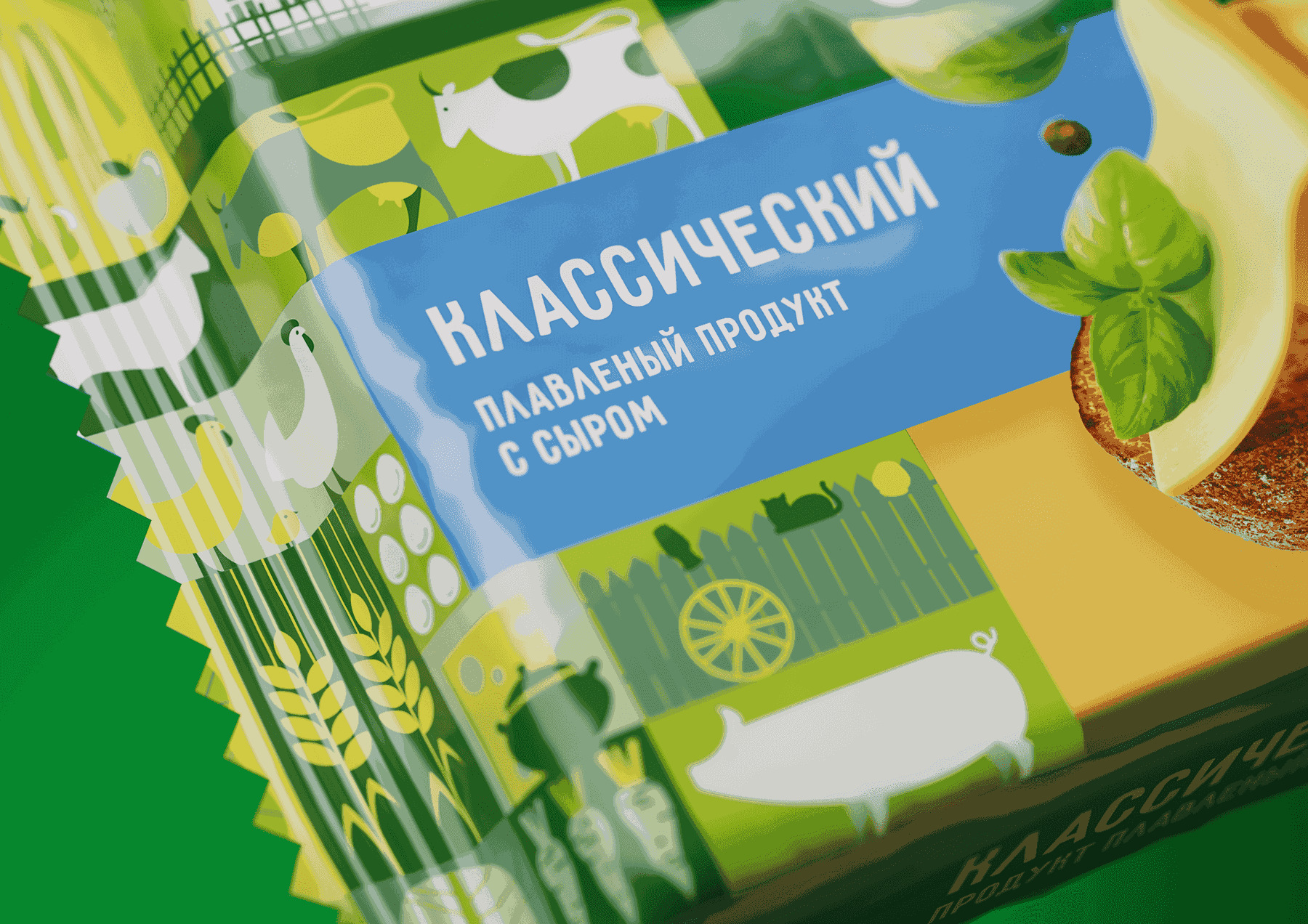
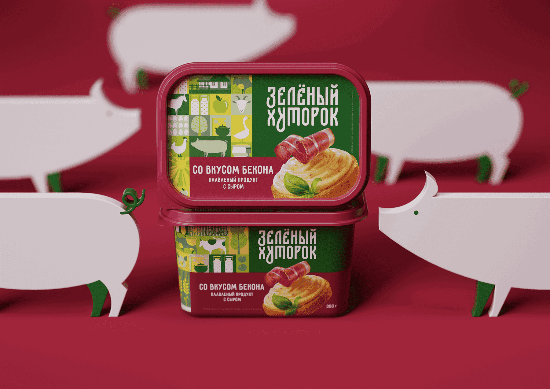
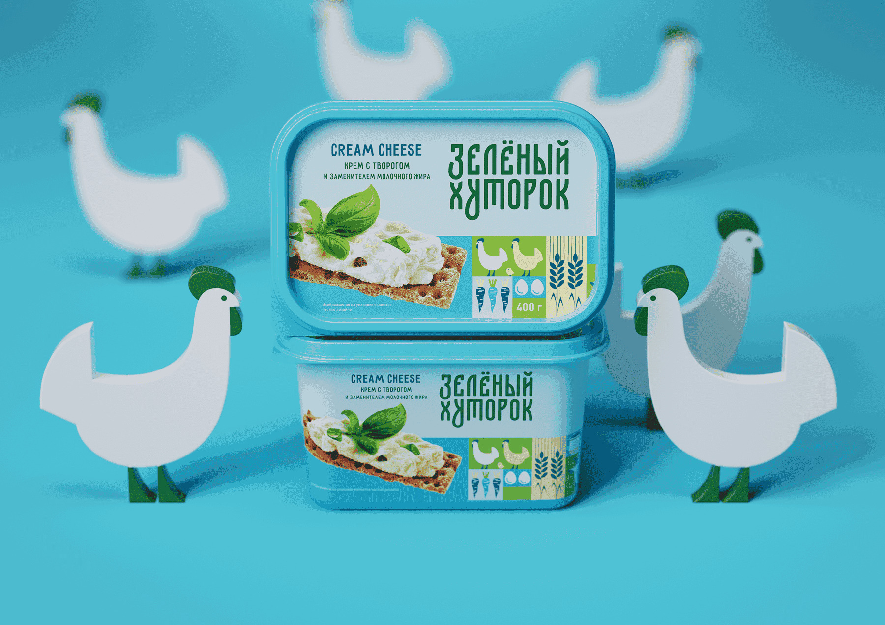
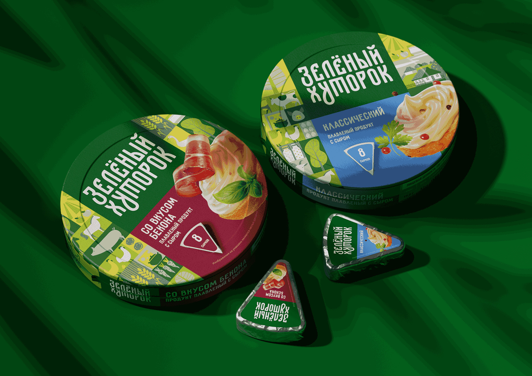
Idea: The foundation of branding is the idea of simplicity, naturalness, and home taste. The logo is made in the style of Russian knitting, which symbolizes the continuity of generations and tradition – because everyone knows that “it was better before.” The elements of rural life in the pattern rhyme with the name, the note “from farm milk” creates a feeling of an environmentally friendly product.
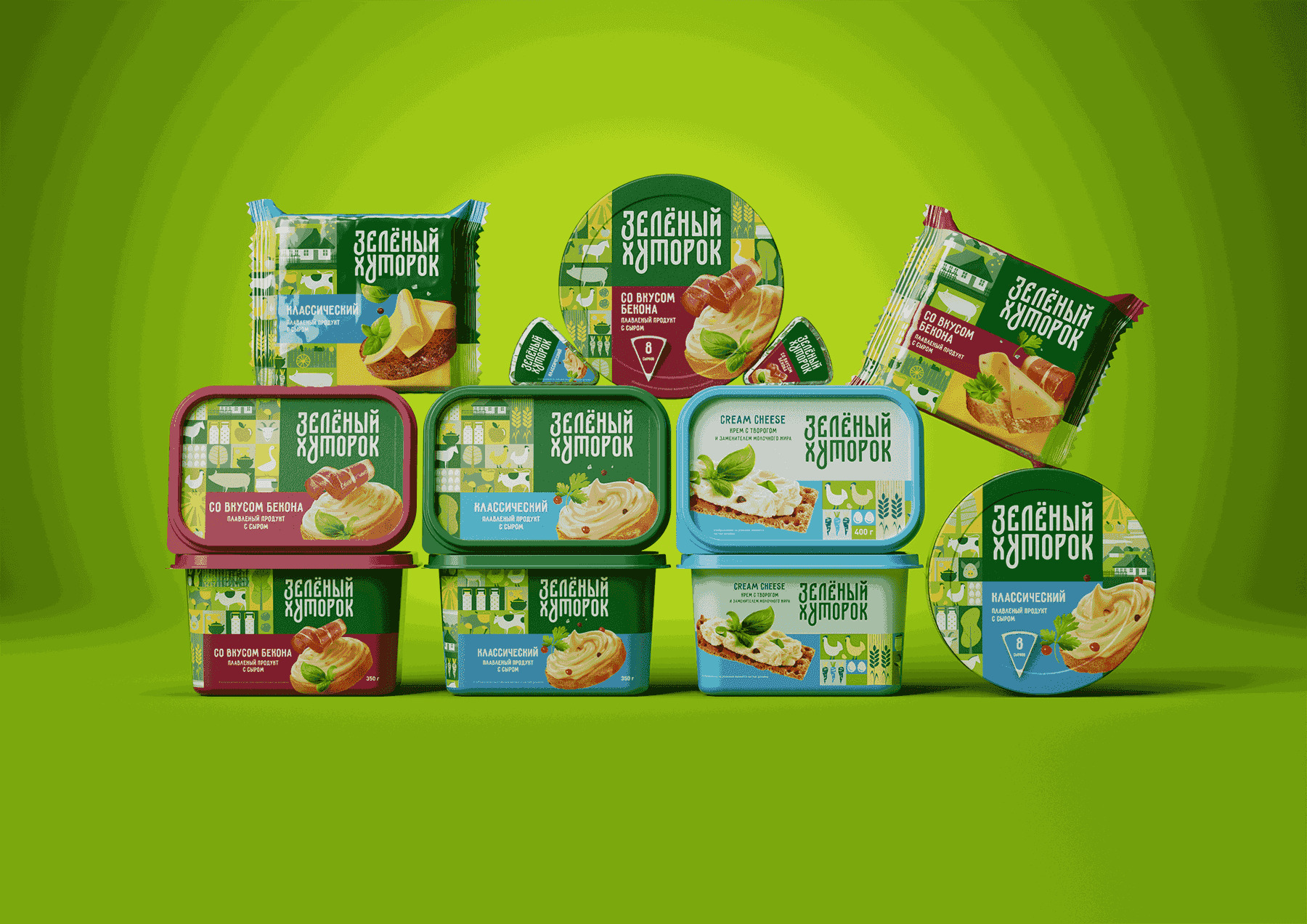
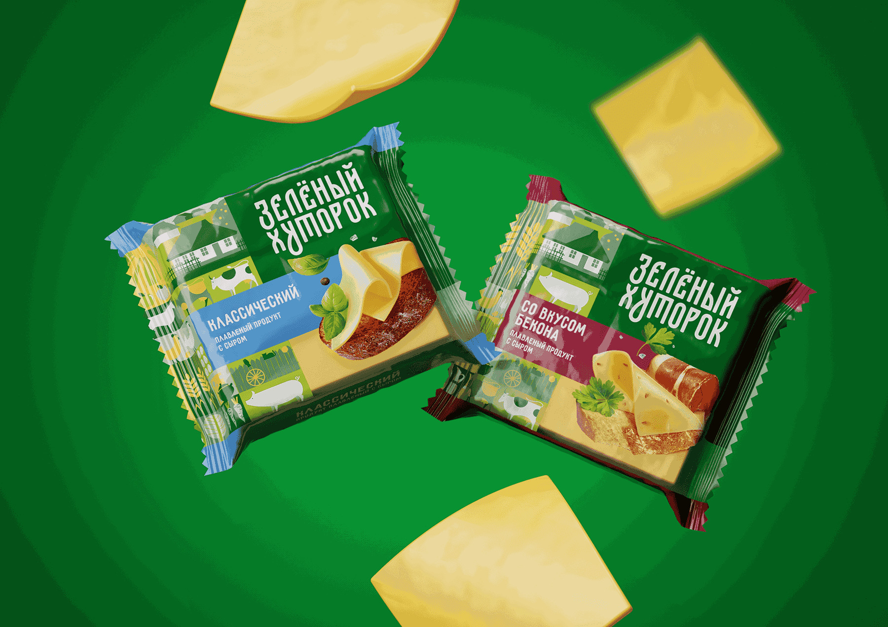
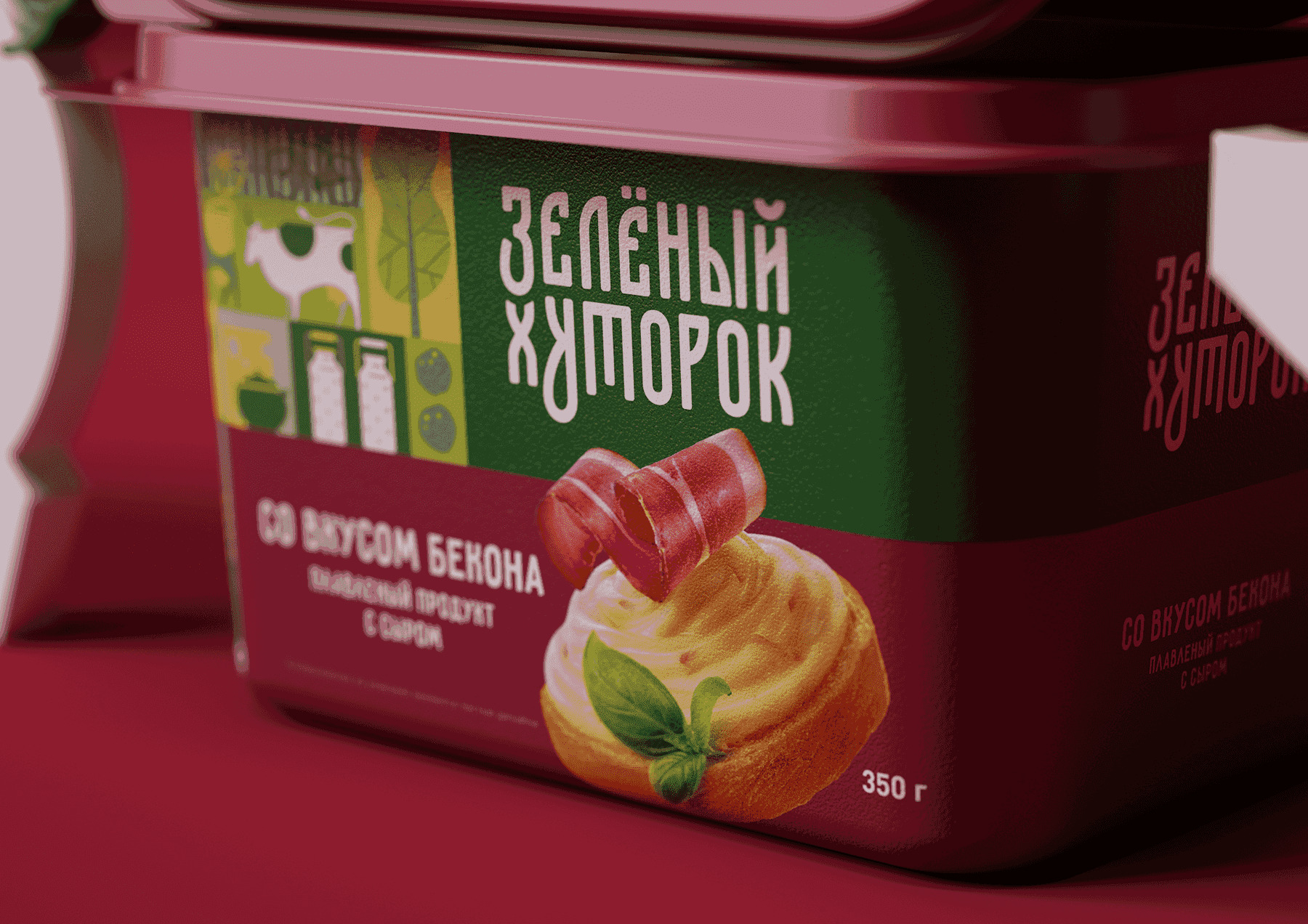
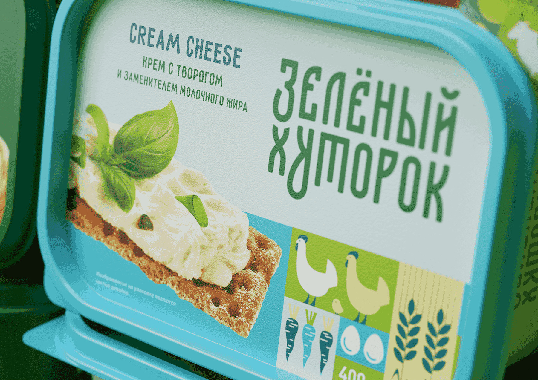
Design: All design elements work on the idea of naturalness and tradition: the green color on the packaging, a leaf of greenery in the food zone, the word “green” in the name refers to nature; The pattern contains recognisable attributes of a farm or village: cattle, barn, agricultural products; The typography of the logo goes back to the Russian script, referring to long-standing traditions, and soft natural shapes enhance the effect of naturalness.
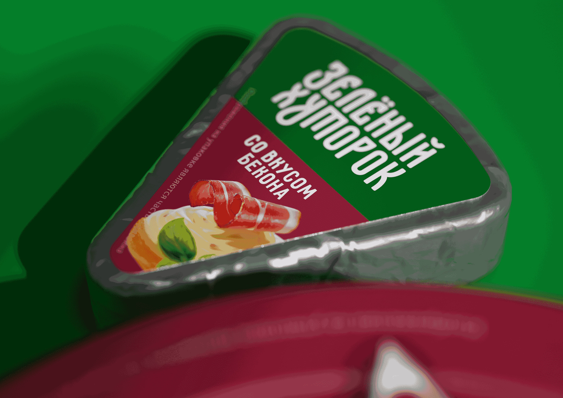
The product line contains a tray, slices and triangles. Each packaging option contains a logo, a pattern, a die with the name, a note “From farm milk” and an appetizing food zone with a sandwich image. The food zone is slightly different on the packages of different products in the line to show the variety of combinations.
CREDIT
- Agency/Creative: Commersat Branding Agency
- Article Title: Commersart Provides Foundation Branding for Zelenyj Khutorok Dairy Spreadable Product Range
- Organisation/Entity: Agency
- Project Type: Packaging
- Project Status: Published
- Agency/Creative Country: Russia
- Agency/Creative City: Москва
- Market Region: Europe
- Project Deliverables: Branding
- Format: Blister-Pack
- Industry: Food/Beverage
- Keywords: Food, Cheese, Packaging, design, bacon, breakfast, village, pattern, print, ILLUSTRATION
-
Credits:
Agency: Commersat Branding Agency


