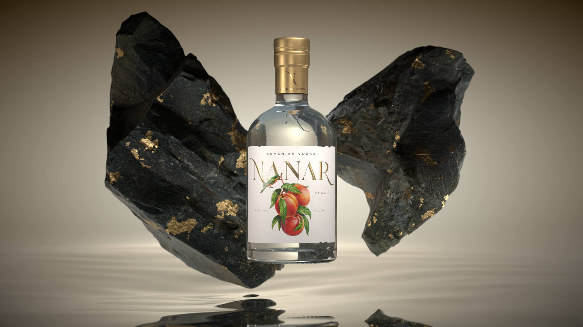
Look what the bird has fetched you!
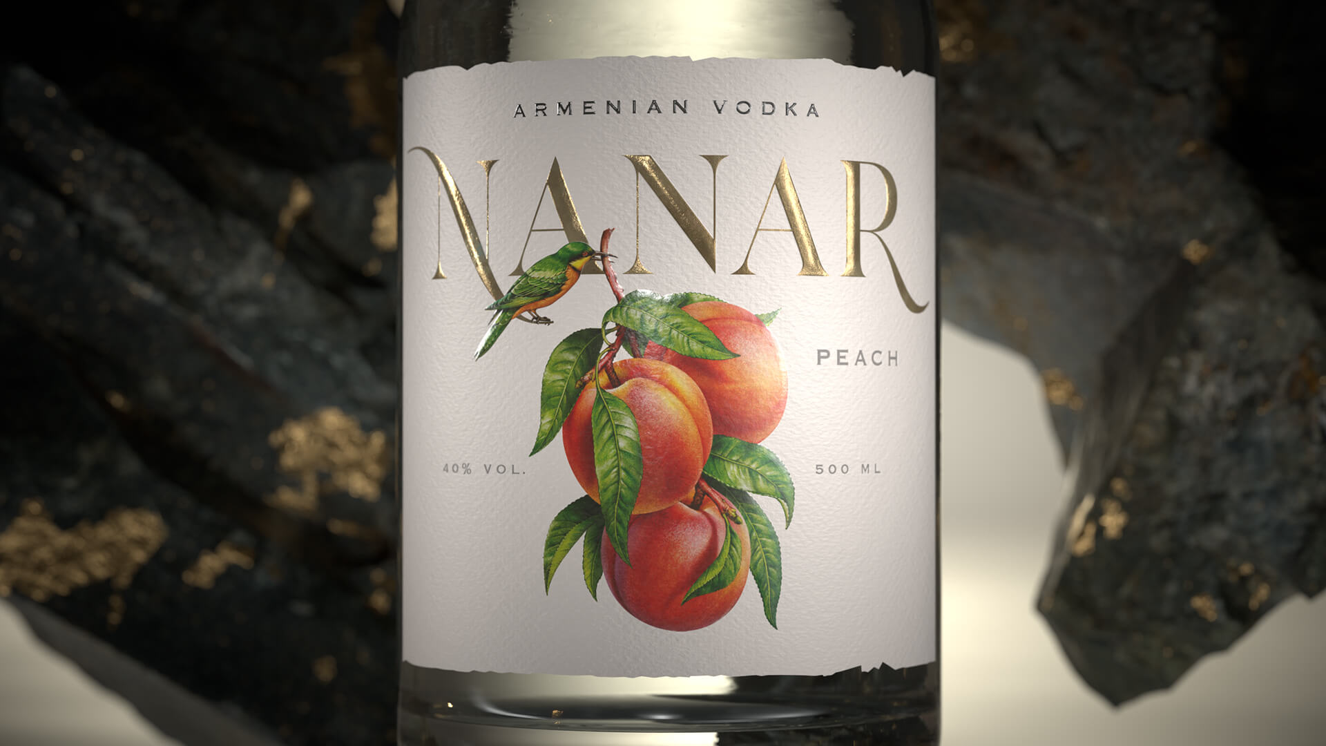
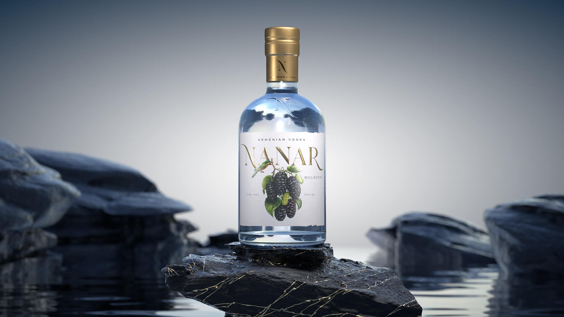
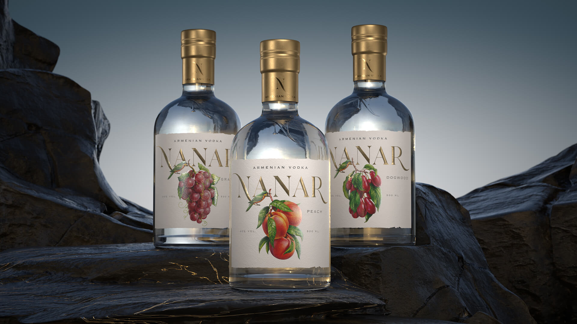
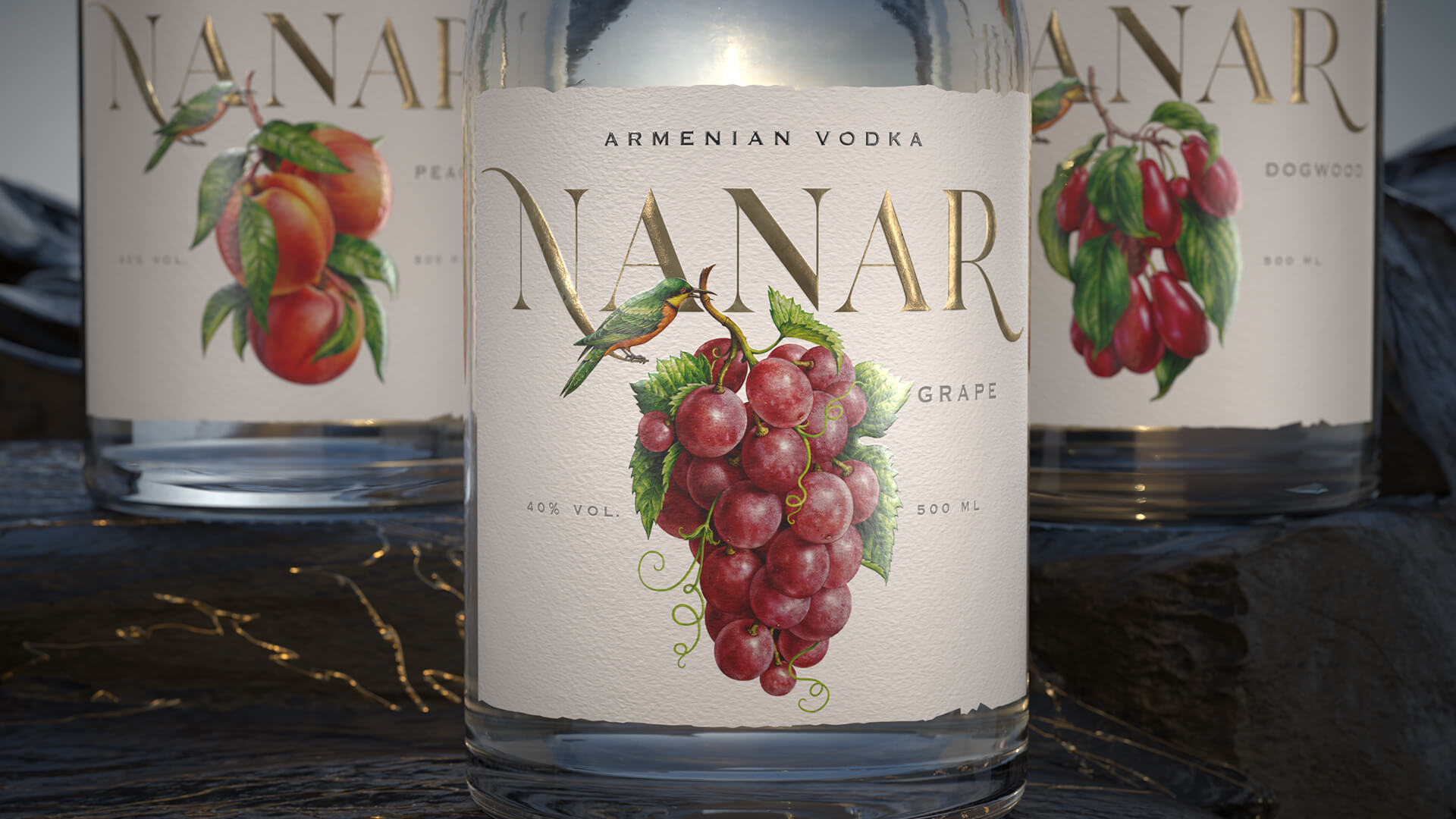
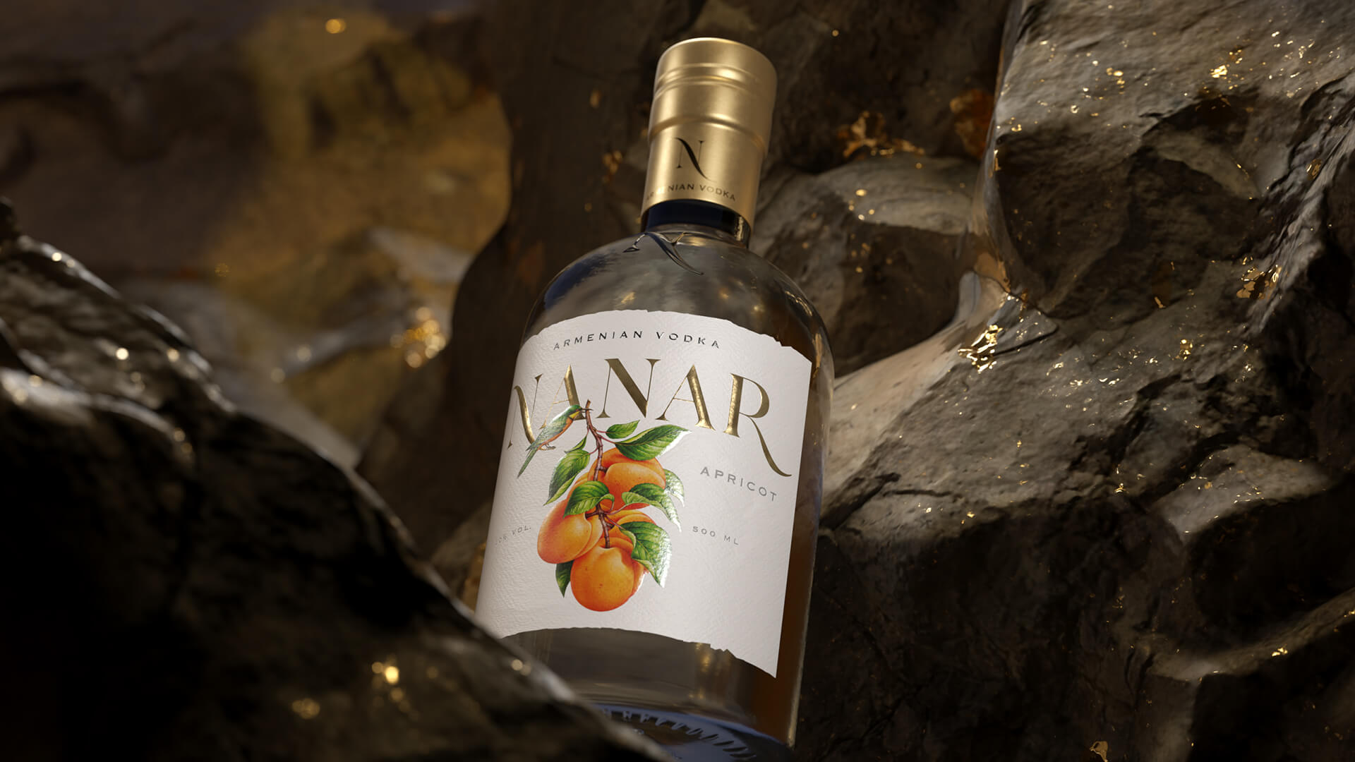
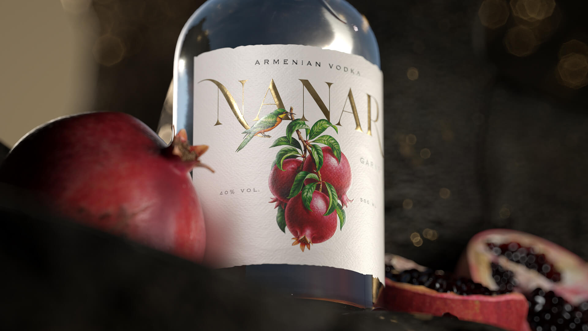
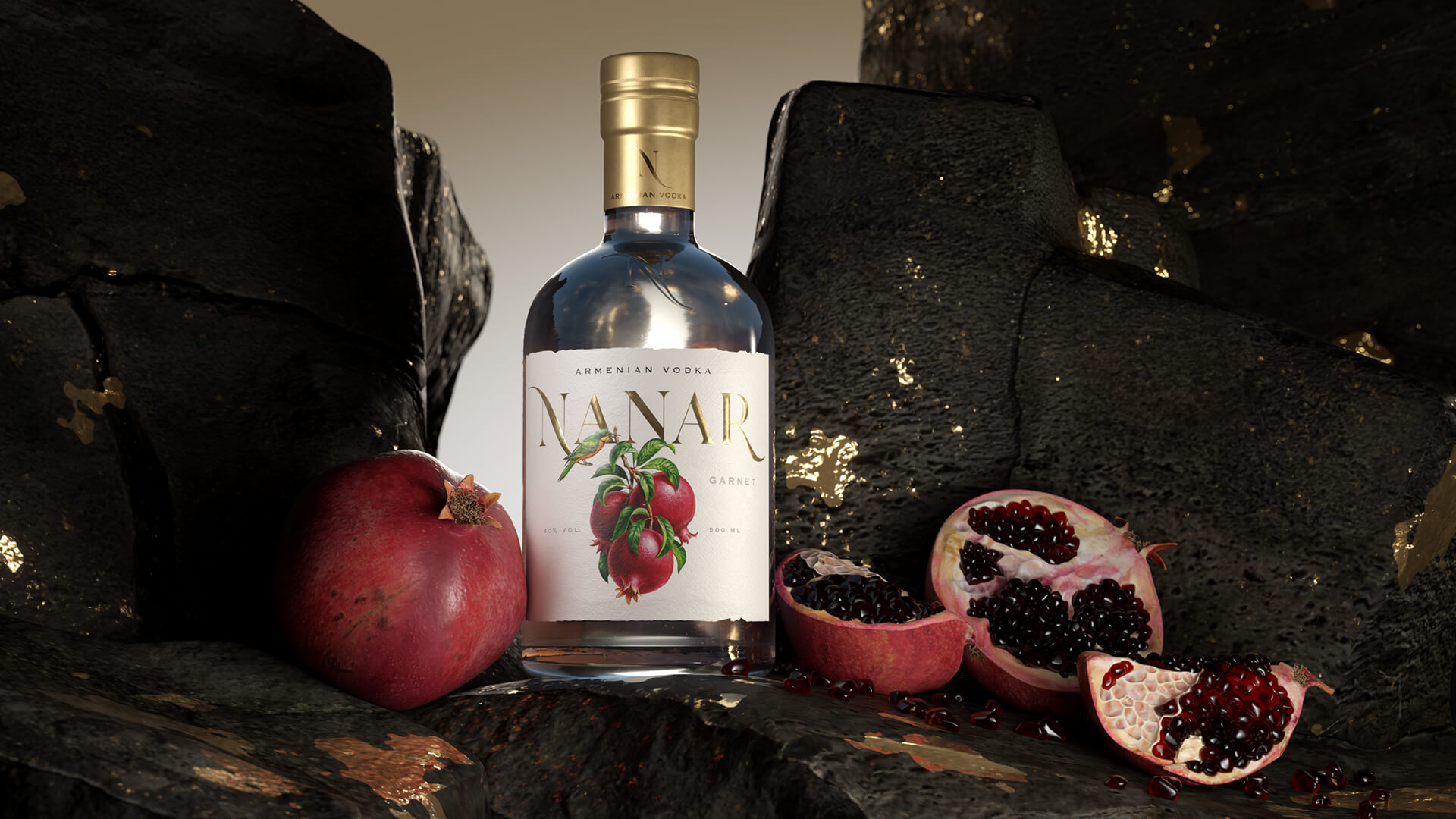
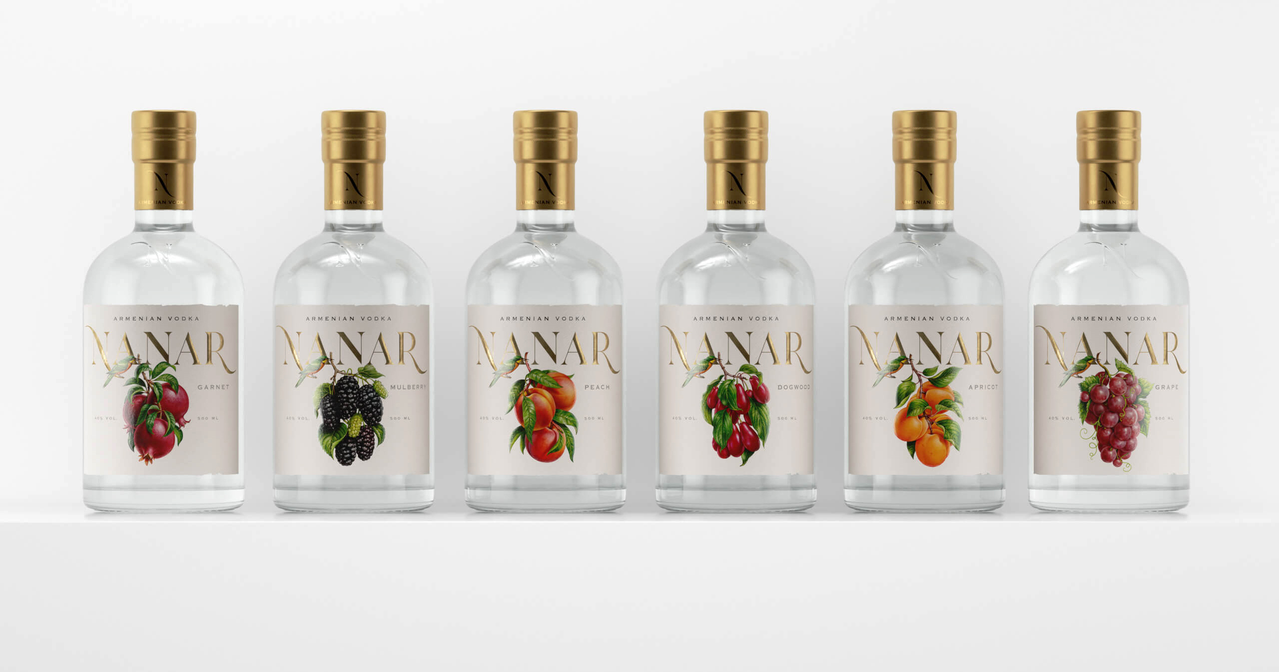
Every drop of the Nanar vodka is imbued with ripe, juicy Armenian fruit! But it is not just a “delectable” story from a small sun-lit country. It is a drink that gets one to savour every single flavour and at the same time to recognize something familiar about it. The nature generously rewards us with its treasures, and who could know better than birds where to get the best nature gifts. We’ve had a bird visitor, too, who brough us the juiciest and ripest fruit.
Gifts of nature are real gold! That brought us to use gilded details. Our design concept was defined by charms of the harvest season. The laconic and luscious packaging of Nanar appeals to one’s feelings rather than to the mind.
Why is it so important? Designing the right kind of packaging is an investment in the brand’s future. The label that can spark emotions and attract the customer will fully meet the expectations of the product manufacturer. With the fruit vodka Nanar we won our customers’ trust with a memorable emotional detail. One glance at it lasting a second or two is enough to notice that it stands out.
CREDIT
- Agency/Creative: Commersart
- Article Title: Commersart Creates Packaging Design for Nanar Armenian Fruit Vodka
- Organisation/Entity: Agency
- Project Type: Packaging
- Project Status: Published
- Agency/Creative Country: Russia
- Agency/Creative City: Moscow
- Market Region: Europe
- Project Deliverables: 3D Design, Art Direction, Brand Naming, Brand Redesign, Graphic Design
- Format: Bottle
- Substrate: Glass Bottle
- Industry: Food/Beverage
- Keywords: N A N A R fruit vodka
-
Credits:
creative director: David
art director: Alevtina
3d modeling: Nikita
3d rendering: Alexsey
illustration: Inorama


