We were approached by startup teams, we were required to develop a brand from scratch. To create a simple, recognizable name and a modern corporate identity for fast food, which will be easily associated with the network format, and not with a separate outlet. The main goal is to distinguish the brand from the spontaneous street kitchen segment and place it in the segment of higher quality, standardized public catering.
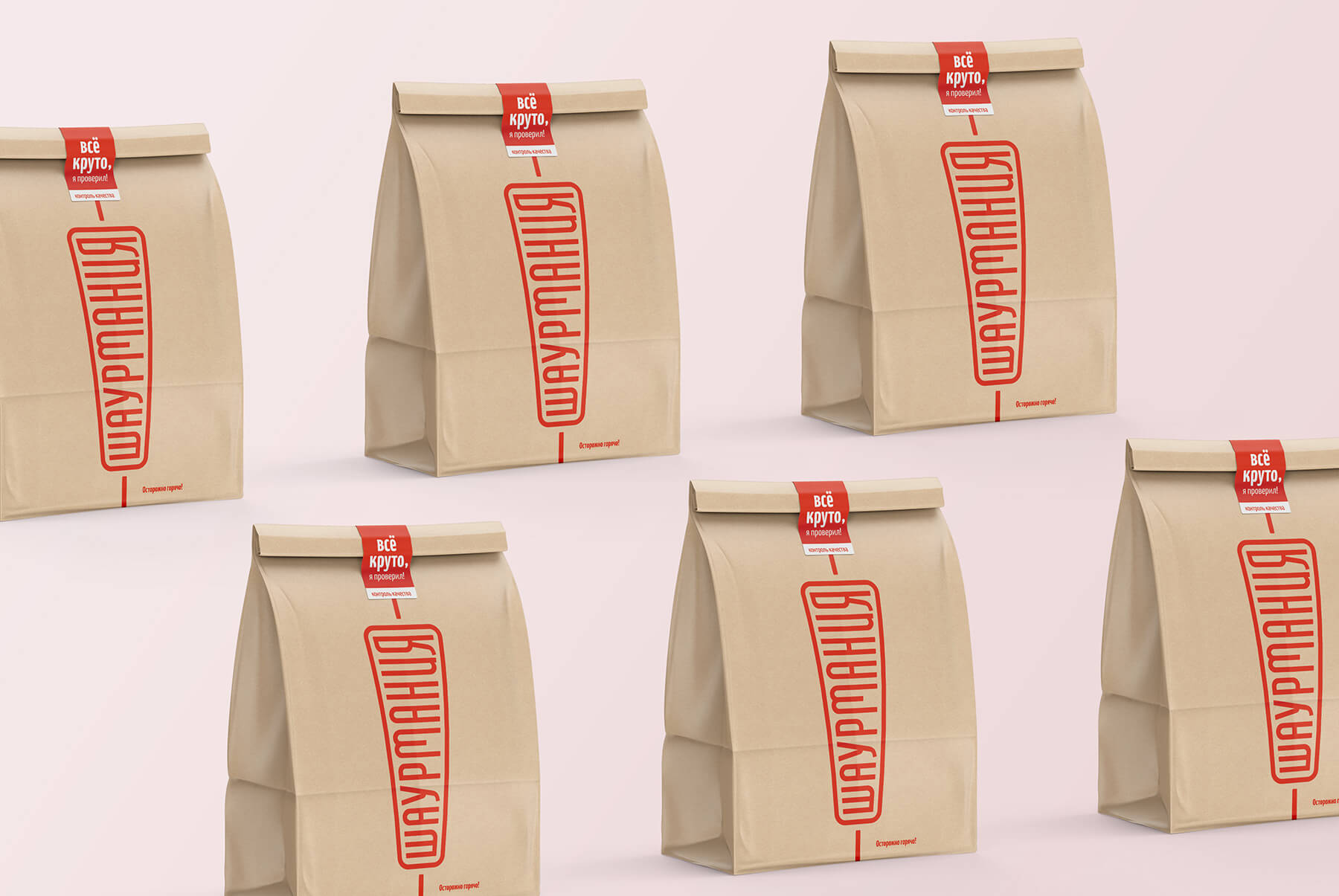
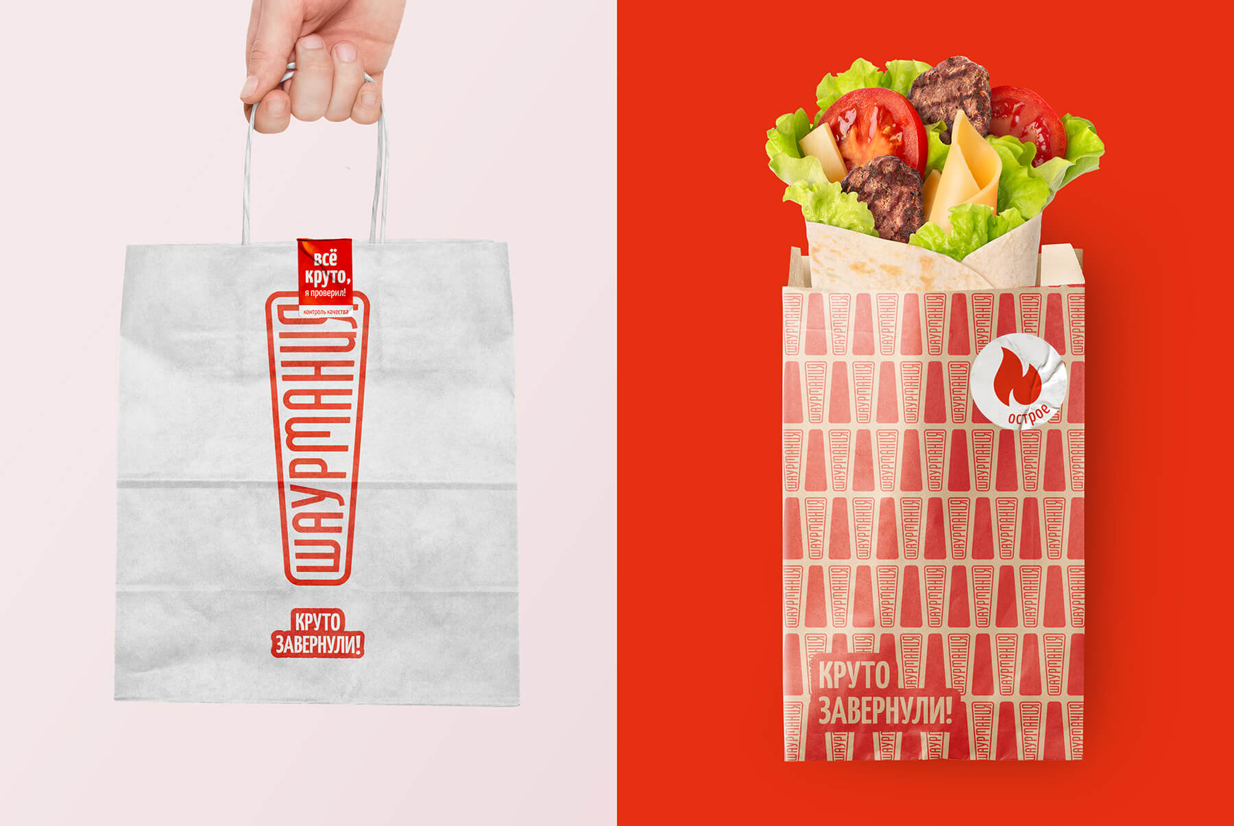
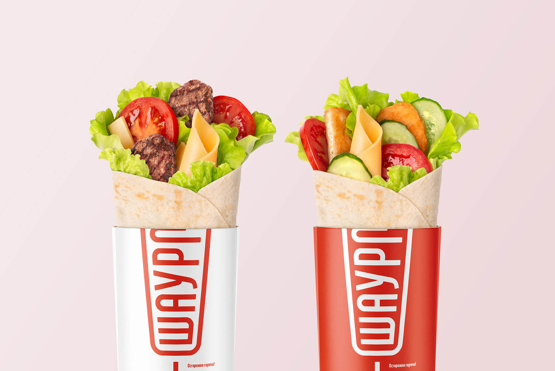
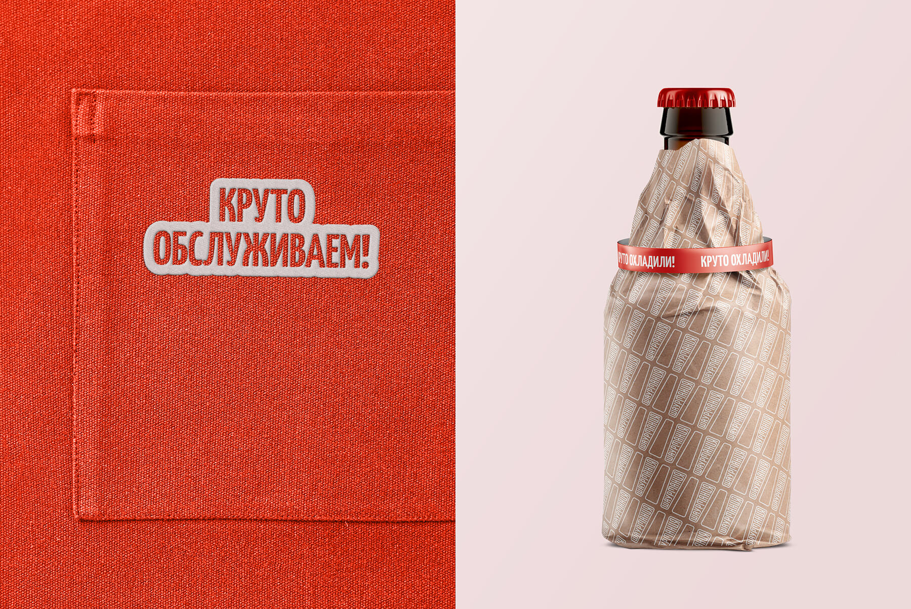
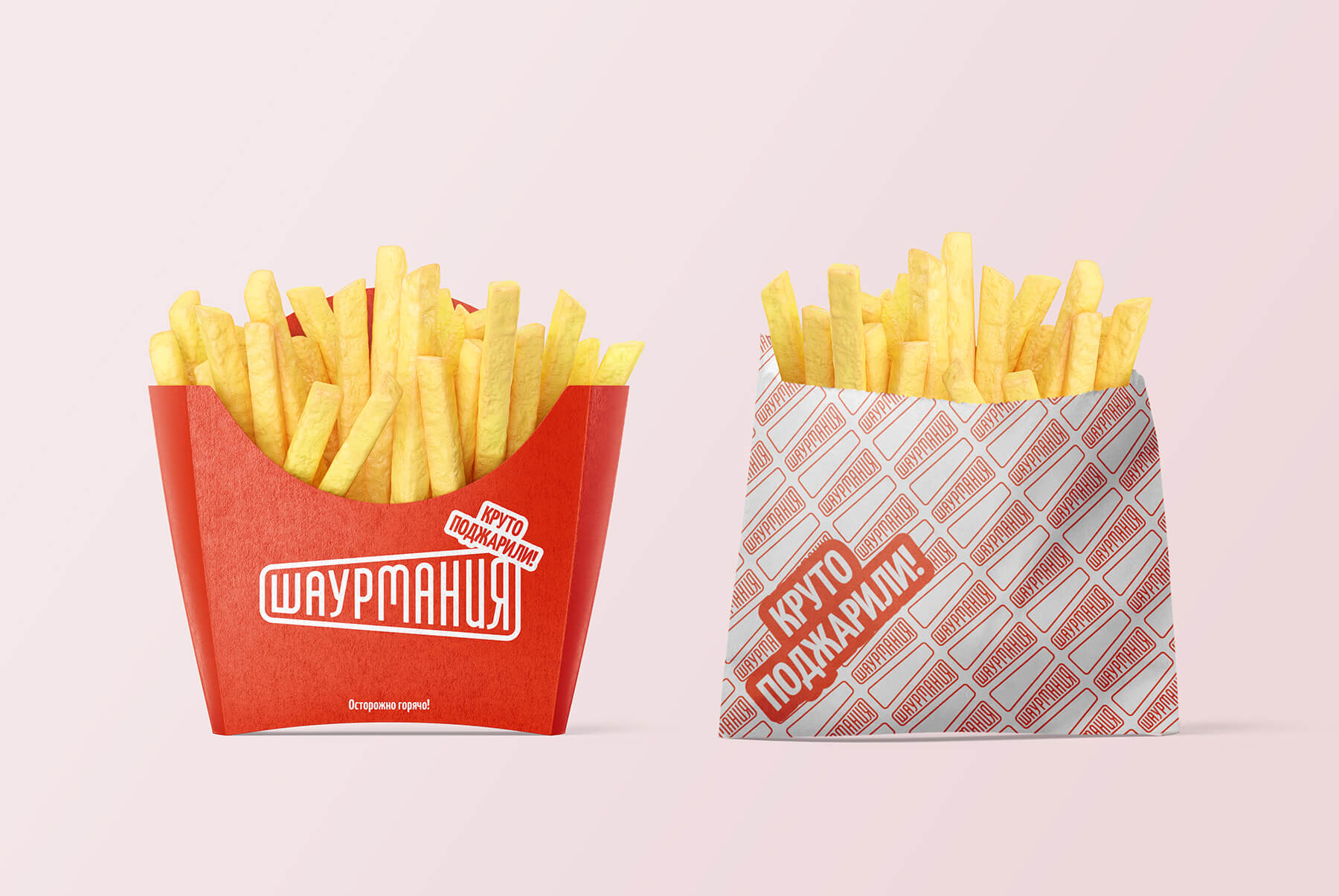
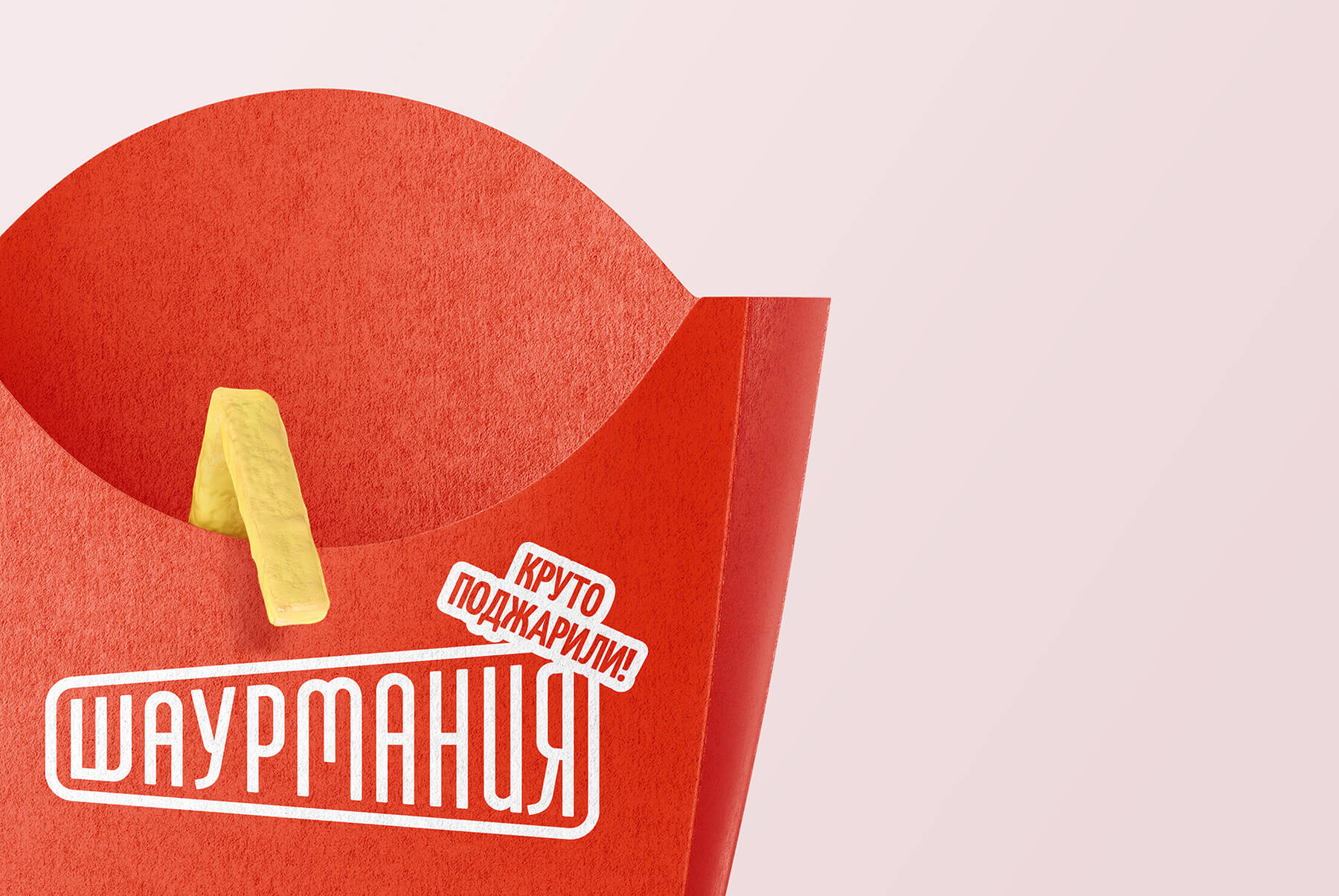
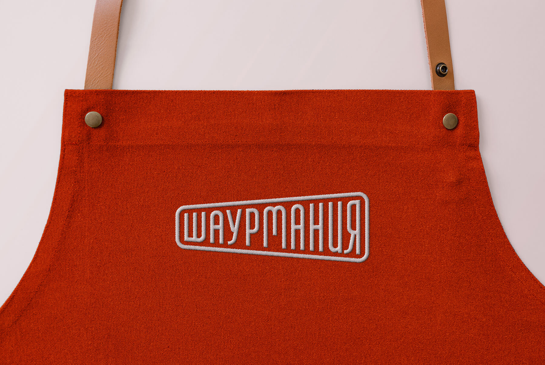
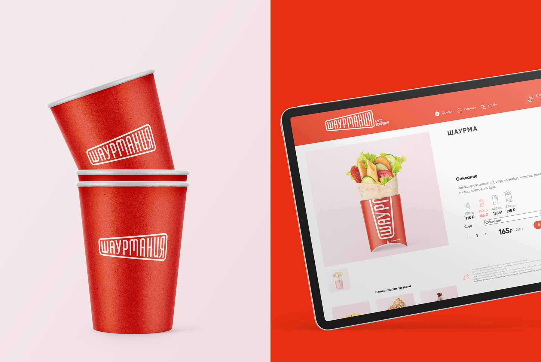
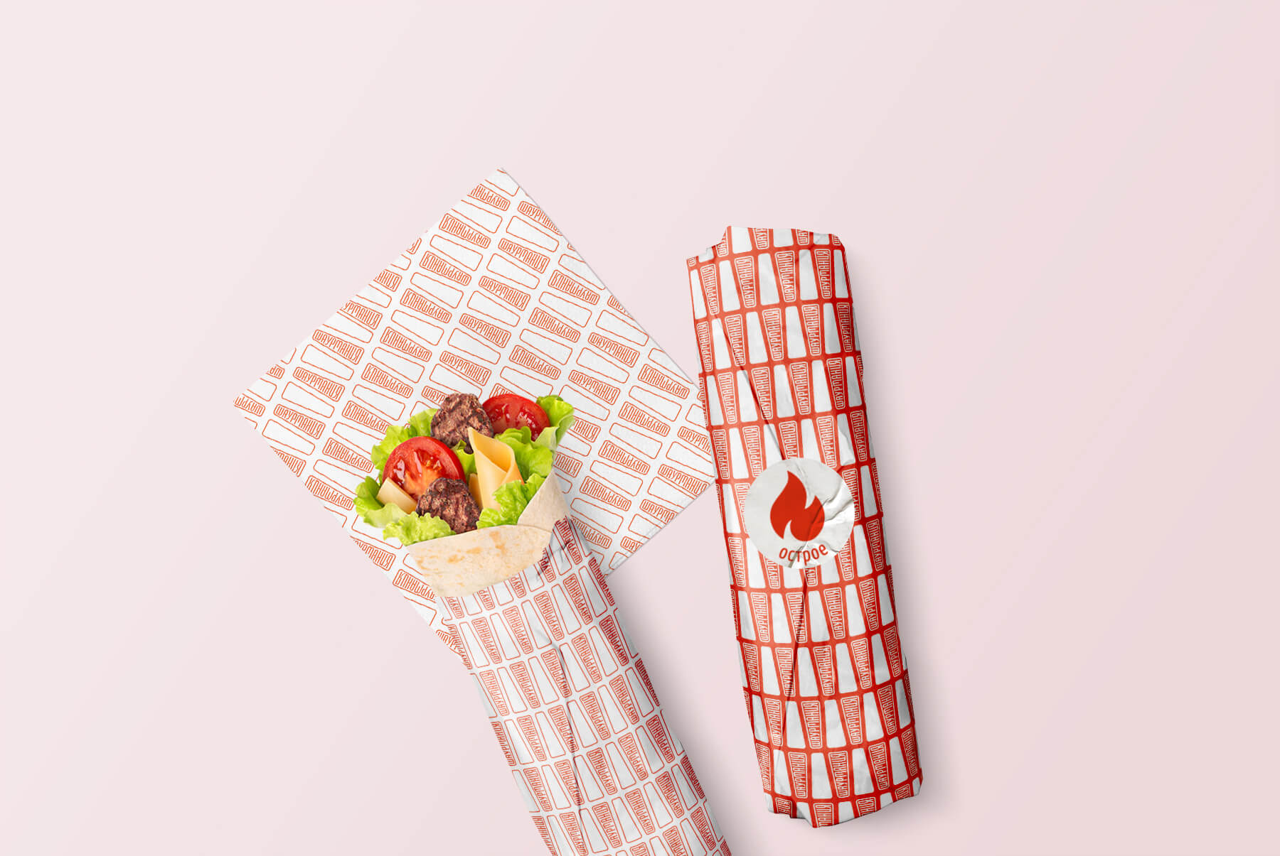
We have developed a logo that is easy to recognize and read in the visual noise of the urban environment. The shape of the logo plays differently on different corporate media. In the horizontal form, it can be a continuation of the product itself, and in the vertical form, it can resemble a meat spit – the main attribute of the kitchen. To differentiate, we made a bright and eye-catching orange color. We also came up with a dynamic slogan that changes depending on the medium and can create a double meaning: “Cool!”
CREDIT
- Agency/Creative: Commersart
- Article Title: Commersart Create Shaurmania Fast Food Brand Design
- Organisation/Entity: Agency, Published Commercial Design
- Project Type: Identity
- Agency/Creative Country: Russia
- Market Region: Europe
- Project Deliverables: Brand Guidelines, Brand Identity, Brand Naming, Branding, Graphic Design, Packaging Design, Product Naming, Research, Retail Brand Design
- Industry: Food/Beverage
- Keywords: Fast Food


