Cơm Niêu 365 is a food establishment that serves ‘Com Nieu’ (pot rice) – a traditional Vietnamese dish was established to serve office workers and families. With the goal of developing into a chain of systems, Cơm Niêu 365 aims to have a professional, impressive Logo image and a consistent brand image across all stores and brand materials.
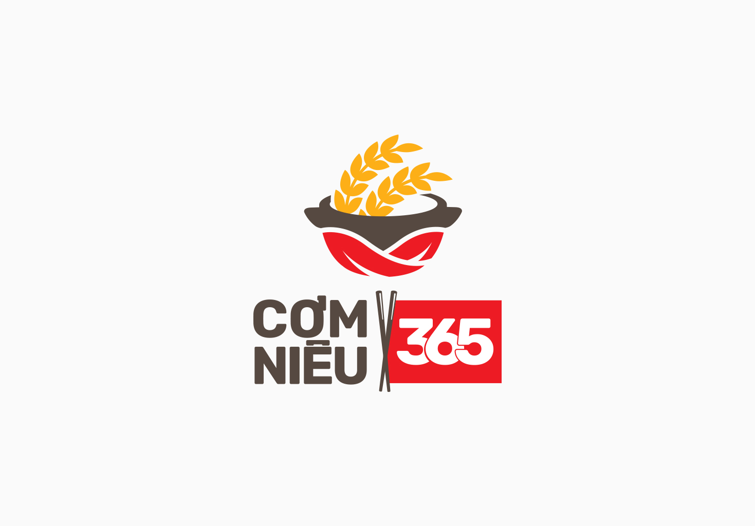
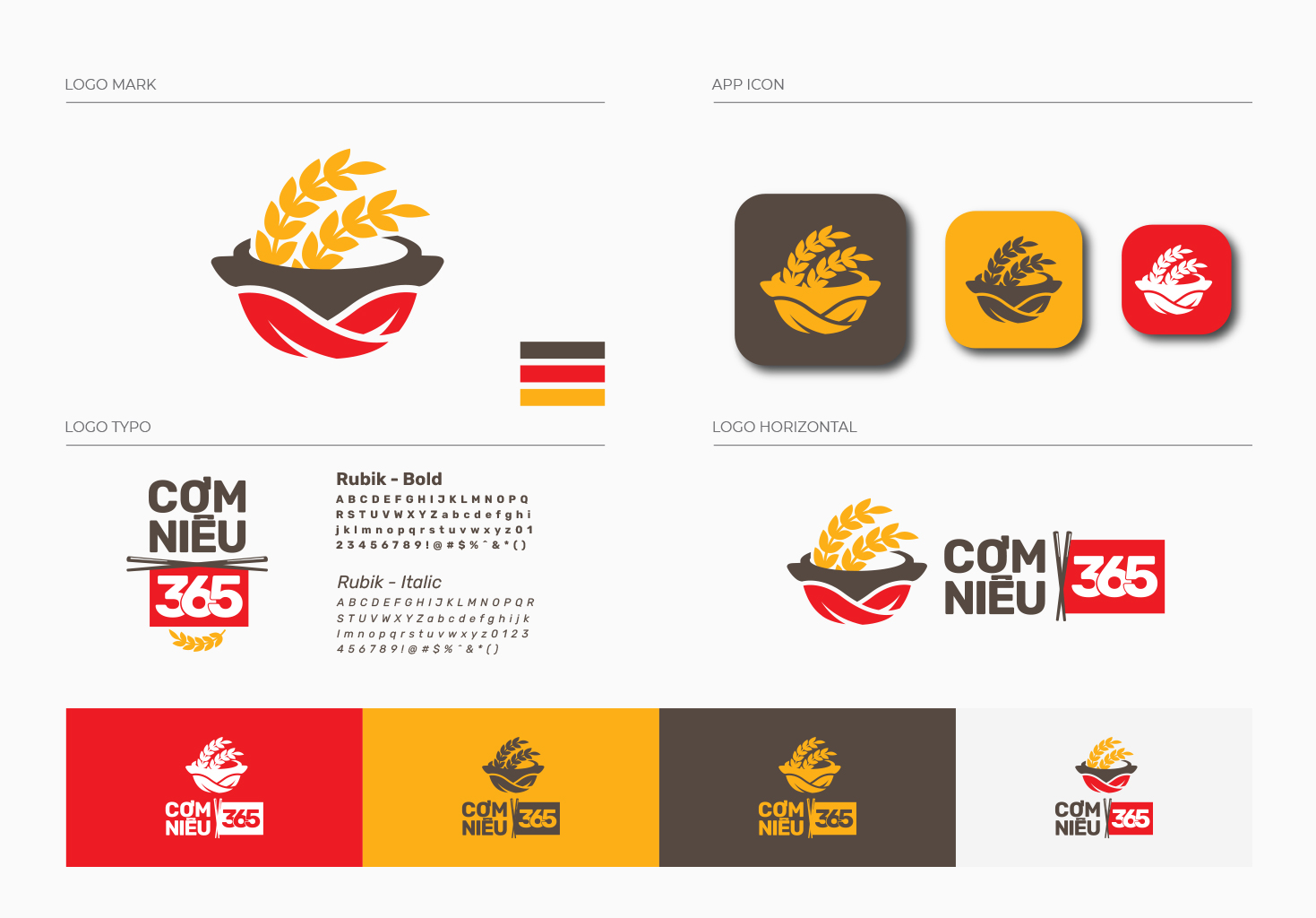
The brand icon in the Logo is inspired by the brand name, the image of a rice pot combined with rice plants and a leaf—simple and familiar images for the Vietnamese people.
The image of the red leaf hugging the base of the pot is a symbol of fire, evoking the hot image of a pot of rice just out of the stove.
The image of the golden rice plants on the rice pot signifies careful selection from grains and rice plants. The rice plant grows upward, signifying that this is not just a meal, but also a spiritual experience, a new source of energy, a journey full of hope and success.
The image of a rice pot is recreated in a wholesome and inviting way, encouraging customers to enjoy this delicious traditional dish to the fullest
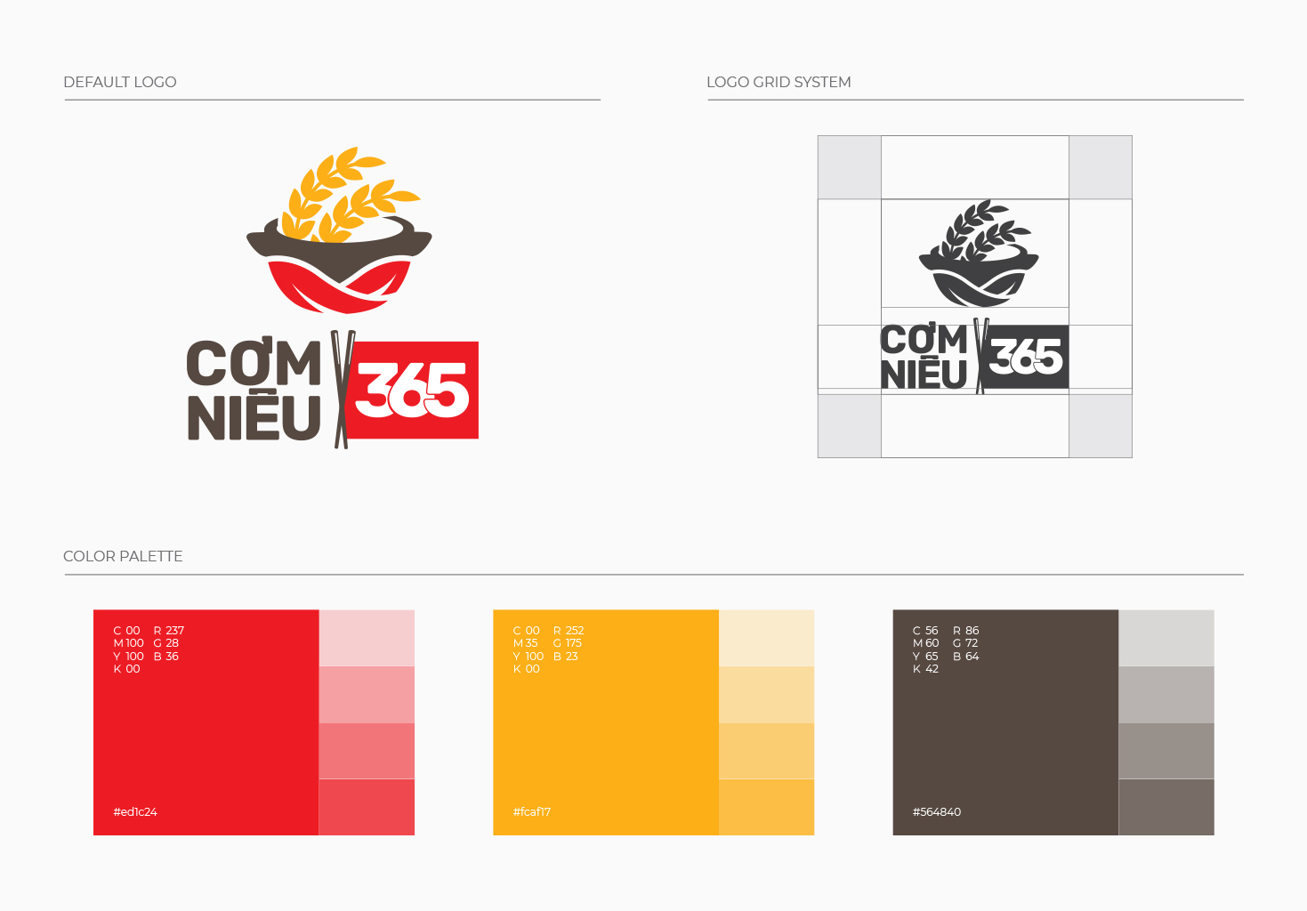
Overall, the Logo combines red and black, signifying desire, strength, agility, and modernity. It clearly reflects Cơm Niêu 365’s business philosophy, blending traditional products with modern services and an unwavering desire for continuous development.
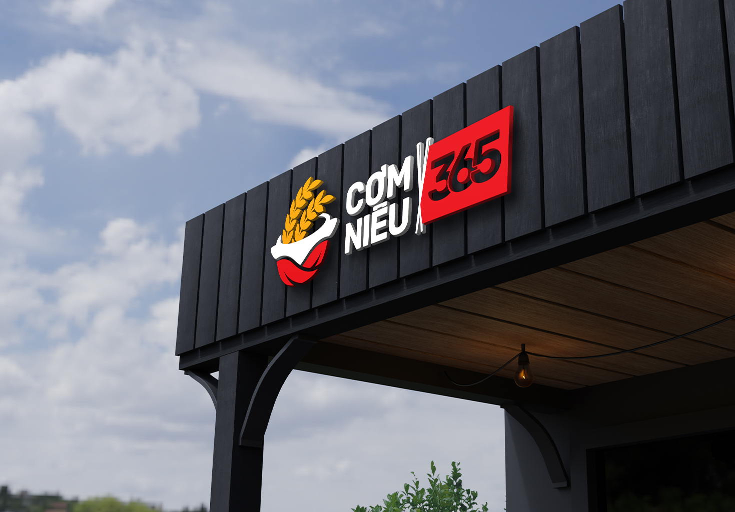
With these changes, Cơm Niêu 365 has created a distinct and standout identity compared to its competitors, while ensuring consistency in its brand image, leaving an indelible mark in the hearts of customers and partners.


CREDIT
- Agency/Creative: Brandall Agency
- Article Title: Cơm Niêu 365 and the Brand Identity Transformation Journey
- Organisation/Entity: Agency
- Project Type: Identity
- Project Status: Published
- Agency/Creative Country: Vietnam
- Agency/Creative City: Hồ Chí Minh City
- Market Region: Asia
- Project Deliverables: Brand Identity
- Industry: Food/Beverage
- Keywords: Brandall, Cơm Niêu 365, Brand Identity, Logo, Logo design, 2D design
-
Credits:
Design Form: Brandall Agency


