


Domain services provider Com Laude Group has revealed a new approachable, fluid ‘Client-Shaped’ corporate brand identity with global appeal.
The refreshed visual identity by Designhouse includes an evolved ‘World of Dots’ logo; a softer, geometric typeface and a pegboard-inspired isometric design system.
Com Laude is a leading global provider of domain names and registry management services, additionally offering expert strategic advice in the dot brand arena, brand protection and security services. Established in London in 2004, the Group has offices across the UK, in Spain, the USA and Japan.
The brief centred on communicating Com Laude’s trusted expertise and customer-centric, flexible approach but with a softer, more contemporary look and feel. The refresh was commissioned as part of a brand consolidation programme following a period of organic and acquired growth.
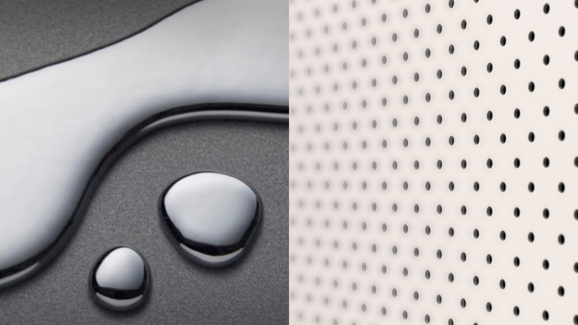
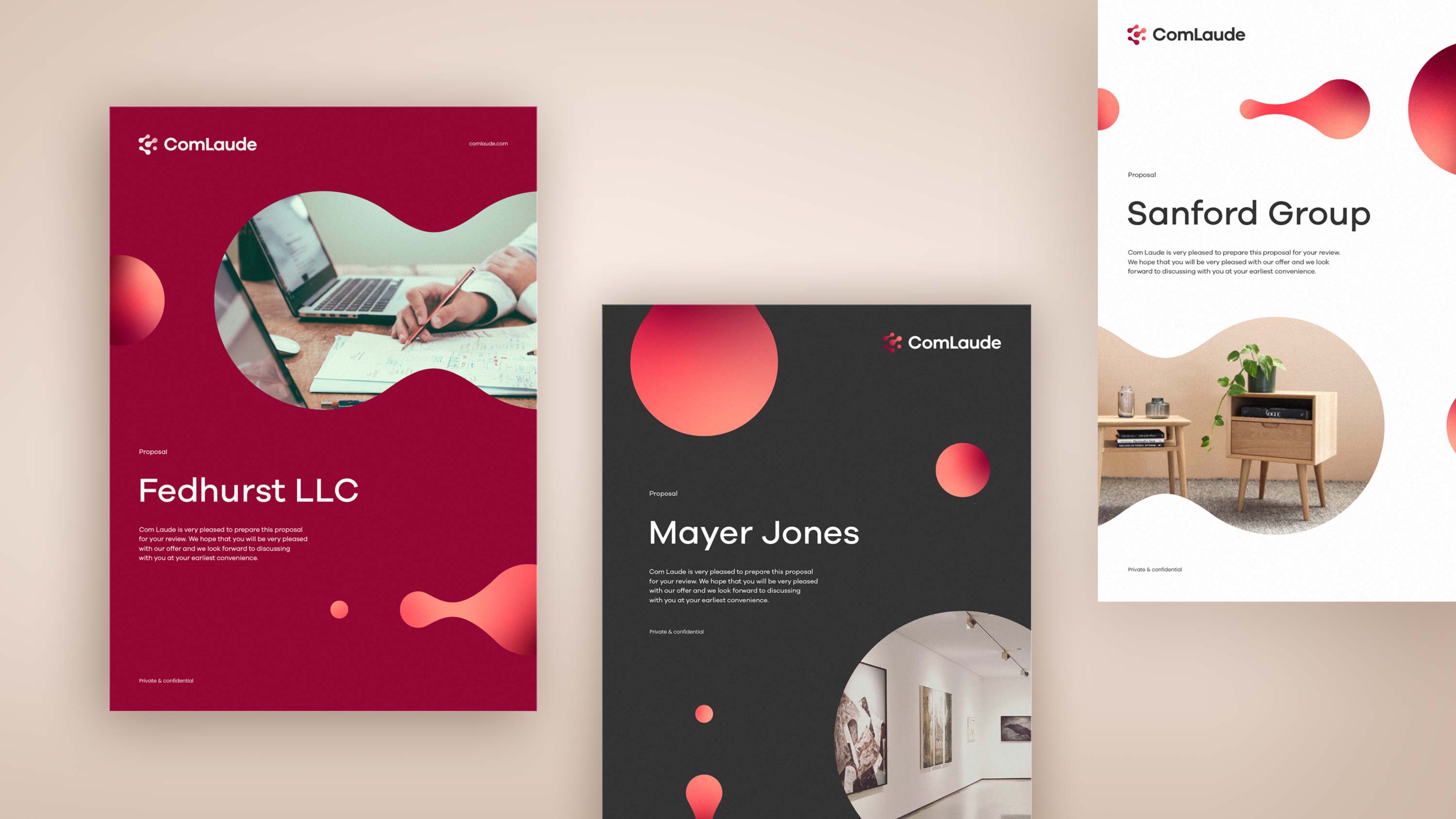
The isometric design system is derived from the original ‘World of Dots’ logo and inspired by the flexibility of pegboards. The design system represents each client’s ever-changing portfolio needs, while mercury-like connections between the dots reinforce the fluidity of the solutions offered by Com Laude.
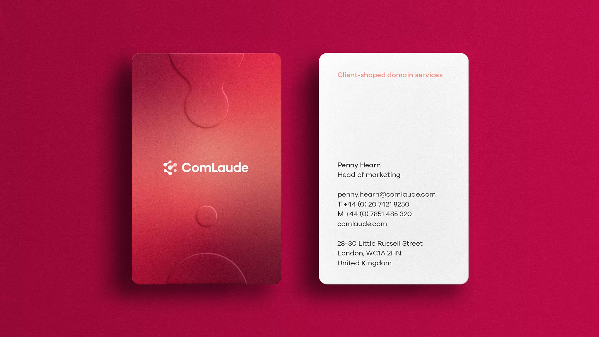
The original 3D logo has been flattened and dramatically simplified to connect to the new design system while retaining an abstract link with the original ‘World of Dots’. The previous wordmark typeface, Helvetica, has been replaced with Galano to be more reflective of the strapline Client-shaped domain services, injecting more personality and warmth to the visual identity.
A sophisticated new colour palette of deep Cranberry and muted grey brings gravitas and professionalism to the master logo, while creating differentiation in a market dominated by blues and greens. Peach and Watermelon add depth and energy.
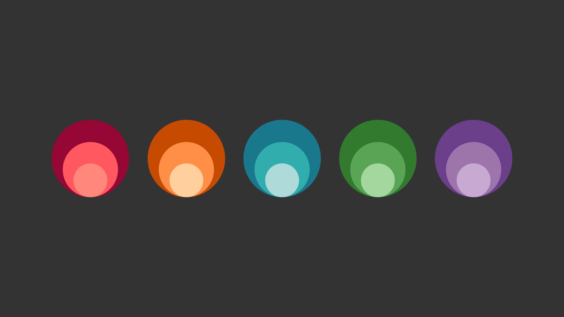
The personalities of each service are reflected in the secondary colour palette:
• Portfolio Management – warm Apricot represents expertise and trust
• Dot brand & new gTLD – Blueberry resonates with the previous brand identity for this service
• Brand protection – Apple represents positivity and the green from a traffic light system, showing ‘you’re good to go’ and protected
• Security – Grape is associated with a premium, sophisticated security service
Penny Hearn, Group Head of Marketing and Communications at Com Laude, said:
“In the refresh, we were looking to introduce a vibrancy of voice and create a brand identity that would be inviting for both clients and prospects alike, and notably create audible differentiation between us and our competitors. We have ambitions to be a global leader in domain names and the new brand system from Designhouse uses intelligent and intuitive design to deliver a professional yet fun and engaging voice.”
Matthew Gillman, Digital Director at Designhouse, said: “Com Laude were looking for a stronger visual representation of their value proposition. We focussed on injecting more personality into the brand with a more contemporary design system and a fruit salad colour palette that is approachable without loss of professionalism.”
The new brand identity will be applied across all Com Laude digital and social platforms, infographics and illustration systems, exhibition stands, presentation templates, stationery and video stings.
CREDIT
- Agency/Creative: Designhouse
- Article Title: Com Laude Unveils Friendly, Fluid Identity in Brand Refresh by Designhouse
- Organisation/Entity: Agency
- Project Type: Identity
- Project Status: Published
- Agency/Creative Country: United Kingdom
- Agency/Creative City: London
- Market Region: Global
- Project Deliverables: Animation, Brand Identity, Brand Redesign, Branding, Design, Exhibition Design, Graphic Design, Infographic, Logo Design, Typography
- Industry: Mass Media
- Keywords: Com Laude; Designhouse; rebrand; brand identity; domain services;
-
Credits:
Design: Designhouse team


