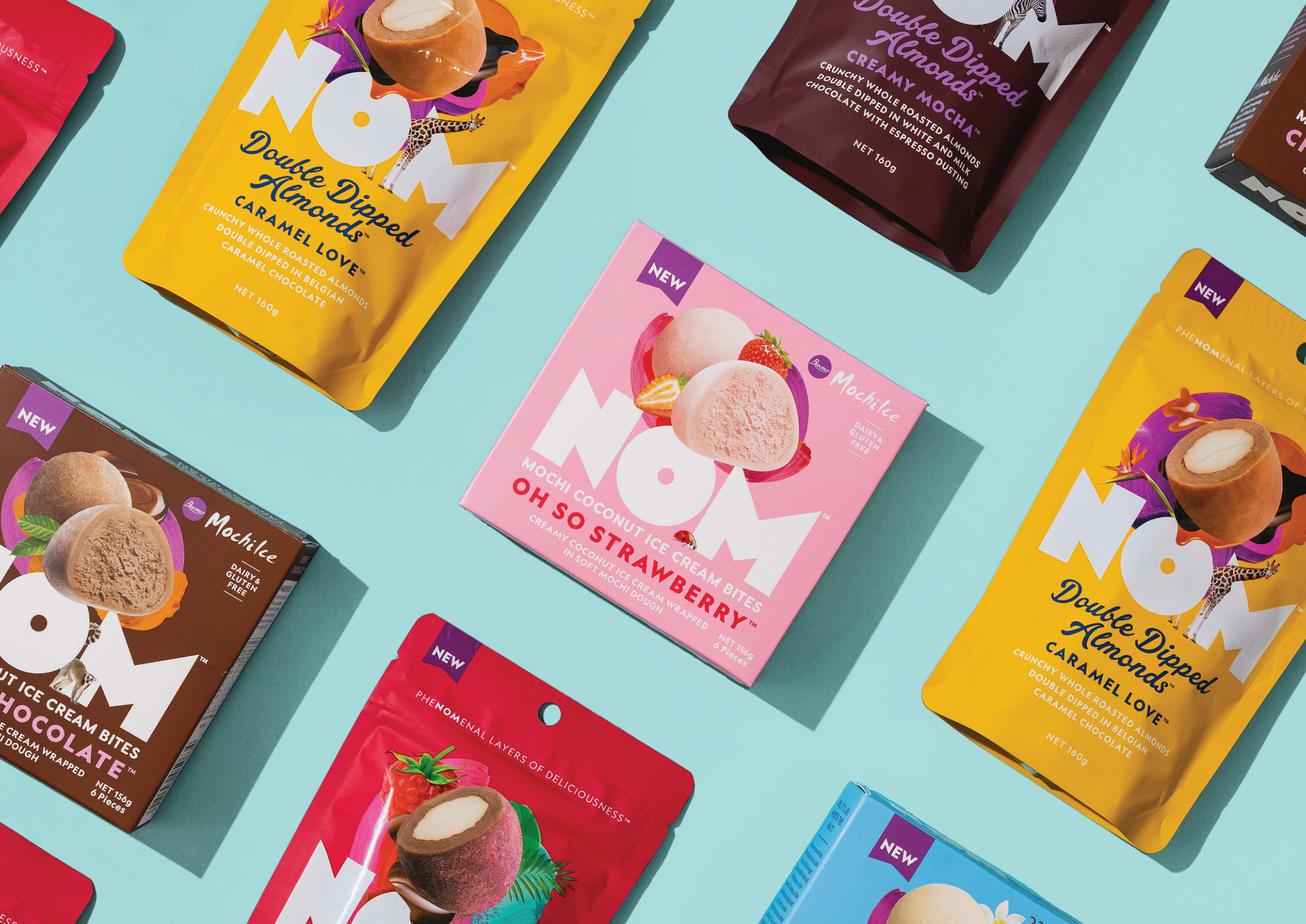
NOM is a new Kiwi-born brand of bite-sized treats that take indulging to a new level. To help launch NOM and create its identity, we were approached with a simple and inspiring brief: stimulate the senses and be boldly creative. As a starting point for us to build the brand from the inside out, we have to admit, it doesn’t get much more exciting than this.
From the get-go, we wanted NOM to be different from anything else in the busy mainstream confectionery and frozen snacking aisles. As a result, our brand platform revolved around the idea of creating magical bite-sized moments. Of course, magic can conjure up thoughts around fairy tales, the supernatural, and whimsical fantasies – the traditional stuff that can come across as pastiche and same-old. Instead, we focused on the magic that’s within our reach and right in front of us – those simple moments in our everyday life when you discover something beautiful or delightful which has that larger than life feel about it.
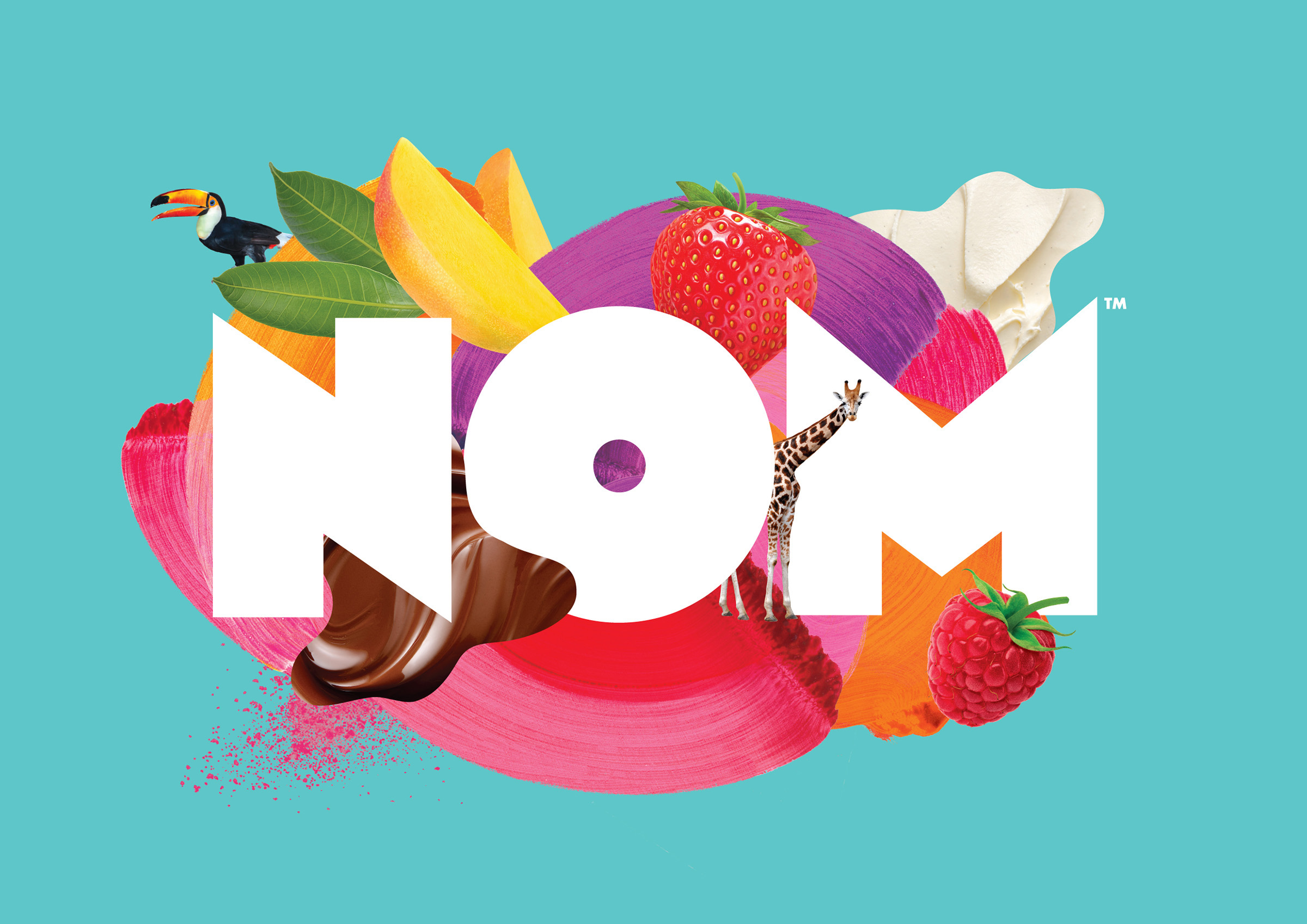
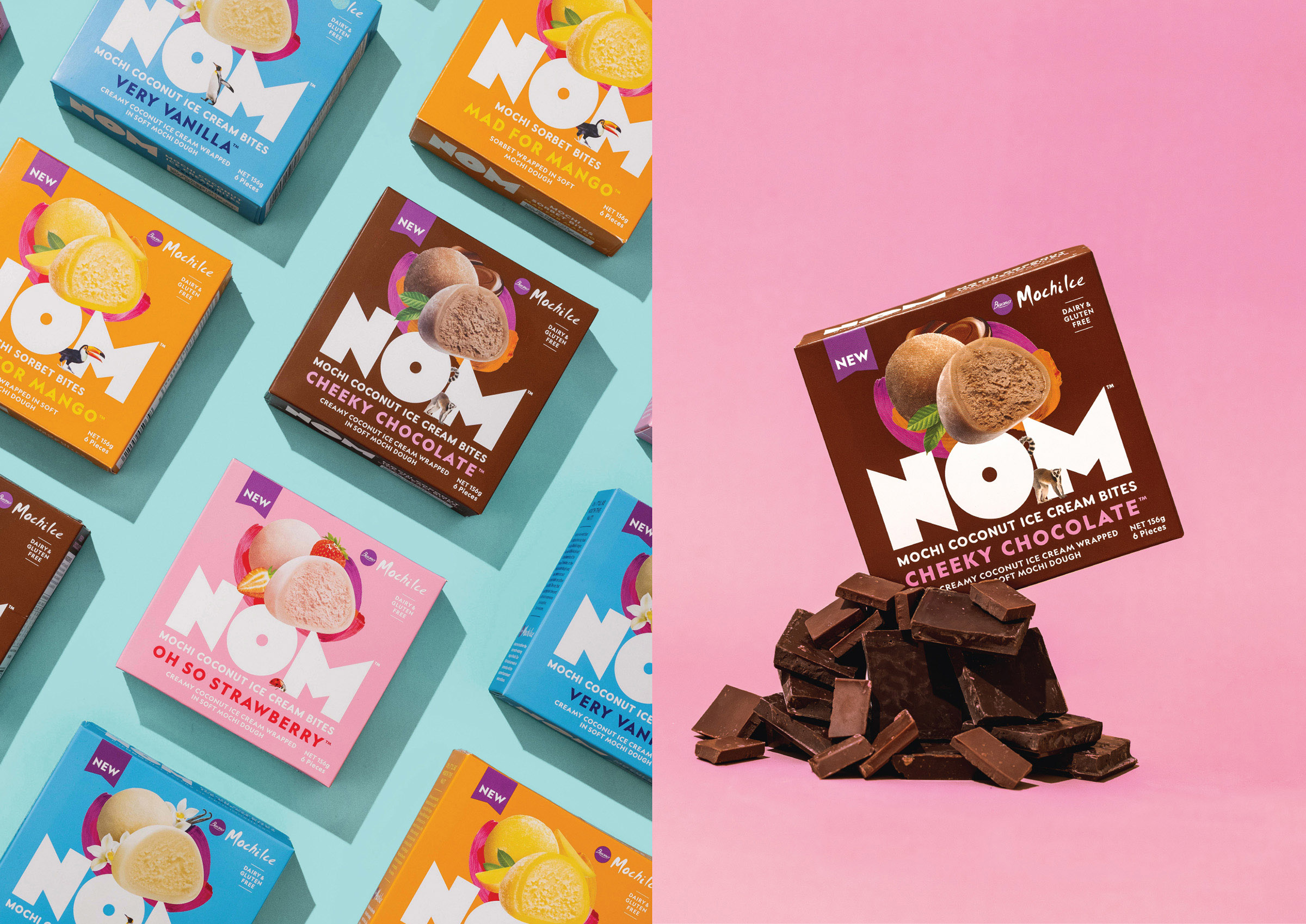
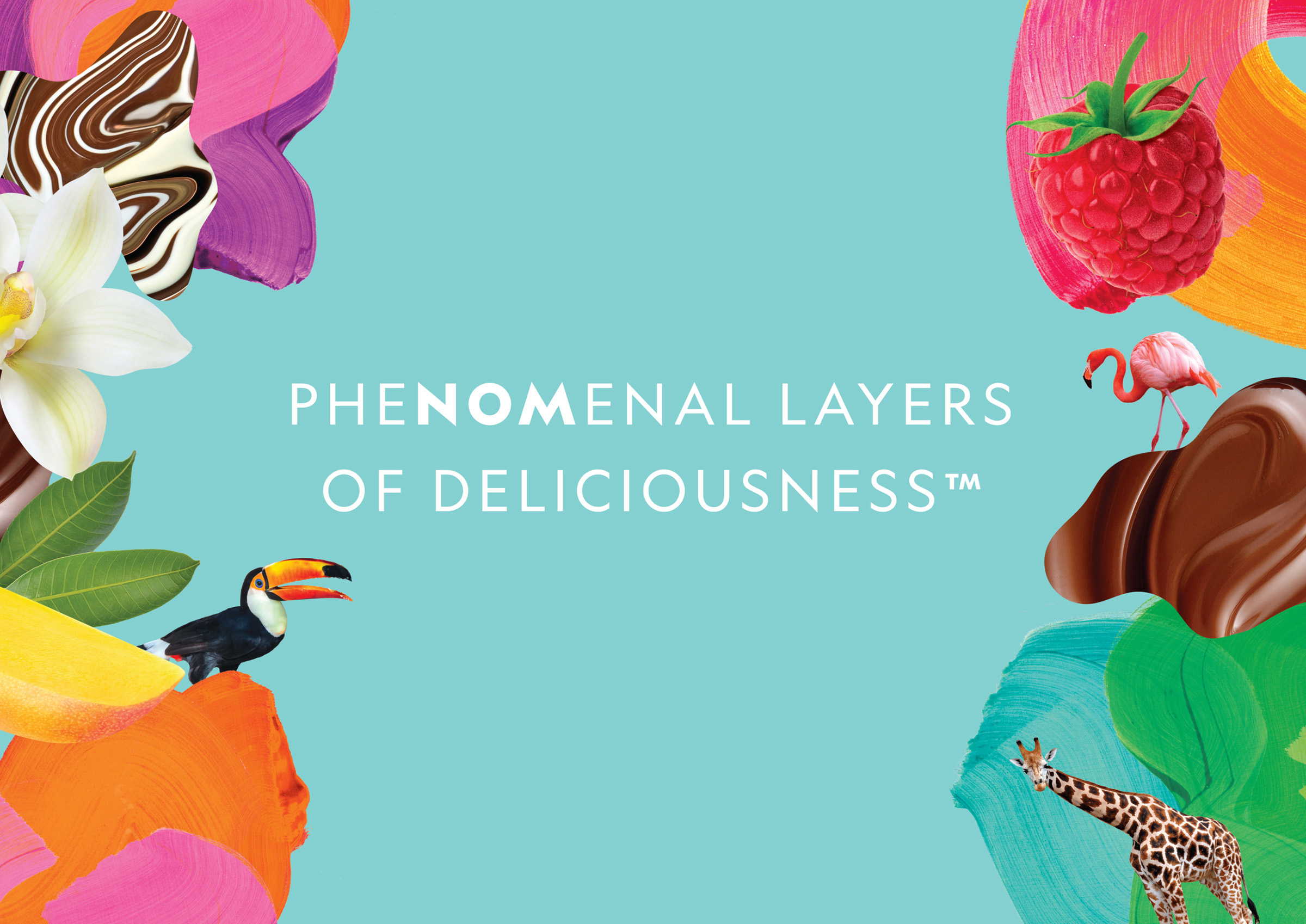
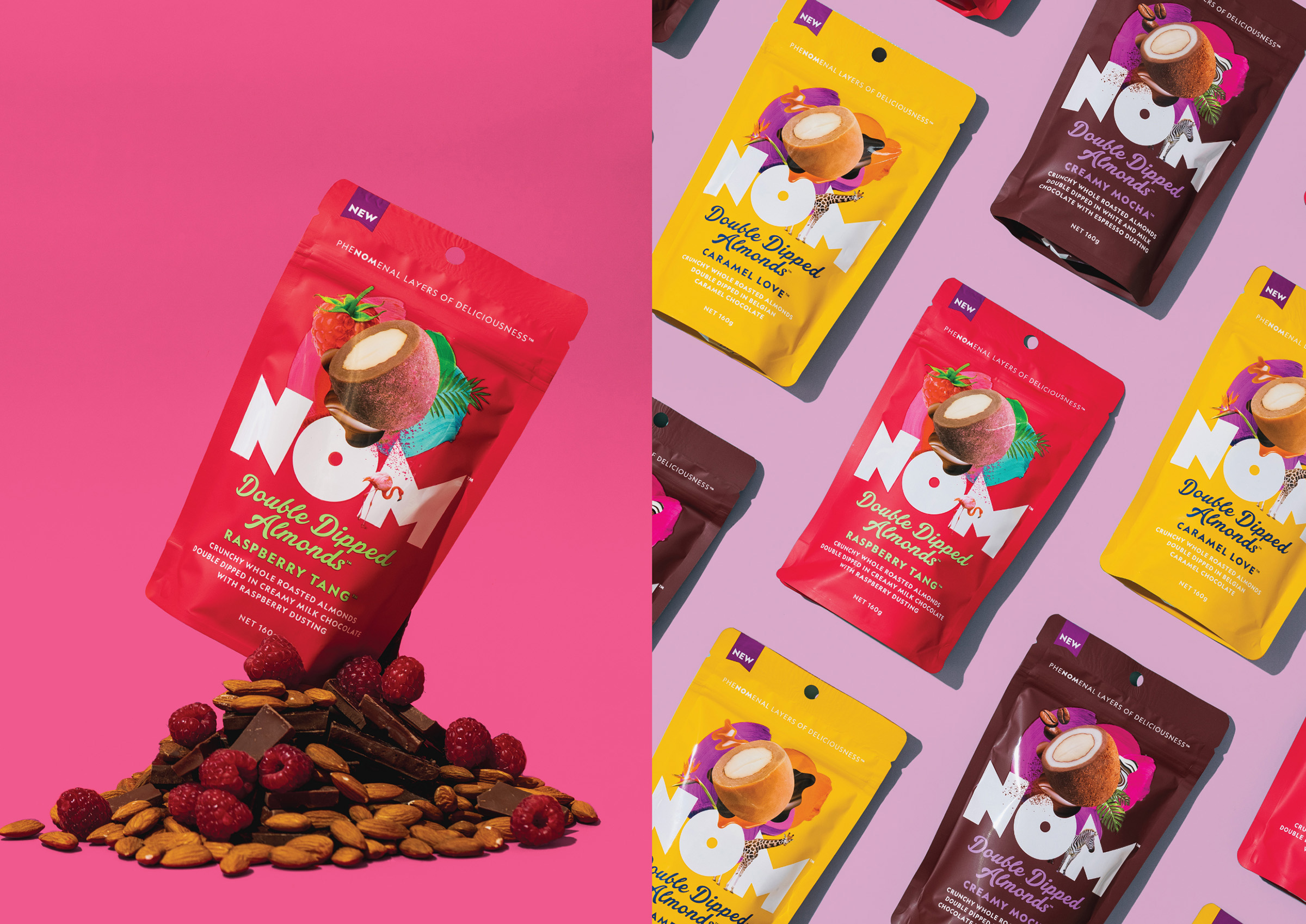
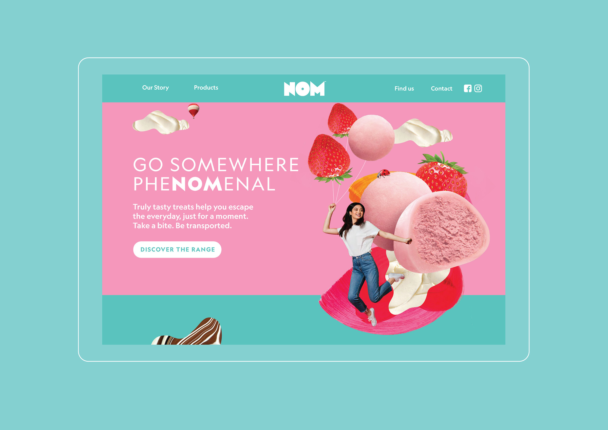
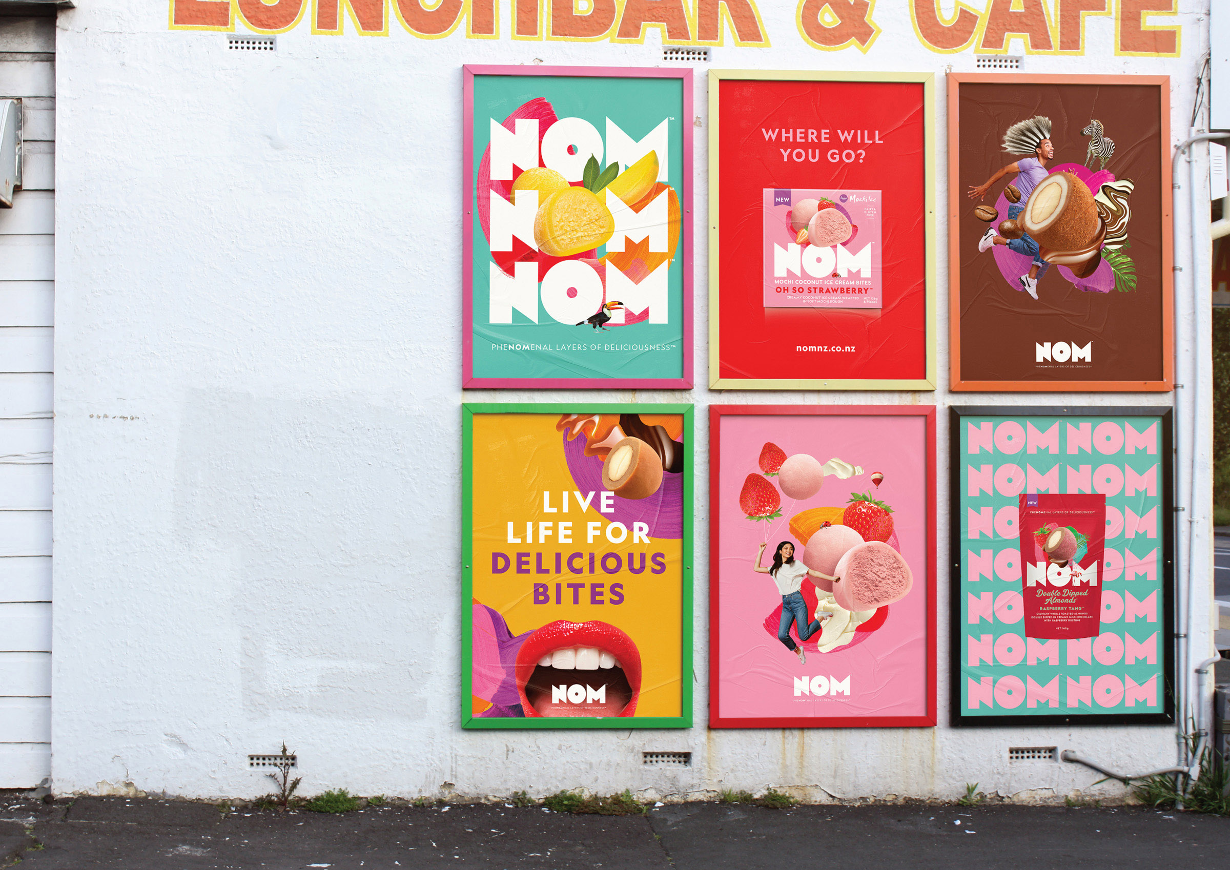
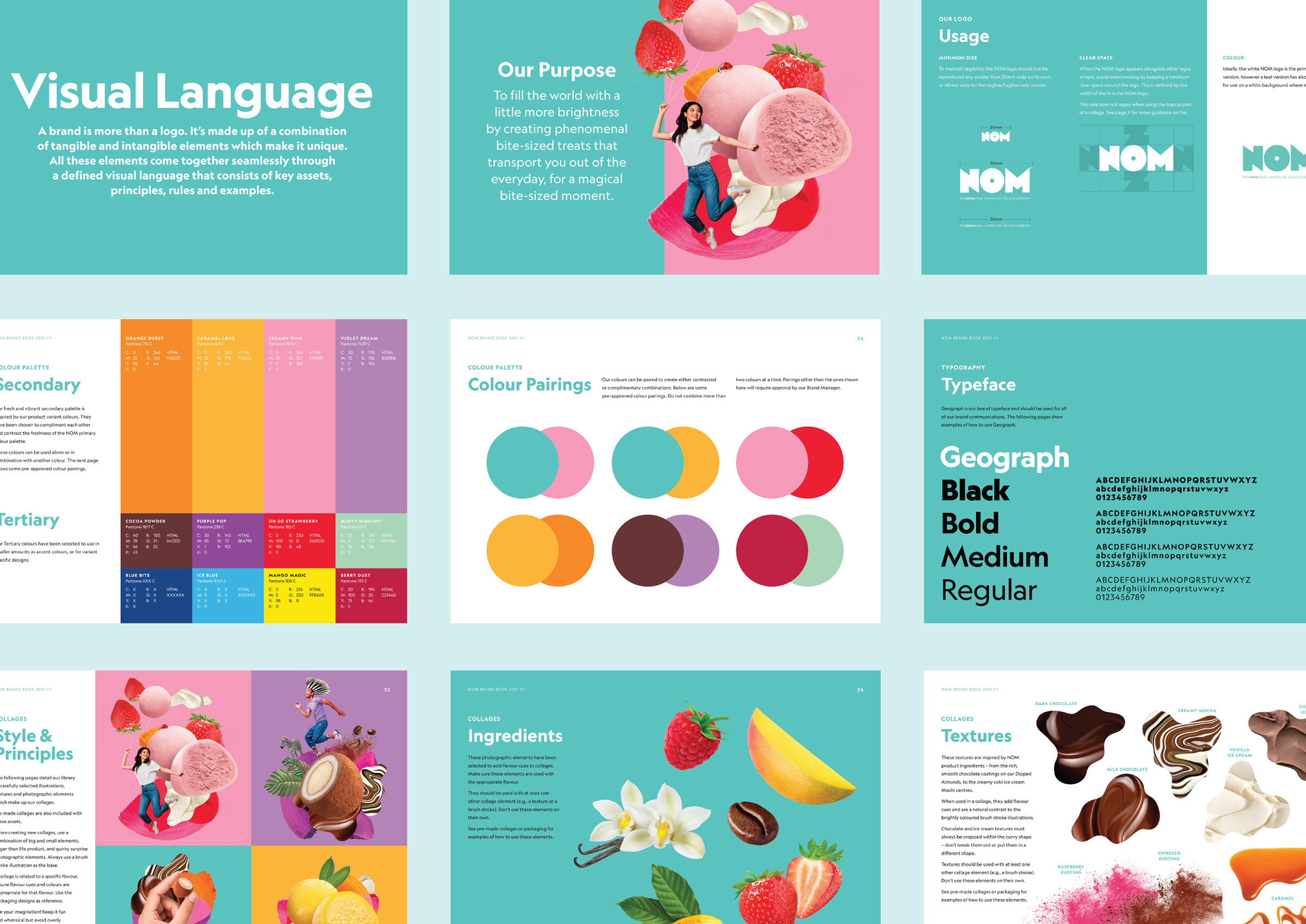
To bring this thinking to life, we created a series of collages that represented moments when you bite into NOM and get transported out of the everyday, to somewhere phenomenal. These collages helped us bring together textures, layers and flavours of each NOM product and became the centerpiece of the brand’s visual language.
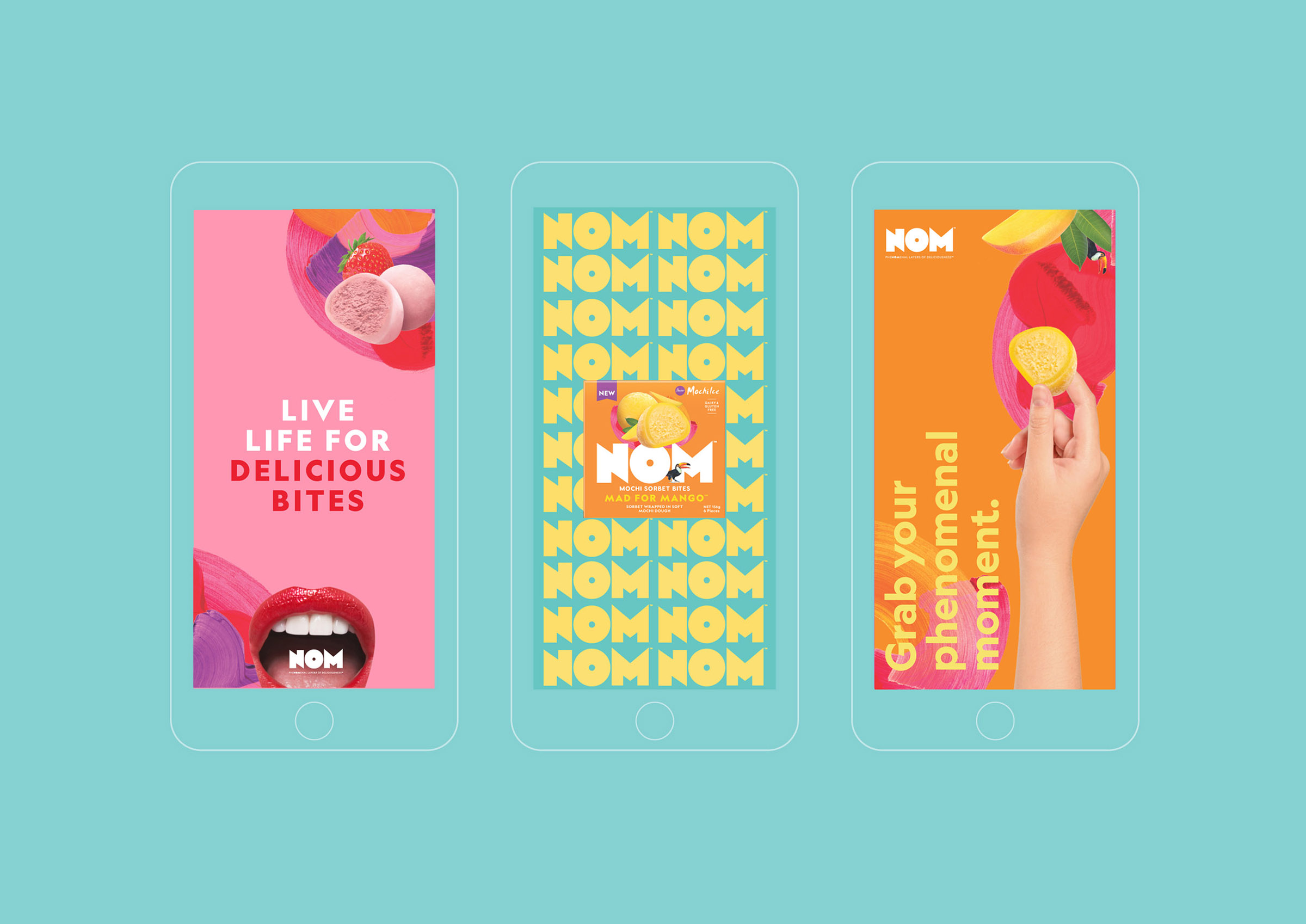
Paired with a delightfully vibrant colour palette and the bold logo which creates a powerful focal point of its own, we created a joyous and evocative brand identity that felt contemporary and fresh.
Our holistic approach to building NOM’s visual language and defining its essence allowed us to create an in-depth brand book and help our client build everything from the brand’s interactive website to its social media visuals.
CREDIT
- Agency/Creative: Unified Brands
- Article Title: Colourful Brand Identity for NOM Treats by Unified Brands
- Organisation/Entity: Agency
- Project Type: Identity
- Project Status: Published
- Agency/Creative Country: New Zealand
- Agency/Creative City: Auckland
- Market Region: Oceania
- Project Deliverables: Brand Guidelines, Brand Identity, Brand Strategy, Packaging Design, Web Design
- Industry: Food/Beverage
- Keywords: nom, new zealand, kiwi, bite size treats, identity design, visual language, mochi, almonds, packaging design, brand guidelines, brand strategy, brand world
-
Credits:
Creative Director: Alex Butenko
Design Director: Ann Davenport
Product Photography: Victoria Baldwin


