Colors is an inclusive Neobank designed with a focus on the LGBTQ+ community and individuals who resonate with its values and lifestyle. Its mission is to provide financial support to clients, enabling them to shine in all aspects of life, connect with others, and achieve their goals. The initial launch spans across CDMX, New York, and Barcelona.
The core emphasis is on assisting clients in achieving financial stability, allowing them to enjoy life without unnecessary worries. The inclusive approach ensures that all clients feel comfortable and welcome, irrespective of their sexual orientation or gender identity. With a dedicated team of professionals, this neobank delivers a personalized financial experience, offering options and solutions tailored to individual needs.
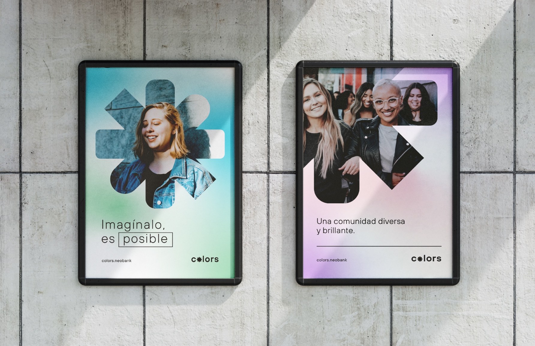
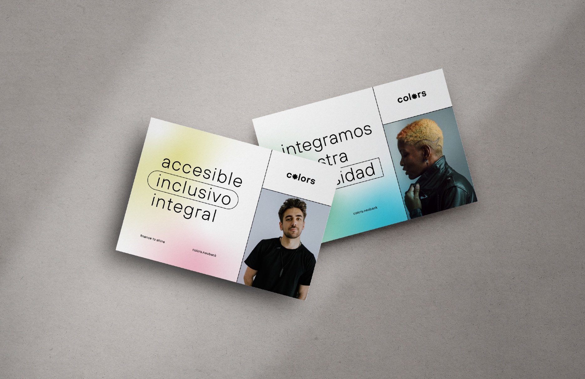
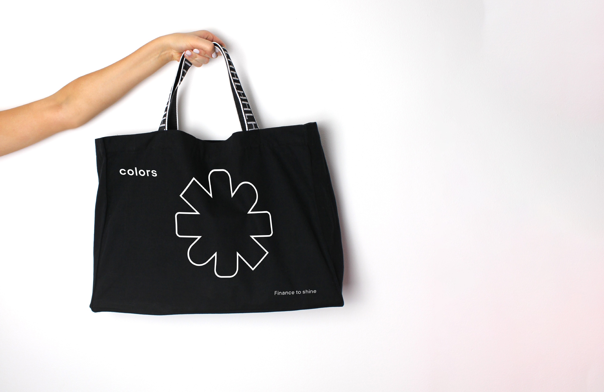
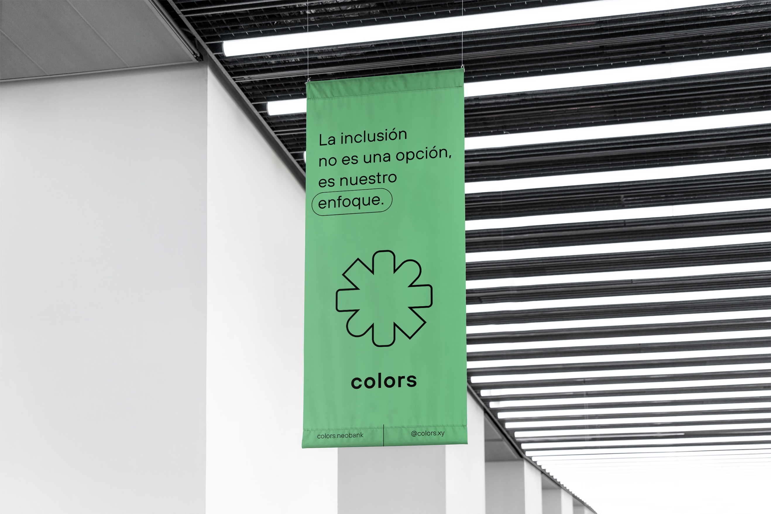
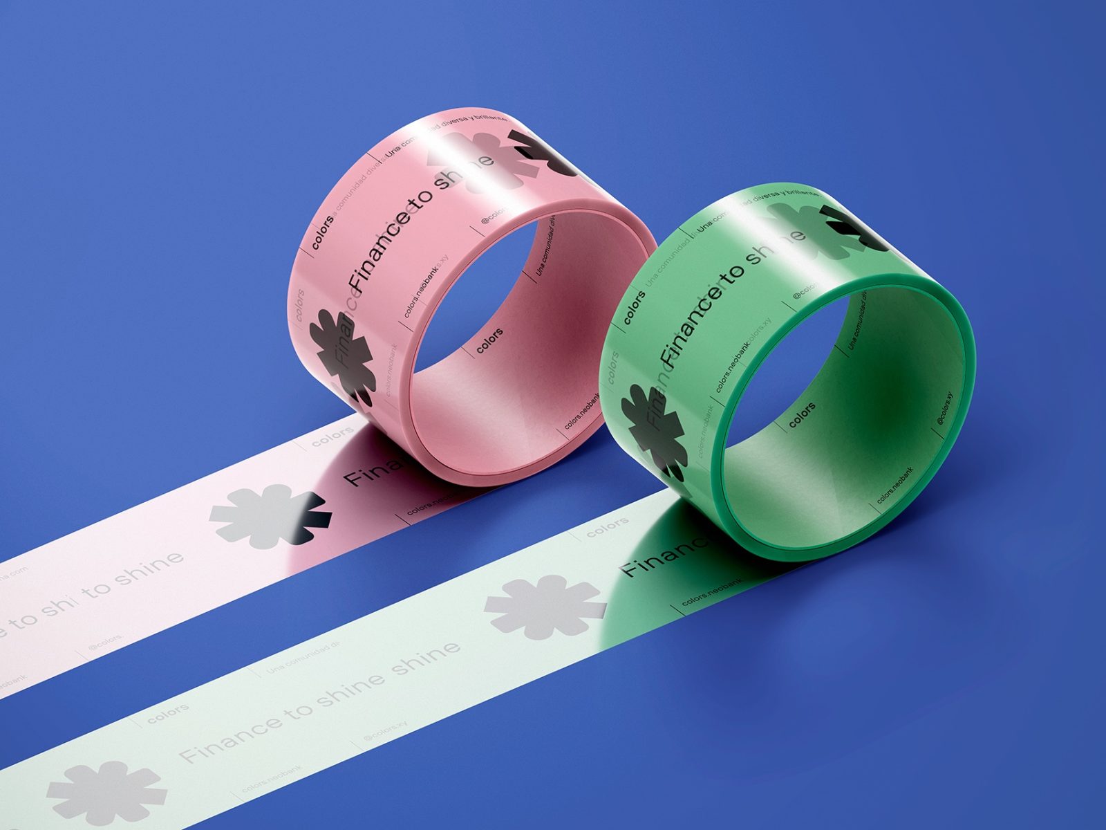
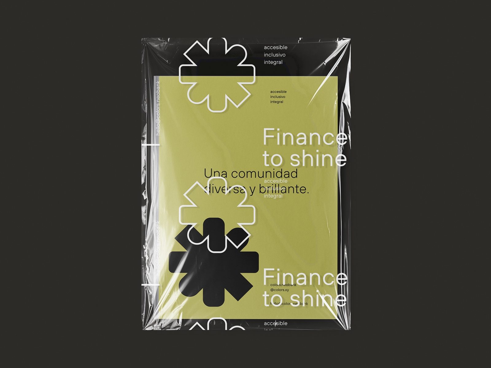
The logo originates from its core and expands outward with lines concluding in diverse ways, symbolizing openness and inclusion for individuals of all backgrounds. The color palette, based on gradients, imparts a sense of freshness, fostering a feeling of belonging among Colors’ users. The typographic palette complements other elements with its neutrality, allowing brand messages to stand out when necessary. This identity will be applied across a wide range of contexts, from digital communication to merchandise products and vehicles for the Love Parade, requiring versatility and easy application to have a direct impact on the user. Our goal is to create a strong and welcoming identity that promotes openness and inclusion.
Colors addresses a significant issue in the financial and cultural realms by providing inclusive banking services specifically designed for the LGBTQ+ community and those who align with its values and lifestyle. Here are some key elements of the problem and cultural context that this project addresses:
Financial Inclusivity: Historically, individuals within the LGBTQ+ community have faced discrimination in various aspects of society, including the financial sector. Colors tackles this issue by providing a financial space that welcomes people of all sexual orientations and gender identities, creating an inclusive environment where everyone feels comfortable and respected.
Personalized Financial Stability: Regardless of sexual orientation or gender identity, many individuals have unique financial needs. Colors focuses on offering financial solutions tailored to the individual needs of each client, helping them achieve financial stability. This may include personalized services, specific financial advice, and products designed to address the financial concerns particular to the LGBTQ+ community.
Emotional Support and Community Connection: By targeting the LGBTQ+ community, Colors recognizes the importance of emotional and community connection in people’s lives. In addition to financial services, the neobank aims to create a platform for its clients to connect with each other, fostering a sense of belonging and emotional support.
Local and Global Economic Development: By initially launching in cities like CDMX, New York, and Barcelona, Colors also addresses the cultural and geographical diversity within the LGBTQ+ community. It contributes to the economic development of these cities, creating a positive impact on the lives of individuals locally while also connecting with the global experience of the community.
In summary, Colors not only focuses on providing financial services but also addresses historical discrimination in the financial sector towards the LGBTQ+ community. It offers personalized financial stability, encourages community connection, and contributes to local and global economic development. This comprehensive approach seeks to enhance the quality of life for its clients by recognizing and addressing the specific needs of the community it serves.





CREDIT
- Agency/Creative: Cantera
- Article Title: Colors Neobank’s Brand Design Creation
- Organisation/Entity: Agency
- Project Type: Identity
- Project Status: Published
- Agency/Creative Country: Mexico
- Agency/Creative City: Mexico City
- Market Region: Europe, North America, South America
- Project Deliverables: Brand Identity
- Industry: Financial
- Keywords: WBDS Agency Design Awards 2023/24
- Keywords: Identity, Brand Design Creation
-
Credits:
Senior Designer: Isabel Caso
Designer: Delia Albarrán
Partner, Strategic Director: Eduardo Castro
Partner, Design Director: Samuel Alazraki


