In a market where most professional haircare brands offer a singular product line focused on color preservation, Colorproof stands out by providing a diverse range of products that combine superior color protection with a multitude of other hair solutions, including smoothing, volumizing, and moisturizing.
Cosway Beauty Brands recognized that Colorproof required a comprehensive transformation that transcended mere aesthetics. It called for a profound reimagination encompassing every aspect of the brand, from identity and packaging to structure, brand architecture, product assortments, and storytelling.
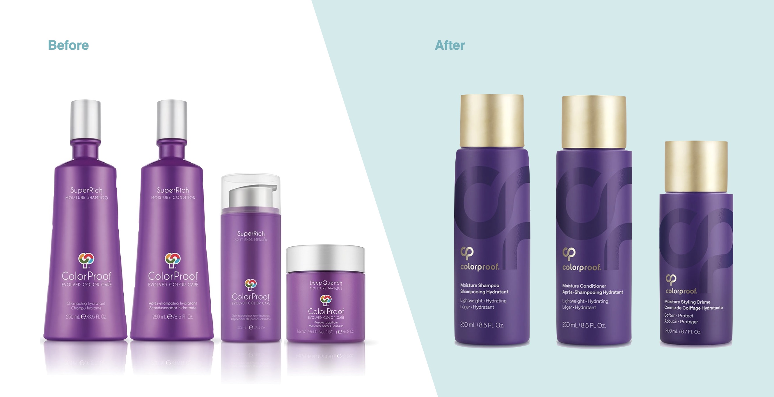
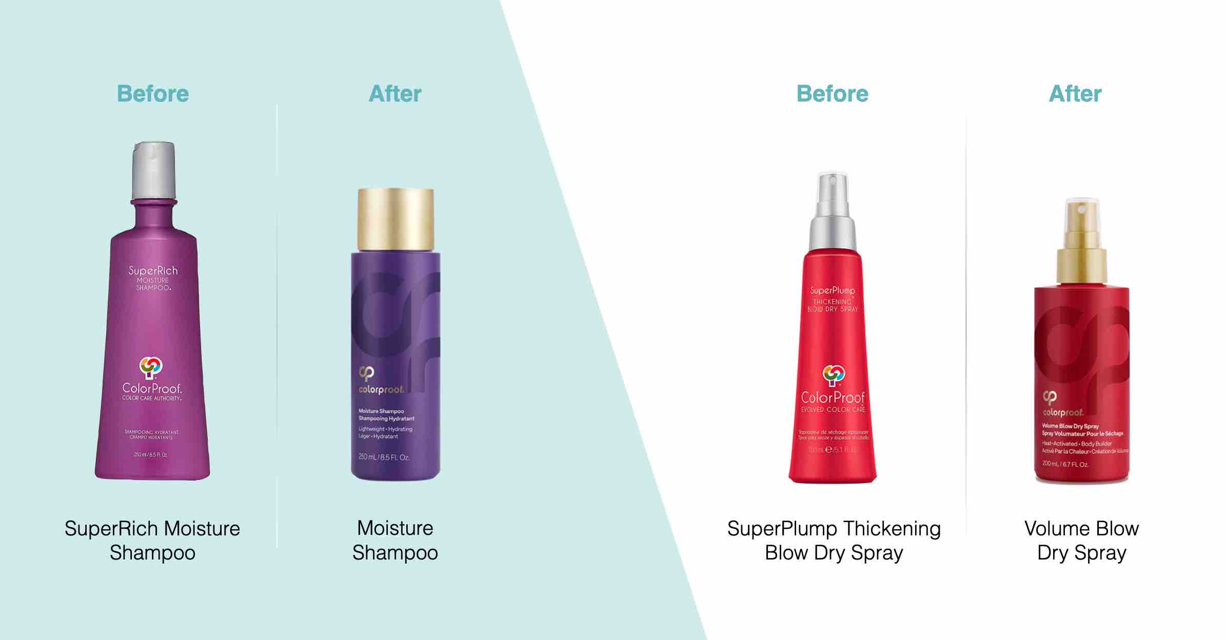
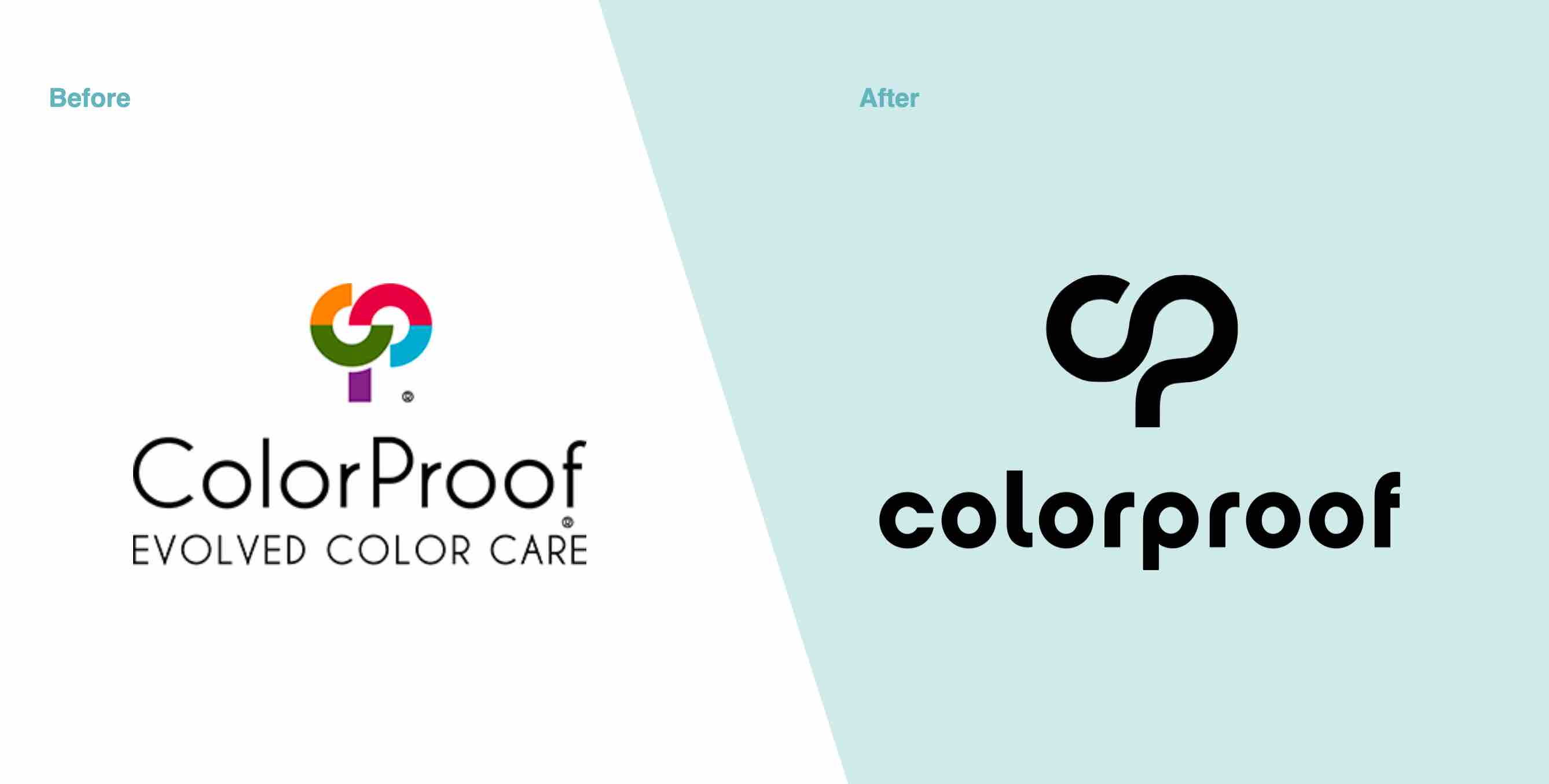
The Brand Mark: Inspired by the graceful movement of hair, our journey began with an evolution of the existing Colorproof “tree” logo. The prior mark had posed logistical challenges, requiring a four-color sticker to be applied to each package. The interweaving strands of our new mark pay homage to the brand’s heritage while also encapsulating the brand name within a captivating C and P monograph.
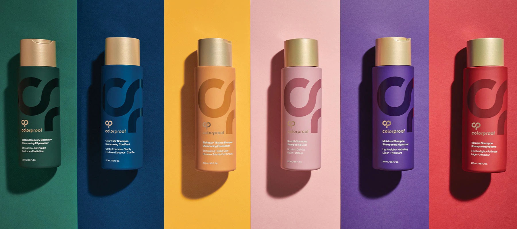
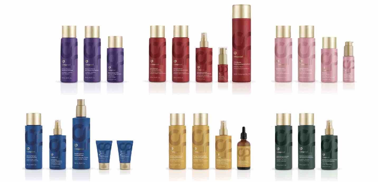
The Packaging Components: Initial feedback from the field indicated that the brand’s packaging was perceived as overly colorful. To address this, we embarked on a path toward a unified base shade for the new packaging molds. However, creative exploration led us to a strategic shift: retaining colored components for each product regimen. This not only provided practical cues for consumers navigating the product range on the shelf but also created a visually arresting spectrum. The resulting lineup explodes with vibrant color, further heightened by the subtle allure of a tone-on-tone spot gloss varnish on the logo, infusing each product with a touch of luxury and a sense of fluidity. Custom gold disc caps, adorned with the new brand mark, crown each package, ensuring that consumers make a tactile connection with the brand with every use.
The Brand Architecture: ColorProof’s product portfolio had grown to encompass over 100 products, many with perplexing names and benefits. While these names were clever and branded, they did not effectively convey each product’s unique value proposition in the market. In collaboration with the Cosway team, we undertook the task of identifying terms most relevant to consumers, suggesting updates to product names, and refining the brand’s architecture to better align with customer needs. Sarena Kirby, Brand Manager, Colorproof cites, “The Brand Architecture work was a very helpful exercise as it helped us identify gaps, bring back SKUs that we now see we have room for, and prioritize potential line extensions.”
For the Colorful: MSLK breathed life into the brand’s newly defined positioning and storytelling by redefining messaging and image guidelines. We harnessed our distinct position in the market by crafting key pillars — “connected by color” and “powered by proof”. Words that not only reflected in the brand redesign but inspired the Cosway stylist education team. Rich, saturated “get the look” imagery served to reinforce the color-coded system, providing consumers with a clear visual guide to selecting the right products for their specific hair goals.
Results: Our redesign for Colorproof transcends mere aesthetics; it serves as both a tribute to the brand’s evolution and a testament to the team’s unwavering commitment to addressing the diverse needs of its valued customers.



CREDIT
- Agency/Creative: MSLK Design
- Article Title: ColorProof Packaging Redesign
- Organisation/Entity: Agency
- Project Type: Packaging
- Project Status: Published
- Agency/Creative Country: United States
- Agency/Creative City: Queens
- Market Region: Global
- Project Deliverables: Packaging Design
- Format: Bottle
- Industry: Food/Beverage
- Keywords: WBDS Agency Design Awards 2023/24
- Keywords: Packaging Design , Product Redesign
-
Credits:
Client: Colorproof Haircare


