


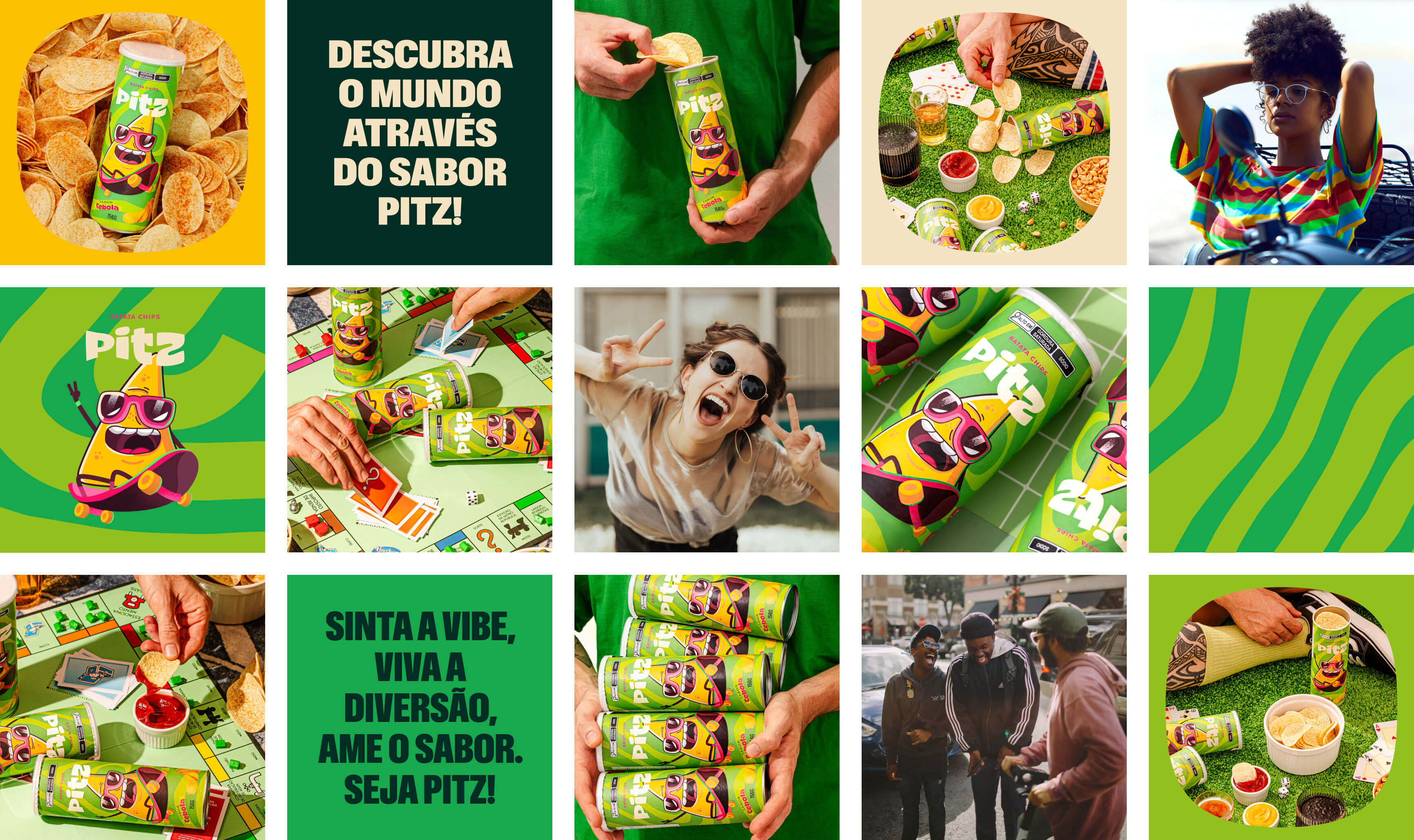
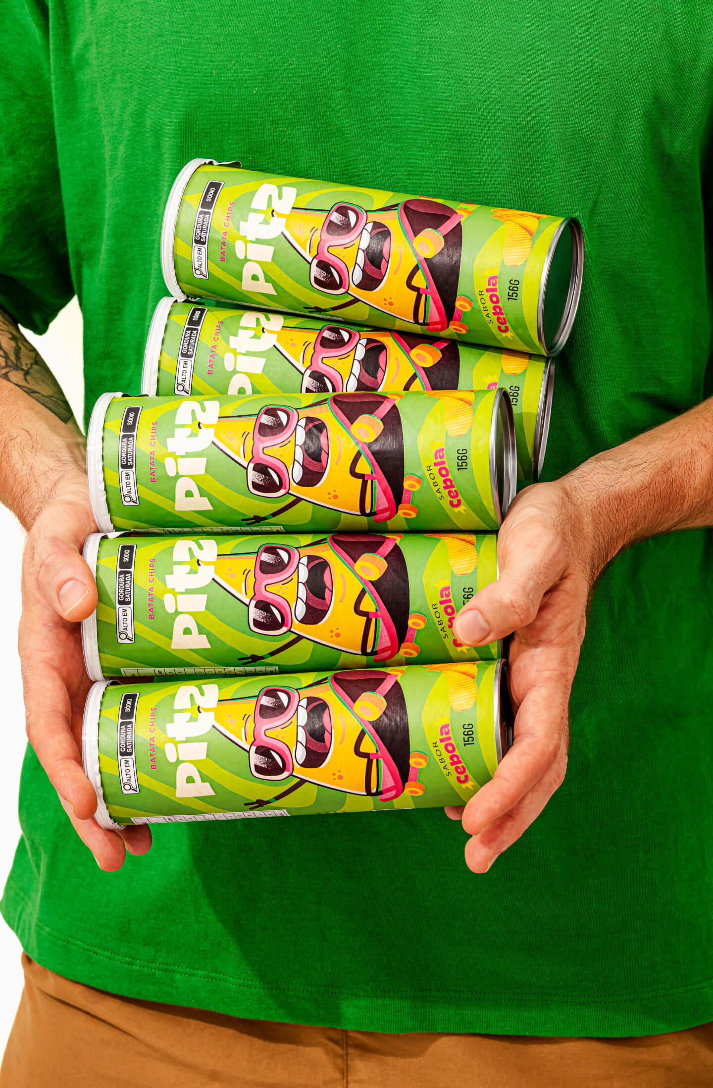
Pitz is a vibrant potato snack brand originating from Brazil, aimed at creating an authentic and inspiring experience. Designed to cater to the universal munchies with an artisanal touch, Pitz is more than a snack; It is an audacious combination of flavor, color and energy, aimed mainly at young audiences.
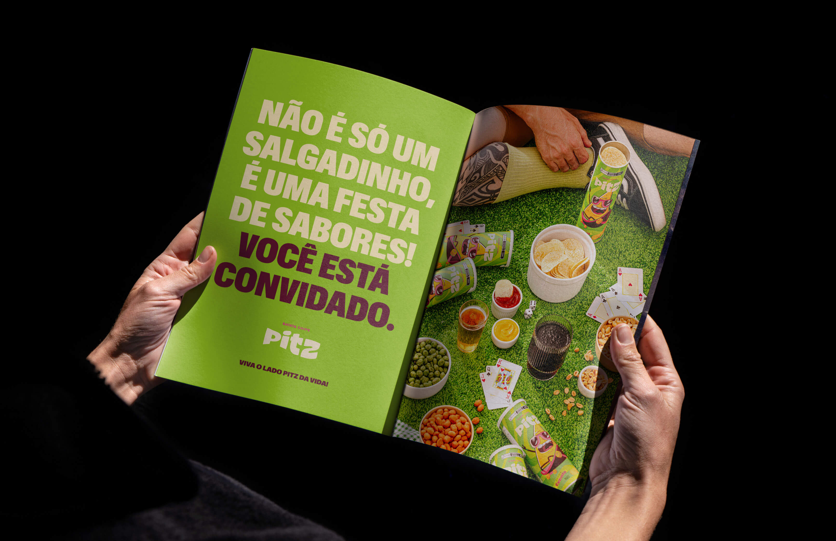
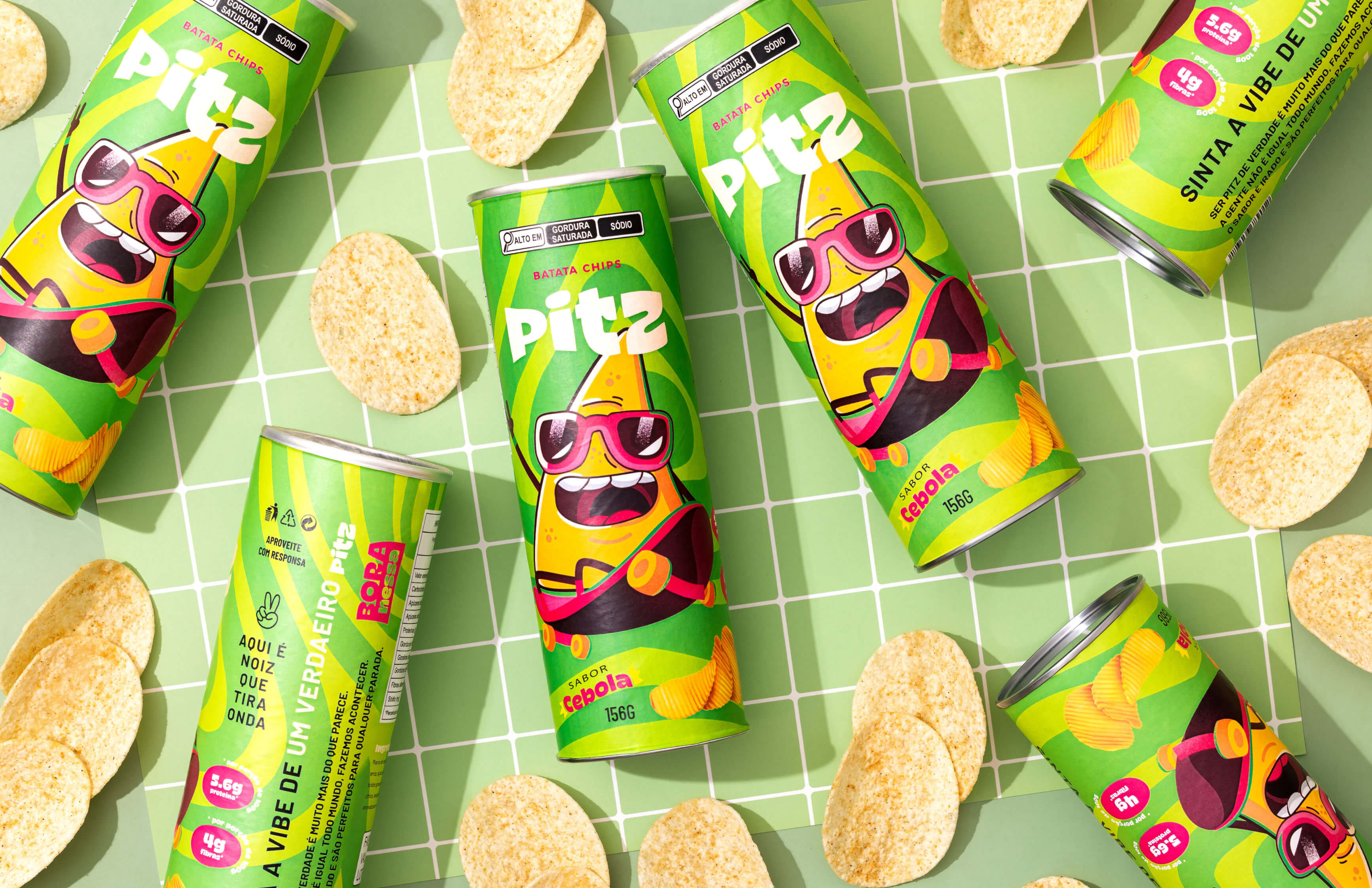
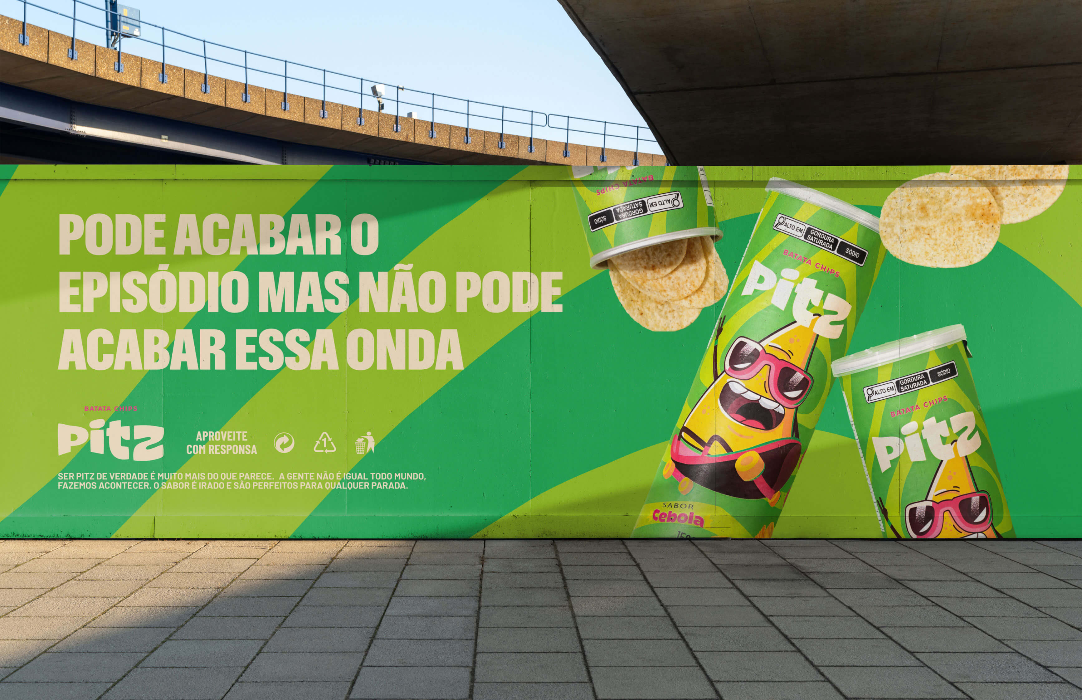
The goal was to design a unique label that would not only capture attention on the shelves with its distinctive look, but also resonate with an innovative personality and concept. We wanted each package to tell a story, expressing flavor through illustrative characters and humor, thus creating a distinctive dialogue with consumers.
We opted for a strategy that embraces diversity and originality. Through contrasting characters and vibrant design, the packaging for each Pitz flavor is a celebration of individuality and creativity. The strategy was centered on making the brand as attractive and engaging visually as it is in taste.
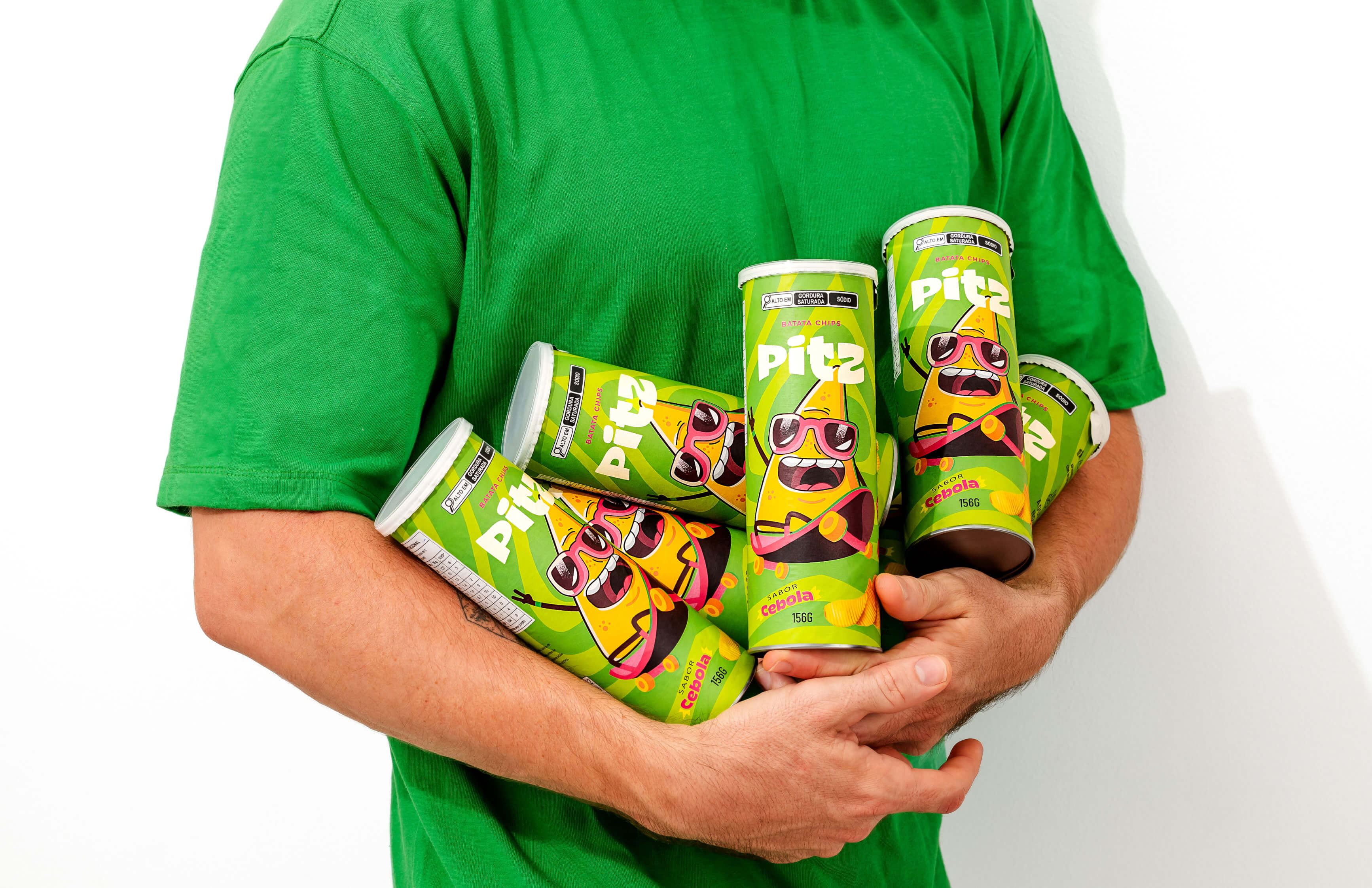
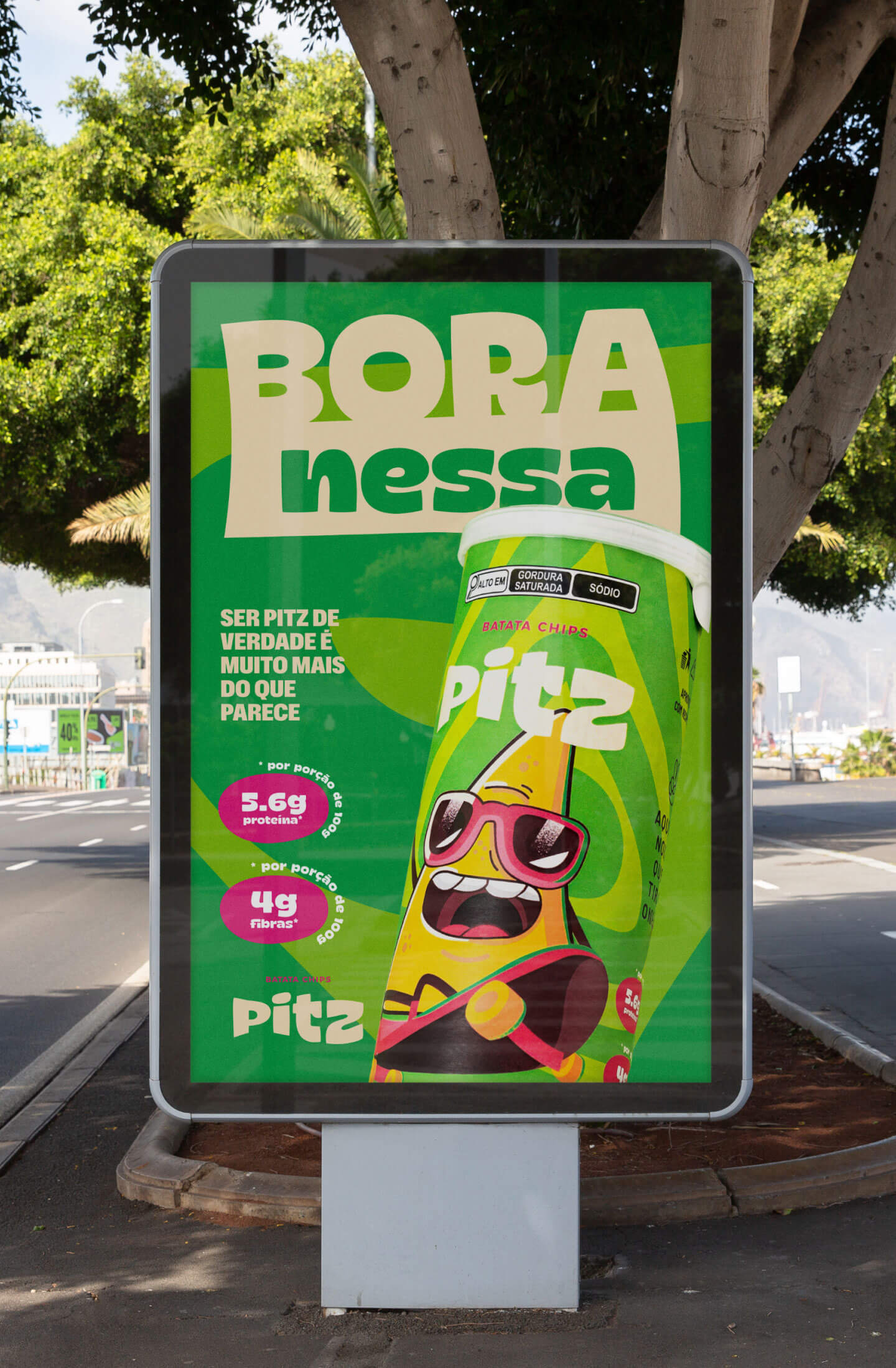
Pitz’s visual identity is bold and cheerful, with a robust pop aesthetic, marked by bright colors and organic shapes. Influenced by the idea of diversity and unity, the brand reflects different characters and personalities, assimilating the varied shapes, volumes and curves of potato chips in its design. Graphic elements are intuitively designed to mimic the familiar shapes of potato chips, establishing a direct and intriguing connection with the product.
Pitz’s tone of voice is relaxed, modern and authentic. Using simple language, the brand communicates with a humorous intention, keeping up to date with cultural references and trends, ensuring an ongoing and relevant conversation with the public. Pitz is not afraid to experiment and adapt, constantly seeking to inspire and be inspired by the vibrant community of consumers.
CREDIT
- Agency/Creative: EstudioKuumba
- Article Title: Colorful and Vibrant Brand Design for Pitz Potato Snacks
- Organisation/Entity: Freelance
- Project Type: Packaging
- Project Status: Published
- Agency/Creative Country: Brazil
- Agency/Creative City: Estúdio Kuumba
- Market Region: South America
- Project Deliverables: Art Direction, Brand Design, Brand Identity, Brand Strategy, Food Photography, Identity System, Packaging Design
- Format: Tube
- Industry: Food/Beverage
- Keywords: batatas fritas, embalagem, identidade visual
-
Credits:
Diretor Criativo: David Silva


