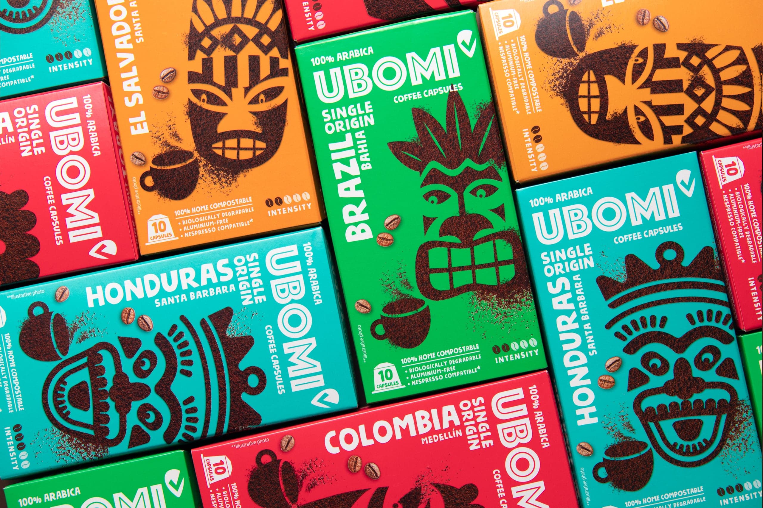
Look behind the mask of Ubomi
Of course, you can take your coffee black. You can take it white. Or flat white, that’s trending, too. With white sugar or brown sugar. When we think of coffee at Cocoon and Rohlík.cz, we actually think in many, many more colours!
Another unique private label of Rohlík e-grocery was born with Cocoon designing it. Just like in Miil dairy brand, Moddia paper hygiene, Dacello meat deli or Yutto dry foods, our aim was to create packaging and identity that would be visually powerful, fun, easily recognisable and a bit rebellious in terms of not fully following the category cues.
Next, there were the “practical” tasks of our brief. We knew there would be a huge variety of SKUs and different ranges. We knew we were designing for the on-line shelf, and we are already very experienced in the specifics of this environment. We also knew that the logo of the new Ubomi brand would be in the unified Phosphate font which connects all the private labels of Rohlík.cz. Our territory was therefore limited in the best way possible: we needed a strong and simple concept to tie it all together while being easily recognized.
And that’s how the concept of tribal masks was born! From the idea of coffee origins in different parts of the world, an original theme had been shaping and offering a flexible and fun solution. The unifying yet differentiating visual of a tribal mask plays the main role on each pack. Some of these truly follow on the heritage of the country and continent, others had to be created anew, but all of them look and communicate with shoppers in a clear and recognizable way. All of them are made as stencils out of ground coffee, and all of them face us from a vividly colourised pack, be it ground coffee, roasted beans or capsules. The variety of colours helps differentiate the variants. Special attention was given to the Organic range which got a more crafted, jute-bag inspired look.
When you see the Ubomi packaging and identity on the website, it immediately catches your eye with its simplicity. But the devil is in the detail. Have a second look, which will unveil elaborate crafting, such as hand-made style and texture of typefaces, extra beans adding dynamics, and neat arrangements of texts. And last but not least, you will also notice a bespoke iconography storytelling the key benefits. The Ubomi coffee brand was a pioneer in introducing the 100% home-compostable capsules, that’s why the iconography inside these packs is a sweet treat.
We encourage you to sit back, relax and have a good sensorial cup of coffee while you enjoy exploring the Ubomi design!
CREDIT
- Agency/Creative: Cocoon
- Article Title: Colorful and Playful Packaging Design for Ubomi Coffee: Inspired by Coffee Origins and Tribal Masks
- Organisation/Entity: Agency
- Project Type: Packaging
- Project Status: Published
- Agency/Creative Country: Czech Republic
- Agency/Creative City: Prague
- Market Region: Europe
- Project Deliverables: Packaging Design
- Format: Box
- Substrate: Pulp Carton
- Industry: Food/Beverage
- Keywords: Coffee packaging
-
Credits:
Artworker: Robert Špecián
Artworker: Tomáš Drábek


