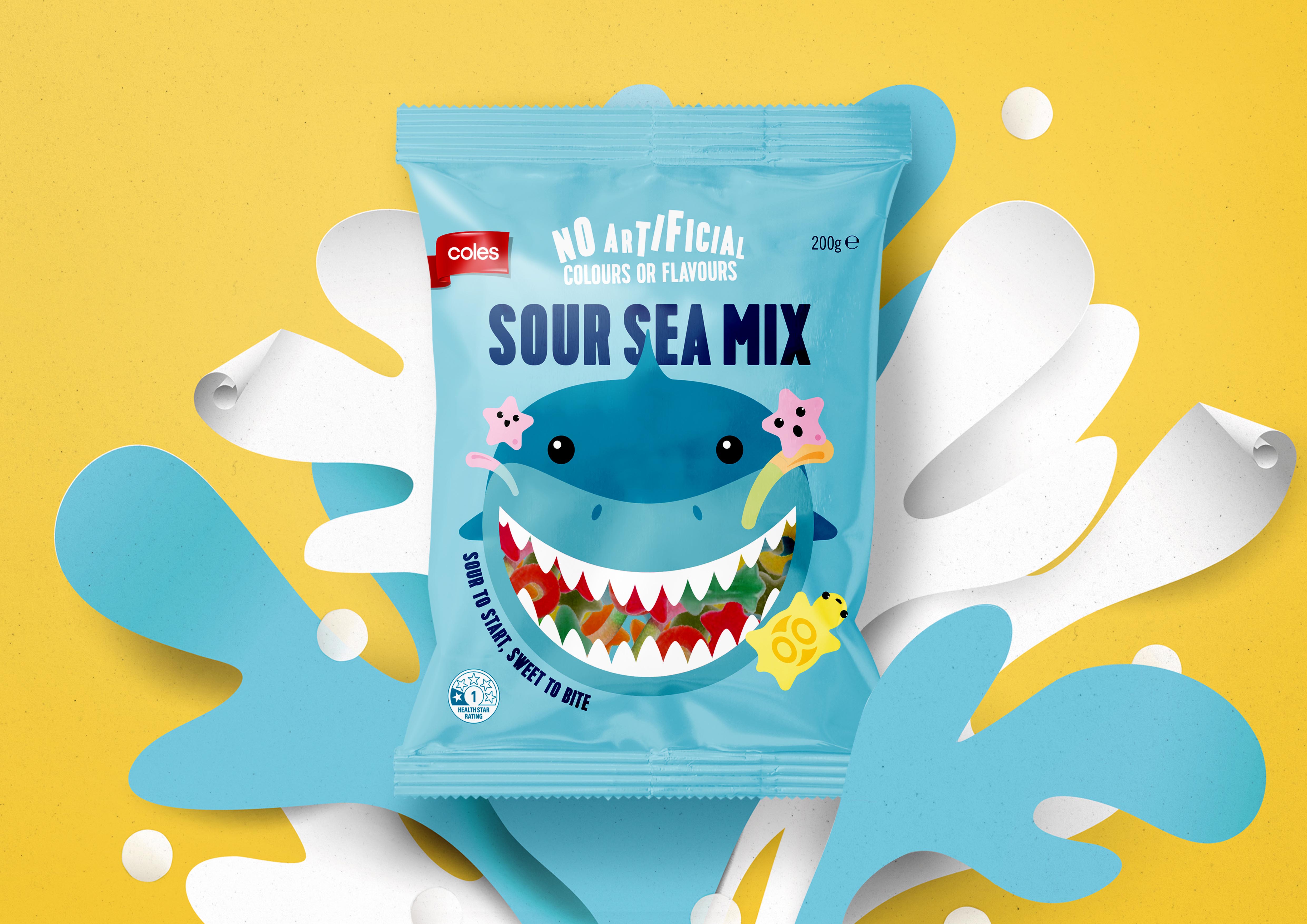
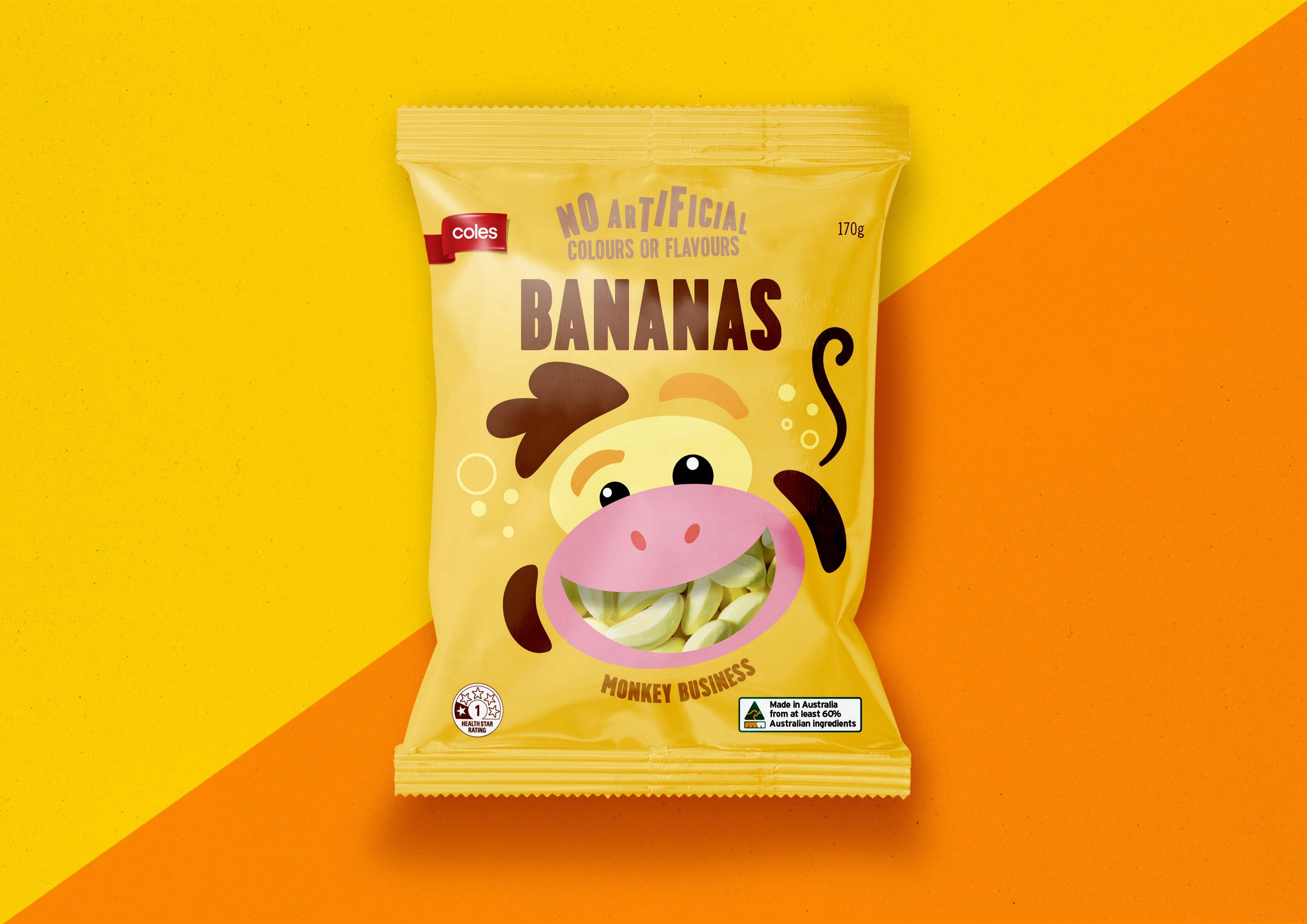
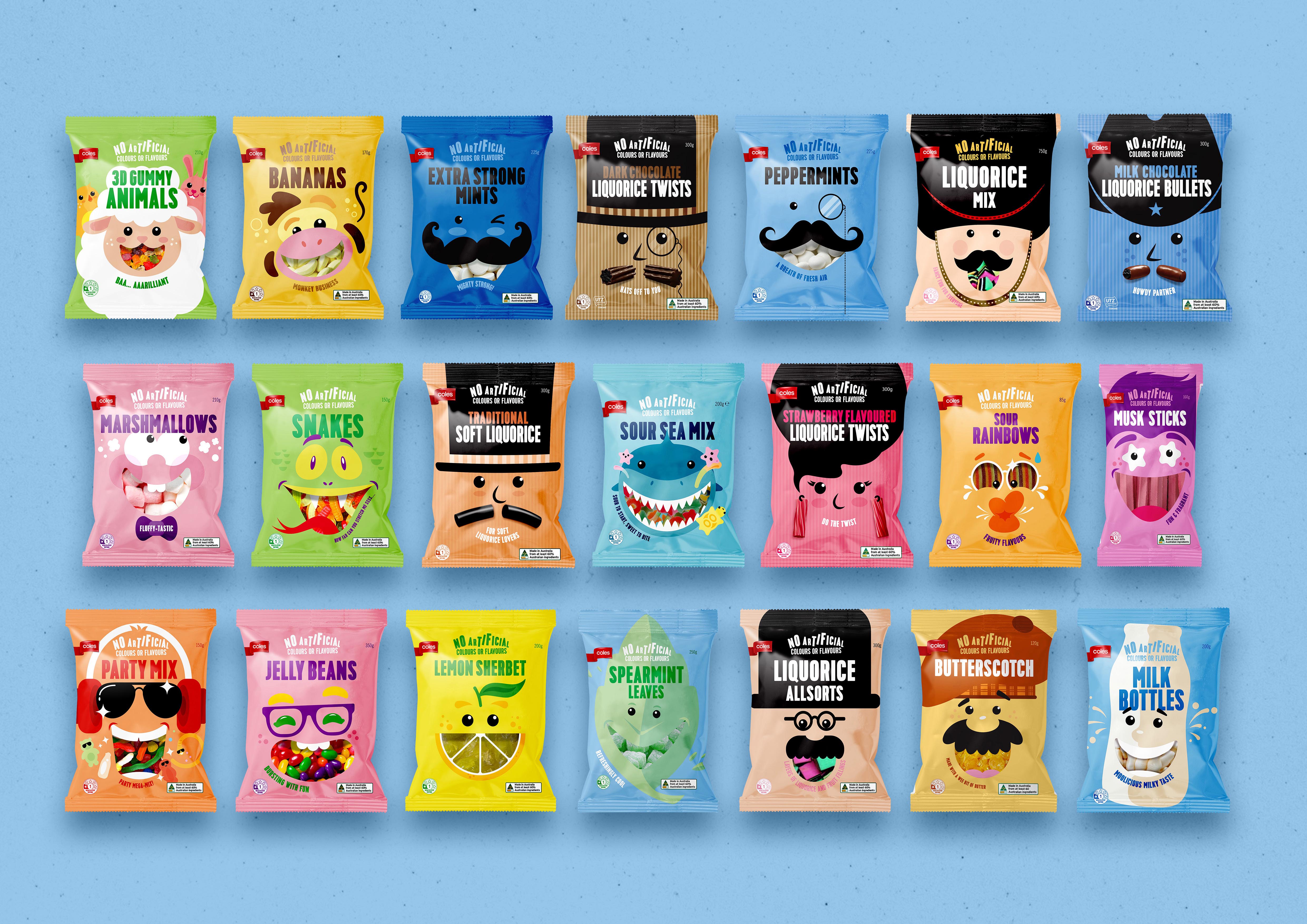
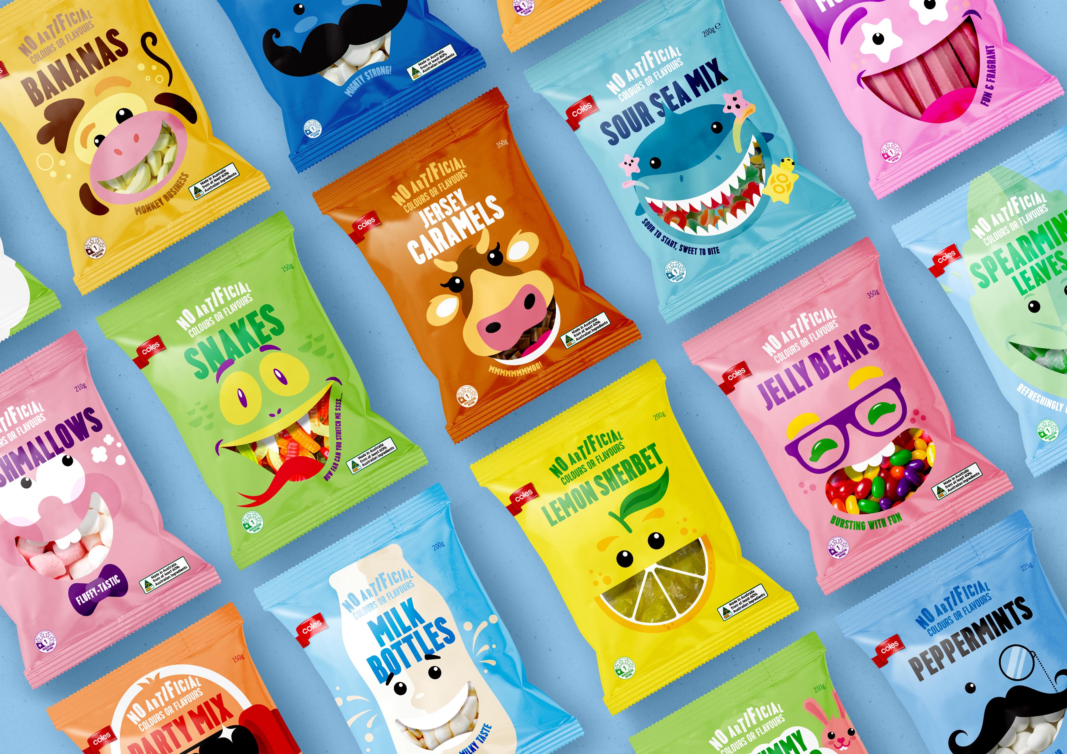
Challenge: The business of private label brands is growing and now accounts for almost one in five packaged products in Australian supermarkets. Critical to supermarket chain Coles operations, was a revolutionary review of its ‘Own Brand’ confectionery range with a packaging redesign and repositioning to elevate its Lollies and Liquorice range. The Lollies and Liquorice brand work had to challenge awareness levels and positively engage consumers who came to Coles ‘Own Band’ for value products.
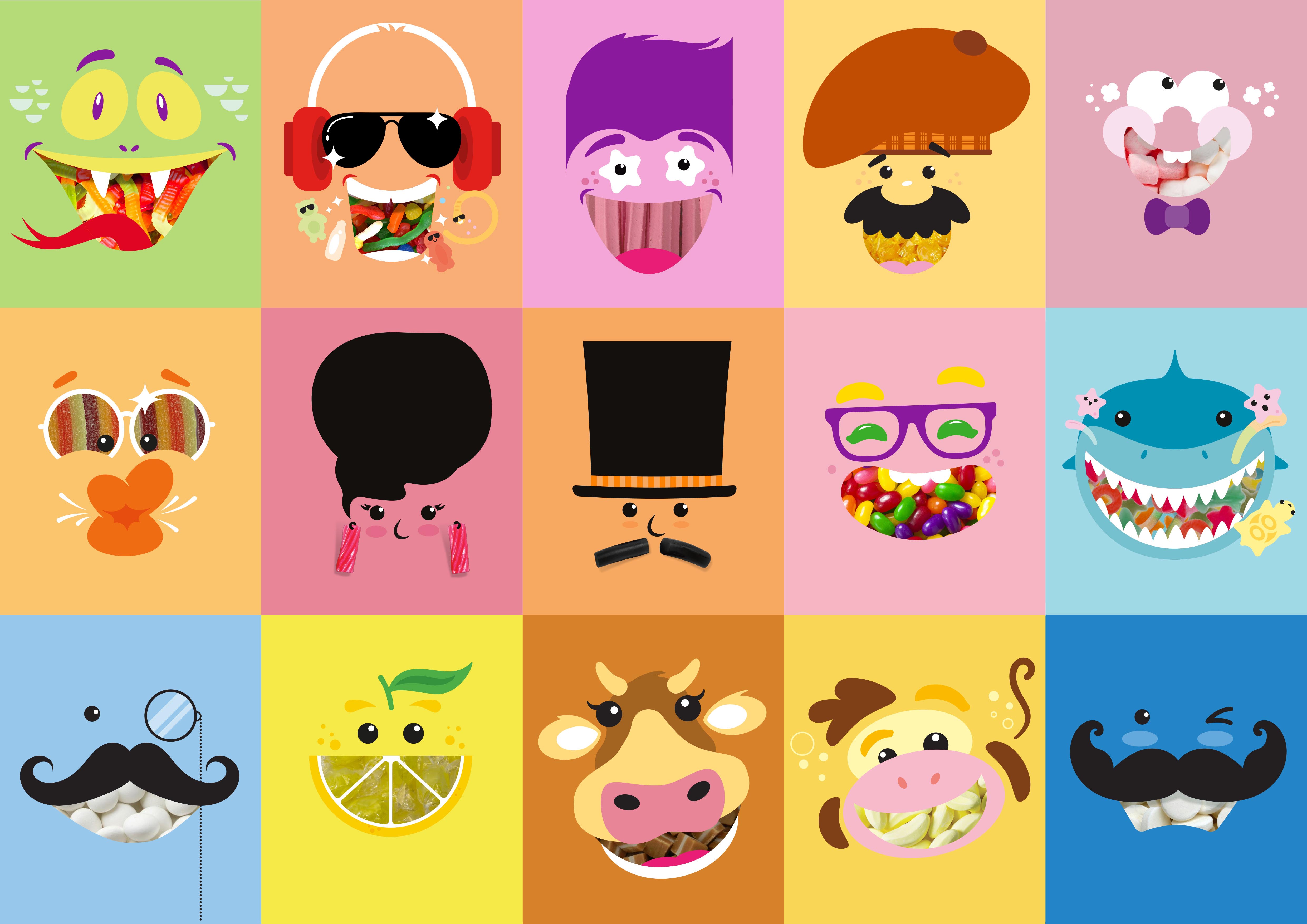
Idea: To create personality and flavour cues for each product, a simple graphic depiction of happy, expressive faces is the central element. The ‘fun-face’ is a visual link throughout the range to encourage an emotive response and an eye-catching colour display that enhances easy product recognition. The new Lollies and Liquorice designs evoke a ‘dare to be different’ playful spirit and supports the range’s profile as a unique stable of sweet offerings that are a category constant.
CREDIT
- Agency/Creative: Hulsbosch
- Article Title: Coles Confectionery Range Redesign Designed by Hulsbosch
- Organisation/Entity: Agency, Published Commercial Design
- Project Type: Packaging
- Agency/Creative Country: Australia
- Market Region: Oceania
- Project Deliverables: Brand Architecture, Brand Rejuvenation, Brand Strategy, Graphic Design, Identity System, Illustration, Packaging Design, Product Architecture, Product Naming, Rebranding
- Format: Bag
- Substrate: Plastic


