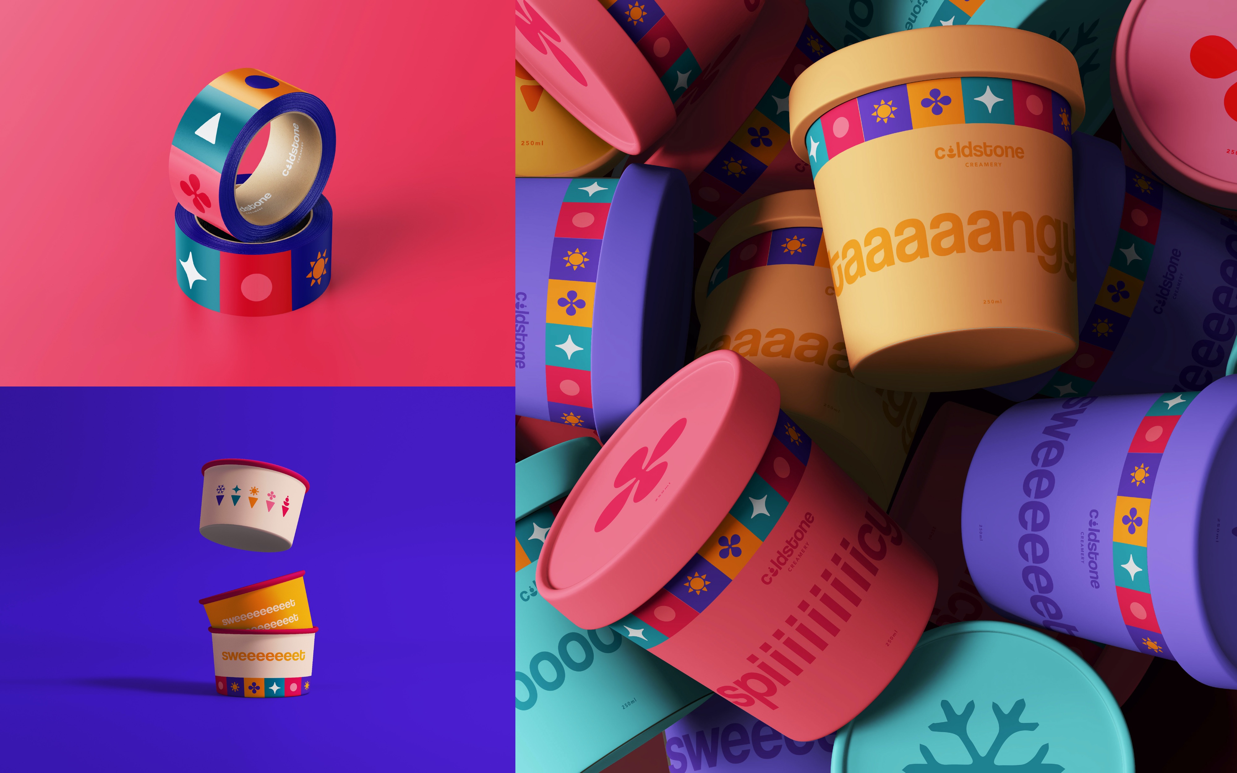
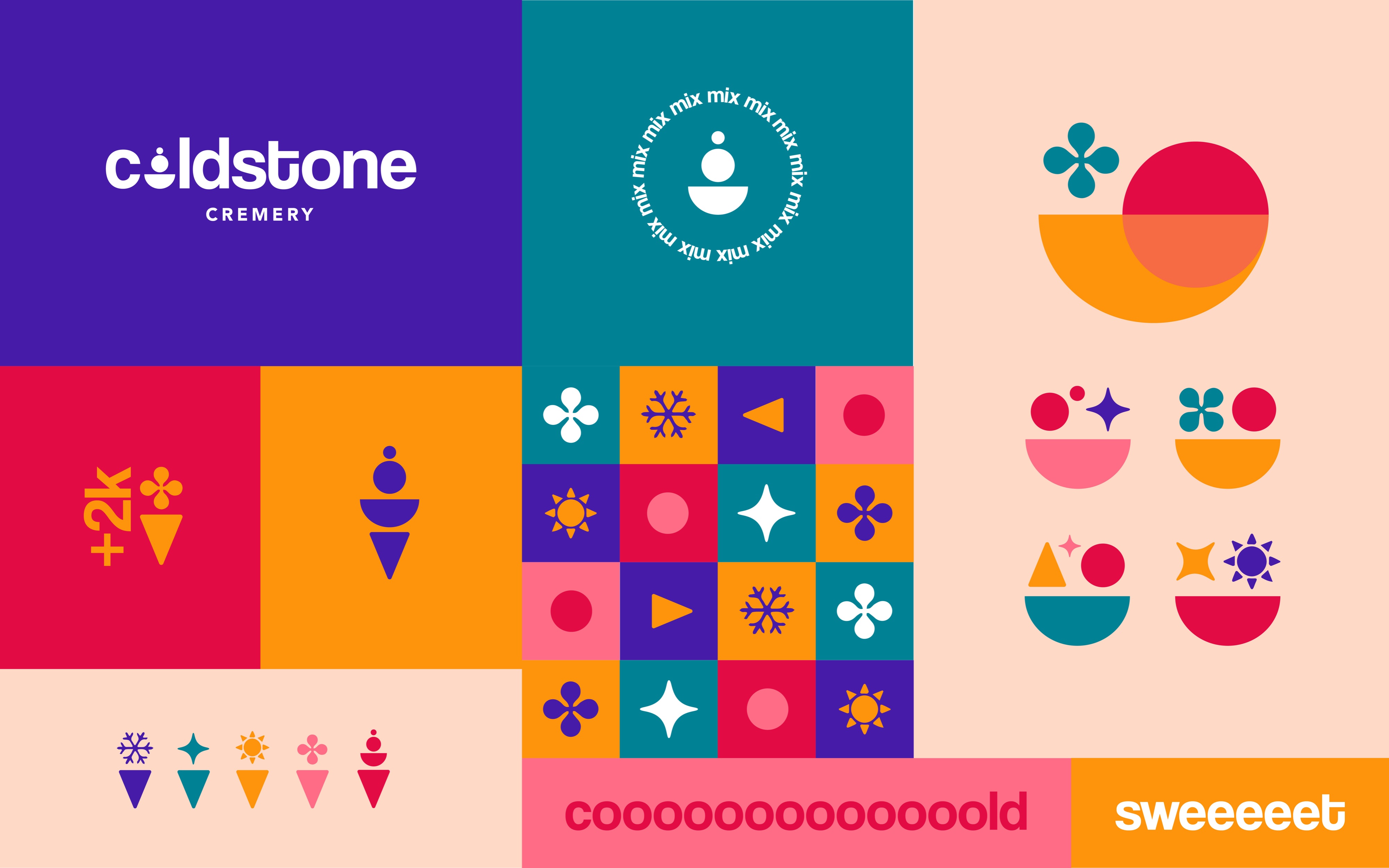
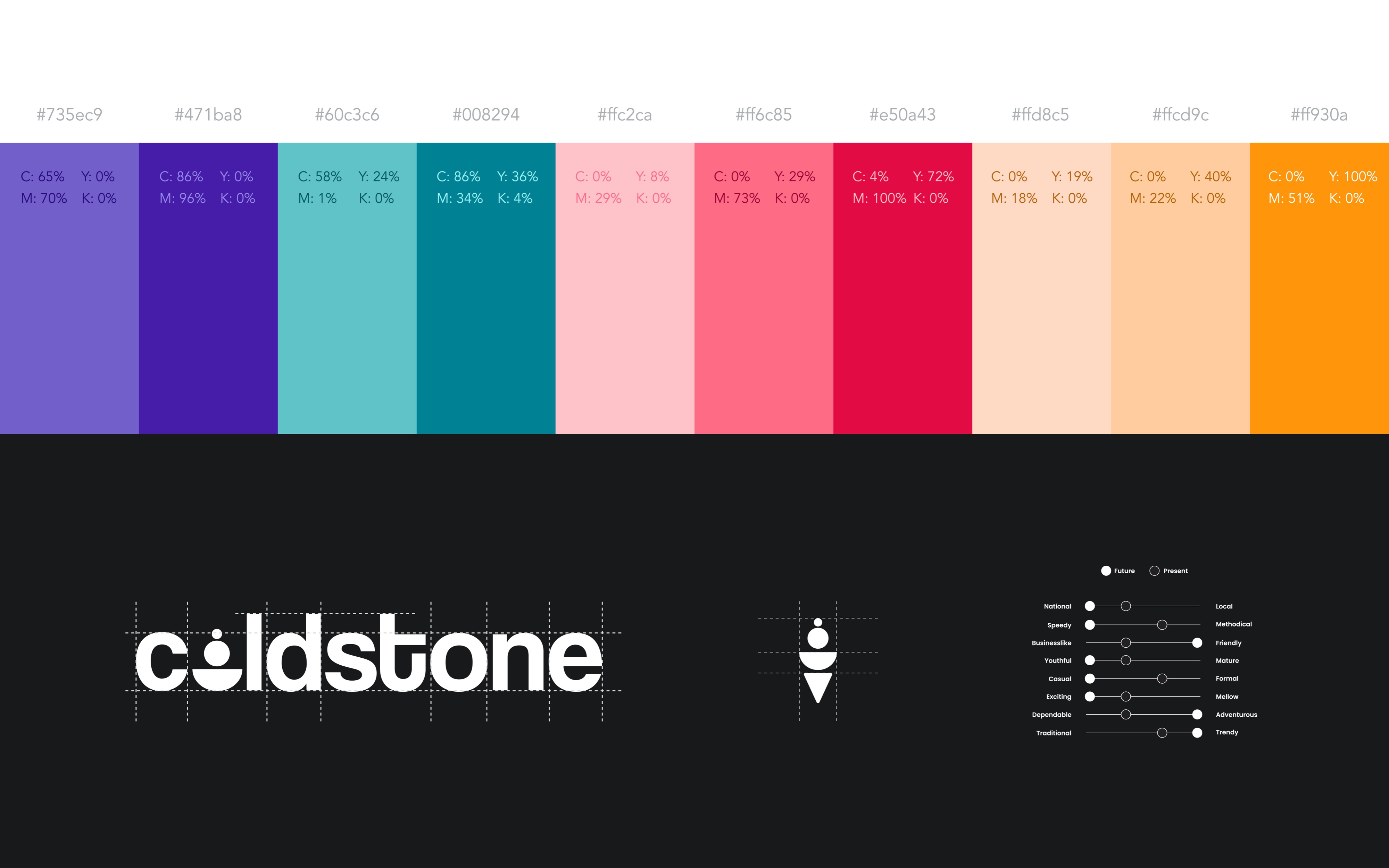
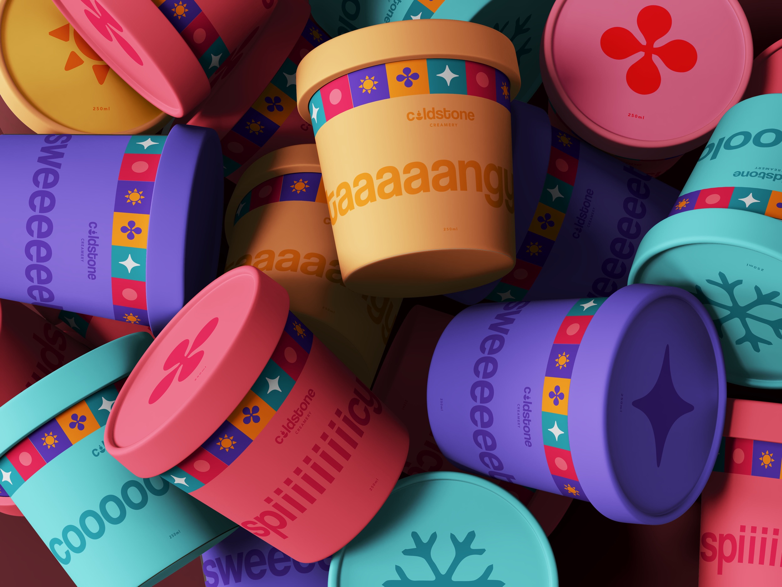
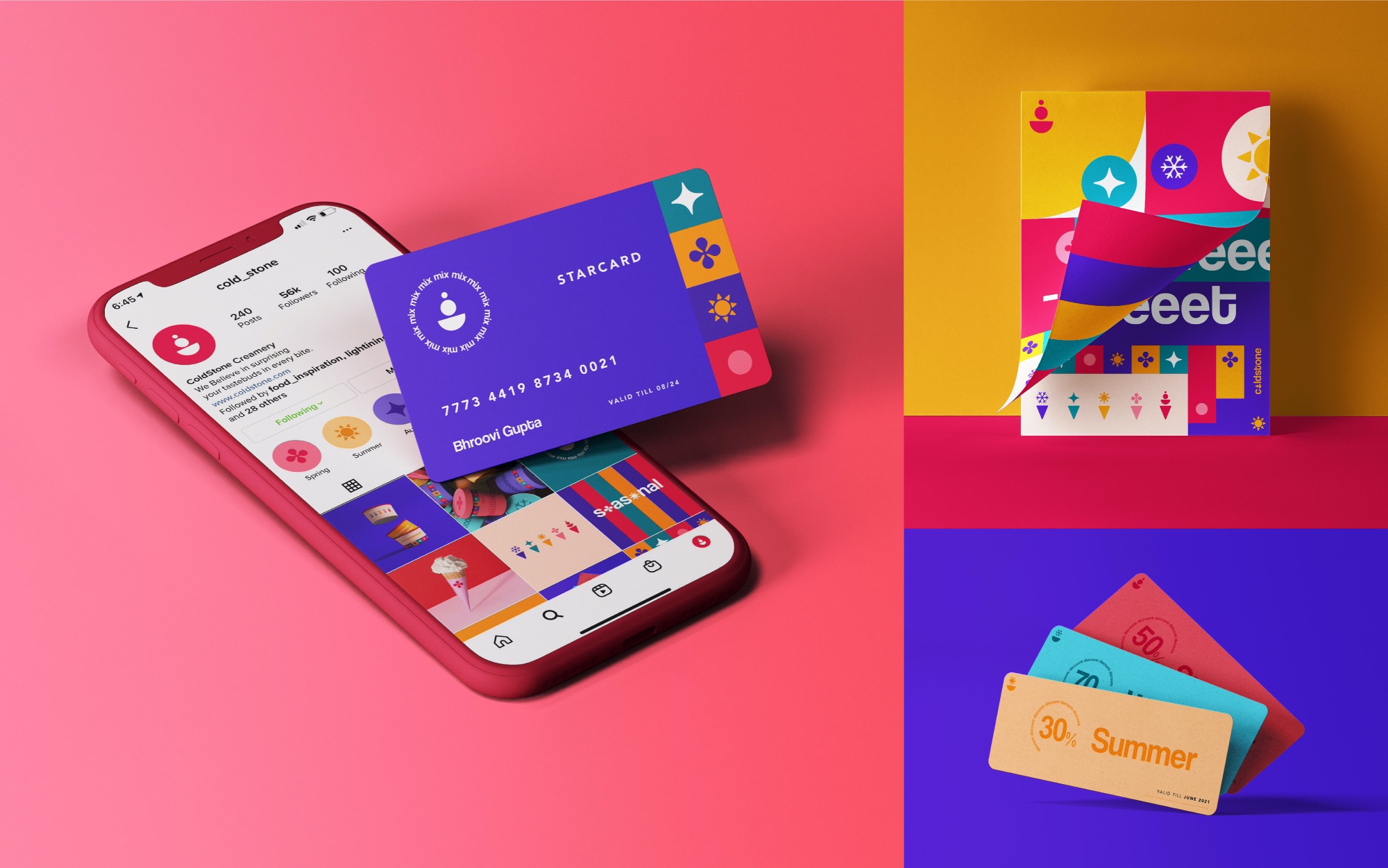
Cold Stone Creamery is one of America’s biggest ice cream chains. The current logo has been constant for over 3 decades and the brand calls for an update due to lack of fluidity. The new visual identity expresses innovation, wild combinations, and a colorful personality to cater to the younger audiences. The rebrand aims to make the packaging vibrant and engaging as if it resembles the same excitement one gets while eating ice cream. The brand identity is outdated and lacks fluidity, and in the case where Coldstone became ‘old’ stone, there was a need of a fresh pitch. “Everytime we create, we aspire to surprise your tastebuds and explore innovation. We innovate by creating infinite flavor combinations in the form of sweet treats. Result? Perfectly creamy, jaw dropping ice creams. The new brand identity is designed to allow the menu to change every 3 months, that is four times a year to signify the four seasons. The different seasons would give way to exclusive limited edition flavors which would help maintain excitement in the brand. The styling occupies personality traits like fun, trendy, innovative, adventurous and personalized. The aim is to not only serve tasty flavourful ice cream but create an entire customer experience bringing childhood memories of bright colors and excitement back. The new brand language also aims to express brand values through the brand identity and especially values of total power of personalization in the customer’s hand. As the company currently struggles with grabbing the attention of young adults, the new brand identity promotes the idea of innovation, experimentation, whacky ideas and ability to stray away from the traditional to create one’s own personal experience. Branding is the process of connecting good stratergy with good creativity and that is exactly what is the goal for this rebrand project.
CREDIT
- Agency/Creative: Bhroovi Gupta
- Article Title: Coldstone Creamery Rebrand
- Organisation/Entity: Student
- Project Type: Packaging
- Project Status: Non Published
- Agency/Creative Country: United States
- Agency/Creative City: Lawrence
- Market Region: Global
- Project Deliverables: Packaging Design
- Format: Pot
- Substrate: Pulp Carton
- Industry: Food/Beverage
- Keywords: WBDS Student Design Awards 2021/22
-
Credits:
Educational Institution: University of Kansas
Educator's Name: Jeremy Shellhorn


