BATLLEGROUP – COLACAO
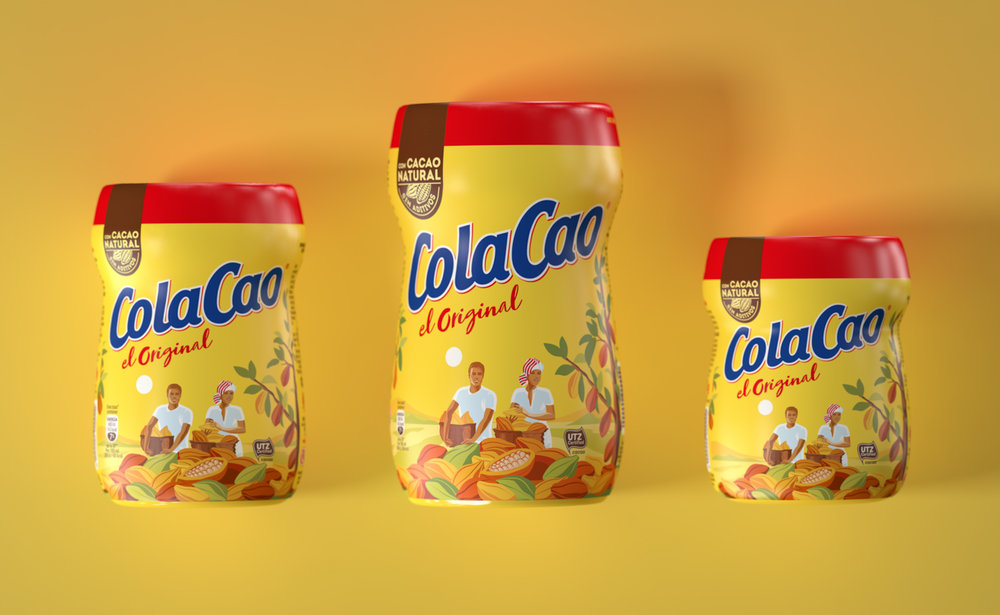
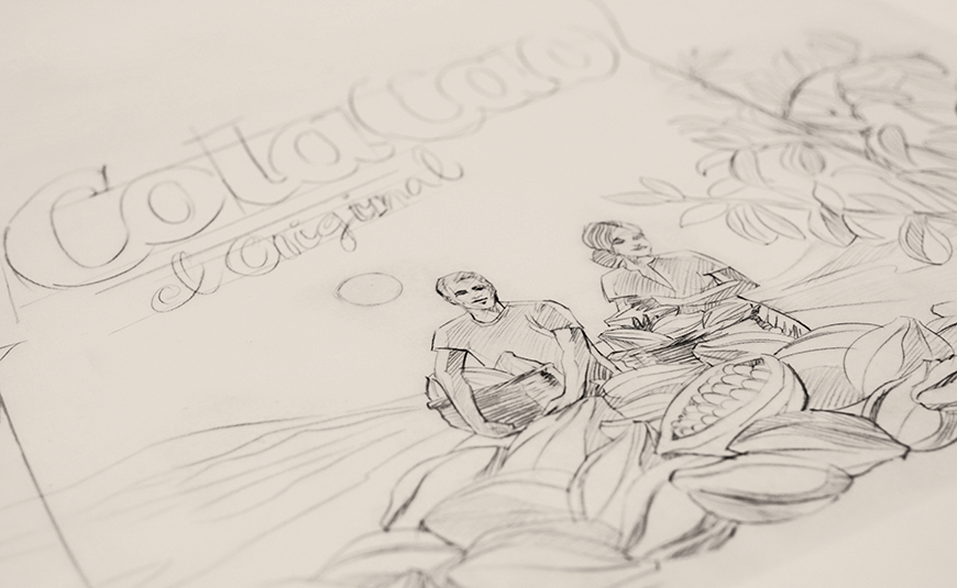
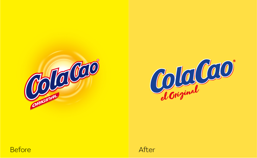
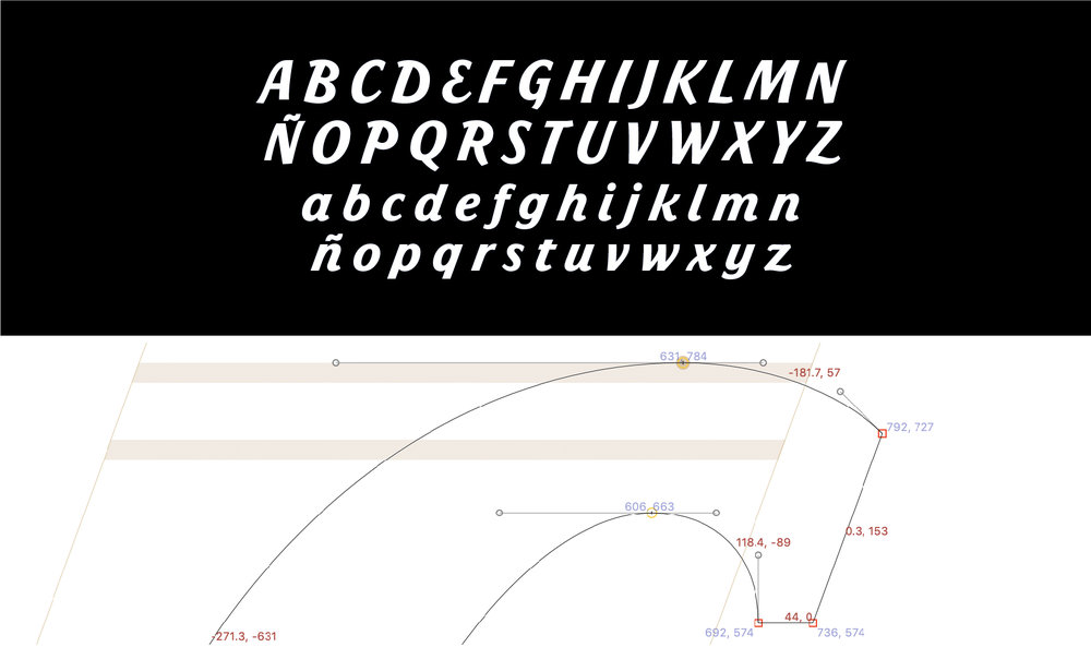
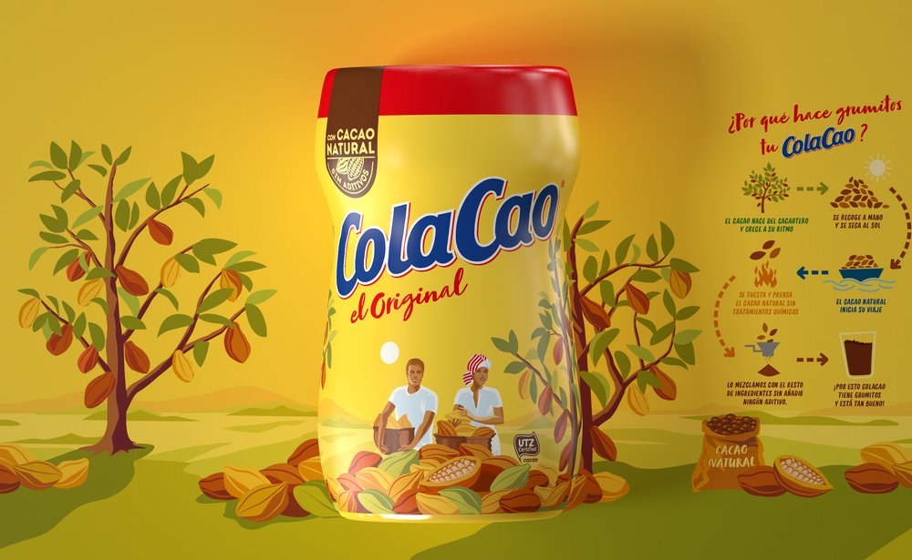
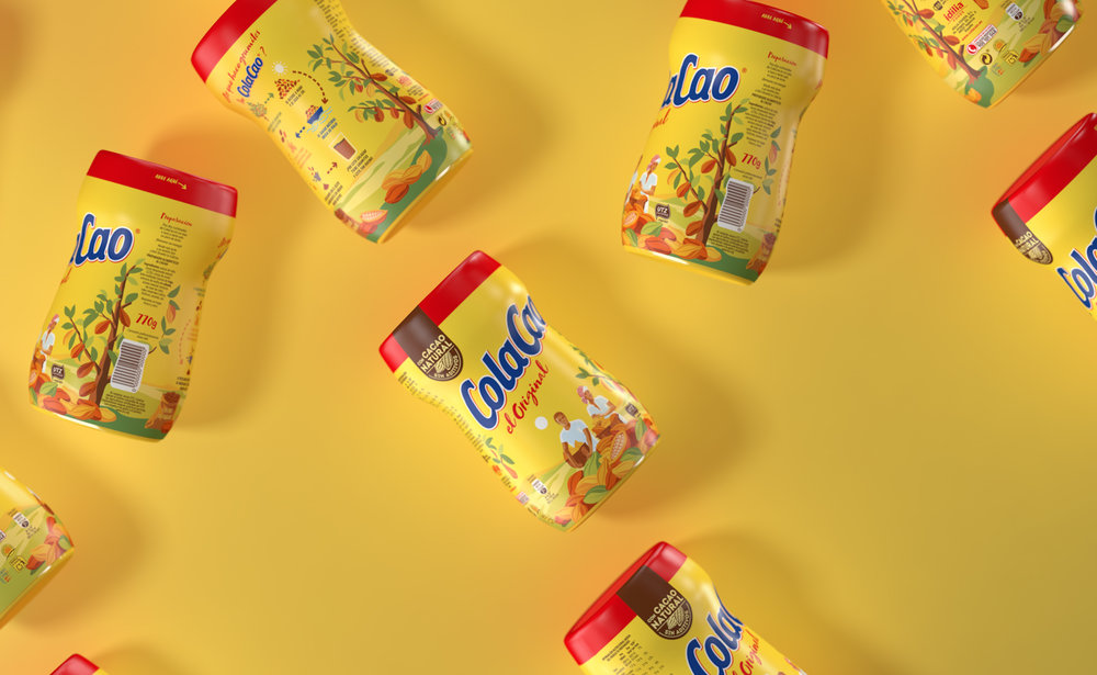
Batllegroup has updated the branding of ColaCao to connect with the new generations that demand greater proximity and transparency. We conceived the creation of the ColaCao design as a composite task in which every little detail counts. For the packaging we incorporated enveloping storytelling with illustrations that speak to us of the heritage and origin of ColaCao. With a heritage of 75 years, ColaCao is a true Love Brand, authentic and overflowing with family associations. All of us fondly remember and continue to enjoy its special texture and inimitable flavour. It is the leading reference brand of the soluble cocoa category in Spain, a country in which 50 glasses of milk and ColaCao are consumed every second.The Challenge: To talk to the new generationsTo redesign a brand with a history like ColaCao is an exciting challenge and, indeed, a task none too easy to achieve. The brand had a clear goal: to strengthen its role as a leader and develop its branding, not only to speak to its current target, but also the new generations which demand greater proximity and transparency. As a brand which forms part of people’s everyday life, ColaCao seeks to become even closer and offer broader information, both on the product and its recipe.The strategy: Authenticity and naturalness for a Love BrandTo bring together strategy, creativity and passion for the brand to create a new concept, built around the authenticity and naturalness of the product, concepts which research shows the product to legitimately own. The new concept: the Original, three product truths: Pioneer in its category, original recipe dating from 1945 and natural cacao. Moreover, we explain that the special texture of ColaCao is because it is made of natural cacao and contains absolutely no additives.The new brand: A simple, bold designWe looked at the remake of ColaCao as a way to evolve the brand, working off the previous design. We sought to update the logo, returning to simpler, slightly less sloping forms and simplifying the fillets of the older version. We decided to keep the typeface so as to maintain recognizability from the previous logo. We improved legibility, corrected the contrast of fine and heavy lines and enlarged and softened counter-forms, while bringing greater light to the orifices in the letters. For the “the Original” text, we use a script typeface which, once again, places the emphasis on naturalness, while enhancing the proximity and personal nature of the product.Packaging: Evolving from the essence of the brandWe proposed a cleaner, more natural look, with updated illustration, colours and typefaces, evolving the iconic image of ColaCao to keep it totally recognisable. We sought to convey simple, honest naturalness, without overstating our promise. This was achieved with a cacao tree, transporting us to the place and origin of the ingredient. This is the concept on which we based the redesign of our ColaCao packaging, including it in the illustration of the harvesters.We see the package illustration as a vehicle to explain the heritage of ColaCao, which takes us from the harvesting to the selection of the cocoa beans, and envelopes the pack to create a 360° effect. At the back, the illustration connects with the explanation of the cocoa process, all the way from the harvesting of the bean to the ColaCao in your glass of milk.The sun, which in the previous design stood out significantly, sustaining the logo, is simpler and forms part of the landscape, transporting us to the moment of harvest, to daybreak. The warm colours are true to the old design, just slightly desaturated. Most particularly the background yellow, which has been softened to add naturalness to the design.
CREDIT
- Agency/Creative: BATLLEGROUP
- Article Title: Colacao, Redesigning a Love Brand
- Organisation/Entity: Agency, Published Commercial Design
- Project Type: Packaging
- Agency/Creative Country: Spain
- Market Region: Europe
- Format: Tube
- Substrate: Plastic


