


Problem:
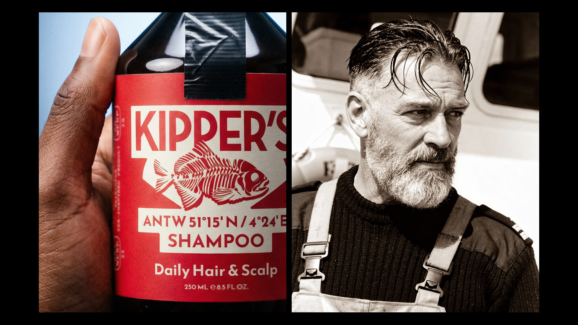
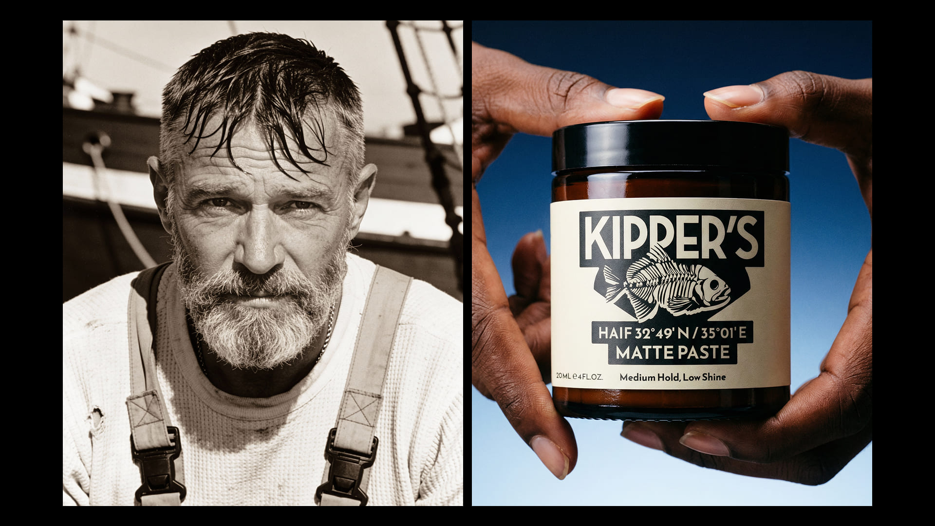
The men’s grooming market is oversaturated with brands built around gloss, trends, and performative masculinity. Many rely on exaggerated visuals and surface-level messaging, which creates distance rather than connection. It was important to create a brand that shifts the focus from appearance to meaning. A brand that speaks about character rather than image, appeals to authenticity rather than performance, and builds a deeper emotional connection with men for whom strength means stability, roots, and principles. Not louder, but more grounded. Not trend-driven, but consistent and honest.
Solution:
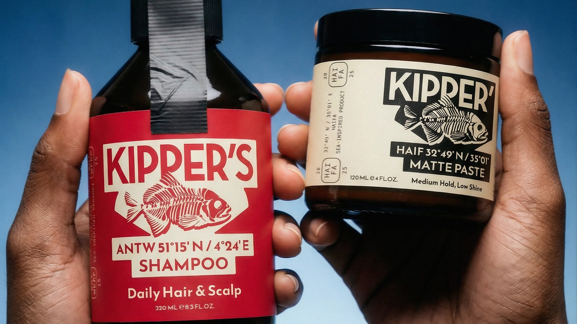
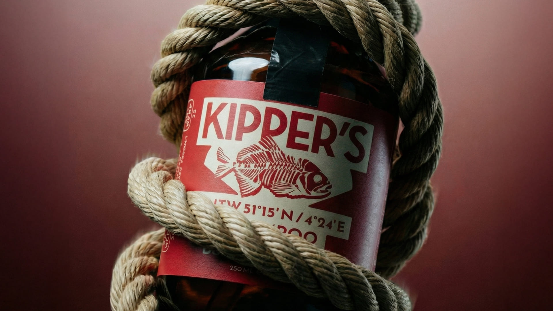
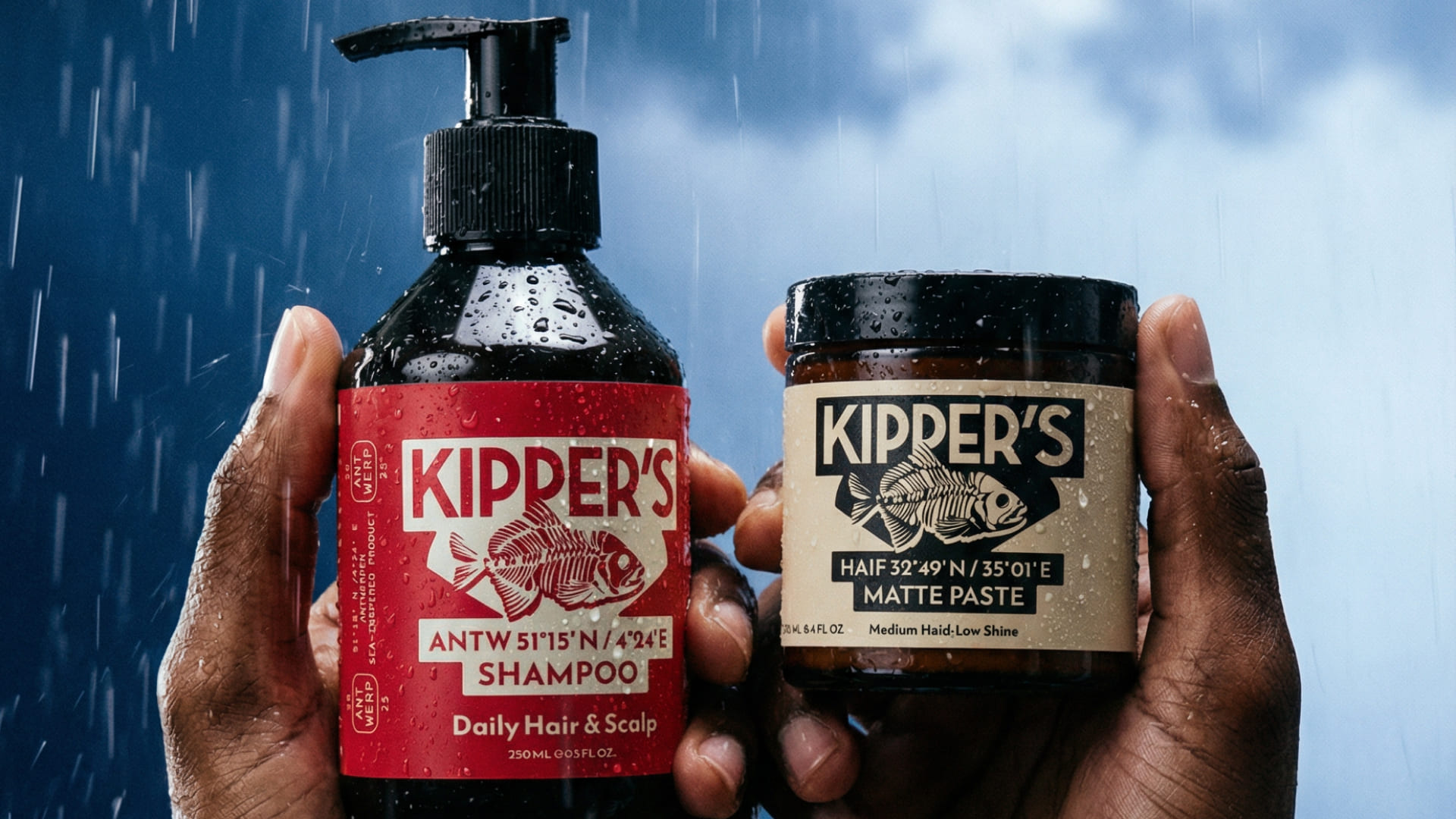
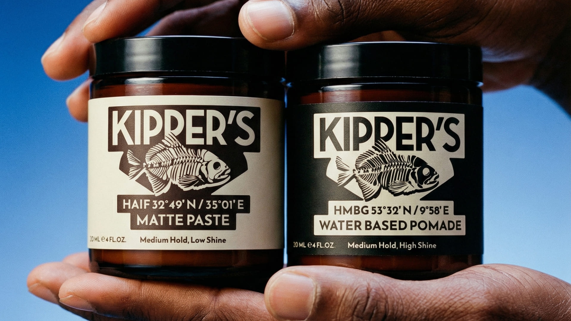
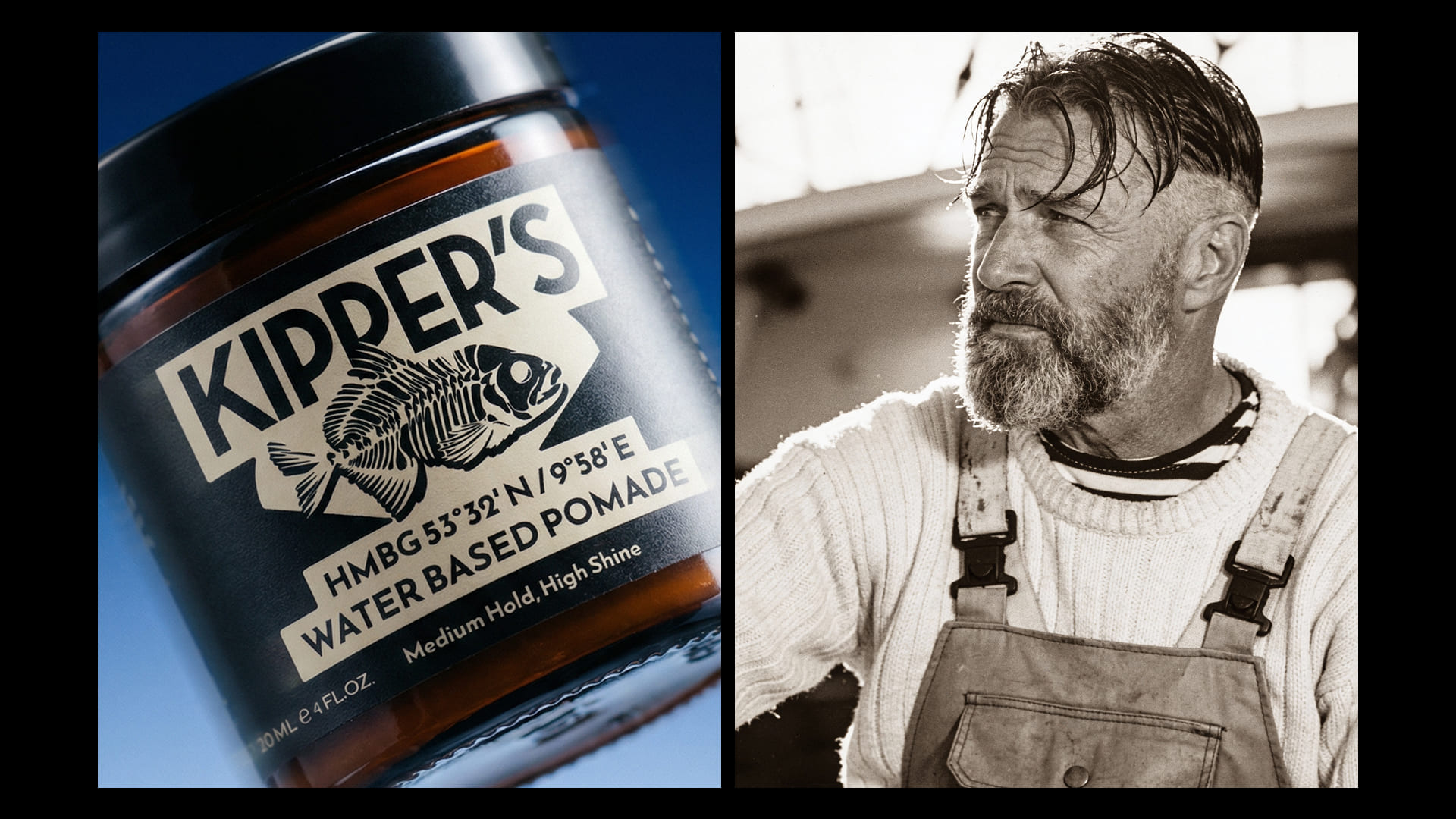
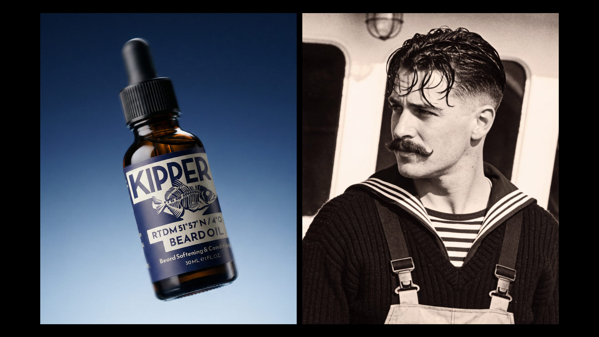
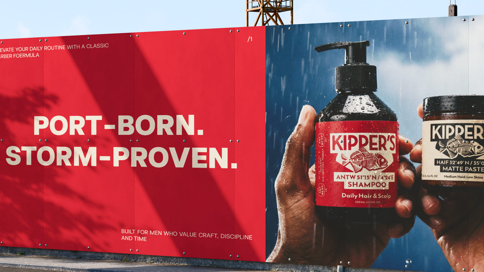
We built the brand around the idea of roots and ritual. The concept draws inspiration from the aesthetics of port cities, working-class dignity, and restrained strength. It reflects a slower, more deliberate rhythm of life, where routine becomes a form of self-respect.
Kipper’s is positioned not as a beauty product, but as an everyday grooming tool — simple, reliable, and honest. The identity conveys discipline, endurance, and a sense of belonging to something timeless. Every element works to support this feeling, without excess or decoration.
Visually, the system is built on a restrained palette, confident typography, and tactile details that reinforce the sense of durability and trust. The design avoids trends and focuses on clarity, creating a consistent experience across all touchpoints.
Scope of work:
• Development of the brand’s strategic platform
• Creation of the core concept and semantic foundation
• Definition of the communication tone of voice
• Building a visual system focused on restrained masculinity
• Crafting a brand narrative centered around the daily rituall
CREDIT
- Agency/Creative: co+lab
- Article Title: co+lab Shapes Kipper’s into a Grounded Men’s Grooming Brand Rooted in Ritual and Authenticity
- Organisation/Entity: Agency
- Project Type: Packaging
- Project Status: Published
- Agency/Creative Country: Ukraine
- Agency/Creative City: Kiyv
- Market Region: Europe
- Project Deliverables: Art Direction, Brand Strategy, Identity System
- Format: Bottle
- Industry: Beauty/Cosmetics
- Keywords: Bath and Beauty; Hair Care; Personal Care;
-
Credits:
Art Direction: Yevhenia Lysenko
Design + Ai: Holovko Oleksandra
Account Managing: Volodimir Boliuh


